Nano Banana Prompts for E-Commerce Product Images: A Structure That Locks Product Consistency (10 Tested Scenes)
Nano Banana Prompts for E-Commerce Product Images: A Structure That Locks Product Consistency (10 Tested Scenes)
When you make e-commerce product images with AI, the problem that gets overlooked isn't whether the shot looks good — it's whether the result is still the same SKU.
Nano Banana is fast, and it's genuinely good at the "change the background, keep the product" kind of work that e-commerce lives on. But when I actually ran it across dozens of SKUs, the place it broke most often was exactly there: swap the scene and the thread on the cap disappears; generate a model shot and the logo drifts a couple of millimeters; a white-background image that looks clean on a light backdrop suddenly grows a fake extra edge down the left side of the bottle on a dark one. If a buyer can't tell at a glance that it's the same item, returns and bad reviews follow.
So this piece isn't about "how to write a pretty prompt." It's about using one fixed structure so that when Nano Banana changes the background, the scene, or puts the product on a model, the product itself stays put. At the end there are 10 scene prompts I've tuned repeatedly that you can copy straight away.
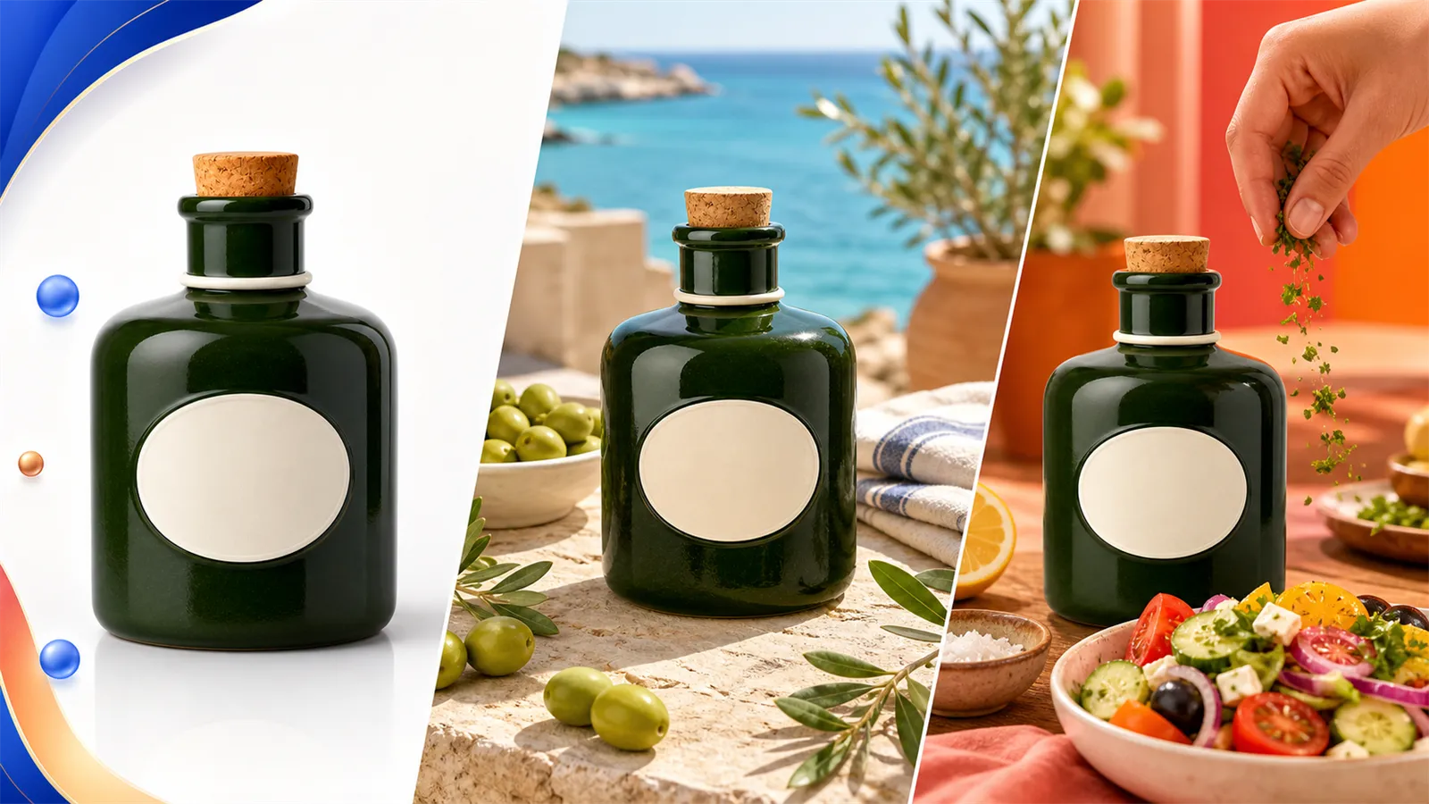
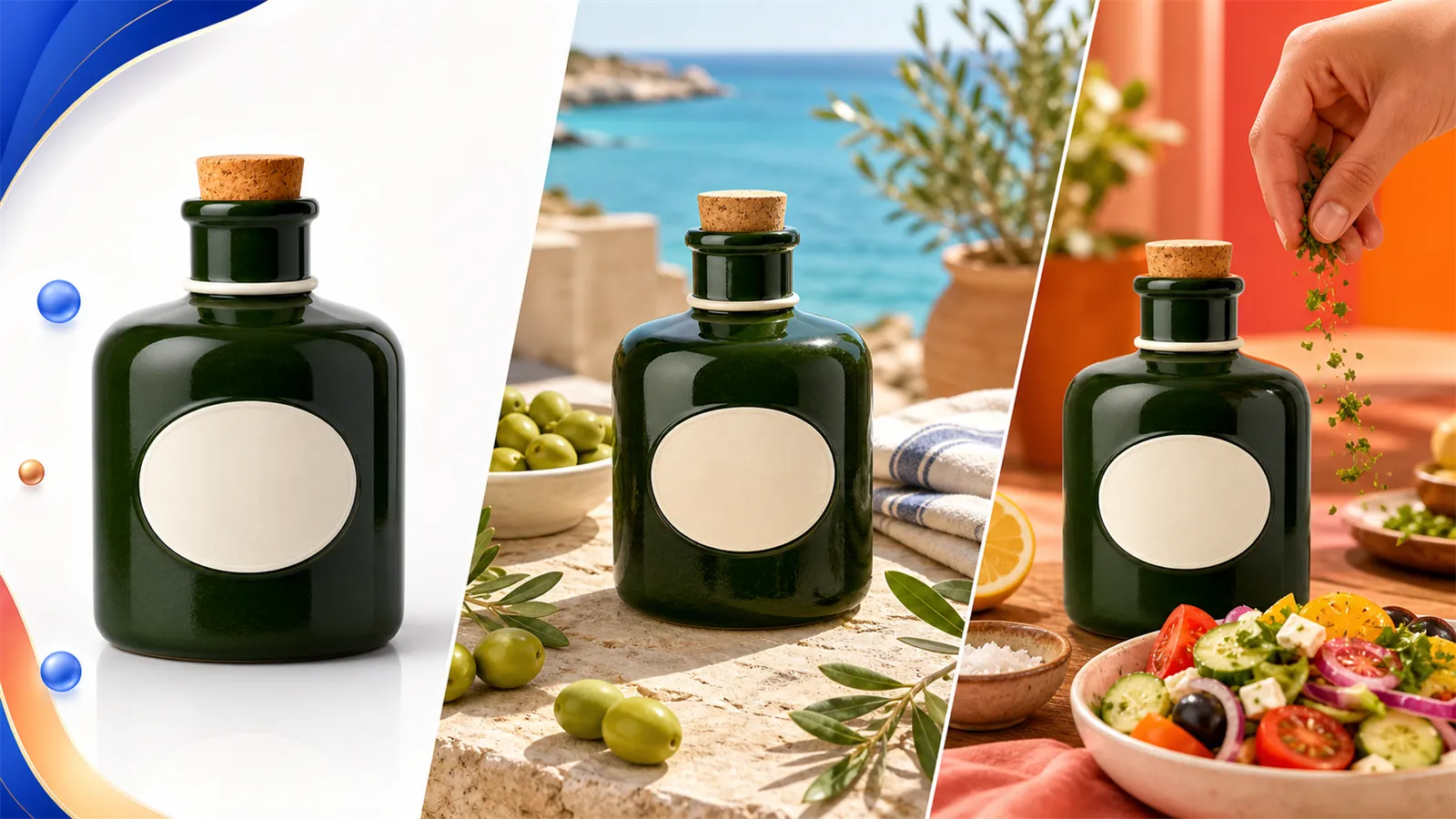
The same bottle, from white-background main image to scene image to usage shot — the hard part isn't making each of the three look good, it's that it stays the same bottle across all three.
Who this is for
This method came out of using Nano Banana across four categories — beauty, home, food, and consumer electronics — and more than twenty SKUs, generating each one 8 to 15 times before I kept a usable image. The conclusions only hold for e-commerce shots that take a real product photo as input and need to preserve product identity. If you're inventing a concept image from nothing or making pure art posters, these constraints will only tie your hands.
One more thing: Nano Banana reads prompts in any language. For words that describe product structure, the more specific the better — which language you use barely matters. My examples are in English, but they hold up translated into anything else.
One reusable prompt structure
The structure I finally settled on has six slots: purpose, product lock, scene, composition, light, exclusions. The order matters — put "product lock" before the scene, and the model prioritizes keeping the product instead of sacrificing its structure for atmosphere. A lot of people open their prompt with "dreamy, high-end scene," and of course the model spends all its effort on the scene.
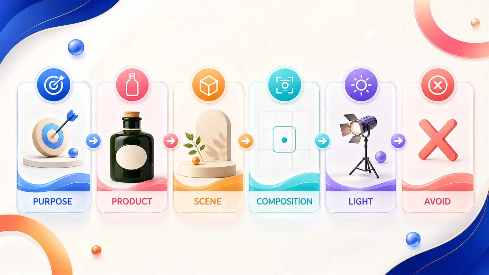
What each slot does:
Purpose sets the tone up front: is this a white-background main image, a scene image, or a model shot? One line, no elaboration.
Product lock is the heart of the whole prompt — its own section below.
Scene describes only the environment around the product, and it should be restrained. The more props, the more likely the model folds a prop into the product — write "petals nearby" and it may print petals onto the bottle.
Composition handles angle, subject size, and negative space. Main images especially need room left for later editing and text, so don't let the product fill the frame.
Light decides whether the material reads. Transparent and metallic surfaces are the most sensitive here — get it wrong and glass turns gray, metal looks like plastic.
Exclusions is the slot most people skip, and it's unusually useful for Nano Banana: write "do not add edges, do not alter the label text, do not add extra accessories" directly in. The model defaults to "helpfully completing" things, so you have to tell it explicitly where it isn't allowed to improvise.
Product lock: translating "keep it consistent" into something the model can execute
"Keep the product consistent" is nearly useless to a model — it doesn't know which features you mean. What works is breaking the product into a handful of attributes that can be seen and checked one by one, and locking each of them down.

Take a forest-green ceramic condiment bottle. I'd break it into: shape (short cylinder, square shoulder), material (matte ceramic, not glass), color (forest green), stopper (cork), neck ring (narrow off-white band), label (centered oval, off-white, blank). Those six go into the prompt, and after generation I check the result against the same six. Whichever one doesn't match, I go back and make that one attribute stricter — I don't regenerate the whole thing.
How fine you break it down depends on the category. Transparent materials need liquid level and the number of bottle-wall edges locked as well; anything with a logo needs the logo position and character count locked; sets need the item count locked. If your source material is missing angles, don't let the model invent the back — fill in the front, back, and details first with the product image set tool, then take the complete material into scene work. And don't force color variants through the prompt — generate same-model-different-color with product recolor and check the seams and label one by one; that's far more reliable than a line saying "make it navy."
10 scene prompts you can copy directly
Each one below gives the prompt, what it's for, and the problem I actually hit while generating it plus the fix. Replace the product description in brackets with your own SKU's attributes.
1. Pure white-background main image
Purpose: pure white-background e-commerce main image. Product: [forest-green matte ceramic condiment bottle, short cylinder with square shoulder, cork stopper, narrow off-white neck ring, centered oval off-white blank label], strictly keep the shape, color, material, and part proportions unchanged. Scene: pure white background (#FFFFFF), no props. Composition: front eye-level view, product centered, negative space around it, a faint contact shadow at the base. Light: soft even studio light; matte ceramic keeps fine highlights without blowing out. Exclusions: no new edges or cracks, no label changes, no added text or accessories.
The white-background image is the baseline for everything else — get this one to pass inspection first, then use it for the rest. Nano Banana's most common white-background flaw is an over-heavy base shadow that makes the product look like it's floating on a gray surface; writing in "faint contact shadow," and if needed "pure white background with no gray gradient," reins it in.
2. White-background detail shot
Purpose: white-background detail image. Product: [as above], keep the shape and color exactly matching the main image. Composition: 45-degree top-down, highlighting the transition from shoulder to stopper and the neck-ring structure, product filling two-thirds of the frame. Light: soft light from the upper side, tracing the outline of the square shoulder. Exclusions: do not change the stopper shape, do not generate a second bottle, no reflections.
I hit one trap here: the model loves to "gift" you a symmetrical second bottle as a companion. Writing "do not generate a second bottle" basically solves it. If you want the full set of front, back, and detail shots at once, the product image set tool is easier than tuning them one at a time.
3. Lifestyle scene (tabletop)
Purpose: kitchen tabletop lifestyle scene. Product: [as above], keep product identity unchanged and make it the clear subject. Scene: light wooden tabletop, a blurred kitchen with window light behind, only a few olives and a small sprig of herbs as accents nearby, props not covering the bottle or label. Composition: product on the left third, breathing room on the right. Light: soft morning window light, warm tone, gentle shadows. Exclusions: props must not touch the bottle; do not generate patterns or reflected objects on the bottle.
The classic scene-image failure is the subject getting upstaged — too many props and the product shrinks in the frame. My rule is to keep props to two kinds at most and spell out their spatial relationship ("nearby," "not covering").
4. Material mood shot (dark background)
Purpose: dark-background texture mood shot. Product: [as above]; forest green must still read as a clear bottle silhouette against the dark backdrop, with only one continuous edge on each side. Scene: dark gray-green gradient background, a directional light on the bottle. Composition: front, slightly low angle, product centered and high. Light: a hard light on one side plus weak fill on the other, bringing out the matte ceramic's texture. Exclusions: no extra bright edges or double outlines against the dark background; the bottle is not transparent.
The dark background is the stress test for product consistency. The same prompt passing on a light background doesn't mean it passes on a dark one — dark backdrops are especially good at exposing a fake extra edge. I run both light and dark, and only when both are clean do I count that SKU as passed.
5. Floating effect shot
Purpose: floating effect shot for ads. Product: [as above], structure intact. Scene: light beige background, the bottle floating slightly with a soft shadow below, a few herb leaves drifting around. Composition: product centered with a slight sense of motion. Light: bright and even, mild highlights. Exclusions: herb leaves do not overlap or cover the label; the bottle does not tilt or deform.
Floating shots work well as ad assets, but too much motion and the model tends to "pinch" the bottle crooked. Adding "the bottle does not tilt or deform" steadies the subject.
6. Model / usage scene
Purpose: usage scene. Product: [as above], the bottle keeps a realistic size in the hand, label facing the camera. Scene: a hand naturally holding the bottle, mid-pour over a salad, background a blurred Mediterranean table. Composition: hand and bottle as subject, a soft-focus plate on the right. Light: bright natural afternoon light. Exclusions: fingers do not pass through the bottle; the bottle size matches the palm; do not change the shape or label.
With people in frame, the thing most likely to break is the hand-to-product relationship — fingers sinking into the bottle, the bottle smaller than the hand. Spelling out the proportion and "fingers do not pass through the bottle" matters. For apparel, shoes, or bags that need a real model, rather than fighting the prompt, use AI model try-on or the apparel set tool — they control fit and body proportion far better than a raw prompt.
7. One-click background swap (keep the product)
Purpose: swap the existing white-background image for a scene background, product completely unchanged. Product: strictly preserve the bottle from the input image — shape, color, label, and light direction all stay. Scene: replace with a light-wood counter, background blurred. Composition: keep the product's original position and size. Light: match the new background's light direction to the product's existing lighting. Exclusions: do not repaint the product, only replace the background, do not change the product edges.
Background swap is Nano Banana's strong suit, but the key is repeating "only swap the background, do not repaint the product" in the prompt. If you just want fast batch background swaps without writing a prompt each time, the background swap inside product retouch is more direct.
8. Color variant image
Purpose: generate a same-model different-color variant. Product: [as above], keep shape, material, stopper, and label all consistent except the color. Variant color: change to [matte terracotta orange], material still matte ceramic. Scene: pure white background. Exclusions: only change the bottle color, do not change the neck ring or label base color, do not change the reflective texture.
Recoloring through a prompt sometimes causes collateral damage — it recolors the neck ring and label base too. The safe route is to confine the region to the bottle body with product recolor and lock the other parts.
9. Scale / reference shot
Purpose: a size-sense shot with an everyday reference object. Product: [as above], realistic proportions. Scene: the bottle on a wooden board, a real-size lemon beside it as reference. Composition: side-on eye level, product and reference on the same plane. Light: even studio light. Exclusions: the reference object is a realistic size, not exaggerated, and does not cover the main bottle.
A reference shot is not a dimension chart — it only gives the buyer an intuition for size; the actual measurements still need a separate annotated image built from real values. Don't expect the model to label centimeters for you.
10. Promo / holiday theme image
Purpose: holiday promo main image. Product: [as above], keep product identity and make it the subject. Scene: warm holiday background, a little pine and warm string lights as accents, leaving blank space at the top for adding promo text later. Composition: product centered-low, text area up top. Light: warm festive ambient light. Exclusions: do not generate any text in the image; decorations do not cover the product; do not change the label.
For promo images I always let the model produce the picture only, no text — I add the text myself afterward. AI-generated text is misspelled nine times out of ten, especially in other languages. Reserving the blank area up front is faster than redoing it.
A few things Nano Banana still can't do
After this many runs, here are some of its current limits, so you don't burn generations on them:
Dense small-print labels don't survive. Ingredient lists and the like get smeared into decorative texture. For images carrying that kind of information, I keep the original label region from being repainted, or just paste the real label back in afterward.
Complex logos drift. Simple text logos are okay; graphic logos deform easily once a scene is repainted. Lock the region of an important logo and keep it out of the repaint.
Precise multi-item counts are unstable. A "six-piece set" often comes out as seven or eight. For count-sensitive set images, generate by structure with the product image set tool rather than a raw prompt.
When you hit these, try switching models: for stronger text and layout control I move to GPT Image 2; for posters and multilingual assets, Seedream 5.0 Pro keeps layouts tidier. To run the flow cheaply first, use Nano Banana 2 Lite for drafts, then move the chosen composition to the full version for finishing.
Wiring it into a real workflow saves the time
A single prompt is only the start. What actually saves time is turning "lock attributes → make the white-background image → batch the scenes → pick and check" into a fixed flow: write the product's six identity attributes into a reusable template, produce one white-background main image that passes inspection as the baseline, then use that baseline to batch scene images, swap backgrounds, and make variants.
This flow runs end to end in the PixPix workbench, and it pairs with detail page generation to drop the set straight into a full listing page. For more tools broken out by scenario, browse the tools overview; and if you want motion, the white-background image can go on into image-to-video for a short clip.
However nicely a prompt is written, it's less useful than locking the product down first and talking about the scene second. Fit this structure to your own SKUs, run one category through it, and you'll see the share of usable images climb noticeably.

AI Image Tool Built for E-commerce Teams
For new product launches, advertising, and promotional campaigns, use AI to generate product images, scene visuals, ad creatives, and short video assets — making content production faster.