【Execution Route | Do Not Display】
If the image-generation tool can be invoked multiple times: concatenate the sharing rules with A–F separately, execute six times, generating only one 1000×1000 square image each time.
If only a single image can be generated at a time: first set the interface/API to a 2:3 portrait orientation (do not use Auto), then arrange A/B, C/D, and E/F into a 2-column × 3-row grid; ensure all six cells are equal in size and maintain a visual aspect ratio of 1:1. The outer canvas must not be 1:1.
【Sharing Rules】
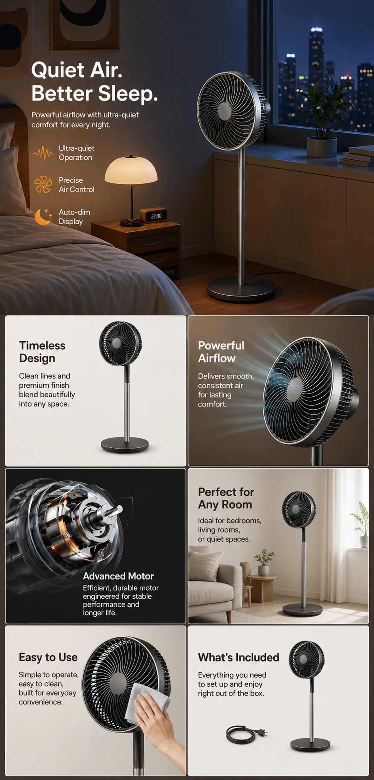
The provided product reference image serves as the sole basis for the product. The product is a quiet pedestal fan. Strictly adhere to the reference image’s shape, structure, color, quantity, accessories, texture, and relative proportions; do not fabricate any unseen components, specifications, or functions. Use high-quality Amazon commercial photography and clear English infographics, with colors derived from the product itself, realistic lighting, and a clean layout. Maintain natural proportions for the product, figures, hands, icons, and props—no stretching, flattening, or independent scaling is allowed. Titles, products, and labels must remain fully within the safe zone, while the background extends across the entire frame to all four edges. Only use MOCKUP for branding. No white borders, vertical sidebars, transparent fill‑ins, watermarks, contact information, social media accounts, original brand logos, platform identifiers, garbled text, distorted body parts, or unverified copywriting are permitted. A–F are solely control markers and must not be displayed.
【A | Product Overview】Title: “PRODUCT OVERVIEW.” The hero composition should fully showcase the product along with the accessories depicted in the reference image, accompanied by three brief English icon‑based selling points that convey only visible or verifiable information.
【B | Materials & Design】Title: “MATERIAL & DESIGN.” Present the material, structure, surface, or styling through an overall view of the product combined with 2–3 close-up details; ensure clear annotations without inventing material names.
【C | Function in Focus】Title: “FUNCTION IN FOCUS.” Demonstrate key functions within realistic usage scenarios; maintain natural proportions among figures, hands, and the product, with authentic actions and easily understandable information.
【D | Details Up Close】Title: “DETAILS UP CLOSE.” Highlight 2–4 critical structural or operational areas using magnified details and short captions; do not alter the product’s structure.
【E | Everyday Use】Title: “MADE FOR REAL LIFE.” Showcase usage, portability, storage, or maintenance scenarios consistent with the product; retain only one clear theme and avoid redundancy with C.
【F | Packing List】Title: “WHAT’S INCLUDED.” Lay out or neatly arrange the actual products and accessories shown in the reference image, ensuring accurate quantities and relative sizes; if the list cannot be confirmed, instead display visible specifications, dimensional relationships, or usage steps without fabricating numbers.