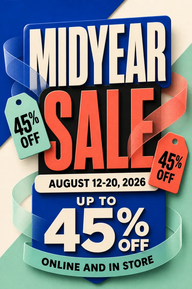
Create a brand-new vertical mid-year sale poster in English for advertising and marketing.
Accurately present the text “MIDYEAR SALE”“AUGUST 12-20, 2026”“UP TO 45% OFF”“ONLINE AND IN STORE”.
Use cobalt blue, coral orange, mint green, cream white, and black.
Utilize bold layered headlines, semi-transparent ribbons, and two floating discount tags.
Center the layout, with an information hierarchy optimized for quick reading on mobile devices.
Incorporate soft three-dimensional paper art shadows to prevent the composition from feeling cluttered.
Do not include brands, logos, websites, QR codes, watermarks, or tiny legal text.
Output a high-quality static PNG image.
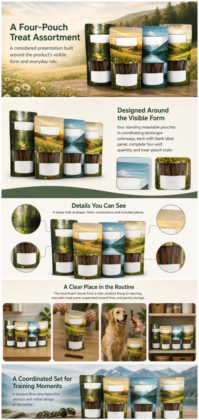
Using the supplied reference image as the sole product reference, create an Amazon A+ design preview for a four-pouch dog-treat assortment. Preserve exact geometry, proportions, colors, construction, quantity, accessories, and scale. Visible details: four standing resealable pouches in coordinating landscape colorways, each with blank label panel, complete four-unit quantity, and treat-pouch scale. Do not invent hidden parts or claims.
Visual system: forest green, warm cream, pale blue, meadow gold, and charcoal. Composition motifs: pastoral banners, rounded dog scenes, colorful circular icons, and tidy pouch lineups. Alternate a wide banner, asymmetric overview, centered detail graphic, three-scene sequence, and wide closing scene. Use readable sans-serif type and mobile-safe margins.
Build this official A+ module order. Keep every module independently complete; never split copy or product details.
MODULE 1 — Image with text overlay — introduction
Exact headline: “A Four-Pouch Treat Assortment”
Exact supporting copy: “A considered presentation built around the product’s visible form and everyday role.”
Layout: wide image-led hero; dominant complete product and large safe headline area.
MODULE 2 — Single image with side text — product overview
Exact headline: “Designed Around the Visible Form”
Exact supporting copy: “four standing resealable pouches in coordinating landscape colorways, each with blank label panel, complete four-unit quantity, and treat-pouch scale.”
Layout: large three-quarter product, side text field, and two detail crops.
MODULE 3 — Four-image and text — visible evidence
Exact headline: “Details You Can See”
Exact supporting copy: “A closer look at shape, finish, connections and included pieces.”
Layout: centered product with four rounded macro callouts; show only visible facts.
MODULE 4 — Multiple image and text — routine or use setting
Exact headline: “A Clear Place in the Routine”
Exact supporting copy: “The assortment moves from a clear product lineup to opening, one plain treat piece, supervised reward time, and pantry storage.”
Layout: three framed scenes with consistent product design and newly generated people or animals only when relevant.
MODULE 5 — Full-width image with text overlay — closing
Exact headline: “A Coordinated Set for Training Moments”
Exact supporting copy: “A focused final view keeps the product and visible design at the center.”
Layout: wide editorial scene, strong silhouette, restrained props, safe text area.
Create one vertical A+ preview at 1200px width with content-driven height, clear module boundaries, and varied compositions for independent export. Render only the exact copy above. Do not add logos, prices, promotions, QR codes, URLs, contacts, competitors, testimonials, ratings, guarantees, unverified claims, certifications, fake UI, watermarks, pseudo-text, or unrelated labels. Keep all elements natural and mobile-safe.
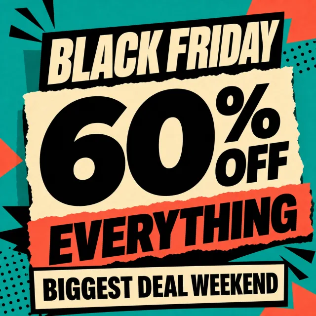
Create a brand-new English-language Black Friday square static promotional image.
Accurately present the text “BLACK FRIDAY”“60% OFF EVERYTHING”“BIGGEST DEAL WEEKEND”.
Use teal, coral orange, cream white, and black.
Center it around a massive 60% discount, paired with torn-paper fragments and rugged geometric elements.
All text should remain large and sharp, fully contained within the safe area of the square canvas.
The design must be a single-frame static image—no animations allowed.
Do not include brands, logos, URLs, QR codes, watermarks, or fine print.
Only output one high-completion static PNG.
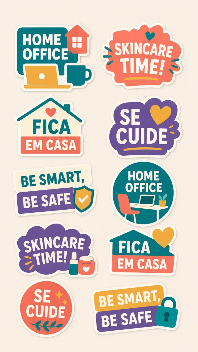
Create a brand-new static sticker collection themed around remote work and skincare, in both Portuguese and English.
Use the phrases “HOME OFFICE”“SKINCARE TIME!”“FICA EM CASA”“SE CUIDE”“BE SMART, BE SAFE” accurately.
Employ teal, coral orange, cream white, violet, and mustard yellow.
Design ten rugged vector-style stickers arranged on a warm-toned neutral vertical background.
Ensure both Portuguese and English text remain sharp and clear, without adding random small text.
The design must be a single-frame static image—no animations allowed.
Do not include brands, logos, URLs, QR codes, watermarks, or copyright marks.
Output only one high-quality static PNG image.
【Execution Routing | Do Not Display】
If the image-generation tool can be invoked multiple times: concatenate the sharing rules with A–F separately, execute six times, generating one 1000×1000 square image each time; do not submit all modules at once.
If only one image can be generated per invocation: set the aspect ratio to 2:3 vertical in the interface or via API, and avoid using Auto mode; a recommended size is 1200×1800. Arrange the images into a 2-column × 3-row grid labeled A/B, C/D, and E/F, ensuring all six modules are equal in size and maintain a 1:1 proportion. If the platform enforces a 1:1 ratio, switch to an Agent-based approach or generate each module individually.
【Sharing Rules】
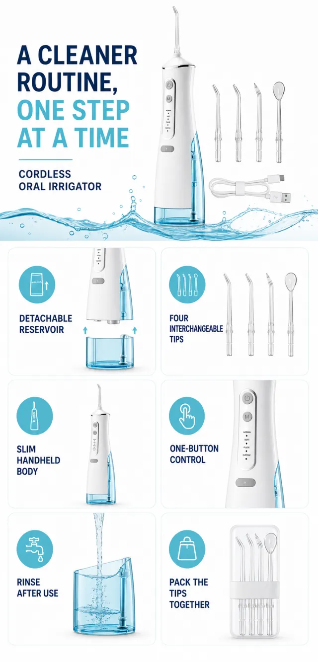
Use the provided product reference image as the sole basis for the product. Product: cordless oral irrigator set. Copywriting must be in English, with brand placeholders replaced by MOCKUP only. Visuals should follow high-end commercial e-commerce photography standards—sharp imagery, clear hierarchy, and concise, easy-to-read copy. The product’s appearance, structure, color, quantity, accessories, and relative proportions must match the reference image; products, people, icons, and props should maintain natural proportions. All essential information must remain within the safe zone, with the background extending fully across all four edges. Prohibit white borders around the perimeter, vertical borders on the left and right, transparent fill-in borders, watermarks, contact information, social media accounts, platform details, original branding, gibberish, irrelevant content, or unverified claims regarding efficacy or specifications; titles must not be displayed. A–F must not appear.
【A|Theme】Copy: “A CLEANER ROUTINE, ONE STEP AT A TIME”; “CORDLESS ORAL IRRIGATOR.” Use the full product main visual to prominently convey the core value.
【B|Theme】Copy: “DETACHABLE RESERVOIR.” Design an independent square image centered around this theme, ensuring no overlap in selling points, composition, or product angles with other modules.
【C|Theme】Copy: “FOUR INTERCHANGEABLE TIPS.” Design an independent square image focused on this theme, avoiding repetition of selling points, composition, or product angles compared to other modules.
【D|Theme】Copy: “SLIM HANDHELD BODY.” Design an independent square image around this theme, ensuring no overlap in selling points, composition, or product angles with other modules.
【E|Theme】Copy: “ONE-BUTTON CONTROL.” Design an independent square image centered on this theme, avoiding duplication of selling points, composition, or product angles with other modules.
【F|Theme】Copy: “RINSE AFTER USE”; “PACK THE TIPS TOGETHER.” Design independent square images for these themes, ensuring no overlap in selling points, composition, or product angles with other modules.
【Output Rules | Do Not Display】
Generate only one 1000×1000, 1:1 Amazon Listing secondary image. No collage images, six-grid layouts, multi-card grids, or multiple scenes are allowed.
【Sharing Rules】
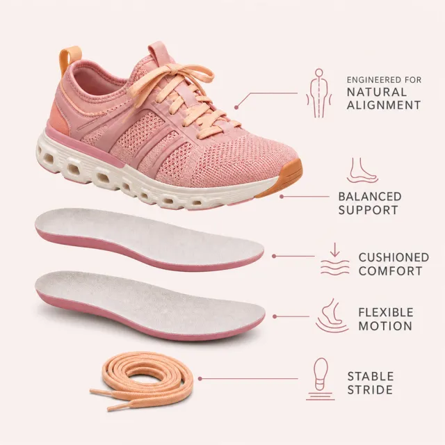
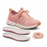
Use the provided product reference image as the sole basis for the product. Product: supportive women's athletic sneaker with removable insoles. Copywriting must be in English; brand placeholders should use MOCKUP only. Visuals must follow high-end commercial e-commerce photography standards—sharp imagery, clear hierarchy, and concise, easy-to-read copy. The product’s appearance, structure, color, quantity, accessories, and relative proportions must match the reference image exactly. Maintain natural proportions among the product, figures, icons, and props. All essential information must remain within the safe area, with the background extending fully to all four edges. Prohibit outer white borders, vertical sidebars, transparent fill-in areas, watermarks, contact details, social media accounts, platform information, original branding, gibberish, irrelevant content, or unverified claims regarding efficacy or specifications. Headlines must not appear.
【Image Composition】
Create a premium pale-blush 1000 x 1000px Amazon infographic using the redesigned product master. Show a vertical exploded view of the shoe, two insole layers, and spare laces with thin leader lines and simple support icons. Use exact copy: "ENGINEERED FOR NATURAL ALIGNMENT", "BALANCED SUPPORT", "CUSHIONED COMFORT", "FLEXIBLE MOTION", "STABLE STRIDE". Keep every item and word within the safe margins.
Create a brand-new English-language recruitment vertical poster.
Accurately present the text “COME JOIN US”“OPEN POSITIONS”“APPLY TODAY”.
Use navy blue, coral orange, mint green, cream white, and violet.
Employ a universal megaphone, applicant cards, and upward arrows to form a striking vertical layout.
The headline should be large and friendly, with clear, professional information hierarchy.
Utilize modern paper-cut graphics while maintaining ample white space.
Do not include company names, brands, logos, URLs, QR codes, watermarks, or fine print.
Output a high-completion static PNG.
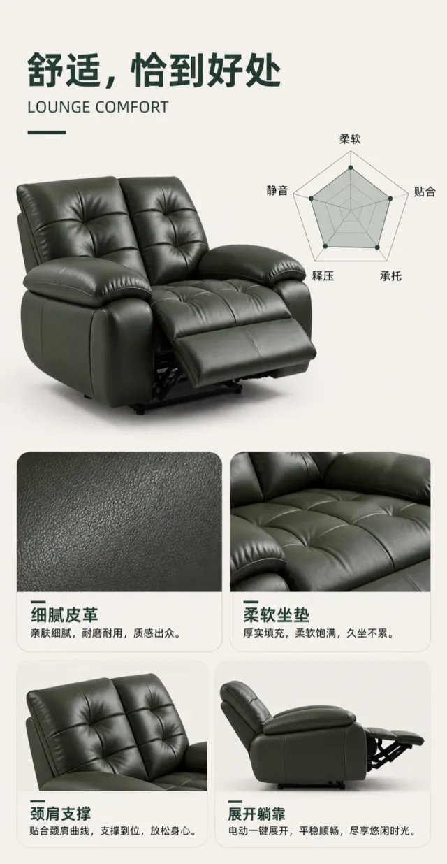
Generate a visual mockup for the product detail page of a leather electric recliner, based on the reference image.
Use a warm beige‑gray background accented with deep dark green. Align a large Chinese headline, “Comfort, Just Right,” to the upper left, paired with a smaller English tagline: “LOUNGE COMFORT.” In the center, feature a three‑quarter side view of a dark‑leather electric recliner as the main element. On the right, present a minimalist five‑dimensional radar chart illustrating “Softness, Fit, Support, Pressure Relief, and Quiet Operation,” rendered with delicate, smooth lines. Below, arrange four rounded‑corner information cards of varying widths, each showcasing fine leather texture, plush cushioning, neck‑and‑shoulder support, and the fully reclined position; each card includes only a brief headline and a single explanatory sentence. Use a modern sans‑serif typeface, with green and charcoal black creating a crisp contrast. Do not include any brand names, logos, slogans, or decorative text on the product surface.
Output dimensions: 750 x 1450px. Avoid text misalignment, overlapping, overflow, noticeable shadows, jagged icons, irrelevant small text, or web‑page borders.
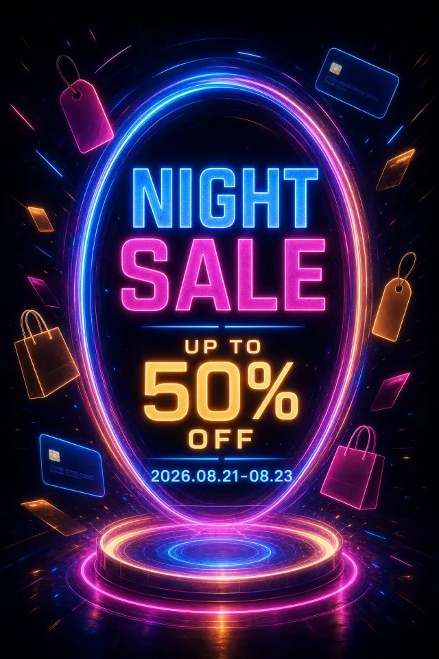
Create a new original English night sale poster with a glowing futuristic portal.
Style: cinematic neon advertising, floating retail icons, radiant oval light structure.
Layout: portrait with title and discount inside the portal, date below, and abstract icons around it.
Main text: "NIGHT SALE", "UP TO 50% OFF", "2026.08.21-08.23".
Language: English only; keep every phrase correctly spelled.
Design changes: use electric blue, magenta, warm amber, and black with an oval portal and new icon positions.
Background: deep black sci-fi environment with blue-magenta light trails.
Remove: watermark, brand logo, QR code, website, author mark, and fine print.
Avoid: exact copying, original colors, random tiny text, misspelled text, and copyrighted brand elements.
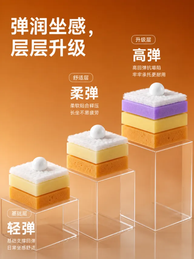
Generate a效果图 for the detailed product page of a sofa sponge cushion structure.
The background features a warm caramel‑orange gradient. In the upper left corner, an oversized white modern black‑type headline reads: “Bouncy Comfort, Layered Upgrades.” In the center of the image, three sets of transparent acrylic pedestals at varying heights showcase the cushion’s material layers: the base layer, the comfort layer, and the premium upgrade layer. Each set comprises a bottom support foam, a middle resilient foam, and a top soft fiber layer; the upgrade layer further incorporates a purple elastic layer. A small white sphere rests atop each set, emphasizing bounce and a plush tactile experience. On the right side and in the lower left, large, hierarchical headings—“Light Bounce,” “Soft Bounce,” and “High Bounce”—are accompanied by one or two lines of explanatory text. The materials—micro‑perforated fabric, fibers, and transparent pedestals—are rendered with realistic, refined detail, lending the composition a youthful, vibrant feel reminiscent of a laboratory display.
Output dimensions: 750 x 1000px. Avoid text misalignment, overlap, overflow, obvious shadows, jagged icons, irrelevant small text, and web‑page borders.
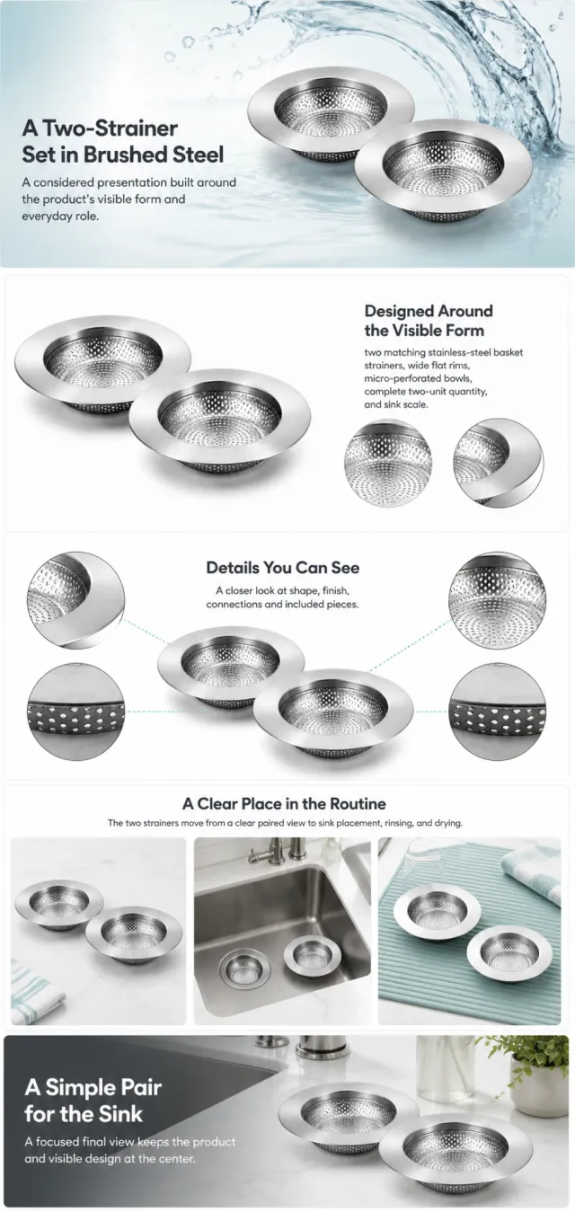
Using the supplied reference image as the sole product reference, create an Amazon A+ design preview for a two-pack sink-strainer set. Preserve exact geometry, proportions, colors, construction, quantity, accessories, and scale. Visible details: two matching stainless-steel basket strainers, wide flat rims, micro-perforated bowls, complete two-unit quantity, and sink scale. Do not invent hidden parts or claims.
Visual system: brushed steel, white, pale aqua, and charcoal. Composition motifs: water arcs, perforation macros, circular comparison crops, and clean sink scenes. Alternate a wide banner, asymmetric overview, centered detail graphic, three-scene sequence, and wide closing scene. Use readable sans-serif type and mobile-safe margins.
Build this official A+ module order. Keep every module independently complete; never split copy or product details.
MODULE 1 — Image with text overlay — introduction
Exact headline: “A Two-Strainer Set in Brushed Steel”
Exact supporting copy: “A considered presentation built around the product’s visible form and everyday role.”
Layout: wide image-led hero; dominant complete product and large safe headline area.
MODULE 2 — Single image with side text — product overview
Exact headline: “Designed Around the Visible Form”
Exact supporting copy: “two matching stainless-steel basket strainers, wide flat rims, micro-perforated bowls, complete two-unit quantity, and sink scale.”
Layout: large three-quarter product, side text field, and two detail crops.
MODULE 3 — Four-image and text — visible evidence
Exact headline: “Details You Can See”
Exact supporting copy: “A closer look at shape, finish, connections and included pieces.”
Layout: centered product with four rounded macro callouts; show only visible facts.
MODULE 4 — Multiple image and text — routine or use setting
Exact headline: “A Clear Place in the Routine”
Exact supporting copy: “The two strainers move from a clear paired view to sink placement, rinsing, and drying.”
Layout: three framed scenes with consistent product design and newly generated people or animals only when relevant.
MODULE 5 — Full-width image with text overlay — closing
Exact headline: “A Simple Pair for the Sink”
Exact supporting copy: “A focused final view keeps the product and visible design at the center.”
Layout: wide editorial scene, strong silhouette, restrained props, safe text area.
Create one vertical A+ preview at 1200px width with content-driven height, clear module boundaries, and varied compositions for independent export. Render only the exact copy above. Do not add logos, prices, promotions, QR codes, URLs, contacts, competitors, testimonials, ratings, guarantees, unverified claims, certifications, fake UI, watermarks, pseudo-text, or unrelated labels. Keep all elements natural and mobile-safe.
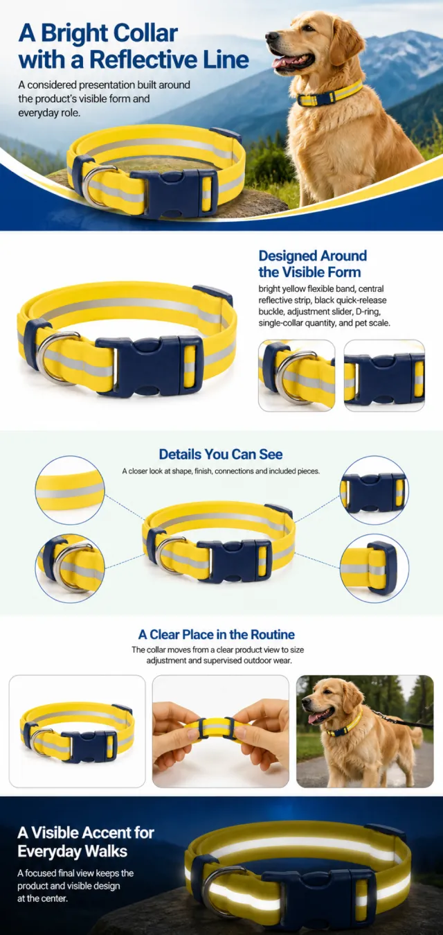
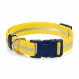
Using the supplied reference image as the sole product reference, create an Amazon A+ design preview for a reflective dog collar. Preserve exact geometry, proportions, colors, construction, quantity, accessories, and scale. Visible details: bright yellow flexible band, central reflective strip, black quick-release buckle, adjustment slider, D-ring, single-collar quantity, and pet scale. Do not invent hidden parts or claims.
Visual system: bright yellow, cobalt blue, white, black, and soft mint. Composition motifs: mountain banners, arched color lineups, night-reflection scenes, and rounded outdoor pet windows. Alternate a wide banner, asymmetric overview, centered detail graphic, three-scene sequence, and wide closing scene. Use readable sans-serif type and mobile-safe margins.
Build this official A+ module order. Keep every module independently complete; never split copy or product details.
MODULE 1 — Image with text overlay — introduction
Exact headline: “A Bright Collar with a Reflective Line”
Exact supporting copy: “A considered presentation built around the product’s visible form and everyday role.”
Layout: wide image-led hero; dominant complete product and large safe headline area.
MODULE 2 — Single image with side text — product overview
Exact headline: “Designed Around the Visible Form”
Exact supporting copy: “bright yellow flexible band, central reflective strip, black quick-release buckle, adjustment slider, D-ring, single-collar quantity, and pet scale.”
Layout: large three-quarter product, side text field, and two detail crops.
MODULE 3 — Four-image and text — visible evidence
Exact headline: “Details You Can See”
Exact supporting copy: “A closer look at shape, finish, connections and included pieces.”
Layout: centered product with four rounded macro callouts; show only visible facts.
MODULE 4 — Multiple image and text — routine or use setting
Exact headline: “A Clear Place in the Routine”
Exact supporting copy: “The collar moves from a clear product view to size adjustment and supervised outdoor wear.”
Layout: three framed scenes with consistent product design and newly generated people or animals only when relevant.
MODULE 5 — Full-width image with text overlay — closing
Exact headline: “A Visible Accent for Everyday Walks”
Exact supporting copy: “A focused final view keeps the product and visible design at the center.”
Layout: wide editorial scene, strong silhouette, restrained props, safe text area.
Create one vertical A+ preview at 1200px width with content-driven height, clear module boundaries, and varied compositions for independent export. Render only the exact copy above. Do not add logos, prices, promotions, QR codes, URLs, contacts, competitors, testimonials, ratings, guarantees, unverified claims, certifications, fake UI, watermarks, pseudo-text, or unrelated labels. Keep all elements natural and mobile-safe.
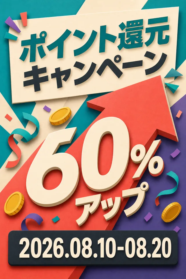
Create a brand-new vertical poster for the Japanese points-boosting campaign.
Accurately present the text “ポイント還元キャンペーン”“60%アップ”“2026.08.10-08.20”.
Use teal, coral orange, cream white, violet, and charcoal black.
Employ a giant 60% upward arrow, universal gold coins, and celebratory ribbons.
The title and date must be bold and well-organized, suitable for mobile viewing.
Adopt a clean vertical layout with modern three-dimensional paper art graphics.
Do not include any point-branded elements, mascots, logos, URLs, QR codes, watermarks, or fine print.
Output a high-quality static PNG image.
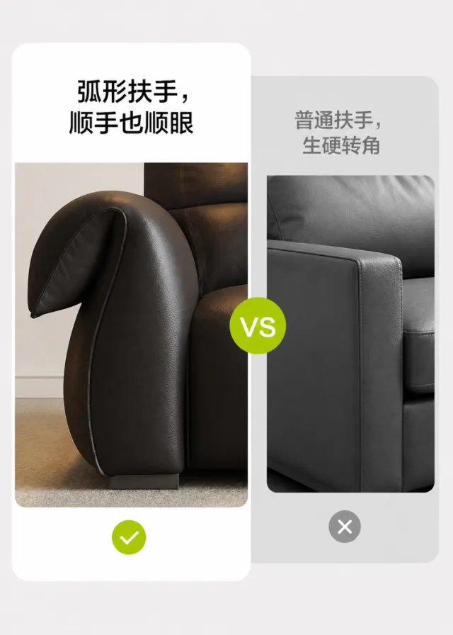
Generate a visual mockup for the craftsmanship details page of a leather sofa armrest.
On a light gray background, employ a left–right contrast: on the left, a large rounded‑corner white card showcases a close‑up view of the deep brown leather sofa’s streamlined, curved armrest from the side, with the headline “Curved Armrest—Comfortable to the Touch and Pleasing to the Eye,” accompanied by a green checkmark below. On the right, a grayscale card highlights the rigid, angular design of a standard armrest, overlaid with a subtle gray cross. A circular “VS” logo separates the two visuals, rendered in modern black typeface with clean, well‑balanced white space and realistic leather texture. Do not include any text related to the original brand, logos, slogans, patents, or counterfeit claims.
Output dimensions: 750 x 1050px. Avoid misaligned text, overlapping elements, text overflow, obvious shadows, jagged icons, irrelevant small print, or visible web page borders.
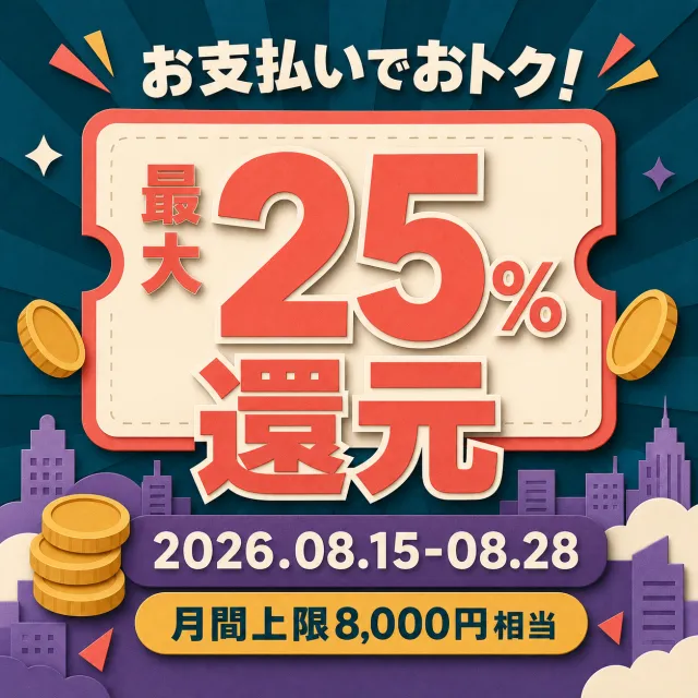
Create a brand-new square poster for the Japanese payment rebate campaign.
Accurately present the text “最大25%還元”“2026.08.15-08.28”“月間上限8,000円相当”.
Use deep cyan, coral orange, cream white, violet, and mustard yellow.
Place a large 25% discount coupon within rounded corners, paired with universal gold coins and a simple city skyline.
All Japanese text must be large, centered, and clearly legible.
Employ modern three-dimensional paper art graphics while maintaining generous spacing.
Do not include any payment brands, city names, mascots, logos, URLs, QR codes, watermarks, or fine print.
Output a high-quality static PNG image.
Create a new original coupon or sale design: high-impact seasonal sale poster with dimensional display lettering, layered paper shapes, confetti, and a clear central offer.
Style: clean commercial graphic, polished and print-ready, with harmonious charcoal, electric cyan, and tangerine.
Layout: Vertical poster composition preserving the source-like hierarchy of headline, large value, supporting line, and date while using entirely new shapes and spacing.
Main text exactly: "KHUYẾN MÃI ĐẶC BIỆT", "GIẢM 20%", "ĐẾN 31.08.2026".
Language: Vietnamese; keep that language and script only, preserve its natural typographic hierarchy, and do not translate.
Design changes: use a different dominant palette, rearrange icons and patterns, and redesign borders, corners, perforations, shadows, gradients, and decorative angles.
Background: Use a newly colored commercial backdrop with no copied texture or decoration.
Remove every brand, store or platform name, logo, watermark, website, QR code, author mark, barcode, and any note beginning with "*".
Avoid exact copying, original colors, copyrighted elements, random text, tiny unreadable legal text, misspellings, fake logos, and scannable codes.
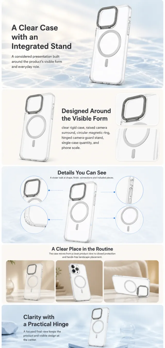
Using the supplied reference image as the sole product reference, create an Amazon A+ design preview for a transparent magnetic phone case. Preserve exact geometry, proportions, colors, construction, quantity, accessories, and scale. Visible details: clear rigid case, raised camera surround, circular magnetic ring, hinged camera-guard stand, single-case quantity, and phone scale. Do not invent hidden parts or claims.
Visual system: clear glass, warm ivory, soft blue, silver, and charcoal. Composition motifs: water reflections, rounded use windows, circular magnetic diagrams, and clean hinge close-ups. Alternate a wide banner, asymmetric overview, centered detail graphic, three-scene sequence, and wide closing scene. Use readable sans-serif type and mobile-safe margins.
Build this official A+ module order. Keep every module independently complete; never split copy or product details.
MODULE 1 — Image with text overlay — introduction
Exact headline: “A Clear Case with an Integrated Stand”
Exact supporting copy: “A considered presentation built around the product’s visible form and everyday role.”
Layout: wide image-led hero; dominant complete product and large safe headline area.
MODULE 2 — Single image with side text — product overview
Exact headline: “Designed Around the Visible Form”
Exact supporting copy: “clear rigid case, raised camera surround, circular magnetic ring, hinged camera-guard stand, single-case quantity, and phone scale.”
Layout: large three-quarter product, side text field, and two detail crops.
MODULE 3 — Four-image and text — visible evidence
Exact headline: “Details You Can See”
Exact supporting copy: “A closer look at shape, finish, connections and included pieces.”
Layout: centered product with four rounded macro callouts; show only visible facts.
MODULE 4 — Multiple image and text — routine or use setting
Exact headline: “A Clear Place in the Routine”
Exact supporting copy: “The case moves from a clean product view to closed protection and hands-free landscape placement.”
Layout: three framed scenes with consistent product design and newly generated people or animals only when relevant.
MODULE 5 — Full-width image with text overlay — closing
Exact headline: “Clarity with a Practical Hinge”
Exact supporting copy: “A focused final view keeps the product and visible design at the center.”
Layout: wide editorial scene, strong silhouette, restrained props, safe text area.
Create one vertical A+ preview at 1200px width with content-driven height, clear module boundaries, and varied compositions for independent export. Render only the exact copy above. Do not add logos, prices, promotions, QR codes, URLs, contacts, competitors, testimonials, ratings, guarantees, unverified claims, certifications, fake UI, watermarks, pseudo-text, or unrelated labels. Keep all elements natural and mobile-safe.
【Execution Routing | Do Not Display】
If the image-generation tool can be invoked multiple times: concatenate the sharing rules with A–F separately, execute six times, generating one 1000×1000 square image each time; do not submit all modules at once.
If only one image can be generated per run: set the aspect ratio to 2:3 portrait mode on the interface or via API, and avoid using Auto; a recommended size is 1200×1800. Arrange the modules in a 2-column × 3-row grid labeled A/B, C/D, and E/F, ensuring all six modules are equal in size and maintain a 1:1 proportion. If the platform enforces a 1:1 ratio, switch to an Agent-based approach or generate each module individually.
【Sharing Rules】
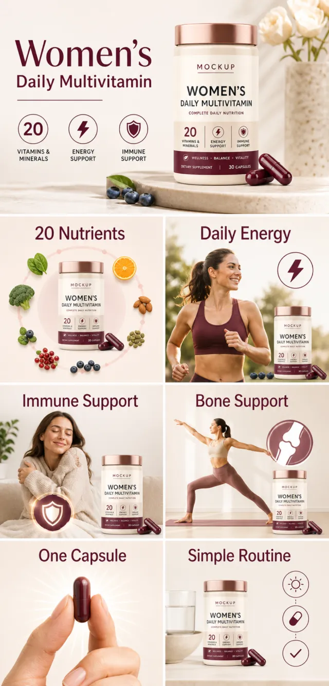
The provided product reference image serves as the sole basis for the product. Product: women's daily multivitamin. Copywriting must be in English, and brand placeholders should use MOCKUP only. Visuals should incorporate ivory, burgundy, rose gold, and charcoal. The product’s appearance, structure, colors, quantity, accessories, and relative proportions must match the reference image; product, figures, icons, and props should maintain natural proportions. All essential information must remain within the safe zone, with the background extending fully to all four edges. External white borders, vertical borders on left and right, transparent padding, watermarks, contact details, social media accounts, platform information, original branding, gibberish, irrelevant content, or unverified claims regarding efficacy or specifications are prohibited. Headlines must not be displayed. A–F must not appear.
【A | Theme】Copy: “Women's Daily Multivitamin”; focus on conveying the core value through a complete primary visual centered on the product.
【B | Theme】Copy: “20 Nutrients”; design an independent square image around this theme, ensuring no overlap in selling points, composition, or product angles with other modules.
【C | Theme】Copy: “Daily Energy”; design an independent square image around this theme, avoiding overlaps in selling points, composition, and product angles with other modules.
【D | Theme】Copy: “Immune Support”; design an independent square image around this theme, avoiding overlaps in selling points, composition, and product angles with other modules.
【E | Theme】Copy: “Bone Support”; design an independent square image around this theme, avoiding overlaps in selling points, composition, and product angles with other modules.
【F | Theme】Copy: “One Capsule”; “Simple Routine”; design independent square images around these themes, ensuring no overlap in selling points, composition, or product angles with other modules.
【Output Rules | Do Not Display】
Generate only one 1000×1000, 1:1 Amazon Listing secondary image. No collage images, six-grid layouts, multi-card grids, or multiple scenes are allowed.
【Sharing Rules】
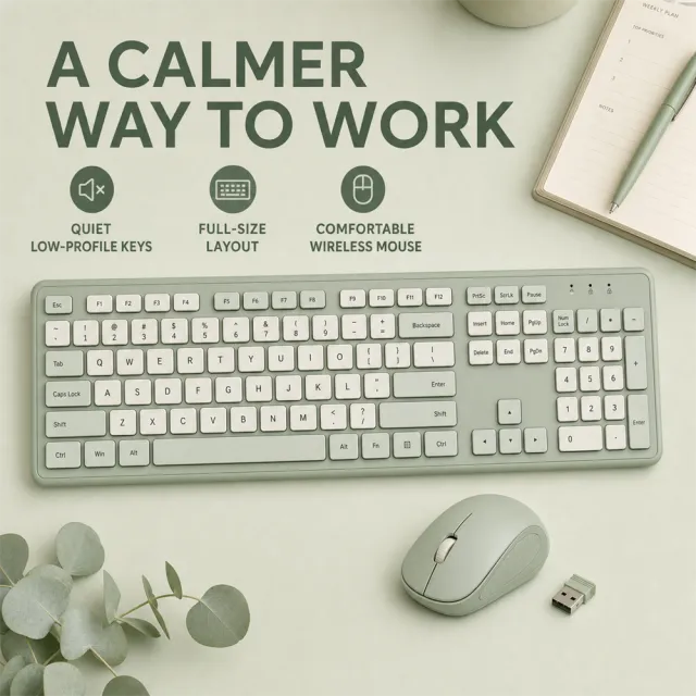
Use the provided product reference image as the sole basis for the product. Product: slim wireless keyboard and mouse set. Copywriting must be in English; brand placeholders should use MOCKUP only. Visuals should follow high-end commercial e-commerce photography standards—sharp imagery, clear hierarchy, and concise, easy-to-read copy. The product’s appearance, structure, color, quantity, accessories, and relative proportions must match the reference image exactly. Products, people, icons, and props must maintain natural proportions. All essential information must remain within the safe zone, with the background extending fully to all four edges. Avoid white borders around the frame, vertical borders on the left and right, transparent fill-in areas, watermarks, contact details, social media accounts, platform information, original branding, garbled text, irrelevant content, or unverified claims regarding efficacy or specifications. Titles must not appear.
【Image Composition】
Arrange the keyboard, mouse, and receiver on a pale eucalyptus desk, with a minimalist planner and pen placed at the far edge. Copy: "A CALMER WAY TO WORK"; "QUIET LOW-PROFILE KEYS"; "FULL-SIZE LAYOUT"; "COMFORTABLE WIRELESS MOUSE." Use monochrome sage, cream, diffused daylight, legible sans-serif fonts, and full bleed. No logos, watermarks, account details, emails, platform branding, pseudo-text, malformed keys, cropping, or distortion.
Views
808K
Sales
1K
Revenue
$148
Create a fresh portrait-format online sale poster with a dimensional hanging price tag.
Use a playful retail campaign style in plum, coral, mint, cream, and warm yellow.
Set the exact headline text to “ONLINE POP-UP SALE!” in bold friendly uppercase lettering.
Make “UP TO 45% OFF” the dominant offer and add “FREE DELIVERY” as a secondary badge.
Include the exact date line “AUGUST 18-21, 2026” near the lower portion of the layout.
Add paper-cut shapes, soft shadows, and compact decorative bursts around the hanging tag.
Do not include any brand names, logos, watermarks, barcodes, QR codes, URLs, or fine print.
Render as a polished static portrait PNG with strong hierarchy and clean readable text.
【Output Rules | Do Not Display】
Generate only one 1000×1000, 1:1 Amazon Listing secondary image. No collage images, six-grid layouts, multi-card grids, or multiple scenes are allowed.
【Sharing Rules】
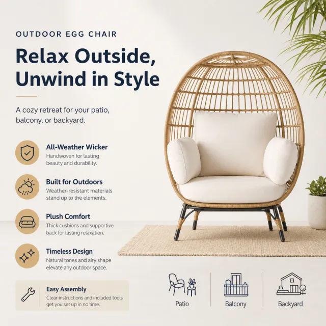
Use the provided product reference image as the sole product basis. Product: hanging egg chair. Copy must be in English; brand placeholders should use MOCKUP only. Visuals must follow premium commercial e-commerce photography standards and stable graphic design principles. The product’s appearance, structure, color, quantity, accessories, and relative proportions must match the reference image exactly. Products, people, icons, and props must maintain natural proportions. All essential information must remain within the safe zone, with the background extending fully to all four edges. External white borders, vertical borders on left and right, transparent edge fills, watermarks, contact information, social media accounts, platform details, original brand logos, gibberish, irrelevant information, or unverified claims regarding efficacy or specifications are prohibited. Headlines must not appear.
【Image Composition】
Layout and Content:
- Create a balanced square composition featuring a strong product hero, a clear headline, concise benefit copy, and an appropriate usage or lifestyle scene.
- Ensure the product remains complete and dominant without any outer frame.
Visual Style:
- Premium commercial e-commerce photography combined with stable graphic design.
- Use clean solid colors or crisp gradients with a palette tailored to the product; no Gaussian-blurred backgrounds.
Copy:
- Write concise, credible e-commerce copy in English.
- Include a product-name headline and short benefit statements relevant to the product.
- Keep text readable and avoid lengthy paragraphs or overly small labels.
People / Animals:
- If a usage scene benefits from including a person or animal, create a new, unrecognizable subject with natural anatomy playing a supporting role.
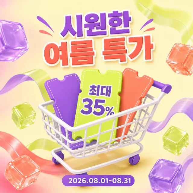
A new square Korean summer special‑offer poster is being created, highlighting shopping carts and discount tickets.
Style: Bright 3D shopping cart, translucent jelly cubes, wavy ribbons, and vivid commercial graphics.
Layout: Square composition, with a title at the top, an inclined shopping cart in the center, and the event period at the bottom.
Exact wording: "시원한 여름 특가", "최대 35%", "2026.08.01-08.31".
Language: Use only Korean and numbers, without translating into other languages.
Design changes: Employ purple, lime, cream, and coral, and rearrange the placement of tickets and decorations.
Background: Bright cream background with purple and lime waves, and transparent jelly cubes.
Removals: Brands, logos, watermarks, URLs, QR codes, asterisk notes, and small terms and conditions.
Avoidances: Original replication, original colors, random small text, typos, and copyright‑related brand elements.
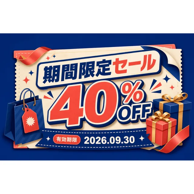
Create a new original coupon or sale design: playful seasonal campaign poster with large central typography, dimensional gift or shopping motifs, and crisp commercial illustration.
Style: clean commercial graphic, polished and print-ready, with harmonious deep cobalt, warm ivory, and coral.
Layout: Square canvas with the horizontal promotional piece centered at its natural proportions, generous breathing room, and complementary background decoration; never stretch it.
Main text exactly: "期間限定セール", "40% OFF", "有効期限 2026.09.30".
Language: Japanese; keep that language and script only, preserve its natural typographic hierarchy, and do not translate.
Design changes: use a different dominant palette, rearrange icons and patterns, and redesign borders, corners, perforations, shadows, gradients, and decorative angles.
Background: Use a newly colored commercial backdrop with no copied texture or decoration.
Remove every brand, store or platform name, logo, watermark, website, QR code, author mark, barcode, and any note beginning with "*".
Avoid exact copying, original colors, copyrighted elements, random text, tiny unreadable legal text, misspellings, fake logos, and scannable codes.
Create a new original square romantic gift visual with a floating present and botanical accents.
Style: premium soft 3D rendering, satin ribbon, delicate flowers, gentle studio shadows.
Layout: square composition with a teal gift box placed diagonally among two envelopes and lavender stems.
Text: no text, letters, or numbers anywhere in the image.
Language: not applicable; keep the asset entirely text-free.
Design changes: use teal, champagne gold, lavender, coral, and warm cream with new object positions.
Background: pale warm-cream studio background with generous negative space.
Remove: watermark, brand logo, QR code, website, author mark, and all written content.
Avoid: exact copying, original colors, random text, misspelled text, and copyrighted brand elements.
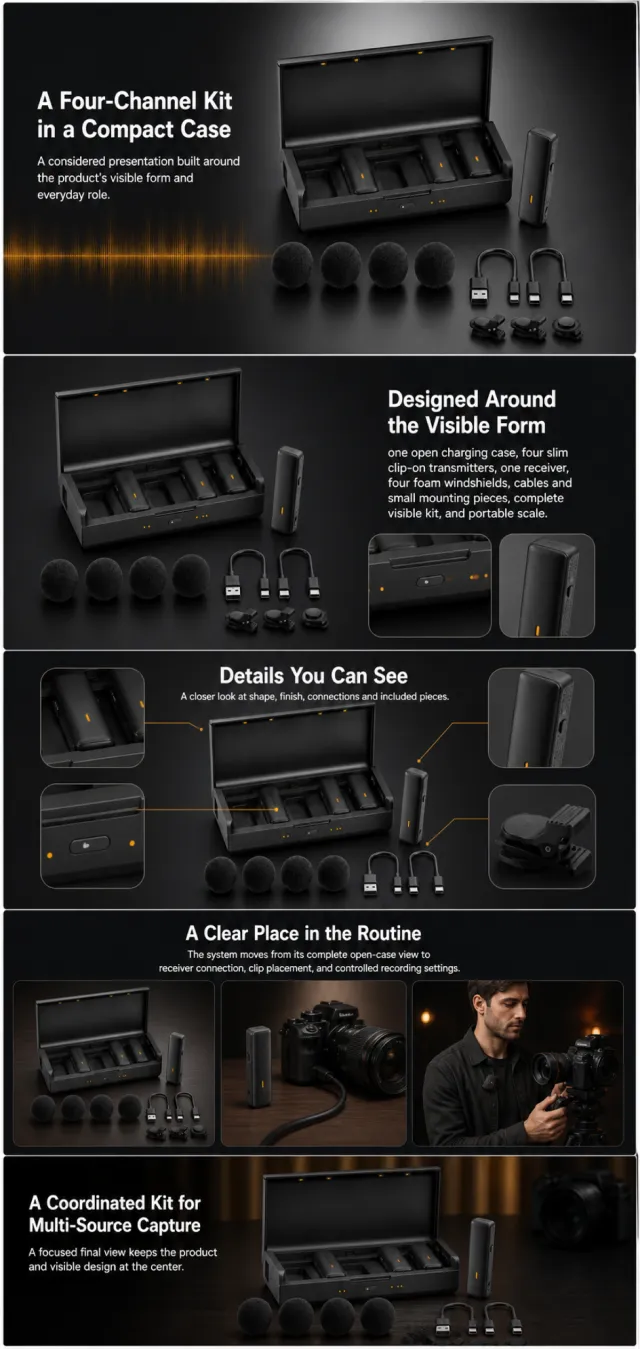
Using the supplied reference image as the sole product reference, create an Amazon A+ design preview for a four-channel wireless microphone system. Preserve exact geometry, proportions, colors, construction, quantity, accessories, and scale. Visible details: one open charging case, four slim clip-on transmitters, one receiver, four foam windshields, cables and small mounting pieces, complete visible kit, and portable scale. Do not invent hidden parts or claims.
Visual system: matte black, graphite, slate gray, and restrained amber accents. Composition motifs: dark cinematic panels, signal-wave graphics, rounded device crops, and low-light creator scenes. Alternate a wide banner, asymmetric overview, centered detail graphic, three-scene sequence, and wide closing scene. Use readable sans-serif type and mobile-safe margins.
Use this five-module order. Keep each module complete.
MODULE 1 — Image with text overlay — introduction
Exact headline: “A Four-Channel Kit in a Compact Case”
Exact supporting copy: “A considered presentation built around the product’s visible form and everyday role.”
Layout: wide image-led hero; dominant complete product and large safe headline area.
MODULE 2 — Single image with side text — product overview
Exact headline: “Designed Around the Visible Form”
Exact supporting copy: “one open charging case, four slim clip-on transmitters, one receiver, four foam windshields, cables and small mounting pieces, complete visible kit, and portable scale.”
Layout: large three-quarter product, side text field, and two detail crops.
MODULE 3 — Four-image and text — visible evidence
Exact headline: “Details You Can See”
Exact supporting copy: “A closer look at shape, finish, connections and included pieces.”
Layout: centered product with four rounded macro callouts; show only visible facts.
MODULE 4 — Multiple image and text — routine or use setting
Exact headline: “A Clear Place in the Routine”
Exact supporting copy: “The system moves from its complete open-case view to receiver connection, clip placement, and controlled recording settings.”
Layout: three framed scenes with consistent product design and newly generated people or animals only when relevant.
MODULE 5 — Full-width image with text overlay — closing
Exact headline: “A Coordinated Kit for Multi-Source Capture”
Exact supporting copy: “A focused final view keeps the product and visible design at the center.”
Layout: wide editorial scene, strong silhouette, restrained props, safe text area.
Create one vertical A+ preview at 1200px width with content-driven height, clear module boundaries, and varied compositions for independent export. Render only the exact copy above. Do not add logos, prices, promotions, QR codes, URLs, contacts, competitors, testimonials, ratings, guarantees, unverified claims, certifications, fake UI, watermarks, pseudo-text, or unrelated labels. Keep all elements natural and mobile-safe.
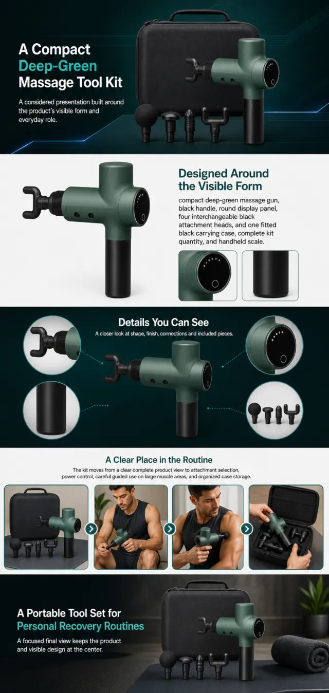
Using the supplied reference image as the sole product reference, create an Amazon A+ design preview for a percussion massage-gun kit. Preserve exact geometry, proportions, colors, construction, quantity, accessories, and scale. Visible details: compact deep-green massage gun, black handle, round display panel, four interchangeable black attachment heads, and one fitted black carrying case, complete kit quantity, and handheld scale. Do not invent hidden parts or claims.
Visual system: deep forest green, black, cool teal, white, and electric blue accents. Use dark technical bands, attachment lineups, control close-ups, handling diagrams, varied module compositions, readable sans-serif type, and mobile-safe margins.
Use this five-module order. Keep each module complete.
MODULE 1 — Image with text overlay — introduction
Exact headline: “A Compact Deep-Green Massage Tool Kit”
Exact supporting copy: “A considered presentation built around the product’s visible form and everyday role.”
Layout: wide image-led hero; dominant complete product and large safe headline area.
MODULE 2 — Single image with side text — product overview
Exact headline: “Designed Around the Visible Form”
Exact supporting copy: “compact deep-green massage gun, black handle, round display panel, four interchangeable black attachment heads, and one fitted black carrying case, complete kit quantity, and handheld scale.”
Layout: large three-quarter product, side text field, and two detail crops.
MODULE 3 — Four-image and text — visible evidence
Exact headline: “Details You Can See”
Exact supporting copy: “A closer look at shape, finish, connections and included pieces.”
Layout: centered product with four rounded macro callouts; show only visible facts.
MODULE 4 — Multiple image and text — routine or use setting
Exact headline: “A Clear Place in the Routine”
Exact supporting copy: “The kit moves from a clear complete product view to attachment selection, power control, careful guided use on large muscle areas, and organized case storage.”
Layout: three framed scenes with consistent product design and newly generated people or animals only when relevant.
MODULE 5 — Full-width image with text overlay — closing
Exact headline: “A Portable Tool Set for Personal Recovery Routines”
Exact supporting copy: “A focused final view keeps the product and visible design at the center.”
Layout: wide editorial scene, strong silhouette, restrained props, safe text area.
Create one vertical A+ preview at 1200px width with content-driven height, clear module boundaries, and varied compositions for independent export. Render only the exact copy above. Do not add logos, prices, promotions, QR codes, URLs, contacts, competitors, testimonials, ratings, guarantees, unverified claims, certifications, fake UI, watermarks, pseudo-text, or unrelated labels. Keep all elements natural and mobile-safe.
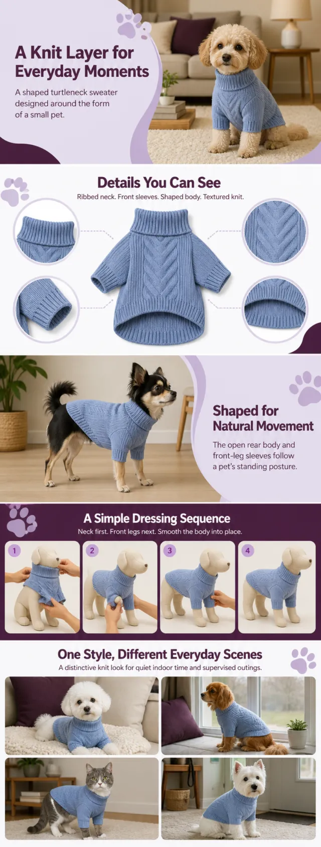
Using the supplied reference image as the sole product reference, create a complete Amazon A+ design preview. Preserve the exact pet-sweater geometry, dusty-periwinkle color, turtleneck, front sleeves, shaped rear body, ribbed edges, knit motif, single-garment quantity, and relative scale. Generate entirely new animals and people; use the garment as the only product reference.
Use deep plum, pale lilac, white, and warm indoor neutrals with paw-inspired rounded shapes, curved panel edges, macro knit crops, and playful bold sans-serif typography. Alternate wide pet lifestyle banners, asymmetric detail layouts, step panels, and a multi-image scene grid.
Build this official A+ module order. Keep each module independently complete and mobile-safe; decorative paw shapes and curved lilac fields may repeat across boundaries.
MODULE 1 — Image with text overlay — introduction
Exact headline: “A Knit Layer for Everyday Moments”
Exact supporting copy: “A shaped turtleneck sweater designed around the form of a small pet.”
Layout: wide warm-living-room banner with a newly generated small dog wearing the product; large safe copy area and curved lilac frame.
MODULE 2 — Four-image and text — visible construction
Exact headline: “Details You Can See”
Exact supporting copy: “Ribbed neck. Front sleeves. Shaped body. Textured knit.”
Layout: one centered garment with four rounded macro crops of neck, sleeve, chevron panel, and hem.
MODULE 3 — Single image with side text — wearing shape
Exact headline: “Shaped for Natural Movement”
Exact supporting copy: “The open rear body and front-leg sleeves follow a pet’s standing posture.”
Layout: newly generated small dog standing in profile; garment remains unobstructed, with a clean side text field.
MODULE 4 — Four-image and text — dressing sequence
Exact headline: “A Simple Dressing Sequence”
Exact supporting copy: “Neck first. Front legs next. Smooth the body into place.”
Layout: four clear numbered visual steps using a neutral pet mannequin and hands; no extra text beyond the specified copy.
MODULE 5 — Multiple image and text — scenes
Exact headline: “One Style, Different Everyday Scenes”
Exact supporting copy: “A distinctive knit look for quiet indoor time and supervised outings.”
Layout: four-image grid with newly generated small dogs or cats in varied safe scenes; maintain identical garment design.
Create one continuous vertical A+ preview at 1200px width with content-driven height, clear module boundaries, and varied compositions for independent export. Render only the exact copy above. Do not add logos, prices, promotions, QR codes, URLs, contacts, size values, material claims, warmth claims, testimonials, guarantees, certifications, watermarks, pseudo-text, or unrelated labels. Keep animals anatomically natural and all text mobile-safe.
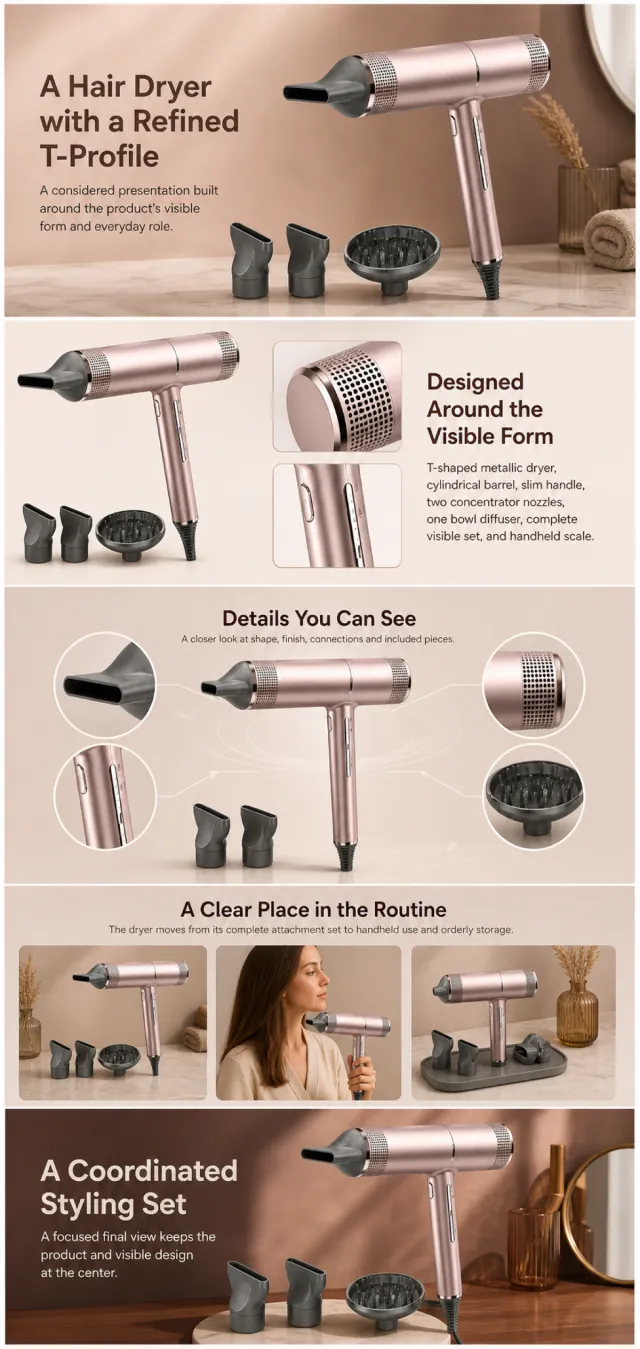
Using the supplied reference image as the sole product reference, create an Amazon A+ design preview for a hair dryer attachment set. Preserve exact geometry, proportions, colors, construction, quantity, accessories, and scale. Visible details: T-shaped metallic dryer, cylindrical barrel, slim handle, two concentrator nozzles, one bowl diffuser, complete visible set, and handheld scale. Do not invent hidden parts or claims.
Visual system: rose champagne, cocoa brown, warm beige, and charcoal. Composition motifs: microfilter close-ups, circular airflow graphics, attachment tiles, and softly lit salon scenes. Alternate a wide banner, asymmetric overview, centered detail graphic, three-scene sequence, and wide closing scene. Use readable sans-serif type and mobile-safe margins.
Build this official A+ module order. Keep every module independently complete; never split copy or product details.
MODULE 1 — Image with text overlay — introduction
Exact headline: “A Hair Dryer with a Refined T-Profile”
Exact supporting copy: “A considered presentation built around the product’s visible form and everyday role.”
Layout: wide image-led hero; dominant complete product and large safe headline area.
MODULE 2 — Single image with side text — product overview
Exact headline: “Designed Around the Visible Form”
Exact supporting copy: “T-shaped metallic dryer, cylindrical barrel, slim handle, two concentrator nozzles, one bowl diffuser, complete visible set, and handheld scale.”
Layout: large three-quarter product, side text field, and two detail crops.
MODULE 3 — Four-image and text — visible evidence
Exact headline: “Details You Can See”
Exact supporting copy: “A closer look at shape, finish, connections and included pieces.”
Layout: centered product with four rounded macro callouts; show only visible facts.
MODULE 4 — Multiple image and text — routine or use setting
Exact headline: “A Clear Place in the Routine”
Exact supporting copy: “The dryer moves from its complete attachment set to handheld use and orderly storage.”
Layout: three framed scenes with consistent product design and newly generated people or animals only when relevant.
MODULE 5 — Full-width image with text overlay — closing
Exact headline: “A Coordinated Styling Set”
Exact supporting copy: “A focused final view keeps the product and visible design at the center.”
Layout: wide editorial scene, strong silhouette, restrained props, safe text area.
Create one vertical A+ preview at 1200px width with content-driven height, clear module boundaries, and varied compositions for independent export. Render only the exact copy above. Do not add logos, prices, promotions, QR codes, URLs, contacts, competitors, testimonials, ratings, guarantees, unverified claims, certifications, fake UI, watermarks, pseudo-text, or unrelated labels. Keep all elements natural and mobile-safe.
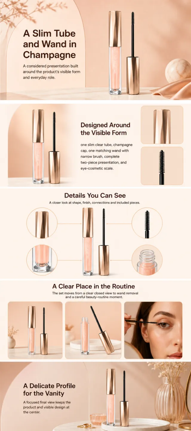
Using the supplied reference image as the sole product reference, create an Amazon A+ design preview for a lash-cosmetic tube and wand set. Preserve exact geometry, proportions, colors, construction, quantity, accessories, and scale. Visible details: one slim clear tube, champagne cap, one matching wand with narrow brush, complete two-piece presentation, and eye-cosmetic scale. Do not invent hidden parts or claims.
Visual system: warm peach, champagne gold, cream, and cocoa brown. Composition motifs: soft beauty portraits, arched beige panels, circular brush details, and airy cosmetic still lifes. Alternate a wide banner, asymmetric overview, centered detail graphic, three-scene sequence, and wide closing scene. Use readable sans-serif type and mobile-safe margins.
Build this official A+ module order. Keep every module independently complete; never split copy or product details.
MODULE 1 — Image with text overlay — introduction
Exact headline: “A Slim Tube and Wand in Champagne”
Exact supporting copy: “A considered presentation built around the product’s visible form and everyday role.”
Layout: wide image-led hero; dominant complete product and large safe headline area.
MODULE 2 — Single image with side text — product overview
Exact headline: “Designed Around the Visible Form”
Exact supporting copy: “one slim clear tube, champagne cap, one matching wand with narrow brush, complete two-piece presentation, and eye-cosmetic scale.”
Layout: large three-quarter product, side text field, and two detail crops.
MODULE 3 — Four-image and text — visible evidence
Exact headline: “Details You Can See”
Exact supporting copy: “A closer look at shape, finish, connections and included pieces.”
Layout: centered product with four rounded macro callouts; show only visible facts.
MODULE 4 — Multiple image and text — routine or use setting
Exact headline: “A Clear Place in the Routine”
Exact supporting copy: “The set moves from a clear closed view to wand removal and a careful beauty-routine moment.”
Layout: three framed scenes with consistent product design and newly generated people or animals only when relevant.
MODULE 5 — Full-width image with text overlay — closing
Exact headline: “A Delicate Profile for the Vanity”
Exact supporting copy: “A focused final view keeps the product and visible design at the center.”
Layout: wide editorial scene, strong silhouette, restrained props, safe text area.
Create one vertical A+ preview at 1200px width with content-driven height, clear module boundaries, and varied compositions for independent export. Render only the exact copy above. Do not add logos, prices, promotions, QR codes, URLs, contacts, competitors, testimonials, ratings, guarantees, unverified claims, certifications, fake UI, watermarks, pseudo-text, or unrelated labels. Keep all elements natural and mobile-safe.
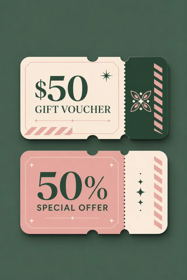
Create a new original coupon or sale design: print-ready voucher collection with rounded ticket corners, perforations, notches, bold value hierarchy, and decorative non-scannable stripe motifs.
Style: clean commercial graphic, polished and print-ready, with harmonious forest green, blush, and cream.
Layout: Vertical poster composition preserving the source-like hierarchy of headline, large value, supporting line, and date while using entirely new shapes and spacing.
Main text exactly: "$50 GIFT VOUCHER", "50% SPECIAL OFFER", "VALID UNTIL 2026.08.31".
Language: English; keep that language and script only, preserve its natural typographic hierarchy, and do not translate.
Design changes: use a different dominant palette, rearrange icons and patterns, and redesign borders, corners, perforations, shadows, gradients, and decorative angles.
Background: Use a newly colored commercial backdrop with no copied texture or decoration.
Remove every brand, store or platform name, logo, watermark, website, QR code, author mark, barcode, and any note beginning with "*".
Avoid exact copying, original colors, copyrighted elements, random text, tiny unreadable legal text, misspellings, fake logos, and scannable codes.
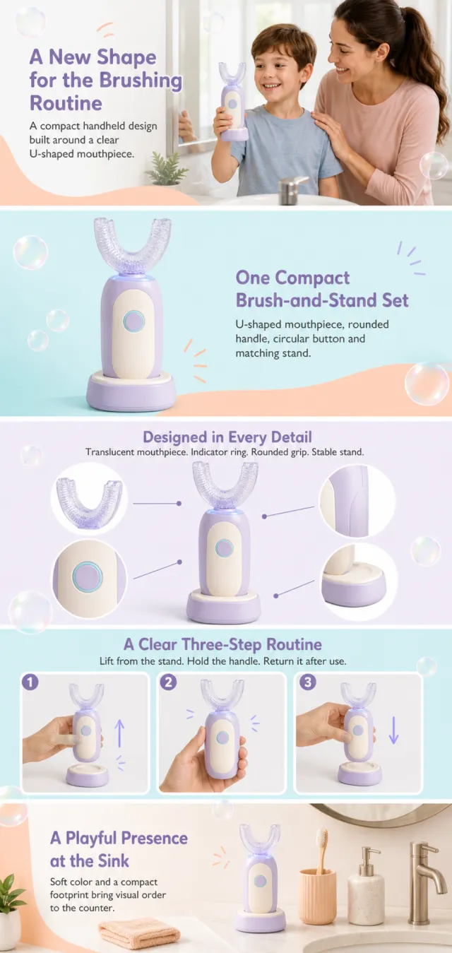
Using the supplied reference image as the sole product reference, create a complete Amazon A+ design preview. Preserve the exact U-shaped mouthpiece, mist-lavender and ivory handle, aqua indicator ring, circular button, charging stand, single-set quantity, and relative scale. Do not invent cleaning performance, age suitability, safety, or health claims. Generate entirely new adults and children where used.
Use warm peach, airy aqua, mist lavender, ivory, soap-bubble circles, soft curved panels, playful hand-drawn accent lines, and friendly rounded sans-serif typography. Alternate a wide family banner, centered product showcase, macro construction callouts, a simple visual sequence, and a calm bathroom scene.
Build this official A+ module order. Keep each module independently complete and mobile-safe; bubbles and curved color fields may repeat across boundaries.
MODULE 1 — Image with text overlay — introduction
Exact headline: “A New Shape for the Brushing Routine”
Exact supporting copy: “A compact handheld design built around a clear U-shaped mouthpiece.”
Layout: wide bright-bathroom banner with a newly generated child holding the product near a mirror, supervised by a newly generated adult; product remains clear.
MODULE 2 — Single image with side text — product overview
Exact headline: “One Compact Brush-and-Stand Set”
Exact supporting copy: “U-shaped mouthpiece, rounded handle, circular button and matching stand.”
Layout: large upright product on an aqua-and-peach field with a clean side text area.
MODULE 3 — Four-image and text — visible details
Exact headline: “Designed in Every Detail”
Exact supporting copy: “Translucent mouthpiece. Indicator ring. Rounded grip. Stable stand.”
Layout: centered product with four bubble-shaped macro callouts and fine connector lines.
MODULE 4 — Multiple image and text — handling sequence
Exact headline: “A Clear Three-Step Routine”
Exact supporting copy: “Lift from the stand. Hold the handle. Return it after use.”
Layout: three framed hand-only steps; do not depict clinical results or tooth diagrams.
MODULE 5 — Full-width image with text overlay — closing
Exact headline: “A Playful Presence at the Sink”
Exact supporting copy: “Soft color and a compact footprint bring visual order to the counter.”
Layout: wide tidy bathroom counter scene with the product dominant and decorative bubbles in the safe background.
Create one continuous vertical A+ preview at 1200px width with content-driven height, clear module boundaries, and varied compositions for independent export. Render only the exact copy above. Do not add logos, prices, promotions, QR codes, URLs, contacts, cleaning claims, age claims, safety or medical claims, certifications, testimonials, awards, fake UI, watermarks, pseudo-text, or unrelated labels. Keep people natural and all text mobile-safe.
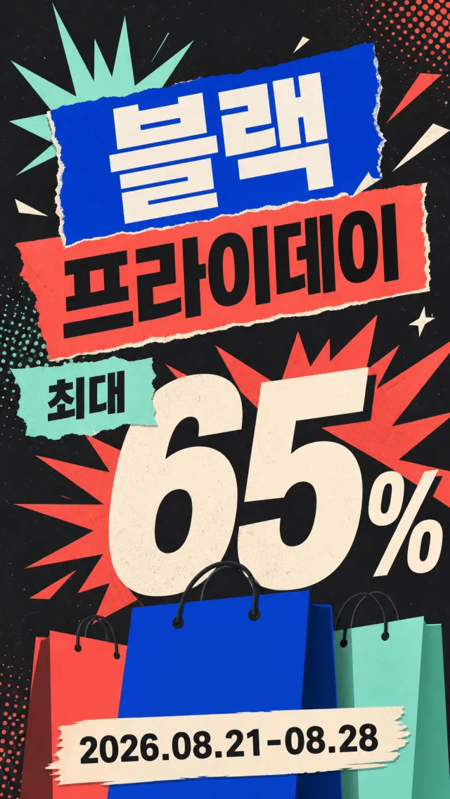
Create a brand-new Korean Black Friday vertical promotion poster.
Accurately present the text “블랙 프라이데이”“최대 65%”“2026.08.21-08.28”.
Use cobalt blue, bright coral orange, mint green, warm cream color, and charcoal black.
Employ oversized numbers, torn-edge labels, and silhouettes of no-brand shopping bags to form a dynamic visual.
Discounts and the Korean headline must be clearly highlighted, suitable for mobile viewing.
Add high-energy graphic explosion elements while maintaining an orderly composition.
Do not include brands, logos, URLs, QR codes, watermarks, or fine print.
Output a high-quality static PNG.
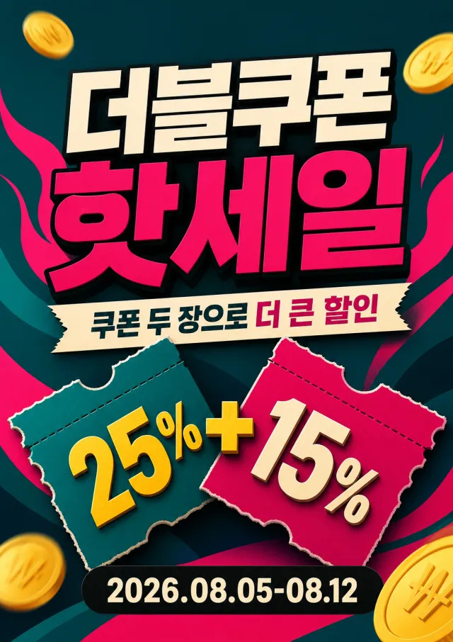
Create a brand-new vertical Korean double-coupon hot-sale poster.
Accurately present the text “더블쿠폰 핫세일”“쿠폰 두 장으로 더 큰 할인”“25% + 15%”“2026.08.05-08.12”.
Use deep cyan, magenta, cream white, yellow, and black.
Form the main visual with two cross-torn coupon tickets and three-dimensional bold text.
Add abstract gold coin and heatwave shapes while keeping the overall composition fresh and uncluttered.
All Korean text must be large and sharp for quick readability.
Do not include brands, logos, website URLs, QR codes, watermarks, or small text.
Output a high-quality static PNG image.
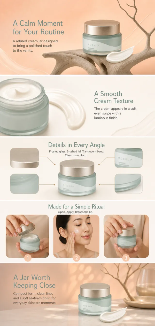
Using the supplied reference image as the sole product reference, create a complete Amazon A+ design preview. Preserve the exact frosted seafoam jar, champagne lid, translucent label band, cream swipe, single-unit quantity, and relative scale. Do not invent ingredients, percentages, clinical results, skin benefits, or duration claims. Generate entirely new people where used.
Use warm peach, soft ivory, seafoam green, and champagne metal with translucent cream swashes, sculptural branches, rounded image windows, soft studio reflections, and elegant modern sans-serif typography. Avoid snails, ingredient symbols, and before-and-after imagery. Alternate full-width beauty banners, asymmetric jar layouts, texture macros, and a calm routine scene.
Build this official A+ module order. Keep each module independently complete and mobile-safe; peach fields, cream swashes, and branch silhouettes may repeat across boundaries.
MODULE 1 — Image with text overlay — introduction
Exact headline: “A Calm Moment for Your Routine”
Exact supporting copy: “A refined cream jar designed to bring a polished touch to the vanity.”
Layout: wide peach banner with the jar on a sculptural branch form, generous headline area, no botanical ingredient implication.
MODULE 2 — Single image with side text — texture
Exact headline: “A Smooth Cream Texture”
Exact supporting copy: “The cream appears in a soft, even swipe with a luminous finish.”
Layout: large cream macro and open-jar crop beside a clean text field; no skin-result claims.
MODULE 3 — Four-image and text — visible design
Exact headline: “Details in Every Angle”
Exact supporting copy: “Frosted glass. Brushed lid. Translucent band. Clean round form.”
Layout: centered closed jar with four rounded macro callouts and fine champagne connector lines.
MODULE 4 — Multiple image and text — routine sequence
Exact headline: “Made for a Simple Ritual”
Exact supporting copy: “Open. Apply. Return the lid.”
Layout: three elegant steps using newly generated hands and one newly generated adult; show no before-and-after comparison.
MODULE 5 — Full-width image with text overlay — closing
Exact headline: “A Jar Worth Keeping Close”
Exact supporting copy: “Compact form, clean lines and a soft seafoam finish for everyday skincare moments.”
Layout: wide vanity scene with jar dominant, warm peach light, restrained branch silhouette, and clear safe copy area.
Create one continuous vertical A+ preview at 1200px width with content-driven height, clear module boundaries, and varied compositions for independent export. Render only the exact copy above. Do not add logos, prices, promotions, QR codes, URLs, contacts, ingredients, percentages, medical or cosmetic claims, certifications, testimonials, awards, guarantees, fake UI, watermarks, pseudo-text, or unrelated labels. Keep all elements natural and mobile-safe.
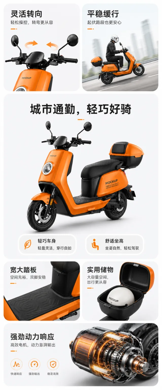
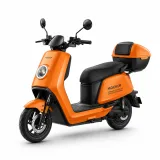
Based on the reference image, generate a visual mockup for an e‑commerce product detail page of a city electric scooter.
A bright orange city electric scooter serves as the focal point, presented in a slight three-quarter side view. Key structural elements—handlebars, round headlight, footboard, seat, rear storage compartment, and front and rear wheels—are retained. The lighting, wheel hubs, body lines, and seat texture have been thoughtfully refined. The product surface features only the words “MOCKUP” and “EMBRACE YOUR BEAUTY, UNLEASH YOUR POWER.” The background is light gray‑white, while the layout employs a clean, modular grid with soft gray rounded corners, using orange as a functional accent color.
At the top, two parallel feature cards: the left card highlights the handlebar area with a rotating arrow, titled “Flexible Steering,” accompanied by the description “Easy to control, turning with confidence”; the right card shows the scooter navigating a gentle slope, titled “Smooth, Gentle Ride,” with the note “Feel more at ease even on uneven roads.” In the middle, a large horizontal card showcases the full‑view of the scooter, with “Urban Commute, Lightweight & Easy to Ride” written in the upper left corner, followed by two prominent numerical labels below: “Lightweight Body” and “Comfortable Seat Height.” Below that, two additional cards emphasize “Wide Footboard” and “Practical Storage,” while the bottom horizontal card displays a motor cross‑section, titled “Powerful Performance Response,” presenting power, range, and everyday speed through concise three‑line data‑driven copy—without specific model specifications.
The typography is bold, modern, sans‑serif Chinese; the main headline is heavy, the card titles are clear, icons and arrows feature smooth outlines, and modules align neatly.
Output dimensions: 750 x 1800px. Avoid: real brand names, model numbers, footnotes, garbled text, watermarks, overlapping text, text overflow, subject obstruction, distorted subject proportions, duplicate products, low‑resolution icons, and excessive white space.
Create a fresh square conference promotion centered on one horizontal perforated admission ticket.
Use a bold modern graphic style with teal, coral, cream, violet, and black.
Set the exact main text to “FREE TICKET” in large high-contrast uppercase lettering.
Add the exact event line “ONE DAY DESIGN CONFERENCE” beneath the main offer.
Include the exact date “SEPTEMBER 12, 2026” as a clearly readable supporting detail.
Surround the ticket with arrows, stars, and abstract geometric shapes while keeping it uncluttered.
Do not include any brand names, logos, watermarks, barcodes, QR codes, URLs, or fine print.
Render as a polished static square PNG with crisp edges and clean typography.
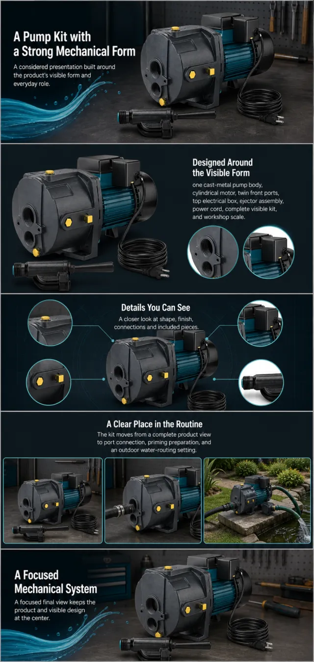
Using the supplied reference image as the sole product reference, create an Amazon A+ design preview for a convertible well-pump kit. Preserve exact geometry, proportions, colors, construction, quantity, accessories, and scale. Visible details: one cast-metal pump body, cylindrical motor, twin front ports, top electrical box, ejector assembly, power cord, complete visible kit, and workshop scale. Do not invent hidden parts or claims.
Visual system: charcoal black, deep teal, bright cyan, and small yellow accents. Composition motifs: bold circular crops, dark technical diagrams, water-flow shapes, and outdoor irrigation scenes. Alternate a wide banner, asymmetric overview, centered detail graphic, three-scene sequence, and wide closing scene. Use readable sans-serif type and mobile-safe margins.
Build this official A+ module order. Keep every module independently complete; never split copy or product details.
MODULE 1 — Image with text overlay — introduction
Exact headline: “A Pump Kit with a Strong Mechanical Form”
Exact supporting copy: “A considered presentation built around the product’s visible form and everyday role.”
Layout: wide image-led hero; dominant complete product and large safe headline area.
MODULE 2 — Single image with side text — product overview
Exact headline: “Designed Around the Visible Form”
Exact supporting copy: “one cast-metal pump body, cylindrical motor, twin front ports, top electrical box, ejector assembly, power cord, complete visible kit, and workshop scale.”
Layout: large three-quarter product, side text field, and two detail crops.
MODULE 3 — Four-image and text — visible evidence
Exact headline: “Details You Can See”
Exact supporting copy: “A closer look at shape, finish, connections and included pieces.”
Layout: centered product with four rounded macro callouts; show only visible facts.
MODULE 4 — Multiple image and text — routine or use setting
Exact headline: “A Clear Place in the Routine”
Exact supporting copy: “The kit moves from a complete product view to port connection, priming preparation, and an outdoor water-routing setting.”
Layout: three framed scenes with consistent product design and newly generated people or animals only when relevant.
MODULE 5 — Full-width image with text overlay — closing
Exact headline: “A Focused Mechanical System”
Exact supporting copy: “A focused final view keeps the product and visible design at the center.”
Layout: wide editorial scene, strong silhouette, restrained props, safe text area.
Create one vertical A+ preview at 1200px width with content-driven height, clear module boundaries, and varied compositions for independent export. Render only the exact copy above. Do not add logos, prices, promotions, QR codes, URLs, contacts, competitors, testimonials, ratings, guarantees, unverified claims, certifications, fake UI, watermarks, pseudo-text, or unrelated labels. Keep all elements natural and mobile-safe.
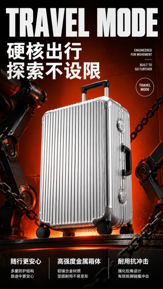
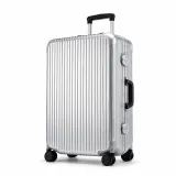
Based on the reference image, generate a high‑fidelity e‑commerce product detail page rendering showcasing the hard‑core texture of an aluminum‑magnesium travel suitcase.
A bright silver, vertically striped suitcase is positioned at a three‑quarter upward angle in the center of an orange‑red industrial‑style background. The design retains the metal vertical‑grain body, pull handle, side carry handle, four wheels, and rigid corner protectors, while refining the wheel assembly, lock mechanism, and edge details. No brand names, logos, slogans, or decorative text appear on the product surface. On either side of the composition, black metallic robotic arms paired with thick chains create a sense of tension, while orange floor lighting illuminates the suitcase from below.
At the top, an oversized, bold, experimental‑type white English headline reads “TRAVEL MODE.” In the middle, large white Chinese text declares “Hardcore Travel” and “Explore Without Limits.” At the bottom, three columns of white bullet points highlight key selling points: “More Peace of Mind on the Go,” “High‑Strength Metal Body,” and “Durable & Impact‑Resistant,” each accompanied by a brief explanatory line. On the right, a small set of offset English supporting text and white circular markers adds visual flair without introducing meaningless micro‑text.
The overall composition evokes a trendy industrial‑style poster, with robust, dynamic typography that keeps information clear and unobscured by the suitcase, while faithfully rendering metallic details.
Output dimensions: 750 x 1334px. Avoid: real brands, model numbers, footnotes, garbled characters, watermarks, overlapping text, text overflow, subject occlusion, abnormal subject proportions, duplicate products, low‑resolution icons, and excessive negative space.