Baby Stroller Creative Inspiration

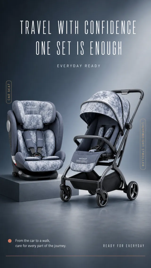
Based on the provided white-background product image, generate a detailed e-commerce page poster. Product Performance: - Maintains the core structure of the smoky blue-gray soft-wrapped child safety seat, lightweight stroller, sunshade, seat belt, and dark gray metal frame. - The safety seat rests on a slightly elevated square base on the left side, while the stroller rests on the right floor, creating a balanced dual-product composition; Product text only retains MOCKUP and EMBRACE YOUR BEAUTY, UNLEASH YOUR POWER. Layout Replica: - Studio background with a gradient from dark blue gray to misty gray, with two lines of narrow white title text centered at the top and a row of small English auxiliary text below. - The left child seat and the right stroller form a front and rear combination, each with a narrow gold vertical label beside them. - On the bottom left, there is a short horizontal dot with two lines of white safety instructions; in the lower right corner, there is a minimalist English short sentence; At the bottom, a thin warm red horizontal line concludes the scene. Fonts and typography: - Font Style: Slim, narrow modern sans-serif titles, with clear, medium-weight sans-serif in the main text. - The main title should be centered in two lines, occupying about 62% of the screen width, with light font weight but large font size; Safety instructions should be aligned to the left, with font size one level smaller. - Gold vertical labels with dark small text, positioned close to the outside of the corresponding product. Copywriting Usage: - Main Title: Leave-With Peace of Mind / One Package Is Enough - English auxiliary word: EVERYDAY READY - Left label: Child seat - Right tag: Light cart - Bottom note: From getting in the car to walking, take care of every step more thoroughly. - English short phrase: READY FOR EVERYDAY Graphic elements: - Use simple gold vertical stripe labels, warm red thin lines at the bottom, and small dots; No certification stamps, models, or footnotes are added. Avoid: children's figures, real brands, exaggerated safety certifications, incorrect proportions, missing wheels, text obscuring products, low-definition labels, watermarks, and screenshot edges.

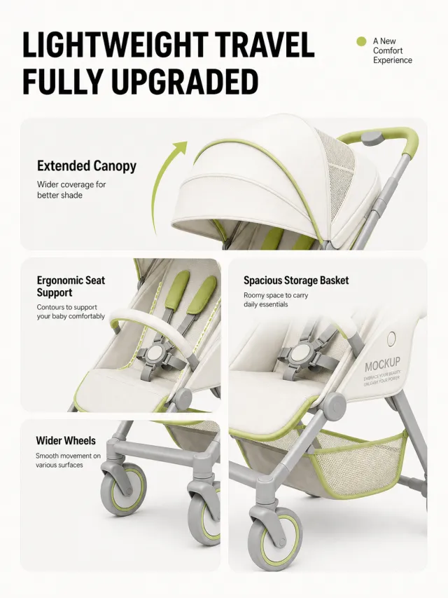
Generate a detailed feature page for the lightweight baby stroller based on the provided white-background product image; The stroller is made the sole subject, retaining its "MOCKUP" and "EMBRACE YOUR BEAUTY, UNLEASH YOUR POWER" logo, without adding any new brands, models, or text. The background is warm white, with the top aligned on the left with a heavy black title "Lightweight Travel Fully Upgraded," and a small lime dot and a short phrase "Comfortable New Experience" placed at the top right. Below is a four-card asymmetrical grid: the upper large truck displays the cart's sunshade partially with an upward curved arrow; Left medium truck shows seat support structure; Middle right: vertical large truck displays storage basket under the cart; The lower left card shows the widened wheelset. Each card features a light gray-white rounded background, with black subheadings and a short description, and lime green highlighted on the edges and key components. The title uses bold black sans-serif font, with medium weight sans-serif text on the card, and the main product or parts are clear and complete inside the card. Do not include baby images, real brands, patent numbers, exaggerated load-bearing or safety promises, screenshot edges, watermarks, garbled text, low-definition icons, or obvious shadows.

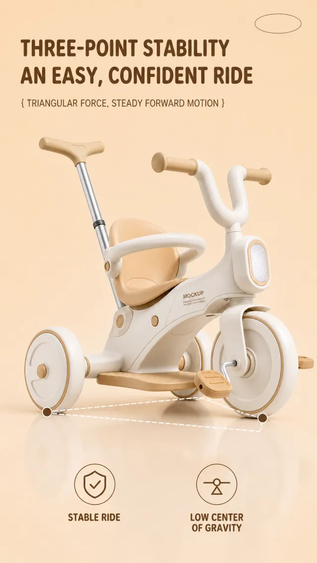
Based on the provided white-background product image, generate a detailed e-commerce page poster. Product Performance: - Maintain warm ivory white and apricot toddler tricycles, three-wheel structures, push bars, U-shaped handlebars, seat cushions, footpegs, and front guardrails. - The car body is positioned slightly to the right of center at the bottom of the frame, fully presented from a slightly frontal angle; Frame text uses only MOCKUP and EMBRACE YOUR BEAUTY, UNLEASH YOUR POWER. Layout Replica: - Warm beige apricot solid background, with two rows of brown large titles aligned at the top left, and a line of bracket-style subtitles below; The upper right corner only retains the minimalist oval decoration and cannot contain brand text. - Use three brown dots and a white dashed line to connect the front end, seat area, front wheels, and rear wheels to form a stable triangle schematic. - The bottom features two linear circular icons and two rows of Chinese and English labels arranged horizontally, with a very light reflection on the white background. Fonts and typography: - Font Style: Rounded, thick black sans-serif title, main text in dark brown medium weight sans-serif, English text in compact uppercase. - Main title aligned to the left, two lines, occupying about 56% of the image width; The subtitle is a notch smaller and placed below the title. - The bottom label has an icon on the left and a copy on the right, with two symmetrical groups on the left and right. Copywriting Usage: - Main Title: Three Points of Stability / Easy and Safe Riding - Subtitle: { Triangular Forces, Steady Progress } - Tag 1: Steady Ride / STEADY RIDE - Tag 2: Low Center of Gravity Design / LOW CENTER Graphic elements: - White dashed triangle, brown dots, two fine-lined circular icons, and understated oval corner markings; Clear lines without jagged edges. Avoid: child figures, real brands, exaggerated safety certifications, missing wheelsets, text pressing down on the body, low-definition icons, watermarks, screenshot margins, and tiny footnotes.
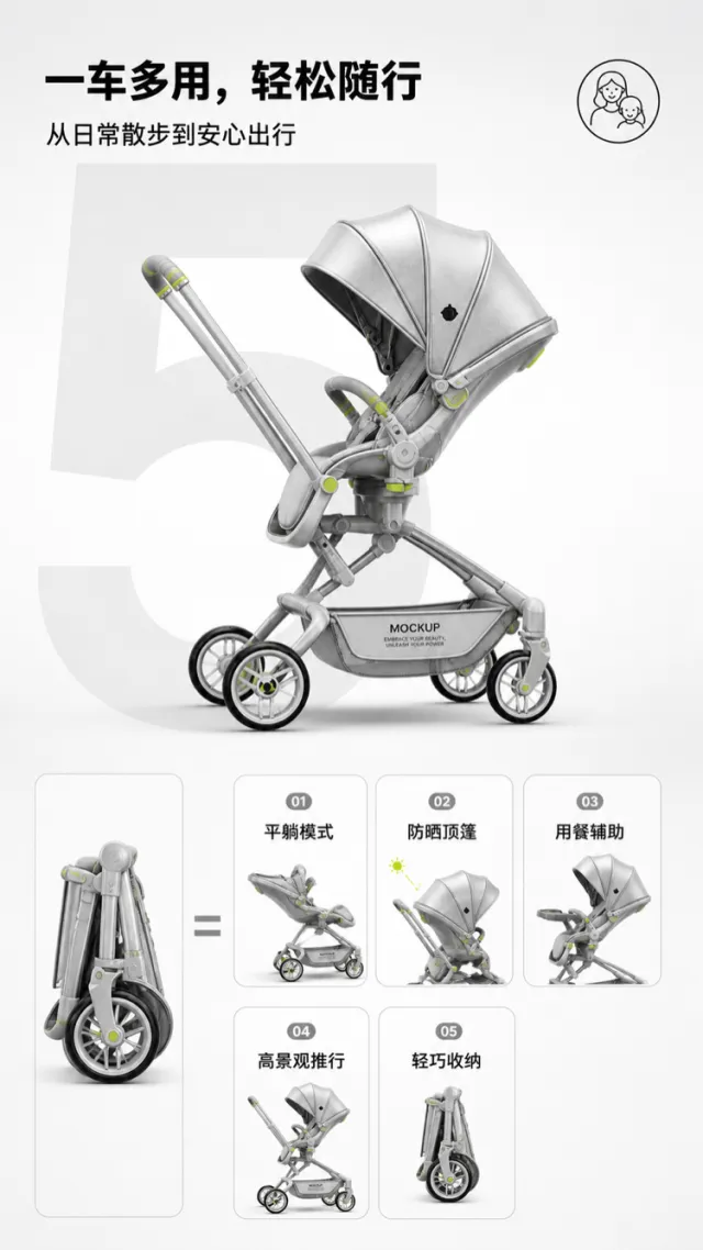
Based on the reference image, generate a multi‑mode stroller e‑commerce product detail page mockup. A silver‑gray stroller is positioned slightly to the side in the upper central area, retaining its push handle, seat, canopy, storage basket, frame, and four wheels. Minor adjustments have been made to the wheel hubs, joints, and light‑green accent details. The product surface displays only “MOCKUP” and “EMBRACE YOUR BEAUTY, UNLEASH YOUR POWER.” The background features a clean gradient from light gray to white, with a large, light‑gray numeral “5” serving as the backdrop beneath the stroller. At the top, centered left, a bold black Chinese headline reads “Multi‑Purpose, Easy On‑the‑Go,” accompanied by the subheading “From Everyday Walks to Peace of Mind Travel.” In the upper right corner, a simple circular parent‑child linear icon is placed. The lower half adopts an equation‑style layout: on the left is a folded stroller, while the right side features five small functional icons labeled, in order, “Flat‑Lying Mode,” “Sun‑Protective Canopy,” “Meal‑Assistance,” “High‑View Pushing,” and “Lightweight Storage.” Each icon is framed in light gray, with soft rounded corners and subtle pictograms. The typography is modern, gentle, and clearly hierarchical; the spacing between icons is uniform, and the design avoids any superfluous brand logos or technical specifications in small print. Output dimensions: 750 x 1334px. Avoid: real brand names, model numbers, footnotes, garbled text, watermarks, overlapping text, text overflow, subject obstruction, distorted subject proportions, duplicate products, low‑resolution icons, and excessive negative space.