Children Water Bottle Creative Inspiration

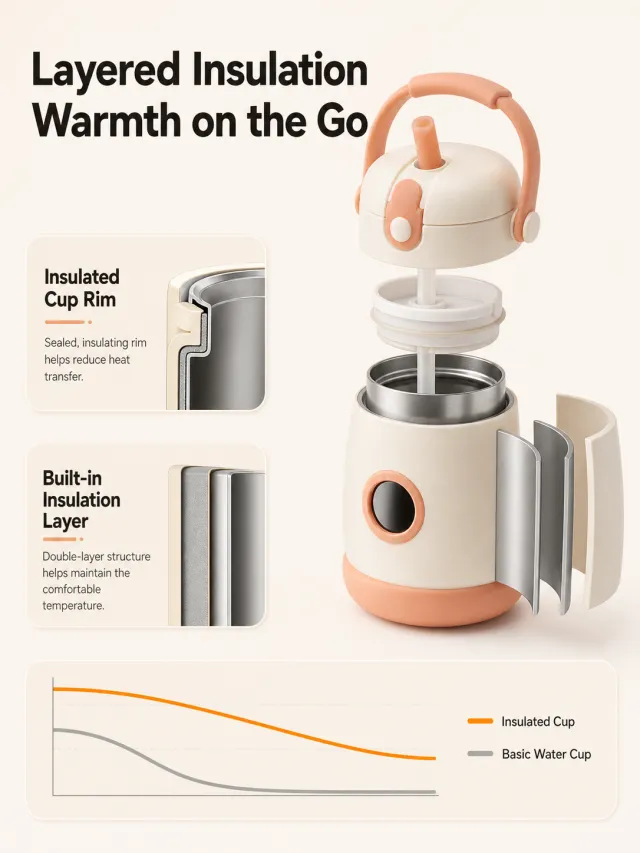
Generate a detail page for a children's insulated straw cup based on the provided white-background product image. The product originally had no brand information, so no brand name, slogan, logo, capacity, or numeric text were added. The painting uses light oatmeal color and soft cream white, with the top aligned to the left and a large bold black font inscribed "Layer Layer Insulation / Warm Travel." On the right side of the middle section, a partial explosion structure is used to display the lid, straw, and the gap between the inner and outer layers; The product maintains a round, cute, and pink-apricot detail. On the left side, two small rounded corner instruction cards are displayed: "Warm-Locked Cup Mouth" and "Built-in Insulation Layer," each containing a small cross-sectional material diagram and two lines of neutral description. At the bottom, a minimalist curve area is placed, with orange and gray smooth lines representing the "thermos cup" and "basic water cup," without writing the time or temperature values. The font uses a rounded yet crisp modern black font, with cards and smooth curved edges. Do not display child figures, real detection data, original image brands, footnotes, watermarks, overlapping text, or low-definition icons.

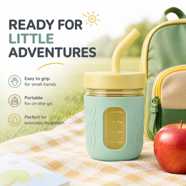
【Output Guidelines | Must Not Appear on Screen】 Generate only one final 1000×1000, 1:1 Amazon Listing secondary image. Do not use collage, six‑panel grids, storyboards, multi‑card grids, split‑screen layouts, or a second image. 【Sharing Guidelines】 Use the provided product reference image as the sole basis for product appearance, structure, color, quantity, accessories, and relative proportions. Product orientation: yellow‑green children’s sports water bottle; designed for outdoor use, easy to grip, portable, and suitable for everyday drinking. The product must be fully presented, with all subjects, props, and text maintaining natural proportions—no stretching, flattening, cropping, or independent non‑proportional scaling is allowed. The background should extend across the entire frame to all four edges. Use “MOCKUP” consistently for branding; remove any original brand elements, logos, watermarks, contact information, social media accounts, platform details, gibberish, or irrelevant content. Copywriting should be concise, clear, and credible, retaining the language of the reference image and refraining from adding unverified absolute claims or medical promises. Create new, natural‑looking characters or animals—do not replicate figures from the original image. 【Image Composition】 Produce a single, complete, single‑scene product secondary image: place the product at the visual center, integrate it with a natural lifestyle scene that aligns with the product’s intended use, preserve all product information and maintain safe margins, ensure harmonious blending between background and subject, and avoid white borders, vertical side bars, outer frames, or collage boundaries.
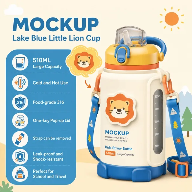
## Use case Advertising and marketing. ## Asset type Amazon secondary product benefit image, 1:1 aspect ratio. ## Input image Use `708_product.png` as the sole product-appearance reference and `708_amazon.jpg` as the approved visual reference. ## Product fidelity Preserve exactly the input product's colors, materials, construction, patterns, quantity, accessories, and package relationships; do not invent or remove components. ## Primary request Reproduce the approved premium Amazon benefit image for SKU 708, retaining its product-specific visual identity. ## Source design to preserve Preserve the approved image's palette, background atmosphere, graphic motifs, composition, information modules, and visual rhythm; do not replace it with a generic template. ## Subject and composition Keep the complete product dominant and unobstructed, with at least 6% safe margin; preserve the approved model-worn composition when the product is apparel. ## Scene and graphics Retain the category-appropriate gradients, lines, icons, textures, ingredient or material details, and accents visible in the approved design. ## Typography system Use a category-appropriate display face for the title and a highly legible complementary face for body copy; maintain clear differences in size, weight, alignment, and color. ## Adaptive layout Measure the available space first, wrap by meaning, and adapt title scale, line count, icon/text grid, spacing, and module size to the actual English copy while preserving the approved visual rhythm. ## Exact visible text (Text (verbatim)) - `MOCKUP` - `Lake Blue Little Lion Cup` - `510ML Large Capacity` - `Cold and Hot Use` - `Food-grade 316` - `One-key Pop-up Lid` - `Strap can be removed` - `Leak-proof and Shock-resistant` - `Perfect for School and Travel` ## Offer filtering Omit prices, currencies, discounts, price comparisons, coupons, gifts, limited-time wording, savings claims, purchase calls to action, and all other promotional messaging. Do not replace them with generic offers. ## Recommended information hierarchy Lead with the title and core benefit, followed by three concise feature groups and, only when relevant, one objective specification or set quantity. Flexible grouping is allowed without changing meaning. ## Constraints English is the only visible language. Keep the product faithful, complete, sharp, mobile-readable, and free of watermarks and invented brands. Preserve the exact visible text listed above. ## Avoid Garbled or misspelled text, missing core copy, translated visible copy, text overlap, rigid generic typography, distorted products, wrong accessory counts, invented claims, unrelated props, low-resolution icons, clutter, and promotional language.