Asset type: Amazon secondary product benefit image, 1:1 aspect ratio.
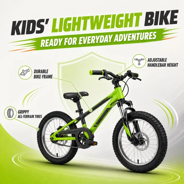
Create a polished product-benefit infographic from `1187_product.png`. Preserve the exact supplied product and its set components, and retain its original visual language, palette and flexible editorial layout.
Information-volume cap: render exactly 1 main title, 1 core benefit and 3 feature components. Add no other generated copy, badge, slogan, price or promotion.
Text (verbatim):
```
KIDS' LIGHTWEIGHT BIKE
READY FOR EVERYDAY ADVENTURES
DURABLE BIKE FRAME
GRIPPY ALL-TERRAIN TIRES
ADJUSTABLE HANDLEBAR HEIGHT
```
Avoid: altered or extra products, watermark, typoed, overlapping or clipped text, prices and promotions.
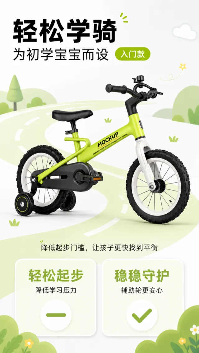
Based on the reference image, generate a mockup for an e‑commerce product detail page of a children’s balance bike.
A bright yellow‑green children’s balance bike is positioned horizontally in the center of the frame, shown from a clean side view. Key components—such as the frame, pedals, chain guard, front and rear wheels, detachable training wheels, seat, and handlebars—are retained, while select details like the hubs, fork, and frame have been subtly refined. The surface features only the words “MOCKUP” and “EMBRACE YOUR BEAUTY, UNLEASH YOUR POWER.” The background is a large expanse of light gray‑white, with a pale green circular road line encircling the bike, lending the composition a lively, rational, yet playful feel.
At the top, aligned to the left, a bold black Chinese headline reads “Learn to Ride with Ease,” followed by “Designed for Beginner Kids.” Next to it is a small, rounded‑corner green label reading “Entry‑Level Model.” Below the bike, a short dark‑gray caption explains: “Lower the barrier to entry, helping kids find their balance faster.” At the bottom, two light‑colored cards are placed side by side: the left card features large green numerals highlighting “Easy Start” and “Reduced Learning Pressure,” while the right card emphasizes “Steady Protection” and “More Peace of Mind with Training Wheels.” Each card incorporates smooth minus and check icons.
The typographic hierarchy is clear: the main headline is the largest, with data and icons taking secondary prominence. The overall layout maintains ample white space, avoiding complex footnotes or clutter.
Output dimensions: 750 x 1334px. Avoid: real brand names, model numbers, footnotes, garbled text, watermarks, overlapping text, text overflow, subject occlusion, distorted proportions, duplicate products, low‑resolution icons, and unusual whitespace.