Hand Cream Creative Inspiration

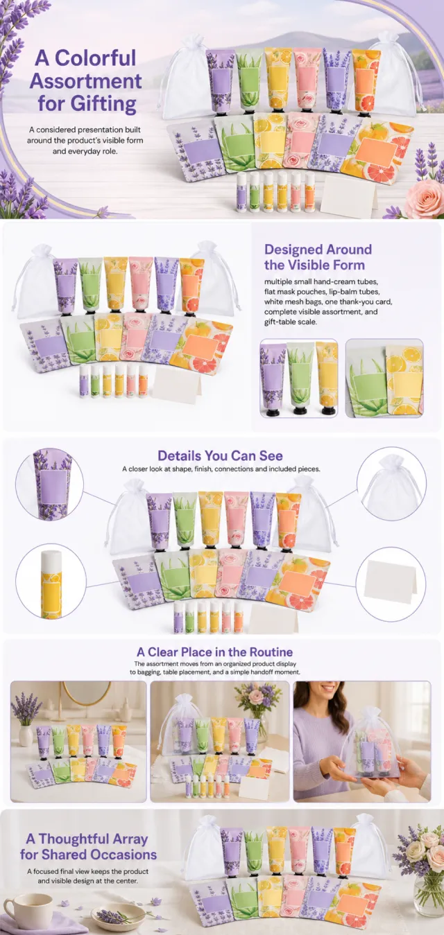
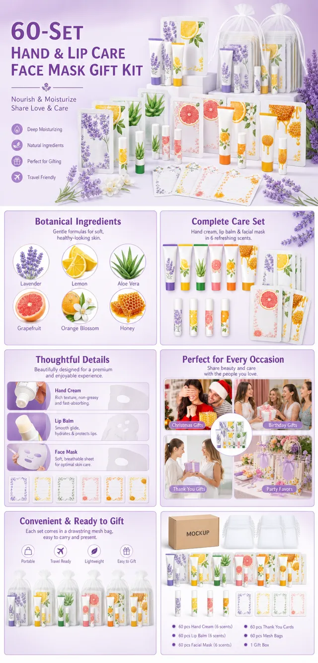
Using the supplied reference image as the sole product reference, create an Amazon A+ design preview for a coordinated personal-care gift assortment. Preserve exact geometry, proportions, colors, construction, quantity, accessories, and scale. Visible details: multiple small hand-cream tubes, flat mask pouches, lip-balm tubes, white mesh bags, one thank-you card, complete visible assortment, and gift-table scale. Do not invent hidden parts or claims. Visual system: lavender, warm white, citrus yellow, aloe green, blush pink, and soft orange. Composition motifs: curved lavender fields, floral accents, arched gifting scenes, and orderly product rows. Alternate a wide banner, asymmetric overview, centered detail graphic, three-scene sequence, and wide closing scene. Use readable sans-serif type and mobile-safe margins. Build this official A+ module order. Keep every module independently complete; never split copy or product details. MODULE 1 — Image with text overlay — introduction Exact headline: “A Colorful Assortment for Gifting” Exact supporting copy: “A considered presentation built around the product’s visible form and everyday role.” Layout: wide image-led hero; dominant complete product and large safe headline area. MODULE 2 — Single image with side text — product overview Exact headline: “Designed Around the Visible Form” Exact supporting copy: “multiple small hand-cream tubes, flat mask pouches, lip-balm tubes, white mesh bags, one thank-you card, complete visible assortment, and gift-table scale.” Layout: large three-quarter product, side text field, and two detail crops. MODULE 3 — Four-image and text — visible evidence Exact headline: “Details You Can See” Exact supporting copy: “A closer look at shape, finish, connections and included pieces.” Layout: centered product with four rounded macro callouts; show only visible facts. MODULE 4 — Multiple image and text — routine or use setting Exact headline: “A Clear Place in the Routine” Exact supporting copy: “The assortment moves from an organized product display to bagging, table placement, and a simple handoff moment.” Layout: three framed scenes with consistent product design and newly generated people or animals only when relevant. MODULE 5 — Full-width image with text overlay — closing Exact headline: “A Thoughtful Array for Shared Occasions” Exact supporting copy: “A focused final view keeps the product and visible design at the center.” Layout: wide editorial scene, strong silhouette, restrained props, safe text area. Create one vertical A+ preview at 1200px width with content-driven height, clear module boundaries, and varied compositions for independent export. Render only the exact copy above. Do not add logos, prices, promotions, QR codes, URLs, contacts, competitors, testimonials, ratings, guarantees, unverified claims, certifications, fake UI, watermarks, pseudo-text, or unrelated labels. Keep all elements natural and mobile-safe.

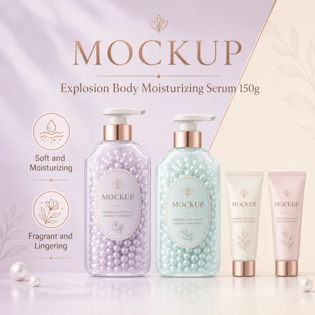
## Use case Advertising and marketing. ## Asset type Amazon secondary product benefit image, 1:1 aspect ratio. ## Input image Use `689_product.png` as the sole product-appearance reference and `689_amazon.jpg` as the approved visual reference. ## Product fidelity Preserve exactly the input product's colors, materials, construction, patterns, quantity, accessories, and package relationships; do not invent or remove components. ## Primary request Reproduce the approved premium Amazon benefit image for SKU 689, retaining its product-specific visual identity. ## Source design to preserve Preserve the approved image's palette, background atmosphere, graphic motifs, composition, information modules, and visual rhythm; do not replace it with a generic template. ## Subject and composition Keep the complete product dominant and unobstructed, with at least 6% safe margin; preserve the approved model-worn composition when the product is apparel. ## Scene and graphics Retain the category-appropriate gradients, lines, icons, textures, ingredient or material details, and accents visible in the approved design. ## Typography system Use a category-appropriate display face for the title and a highly legible complementary face for body copy; maintain clear differences in size, weight, alignment, and color. ## Adaptive layout Measure the available space first, wrap by meaning, and adapt title scale, line count, icon/text grid, spacing, and module size to the actual English copy while preserving the approved visual rhythm. ## Exact visible text (Text (verbatim)) - `MOCKUP` - `Buy 2 Get 1 Free` - `Explosion Body Moisturizing Serum 150g` - `Soft and Moisturizing` - `Fragrant and Lingering` ## Offer filtering Omit prices, currencies, discounts, price comparisons, coupons, gifts, limited-time wording, savings claims, purchase calls to action, and all other promotional messaging. Do not replace them with generic offers. ## Recommended information hierarchy Lead with the title and core benefit, followed by three concise feature groups and, only when relevant, one objective specification or set quantity. Flexible grouping is allowed without changing meaning. ## Constraints English is the only visible language. Keep the product faithful, complete, sharp, mobile-readable, and free of watermarks and invented brands. Preserve the exact visible text listed above. ## Avoid Garbled or misspelled text, missing core copy, translated visible copy, text overlap, rigid generic typography, distorted products, wrong accessory counts, invented claims, unrelated props, low-resolution icons, clutter, and promotional language.
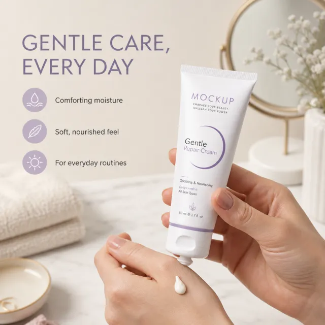
Create ONE independent Amazon listing image. Use a 1:1 square 1000x1000 px canvas with a full-bleed composition, no white border, no side bars, no collage, and no multi-panel layout. Use the visual reference only for composition, camera angle, lighting, color mood, scene, typography hierarchy, and information structure. Do not copy its original wording or graphic assets. Use the provided white-background product image as the sole product source. Preserve its exact silhouette, geometry, parts, materials, colors, proportions, controls, labels, connectors, and accessory count. Keep the product complete, naturally assembled, and undistorted. Do not replace, merge, stretch, crop, or redesign the product. Do not show cutaway, exploded, anatomical, or internal views. Preserve any approved MOCKUP identity already present on the product image, but do not copy brands or logos from the visual reference. Rewrite all visible copy in English with fresh, plausible, category-appropriate wording. Do not reuse the visual reference's original brand names, phrases, statistics, certifications, filenames, or source graphics. Avoid unsupported medical, legal, safety, or absolute claims. Do not include Chinese or mixed-language instructions. Do not include execution-mode notes, source names, file paths, reconstruction history, or metadata. Keep all typography legible and inside the canvas. Show the skincare tube in a calm vanity or hand-held care scene with a soft texture cue. Use fresh copy such as “GENTLE CARE, EVERY DAY”, “Comforting texture”, “Light moisture”, and “A simple daily routine”.

【Execution Route | Do Not Display】 If the image-generation tool can be invoked multiple times: concatenate the sharing rules with A–F separately, execute six times, generating only one 1000×1000 square image each time. If only a single image can be generated at a time: first set the interface/API to a 2:3 portrait orientation (do not use Auto), then arrange A/B, C/D, and E/F into a 2-column × 3-row grid; ensure all six cells are equal in size and maintain a visual aspect ratio of 1:1. The outer canvas must not be 1:1. 【Sharing Rules】 The provided product reference image serves as the sole basis for the product. The product consists of a 60-set containing hand cream, lip balm, facial mask, and favor kit. Strictly adhere to the shape, structure, color, quantity, accessories, texture, and relative proportions depicted in the reference image; do not fabricate any components, specifications, or functions that are not shown. Use high-quality Amazon commercial photography and clear English infographics; color schemes should match the product, lighting should be realistic, and layout should be simple. Maintain natural proportions among the product, figures, hands, icons, and props—no stretching, flattening, or independent scaling is allowed. Titles, products, and labels must remain fully within the safe area, while the background extends across the entire frame on all four sides. Only use MOCKUP for branding. No white borders, vertical edges on either side, transparent fill-in borders, watermarks, contact information, social media accounts, original brand logos, platform identifiers, garbled text, distorted limbs, or unverified copywriting are permitted. A–F are solely control markers and must not be displayed. 【A | Product Overview】Title: “PRODUCT OVERVIEW.” The hero composition should fully showcase the product along with the accessories included in the reference image; accompany it with three brief English icon-based selling points, stating only information that is visible or verifiable. 【B | Materials & Design】Title: “MATERIAL & DESIGN.” Present materials, structure, surface finish, or styling through an overall view of the product combined with 2–3 close-up details; ensure clear labeling without inventing material names. 【C | Function in Focus】Title: “FUNCTION IN FOCUS.” Demonstrate key functions within realistic usage scenarios; maintain natural proportions among figures, hands, and products, with actions appearing genuine and information easily understandable at a glance. 【D | Details Up Close】Title: “DETAILS UP CLOSE.” Highlight 2–4 critical structural elements or operational areas using magnified details and short labels; do not alter the product’s structure. 【E | Everyday Use】Title: “MADE FOR REAL LIFE.” Depict usage, carrying, storage, or maintenance scenarios consistent with the product; retain only one clear theme and avoid duplication with C. 【F | Packaging Contents】Title: “WHAT’S INCLUDED.” Lay out or neatly arrange the actual products and accessories featured in the reference image, ensuring accurate quantities and relative sizes; if the contents cannot be confirmed, instead display visible specifications, dimensional relationships, or usage steps, without fabricating numbers.

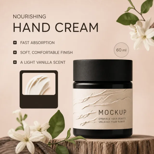
Create one standalone square 1000x1000 Amazon listing image. Use the first reference for visual direction: a warm beige hand-care scene, one dark cream jar on the right, a creamy texture inset, soft botanicals, and a short left-side benefit list. Use the second reference for exact geometry: one complete black hand-cream jar with its lid, label area, silhouette, and proportions. Replace all visible copy with English-only invented copy: “SOFT HANDS, EVERY DAY”, “RICH HAND CREAM”, “FAST-ABSORBING”, “COMFORTING MOISTURE”, “NON-GREASY FINISH”. Add subtle MOCKUP branding on the existing jar surface. Preserve the warm editorial beauty style and soft botanical accents. No original brand, watermark, filename, contact information, copied claims, extra jars, collage, grid, split-screen, outer white frame, cutaway, or stretched product.