生成一张单幅连续画布的亚马逊 A+ 详情长图,最终宽度 1200px,高度约 2529px,采用六个连续模块。产品是一组无品牌一次性空气炸锅纸托:天然未漂白浅牛皮纸色,软圆角方形浅盆,侧墙轻微向外张开,四周均匀宽褶并在四角连续折叠,上沿为双折加固边,底部压出浅放射纹理,多张同向紧密嵌套。所有模块保持纸托的圆角方形、浅盆深度、宽褶、双折边和浅牛皮纸色一致,不把主产品变成圆形烘焙杯或平纸。
整体采用浅牛皮纸色、奶油白、深鼠尾草绿、炭灰和烘烤金棕色,结合明亮厨房摄影、深绿窄体粗无衬线标题、圆形线性图标、圆角信息卡和连续弧面背景。空气炸锅、食物、手部和厨房均为全新创作且无品牌。模块之间通过连续奶油石材台面和鼠尾草色弧面自然过渡,不使用白色横向间隔、模块编号、轮播或购物控件。
模块 1:空气炸锅抽篮打开,主纸托承托烤鱼和蔬菜,台面另有两只装有鸡翅与烤蔬菜的纸托以及一叠同向嵌套纸托。文字准确为:
LINE THE BASKET. KEEP CLEANUP SIMPLE.
DISPOSABLE AIR FRYER PAPER LINERS
A shaped parchment insert for everyday air frying.
NONSTICK PARCHMENT
GREASE BARRIER
UNBLEACHED PAPER
SINGLE USE
模块 2:深鼠尾草背景上的透明空气炸锅剖视,热风以橙色环流包围已装食物的纸托,纸托完整张开且不接触加热管。文字准确为:
SHAPED TO STAY OPEN IN THE BASKET
UP TO 428 °F / 220 °C
RAISED PLEATED WALLS
DOUBLE-FOLD RIM
Always place food on the liner before heating.
模块 3:左侧尺寸与兼容信息,中间是一只大幅 8.5in 圆角方形纸托尺寸图,右侧展示四种常见圆形或方形无品牌空气炸锅篮体中的铺放效果。文字准确为:
ONE SHAPE FOR COMMON BASKET SIZES
8.5 IN BASE
5–8 QT BASKETS
ROUND OR SQUARE BASKETS
Measure the basket before ordering.
模块 4:四张横向连续使用步骤卡,篮体和食物状态逐步变化,最后由成人双手在冷却后提起纸托。文字准确为:
PLACE. ADD FOOD. COOK. LIFT.
1 PLACE LINER
2 ADD FOOD
3 COOK
4 COOL, LIFT AND DISCARD
模块 5:六张等权食物卡横向排布,每张食物都位于同系列浅牛皮纸托中。文字准确为:
FROM QUICK SIDES TO FAMILY MEALS
VEGETABLES
WINGS
FISH
PASTRIES
FRIES
ROASTED SIDES
模块 6:左侧深绿信息栏,中央展示使用后的纸托留住油渍和碎屑,右侧成人手在冷却后提起纸托,空气炸锅篮保持可见。文字准确为:
KEEP THE BASKET BETWEEN MEALS
CAPTURES DRIPS AND CRUMBS
LIFT OUT AFTER COOLING
DISCARD AFTER USE
画布底端延续深鼠尾草绿色背景形成无信息缓冲,不裁切手部或纸托。禁止品牌、Logo、认证、FDA/SGS 徽章、少油或健康保证、可重复使用暗示、价格、CTA、乱码和白色分隔线;禁止空纸托在运行中的炸锅内、纸托接触加热管、主纸托变成薄平纸、褶皱和双折边消失或产品比例拉伸。所有英文必须清晰准确。
生成一张单幅连续画布的亚马逊 A+ 详情长图,最终宽度 1200px,高度约 2529px,采用六个连续模块。产品是一套无品牌多功能沙拉甩干与切配系统,所有模块保持同一结构:烟灰透明圆角六边形外碗、低饱和鼠尾草绿六边形竖向开孔沥水篮、深墨绿整圈防滑底环;浅鼠尾草绿薄型六边上盖,中央深墨绿可折叠摇臂连接中心驱动轴,右侧陶土橙圆形制动键,左侧矩形侧向导轨切配窗口;配三枚相同外框的不锈钢刀片盒,分别为薄片、粗丝和细丝,以及一枚深墨绿拱形护手推块。禁止刀片数量、导轨方向、制动键位置、中心轴和部件比例在不同模块中漂移。
整体采用暖奶油白、浅鼠尾草绿、深森林绿、陶土橙与透明烟灰色,结合明亮石材厨房摄影、干净的圆角信息卡、点状结构引线和深绿窄体粗无衬线标题。人物、厨房、食材和菜式均为全新创作。模块之间用连续奶油色台面、淡鼠尾草弧面和柔和阴影自然衔接,不使用白色横向分隔线,不显示品牌、模块编号、轮播、播放或购物控件。
模块 1:上部非等宽双场景首屏。左侧新创作成年人物在厨房水槽清洗叶菜,右侧大幅产品英雄图展示完整组装状态。文字准确为:
FRESH PREP STARTS HERE
SALAD SPINNER + SLICER SYSTEM
Rinse, spin and prep in one compact bowl.
模块 2:左侧功能清单,中央完整产品,右侧横排三枚刀片盒与护手推块,以虚线说明附件和上盖导轨的对应关系。文字准确为:
ONE BOWL. FIVE EVERYDAY TASKS.
RINSE
SPIN
SLICE
JULIENNE
SERVE
模块 3:两行四列功能证据矩阵,每格保持同一产品结构和正确手部动作。文字准确为:
DESIGNED AROUND THE WAY YOU PREP
RINSE BASKET
SMOOTH SPIN
QUICK BRAKE
LOCKED LID
THIN SLICE
COARSE JULIENNE
FINE JULIENNE
COVERED PUSHER
模块 4:中央纵向爆炸结构,上盖、中心轴、沥水篮、透明外碗和底环沿同一轴线分离,三枚刀片盒位于右侧并与导轨位置对应,左右使用清楚虚线标注。文字准确为:
A SIMPLE STACK THAT WORKS TOGETHER
FOLD-DOWN CRANK
DRIVE SHAFT
PERFORATED BASKET
CLEAR SERVING BOWL
GRIP BASE
BRAKE BUTTON
SLIDE-IN BLADE DECK
模块 5:两行四列新鲜菜式摄影马赛克,中部覆盖一条半透明鼠尾草色标题带。文字准确为:
MORE WAYS TO BUILD A FRESHER PLATE
Greens, slaws, toppings and sides—prepared your way.
模块 6:宽幅家庭厨房备餐收束画面,两位全新成年人物共同准备沙拉,产品完整置于台面并以合理方式使用。文字准确为:
PREP TOGETHER. SERVE WITH EASE.
A compact system for everyday meals.
画布底端延续奶油色台面和淡鼠尾草弧线作为缓冲,不裁切人物、产品或文案。禁止原品牌、新造品牌、认证、BPA 徽章、绝对安全/防滑结论、价格、CTA、乱码、白色分隔线;禁止裸露刀片朝向手部、推块穿透刀片、导轨与刀盒不匹配、中心轴偏心、制动键漂移、产品拉伸和错误装配。所有英文必须清晰准确。
Create one complete continuous tall Amazon A+ product-detail image for a premium 13-inch tri-ply deep stainless-steel wok. Use a 1200px-wide natural-height canvas with exactly seven outer modules. Make the entire page one uninterrupted composition connected by deep forest-green stone, smoky stainless gradients, warm amber cooking light, rising steam, and subtle champagne-silver arcs. Do not use white, cream, pale, or contrasting horizontal separator lines or visible gaps. Keep the bottom 5% as empty deep-green/charcoal safe background with only one faint silver arc; place no text, product, icon, person, or important object there.
Keep one exact product identity in every module and angle: wide 13-inch round mouth, deep bowl-shaped continuously curved walls, stable small flat base, radial satin-silver interior, smoke-silver brushed exterior, narrow matte deep-green magnetic lower ring, and a smooth rivet-free interior. The long handle gently rises and uses a stainless double-ridge frame, broad Y-shaped exterior mount with exactly two external rivets, deep forest-green heat-guard sleeve, and an exposed champagne-silver oval hanging eye. The opposite helper handle is a short low/upturned D-shaped stainless loop with a deep-green grip insert and its own broad exterior two-rivet support. When shown, the matching lid is low-domed transparent glass with a smoke-silver edge, deep-green low bridge handle, and one steam vent. Preserve proportions; never stretch or change it into a shallow skillet, round-bottom wok, pot, black nonstick pan, or another product.
Use a newly designed premium high-motion cooking system in forest green, charcoal, smoke silver, warm amber flame, and restrained champagne accents. Create new food scenes, diverse adults, diagrams, and icons. Do not include brands, seals, certifications, patents, absolute nonstick claims, prices, shopping UI, module labels, crop marks, placeholders, random characters, or extra copy.
Module 1, 17%: dynamic hero in a new dark-green contemporary kitchen, exact wok on a stable cooktop with physically plausible flame and safely tossed ingredients. Typeset exactly: “TURN UP THE TOSS.”, “13 IN TRI-PLY DEEP WOK”, “A deep curved bowl for quick searing, tossing and everyday one-pan meals.” Add icons labeled exactly: “13 IN WIDE MOUTH”, “DEEP CURVED BOWL”, “FLAT INDUCTION BASE”, “TWO-HANDLE CONTROL”.
Module 2, 14%: five connected high-motion cooking beats on one continuous worktop. Use the exact wok consistently and show the two-hand lift with one hand on each handle. Typeset exactly: “BUILT FOR HIGH-MOTION COOKING”, “STIR-FRY”, “SEAR”, “TOSS”, “SIMMER”, “TWO-HAND LIFT”.
Module 3, 14%: precise aligned section of the curved bowl, showing three continuous layers from the small flat base up the deep wall and amber heat paths climbing the curve. Typeset exactly: “HEAT THAT CLIMBS THE CURVE”, “STAINLESS STEEL INTERIOR”, “CONTINUOUS ALUMINUM CORE”, “MAGNETIC STAINLESS EXTERIOR”.
Module 4, 13%: asymmetric layout with a smooth inner-bowl view, a dedicated centered close-up of the short D-shaped helper handle, and a separate long-handle mount view. Use unambiguous callout lines. Typeset exactly: “A CLEAN BOWL. A SECURE GRIP.”, “RIVET-FREE INTERIOR”, “EXTERIOR DOUBLE-RIVET SUPPORT”, “HEAT-GUARD LONG HANDLE”, “UPTURNED HELPER HANDLE”. The helper-handle label must point only to the short D-shaped helper loop, never the long handle.
Module 5, 13%: four connected macro scenes showing the deep curved wall, stable flat base, rolled pouring rim, and matching vented glass lid. Typeset exactly: “SHAPED FOR THE WAY A WOK MOVES”, “DEEP CURVED WALL”, “STABLE FLAT BASE”, “ROLLED POURING RIM”, “VENTED GLASS LID”.
Module 6, 13%: three physically correct connected steps using the same wok. Typeset exactly: “HOT WOK. COOL OIL.”, “PREHEAT THE EMPTY WOK”, “ADD OIL AFTER HEATING”, “ADD FOOD WHEN THE OIL SHIMMERS”.
Module 7, 11%: new sink-side closure using the exact wok and only gentle care actions. Typeset exactly: “TOSS OFTEN. CLEAN GENTLY.”, “LET THE WOK COOL”, “WASH WITH MILD SOAP”, “USE A SOFT SPONGE”, “SOAK TO LOOSEN RESIDUE”. End all visible content above the empty bottom safe zone.
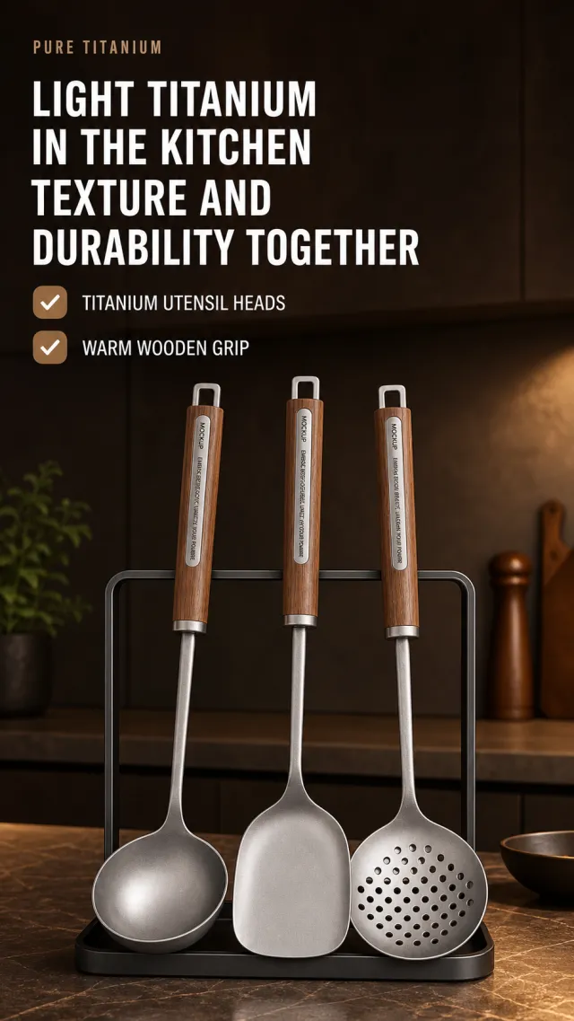
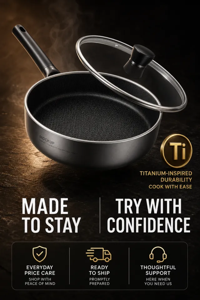
Based on the provided white-background product image, generate a detailed e-commerce page poster.
Product Performance:
- Keeps three pieces of titanium kitchenware, walnut handles, and dark metal storage racks; Spoons, spatulas, and strainers stand on the kitchen countertop.
- Only MOCKUP and EMBRACE YOUR BEAUTY, UNLEASH YOUR POWER are displayed on the controller and product, with no other brands, models, or small engravings.
Layout Replica:
- Dark brown modern kitchen background: on the top left side are small English auxiliary text and two lines of large white titles, with two horizontal warm brown tick icons and short selling points arranged horizontally below the title.
- Three pieces of kitchenware stand on black shelves in the lower middle, with a slight warm side shine; Place a few blurry kitchen still lifes as backgrounds around the area, without overshadowing the main subject.
- The overall image features a low-light atmosphere typical of high-end material advertisements.
Fonts and typography:
- Font Style: Bold white sans-serif title, English is small narrow full-caps, selling point is white medium sans-serif lines.
- Title aligned to the left, occupying about 72% of the image width, two lines; Check the selling points to arrange vertically and leave a breathable feel at the top of the product.
Copywriting Usage:
- English auxiliary word: PURE TITANIUM
- Main Title: Light Titanium for the Kitchen / Combining Quality and Durability
- Selling Point: Titanium spoon head / Smooth wooden grip
Graphic elements:
- Two warm brown rounded checkboxes icon; Do not use brand logos, certification labels, specification sheets, or footnotes.
Avoid: Real brands, kitchen clutter covering kitchenware, low-resolution metal materials, product deformation, text shadows, garbled text, watermarks, and screenshot edges.
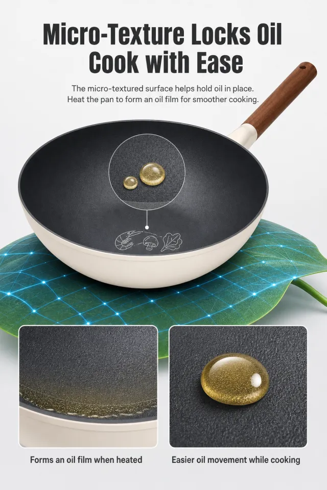
Based on the provided white-background product images, generate a micro-textured non-stick wok principle explanation page. The product originally had no brand information, so no brand name, slogan, logo, material grade, or decorative text were added. The image uses a light gray-white background, with the top centered in dark gray bold black font reading "Micro-texture Grease Lock / More Confident Cooking," and two lines of neutral text below in small print. On the left side of the center, enlarge the wok, stacking a semi-transparent micro-textured circular cross-section and two high-gloss oil droplets inside, with thin lines connecting the bottom of the cross-section to abstract the outline of the ingredients; A green leaf with a blue mesh is placed under the pot as a tech-inspired backdrop. At the bottom, two square close-up cards are placed side by side: the left shows the pan bottom in contact with the oil film, the right shows the smooth oil dripping on the grain, followed by short sentences like "oil film forms when the pan is hot" and "it flows more easily during cooking." The title uses a bold bold font, with clear sans-serif in the main text. Do not use national standards, micro-hole count, absolute non-stick promises, original brands, watermarks, footnotes, or text obstruction.
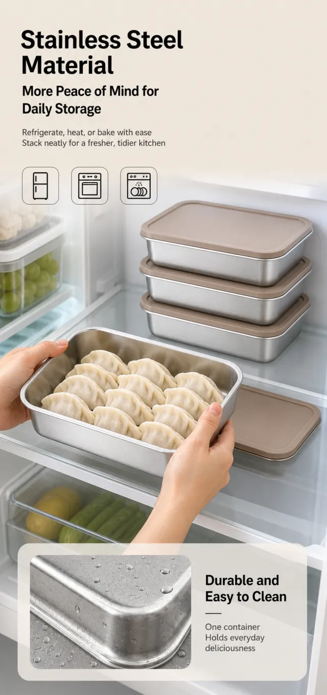
Based on the provided white-background product images, a kitchen usage poster for stainless steel fresh-keeping lunch boxes is generated.
Maintains the combined appearance of a square stainless steel box, rounded edges, and warm beige sealing cover, without branding or readable markings.
The top is light beige with blank space, aligned to the left, with two large black headings and two lines of description; The center features a bright refrigerator storage scene, with both hands holding lunch boxes filled with dumplings, with stacked containers from the same series and open lids beside them; A small rounded material card is added at the bottom to enlarge the stainless steel surface and water droplets for a close-up of easy cleaning.
Copywriting Usage:
Made of stainless steel
Everyday storage is more reassuring
It handles refrigeration, heating, and baking with ease
Stack neatly for cleaner kitchen storage
Durable and easy to clean
One box holds delicious everyday flavors
The title uses HollyGreen HeiTi Chinese Simplified with heavy fonts, and the main text is in dark gray; Text should be left blank at the top and cards at the bottom, not covering the edges of the food or lunch box. The bottom card uses a semi-transparent light gray background, without obvious text shadowing.
Icons/Labels: Use simple line art for refrigerators, ovens, and dishwashers to indicate usage scenarios, with smooth lines.
Output size: '750 x 1590px'
Avoid: Authentic brands, exaggerated material detection, hand deformities, watermarks, food deformation, readable packaging text, information overcrowding.
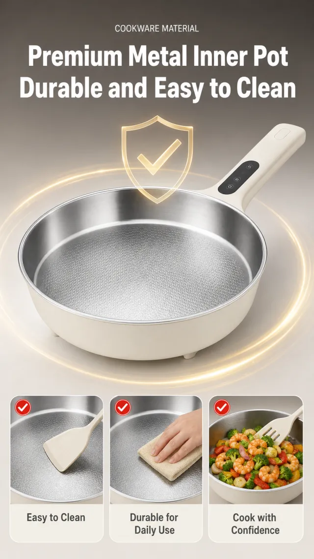
Based on the provided white-background product images, generate a stainless steel electric frying pan material display page. The product originally had no brand information, so no brand name, slogan, logo, material grade number, or decorative text were added. The image features a warm graphite gray to light gray beige background, with the top centered in bold white lettering "Quality Metal Inner Pot / Durable and Easy to Maintain," and a small line of English "COOKWARE MATERIAL" at the top. In the middle, the electric frying pan is enlarged to a four-thirds bird's-eye view, highlighting the inner pan's texture; Above the pot floats a translucent champagne gold shield wire frame and checkmark symbol, surrounded by a faint golden ring-shaped light band. At the bottom are three identical rounded image cards: a spatula lightly touches the bottom, a soft cleaning cloth wipes, and daily stir-frying vegetables. Each card has a red circle checkmark at the top left, with the cards reading "Easy to Clean," "Durable for Daily Use," and "More Confident Cooking." The title uses a heavy, modern bold font, with card instructions in medium weight sans-serif. There should be no real steel grade, inspection certification, original brand, parameter footnotes, watermarks, screenshot borders, text overflow, or obvious shadows.
Create one complete, continuous, tall Amazon A+ product-detail image for a premium 5-quart everyday cooking pot. Use a 1200px-wide natural-height vertical canvas with exactly seven outer modules. The page must read as one uninterrupted composition: modules flow through midnight-blue fields, charcoal slate counters, brushed-steel surfaces, steam, and subtle soft-copper arcs. Do not place white, cream, pale, or high-contrast horizontal separator lines between modules. Keep the bottom 5% as empty midnight-blue/slate safe background with only a faint copper arc; place no text, product, icons, people, or important objects there.
Maintain the same product identity in every module and angle: a medium-tall straight-wall cylindrical brushed-stainless-steel pot, broad rolled rim, midnight-blue lower heat-guard band, satin-steel interior with a subtle soft-copper concentric-dot pattern only on the inner base, and two symmetric upward-swept open wing-shaped side handles with steel frames, midnight-blue underside inserts, and exactly two rivets per side. When the lid appears, it is a low-domed transparent tempered-glass lid with a midnight-blue steel edge, a soft-copper horizontal bridge handle, and one steam vent. Preserve proportions and geometry; never stretch the product or convert it into a shallow wok, skillet, stockpot with loop handles, or another vessel.
Use a premium family-cooking palette of midnight blue, brushed silver, warm cream, soft copper, and charcoal slate. Create new diverse adults, new kitchens, new food staging, new diagrams, and new icons. Use strong editorial typography and dense but balanced information hierarchy. Do not include brand logos, official seals, certifications, medical claims, prices, calls to action, shopping UI, pagination controls, crop marks, module labels, placeholder strings, random characters, or extra copy.
Module 1, 17%: premium hero on a continuous slate counter in a newly designed warm family kitchen. Show the exact pot with its matching lid, gentle steam, and a family meal in the background. Typeset exactly: “SIMMER. BOIL. SERVE.”, “5 QT EVERYDAY COOKING POT”, “A balanced size for soups, pasta, sauces and slow Sunday meals.” Add four compact icons labeled exactly: “5 QT CAPACITY”, “TRI-PLY BODY”, “FLAT INDUCTION BASE”, “TEMPERED GLASS LID”.
Module 2, 14%: a wide midnight-blue cooking story with five equal visual beats and the same pot at consistent scale. Show newly staged soup, pasta, stew, sauce, and one physically plausible two-hand lift using both side handles. Typeset exactly: “ROOM FOR THE MEALS YOU MAKE MOST”, “SOUPS”, “PASTA”, “STEW”, “SAUCES”, “TWO-HANDLE LIFT”.
Module 3, 14%: a precise elegant exploded cross-section of the same pot body with aligned layers, exact handle geometry, brushed-metal callouts, and copper heat lines. Typeset exactly: “EVEN HEAT FROM BASE TO WALL”, “STAINLESS STEEL INTERIOR”, “CONTINUOUS ALUMINUM CORE”, “MAGNETIC STAINLESS EXTERIOR”.
Module 4, 13%: center the same complete pot and lid over a seamless dark slate-to-midnight-blue cooktop environment. Place five cooktop symbols on one controlled baseline without separate white cards. Typeset exactly: “ONE FLAT BASE. FIVE COOKTOPS.”, “GAS”, “INDUCTION”, “ELECTRIC”, “CERAMIC”, “HALOGEN”.
Module 5, 13%: an asymmetric editorial macro grid showing the exact double-riveted handle attachment, smooth rolled rim, midnight-blue lower band, and matching vented glass lid. Typeset exactly: “DETAILS FOR DAILY COOKING”, “DOUBLE-RIVETED SIDE HANDLES”, “SMOOTH ROLLED RIM”, “MIDNIGHT HEAT-GUARD BAND”, “VENTED GLASS LID”.
Module 6, 13%: four connected care steps on a continuous warm-cream-to-slate counter, all using the same pot with physically plausible handling. Typeset exactly: “COOK. COOL. CLEAN.”, “USE SILICONE OR WOOD UTENSILS”, “LET THE POT COOL BEFORE WASHING”, “CLEAN WITH A SOFT SPONGE”, “AVOID ABRASIVE PADS”.
Module 7, 11%: a newly designed evening dining scene with the same pot on the table, an original family composition, a closing headline, and four concise proof points. Typeset exactly: “BUILT FOR THE MEALS THAT STAY ON THE TABLE”, “5 QT FAMILY SIZE”, “TRI-PLY BODY”, “TWO-HANDLE CONTROL”, “TEMPERED GLASS LID”. End all visible content above the empty 5% safe zone.
Create one complete, continuous, tall Amazon A+ product-detail image for a premium 12-inch tri-ply stainless-steel everyday skillet. Use a 1200px-wide natural-height canvas with exactly seven outer modules. Connect all modules through graphite-stone worktops, warm sandstone walls, brushed-steel gradients, subtle champagne arcs, steam, and continuous lighting. Do not use white, cream, pale, or high-contrast horizontal separator lines or gaps. Reserve the bottom 5% as empty graphite-gray safe background with only a faint champagne arc; place no text, product, icon, person, or important object there.
Keep one exact product identity in every module and angle: wide 12-inch circular mouth, shallow body, smoothly flared walls, large flat base, fine brushed-silver exterior, low-reflective satin interior, narrow graphite-gray magnetic ring around the lower edge, and a completely smooth rivet-free inner cooking surface. The long handle is a gently upward-tilted hollow arched-ridge stainless handle with a broad triangular exterior support plate, exactly two round external rivets, a short champagne-gold oval end cap, and one hanging hole. The opposite helper handle is a short upward-swept open loop with a steel outer frame, graphite underside insert, broad exterior support plate, and exactly two round external rivets. Preserve proportions without stretching and never change it into a deep pot, wok, saucepan, double-long-handle pan, black nonstick pan, or another product.
Use a newly designed premium culinary editorial system in warm sandstone, graphite gray, brushed silver, champagne gold, and small herb-green accents. Use newly created diverse adults, kitchens, food staging, diagrams, and icons. Do not include brand logos, official seals, certifications, patents, prices, shopping UI, medical claims, module labels, crop marks, placeholders, random characters, or extra copy.
Module 1, 17%: new warm contemporary kitchen, the exact skillet on a graphite cooktop, fresh ingredients, gentle steam, and a newly created cook. Typeset exactly: “SEAR. TOSS. FINISH.”, “12 IN TRI-PLY EVERYDAY SKILLET”, “A wide cooking surface with balanced control from stovetop to table.” Add four icon labels exactly: “12 IN WIDE SURFACE”, “TRI-PLY BODY”, “FLAT INDUCTION BASE”, “TWO-HANDLE CONTROL”.
Module 2, 14%: five connected editorial cooking beats on one continuous worktop. Use the exact skillet at consistent proportions for searing, sautéing, simmering, tossing, and a physically plausible two-hand lift with one hand on each handle. Typeset exactly: “ONE PAN FOR THE MEALS IN MOTION”, “SEAR”, “SAUTÉ”, “SIMMER”, “TOSS”, “TWO-HAND LIFT”.
Module 3, 14%: elegant aligned fan/exploded section of the same pan body. Keep the three layers continuous from the flat base through the flared wall, with champagne heat lines. Typeset exactly: “EVEN HEAT ACROSS THE WHOLE PAN”, “STAINLESS STEEL INTERIOR”, “CONTINUOUS ALUMINUM CORE”, “MAGNETIC STAINLESS EXTERIOR”.
Module 4, 13%: asymmetric split view of the perfectly smooth inner wall and exterior double-rivet support plates without implying exposed inner rivets. Clearly show both handle geometries. Typeset exactly: “A SMOOTH INTERIOR. A SECURE EXTERIOR.”, “RIVET-FREE COOKING SURFACE”, “DOUBLE-RIVETED SUPPORT PLATES”, “LOW-LIFT LONG HANDLE”, “UPTURNED HELPER HANDLE”.
Module 5, 13%: four connected macro frames without white cards, showing the flared rim, graphite base ring, champagne end cap, and balanced helper handle. Typeset exactly: “CONTROL IN EVERY DETAIL”, “SMOOTH FLARED RIM”, “GRAPHITE BASE RING”, “CHAMPAGNE END CAP”, “BALANCED HELPER HANDLE”.
Module 6, 13%: three physically correct connected cooking steps using the same pan. Typeset exactly: “HOT PAN. COOL OIL.”, “PREHEAT THE EMPTY PAN”, “ADD OIL AFTER HEATING”, “START COOKING WHEN THE OIL SHIMMERS”.
Module 7, 11%: newly designed sink-side lifestyle closure using the same skillet and only gentle care actions. Typeset exactly: “COOK OFTEN. CLEAN GENTLY.”, “LET THE PAN COOL”, “WASH WITH MILD SOAP”, “USE A SOFT SPONGE”, “SOAK TO LOOSEN RESIDUE”. End all visible content above the empty bottom safe zone.
Based on the provided white-background product images, generate a high-end non-stick frying pan e-commerce detail page poster. The background features a rock-textured kitchen countertop ranging from warm brown to deep black, with a touch of moisture and soft reflections; The main pot floats at a steep angle in the upper middle of the image, with the lid tilted over the rim, clearly displaying the dark textured inside, metal body, and long handle.
Layout: On the right side, a gold, metallic circular quality badge is stacked, with a large gold display character "Ti" next to the badge and a smaller heading below "Durable and Non-stick." Below the main pot, two large sets of white digital sensors create a left-right contrast, separated by a thin vertical line in the middle; At the very bottom is a semi-transparent black rounded corner information bar, divided into three columns, each containing a white service phrase and a line of small text description.
Rewrite the copy: Quality headline "Titanium Durable / Easy to Cook"; Two groups focus on "long-term companionship" and "safe trial"; At the bottom, the three main features are "daily price protection," "fast spot shipping," and "thoughtful after-sales."
Product performance: Maintains the white background as shown in the product image of the dark gray non-stick pan, metal edges, glass lid, and black handle, allowing changes in pot curvature, lid tilt, and texture details. The product originally contains brand information, so the pot body only retains "MOCKUP" and "EMBRACE YOUR BEAUTY, UNLEASH YOUR POWER," without any other brand, model, or micro-labels.
The font is a bold, sans-serif line reminiscent of a high-end kitchenware advertisement, with large numbers or short words and ample blank space; The gold badge has smooth, reflective edges. The text does not press down on the inner texture of the pot or the handle, and the service columns are evenly aligned; No actual age date, number of days for returns or exchanges, material content, price, QR code, watermark, or screenshot elements should be displayed.
【Execution Routing | Do Not Display】
If the image-generation tool can be invoked multiple times: concatenate the sharing rules with A–F separately, execute six times, generating one 1000×1000 square image each time; do not submit all modules at once.
If only one image can be generated per invocation: set the aspect ratio to 2:3 portrait mode on the interface or via API, and avoid using Auto; a recommended size is 1200×1800. Arrange the modules in a 2-column × 3-row grid labeled A/B, C/D, and E/F, ensuring all six modules are equal in size and maintain a 1:1 proportion. If the platform enforces a 1:1 ratio, switch to an Agent-based approach or generate each module individually.
【Sharing Rules】
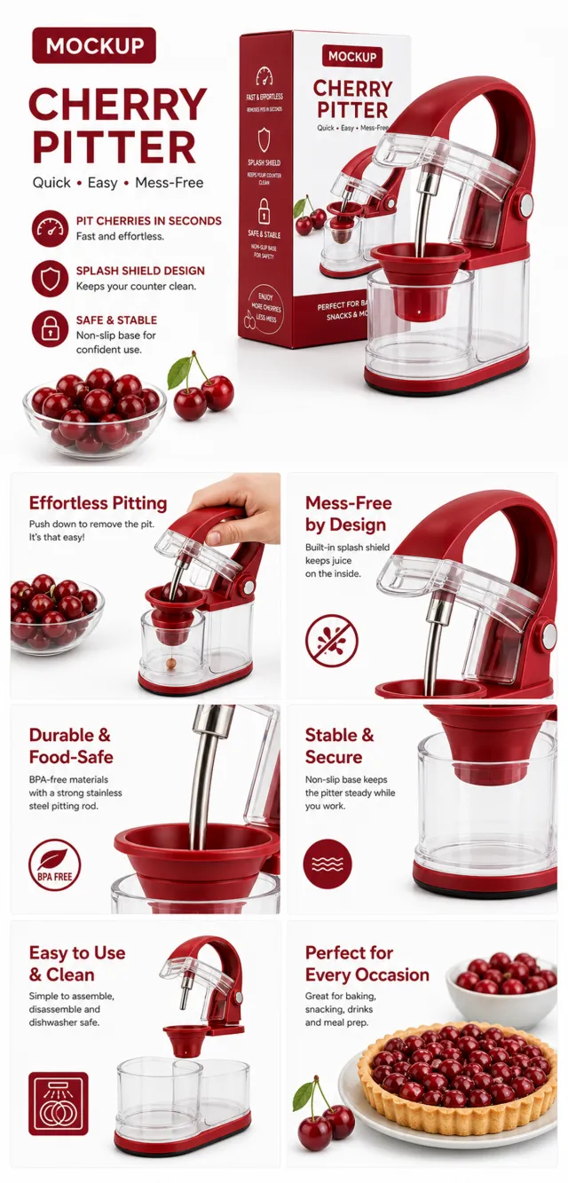
The provided product reference image serves as the sole basis for the product. Product: cherry pitter. Copywriting must be in English, with brand placeholders replaced by MOCKUP only. Visuals should follow premium commercial e-commerce photography standards and stable graphic design principles. The product’s appearance, structure, color, quantity, accessories, and relative proportions must match the reference image; products, people, icons, and props should maintain natural proportions. All essential information must remain within the safe zone, with the background extending fully to all four edges. External white borders, vertical borders on left and right, transparent fill-in borders, watermarks, contact details, social media accounts, platform information, original branding, gibberish, irrelevant content, or unverified claims regarding efficacy or specifications are prohibited. Headlines must not be displayed. A–F must not appear.
【A | Core Selling Point】Write concise English copy that succinctly conveys the theme, focusing on the core value through the full product main visual.
【B | Usage Instructions】Provide brief English copy explaining the theme, illustrating the usage process, combinations, or key operations.
【C | Applicable Scenarios】Present short English copy highlighting real-world, credible, and product-relevant usage scenarios.
【D | Functional Details】Offer concise English copy describing the theme, using close-up shots, cross-sections, or icons to clarify structural and functional details.
【E | Daily Maintenance】Provide brief English copy outlining methods for use, cleaning, storage, or maintenance.
【F | Specification List】Present concise English copy detailing materials, specifications, packaging contents, or reliable comparisons—without fabricating parameters.
Use case: product-mockup. Reference image: warm sunlit kitchen tabletop composition only. Create a clean vertical 2:3 cozy cream kitchen background with a broad light-oak table filling the lower half, a small unmarked ivory vase with a few delicate white flowers at the front left, a shallow plain white bowl at the lower edge, a soft-focus pale kitchen counter behind with two clear unbranded oil bottles, hanging cream-and-wood utensils, a simple wood cutting board, and a small orange squash in a neutral basket at right. Leave the tabletop center clear. Warm morning sunlight, soft shadows, photorealistic editorial style. Remove the top-left AI label and all text. Change object placement, vase shape, flower stems, utensil forms, food arrangement, and wood grain so it is related but not identical. No text, numbers, Chinese characters, watermark, logo, tiny edge text, border, or white margin.
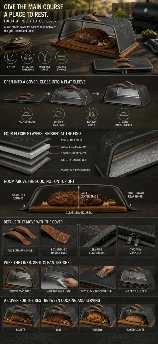
生成一张单幅、连续画布的亚马逊 A+ 详情长图,画布宽度 1200px,高度根据七个模块自然延展。产品为一款无品牌的 18×14 英寸折叠熟食静置罩:圆角矩形平面,打开后为低矮罩体;深炭灰织物外壳,外表面带低对比海松绿植物拱线,所有边缘使用连续海松绿包边;内侧为低光泽银灰反射衬里并带浅铜色压胶缝;前边与左右两边设置三边双向拉链,完整后长边作为柔性铰接;上面板外侧有两条浅铜棕织带提手和四个方形缝合端。所有模块中的产品必须保持同一结构、配色、细节与比例,不得拉伸、变形或改变拉链和提手位置。
整体采用高端户外烹饪编辑摄影与清晰技术信息图结合的视觉体系,主色为深炭灰、海松绿、柔和浅铜和银灰;使用有力度的窄体无衬线标题、清楚的正文和对齐良好的图标标签。人物、手部、食物、烤炉、砧板、厨房、餐桌与露营场景全部重新创作。相邻模块通过连续深色材质、光线、曲线和构图自然衔接,不使用白色或近白色模块分隔带,不显示模块编号、像素标记、轮播、播放、按钮或购物界面。
模块 1 约占 18%。新设计的傍晚户外烤制场景,低矮罩体打开并跨在装有熟制烤肉的矩形砧板上,侧翼与砧板边缘接触,罩体中央在食物上方保持净空;一件闭合平套状态仅作为次要收纳提示。文字必须准确为:
GIVE THE MAIN COURSE A PLACE TO REST.
FOLD-FLAT INSULATED FOOD COVER
A low-profile cover for cooked food between the grill, board and table.
四个紧凑图标标签:
18 × 14 IN
REFLECTIVE INNER LINER
THREE-SIDE ZIPPER
FOLD-FLAT STORAGE
模块 2 约占 14%。从左到右展示同一产品由平套、拉开三边拉链并展开侧翼、到稳定低罩的三阶段变化,清楚呈现后侧铰接边和拉链路径。文字必须准确为:
OPEN INTO A COVER. CLOSE INTO A FLAT SLEEVE.
LOW TENT PROFILE
FLEXIBLE REAR HINGE
TWO-WAY ZIPPER
ALIGNED CARRY HANDLES
模块 3 约占 14%。展示高级、机械合理的边缘拆层图,外到内严格为四层,并显示连续包边。文字必须准确为:
FOUR FLEXIBLE LAYERS, FINISHED AT THE EDGE
WOVEN OUTER SHELL
CLOSED-CELL INSULATION
FLEXIBLE SUPPORT LAYER
REFLECTIVE INNER LINER
CONTINUOUS EDGE BINDING
模块 4 约占 13%。使用产品侧剖面覆盖在砧板与熟制烤肉上方,以箭头说明罩体中央净空、侧翼与砧板接触、后长边铰接和服务区域;罩体不得压在食物上。文字必须准确为:
ROOM ABOVE THE FOOD, NOT ON TOP OF IT
RAISED CENTER SPACE
BOARD-EDGE CONTACT
FULL-LENGTH REAR HINGE
CLEAR SERVING AREA
模块 5 约占 13%。四格局部细节:两条外侧提手、方形缝合端、海松绿包边、两个拉链头。文字必须准确为:
DETAILS THAT MOVE WITH THE COVER
TWO EXTERIOR HANDLES
BOX-STITCHED HANDLE ENDS
SEA-PINE EDGE BINDING
TWO-WAY ZIP PULLS
模块 6 约占 13%。新设计的清洁流程,依次表现先移除食物、擦拭银灰内衬、局部清洁外壳、罩体完全打开后自然晾干。文字必须准确为:
WIPE THE LINER. SPOT CLEAN THE SHELL.
REMOVE FOOD FIRST
WIPE THE INNER LINER
SPOT CLEAN THE OUTER SHELL
AIR DRY FULLY OPEN
模块 7 约占 10%。四格统一风格的熟食应用场景,产品保持相同低罩结构,分别对应烤肉、肋排、禽类和烤制面包。文字必须准确为:
A COVER FOR THE REST BETWEEN COOKING AND SERVING
ROASTS
RIBS
POULTRY
BAKED LOAVES
在完整第七模块之后保留约占整图 5% 的底部安全区,仅延续深炭灰桌面纹理与非常淡的海松绿植物拱线;安全区中不放文字、产品、食物、人物、图标或任何重要信息。
禁止品牌、Logo、MOCKUP 字样、权威认证、食品安全保证、绝对防水/保温/耐用结论、竞品对比、价格和乱码;禁止反射内衬变成松散铝箔、拉链跨过后铰接边、提手出现在内侧、侧翼无支撑悬空、闭合产品鼓包、层级错序、产品变形拉伸、重复标题或额外微文案。确保全部英文拼写正确、清楚可读,并为底部内容保留安全边距。
Create one complete continuous tall Amazon A+ product-detail image for a dual-surface kitchen prep board. Use a 1200px-wide natural-height canvas with exactly seven outer modules. Connect the page through deep-indigo countertops, warm-sand plaster, terracotta curves, brushed-steel reflections, and continuous low-angle light. Do not use white, near-white, cream, or high-contrast horizontal separator lines or gaps. Reserve the bottom 5% as empty deep-indigo safe background with two faint terracotta arcs; place no text, board, food, knife, hand, icon, or important object there.
Keep one exact product identity throughout: 16 × 11 inch thin rounded rectangle, rounded rectangular through-handle near the left short side, continuous deep-indigo elastomer frame around the perimeter and inside the handle, and slightly reinforced corners. Side A is low-reflective fine-brushed stainless steel with exactly one small deep-indigo circular marker near the lower-right corner and no groove or grater. Side B is warm-sand textured PP with one deep terracotta-orange perimeter juice groove and one pale-indigo oval fine-hole grating area near lower right inside the groove. The sealed layer order is stainless-steel surface, dark-gray rigid composite core, textured PP surface, captured by the continuous indigo frame. Never mix Side A and Side B features on one face, stretch the board, turn it into a tray, or add loose tape.
Use a newly designed modern culinary editorial system in deep indigo, warm sand, terracotta, brushed steel, and charcoal. Create new diverse hands/adults, kitchens, foods, knives, diagrams, and icons. No brands, seals, certifications, titanium/antibacterial/scratch-proof/knife-safe/zero-residue claims, prices, shopping UI, module labels, crop marks, random characters, or extra copy.
Module 1, 18%: new contemporary kitchen, exact Side A board as hero with Side B visible only in a controlled flip inset. Typeset exactly: “FLIP THE BOARD. CHANGE THE TASK.”, “DUAL-SURFACE PREP BOARD”, “Two distinct work surfaces in one low-profile kitchen board.” Add icons: “16 × 11 IN”, “STAINLESS-STEEL SIDE”, “TEXTURED PP SIDE”, “FULL-PERIMETER EDGE”.
Module 2, 14%: one board shown in coordinated Side A and Side B views with unambiguous labels. Typeset exactly: “ONE BOARD. TWO WORKING FACES.”, “BRUSHED STEEL PREP SIDE”, “TEXTURED PP PREP SIDE”, “SIDE MARKER”, “EASY FLIP HANDLE”.
Module 3, 14%: Side B top view with produce kept within the board, plus accurate groove and grater macros. Typeset exactly: “KEEP JUICES AND SMALL PREP IN THE BOARD”, “DEEP PERIMETER GROOVE”, “INTEGRATED GRATING AREA”, “CATCH AREA”, “CLEAR CENTER ZONE”.
Module 4, 13%: precise aligned exploded cross-section with every layer and the indigo frame. Typeset exactly: “THREE LAYERS, SEALED AT THE EDGE”, “STAINLESS-STEEL WORK SURFACE”, “RIGID COMPOSITE CORE”, “TEXTURED PP WORK SURFACE”, “CONTINUOUS EDGE FRAME”.
Module 5, 13%: four connected shape-detail macros without pale cards. Typeset exactly: “DETAILS BUILT INTO THE SHAPE”, “THROUGH-HANDLE”, “ROUNDED CORNERS”, “LOW-PROFILE EDGE”, “REINFORCED CORNER BUMPERS”.
Module 6, 13%: four physically plausible connected care steps. Typeset exactly: “RINSE. WIPE. STORE.”, “RINSE AFTER USE”, “WASH WITH MILD SOAP”, “DRY BOTH SIDES”, “STORE UPRIGHT”.
Module 7, 10%: four new prep scenes preserving exact board geometry. Typeset exactly: “A BOARD FOR THE PREP THAT CHANGES THROUGH THE DAY”, “FRUIT”, “VEGETABLES”, “BREAD”, “PROTEIN PREP”. End all visible content above the empty bottom safe zone.