Moisturize Creative Inspiration

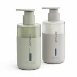
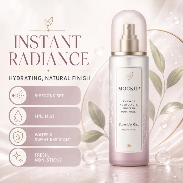
## Use case Advertising and marketing. ## Asset type Amazon secondary product benefit image, 1:1 aspect ratio. ## Input image Use `700_product.png` as the sole product-appearance reference and `700_amazon.jpg` as the approved visual reference. ## Product fidelity Preserve exactly the input product's colors, materials, construction, patterns, quantity, accessories, and package relationships; do not invent or remove components. ## Primary request Reproduce the approved premium Amazon benefit image for SKU 700, retaining its product-specific visual identity. ## Source design to preserve Preserve the approved image's palette, background atmosphere, graphic motifs, composition, information modules, and visual rhythm; do not replace it with a generic template. ## Subject and composition Keep the complete product dominant and unobstructed, with at least 6% safe margin; preserve the approved model-worn composition when the product is apparel. ## Scene and graphics Retain the category-appropriate gradients, lines, icons, textures, ingredient or material details, and accents visible in the approved design. ## Typography system Use a category-appropriate display face for the title and a highly legible complementary face for body copy; maintain clear differences in size, weight, alignment, and color. ## Adaptive layout Measure the available space first, wrap by meaning, and adapt title scale, line count, icon/text grid, spacing, and module size to the actual English copy while preserving the approved visual rhythm. ## Exact visible text (Text (verbatim)) - `MOCKUP` - `一喷透亮` - `水润不假白` - `5秒成膜` - `细腻雾感` - `防水防汗` - `清爽不黏腻` ## Offer filtering Omit prices, currencies, discounts, price comparisons, coupons, gifts, limited-time wording, savings claims, purchase calls to action, and all other promotional messaging. Do not replace them with generic offers. ## Recommended information hierarchy Lead with the title and core benefit, followed by three concise feature groups and, only when relevant, one objective specification or set quantity. Flexible grouping is allowed without changing meaning. ## Constraints English is the only visible language. Keep the product faithful, complete, sharp, mobile-readable, and free of watermarks and invented brands. Preserve the exact visible text listed above. ## Avoid Garbled or misspelled text, missing core copy, translated visible copy, text overlap, rigid generic typography, distorted products, wrong accessory counts, invented claims, unrelated props, low-resolution icons, clutter, and promotional language.
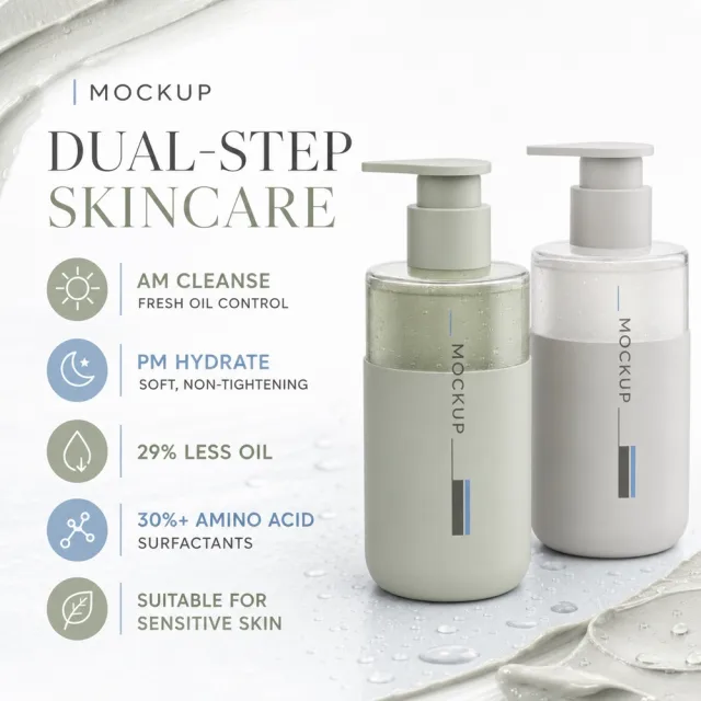
## Use case Advertising and marketing. ## Asset type Amazon secondary product benefit image, 1:1 aspect ratio. ## Input image Use `693_product.png` as the sole product-appearance reference and `693_amazon.jpg` as the approved visual reference. ## Product fidelity Preserve exactly the input product's colors, materials, construction, patterns, quantity, accessories, and package relationships; do not invent or remove components. ## Primary request Reproduce the approved premium Amazon benefit image for SKU 693, retaining its product-specific visual identity. ## Source design to preserve Preserve the approved image's palette, background atmosphere, graphic motifs, composition, information modules, and visual rhythm; do not replace it with a generic template. ## Subject and composition Keep the complete product dominant and unobstructed, with at least 6% safe margin; preserve the approved model-worn composition when the product is apparel. ## Scene and graphics Retain the category-appropriate gradients, lines, icons, textures, ingredient or material details, and accents visible in the approved design. ## Typography system Use a category-appropriate display face for the title and a highly legible complementary face for body copy; maintain clear differences in size, weight, alignment, and color. ## Adaptive layout Measure the available space first, wrap by meaning, and adapt title scale, line count, icon/text grid, spacing, and module size to the actual English copy while preserving the approved visual rhythm. ## Exact visible text (Text (verbatim)) - `Early Clean Oil, Clear and Refreshing` - `Night Moisturizing, Hydrating and Non-Tightening` - `Oil Reduction by 29%` - `30+% Ammonia Acid Surface Activity` - `Suitable for Sensitive Skin` - `Dual-Step Skincare` ## Offer filtering Omit prices, currencies, discounts, price comparisons, coupons, gifts, limited-time wording, savings claims, purchase calls to action, and all other promotional messaging. Do not replace them with generic offers. ## Recommended information hierarchy Lead with the title and core benefit, followed by three concise feature groups and, only when relevant, one objective specification or set quantity. Flexible grouping is allowed without changing meaning. ## Constraints English is the only visible language. Keep the product faithful, complete, sharp, mobile-readable, and free of watermarks and invented brands. Preserve the exact visible text listed above. ## Avoid Garbled or misspelled text, missing core copy, translated visible copy, text overlap, rigid generic typography, distorted products, wrong accessory counts, invented claims, unrelated props, low-resolution icons, clutter, and promotional language.
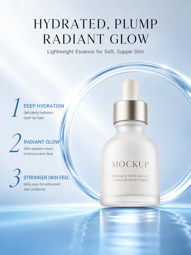
Based on the provided white-background product images, generate a detailed e-commerce poster for the Hydrating Brightening Essence. Product Features: Maintains the matte white dropper essence bottle, silver shoulder design, and minimalist curved bottle body; The main body includes a MOCKUP and slogan, fully preserved, without adding numbers, specifications, or other text. Layout replica: A tech skincare background ranging from ice white to deep sea blue, with a centered heading at the top, a transparent glass ring wrapping around the product below, and a blue reflective countertop at the bottom. On the left, from top to bottom, there are three groups of large selling points numbered 1, 2, and 3, aligned with the numbering and title, with fine text within two lines. Font and text layout: Main title uses slim, high-contrast serif Chinese in black; Numbering uses a large blue slanted serif line; The selling point is that the title is blue medium weight, the main text is dark gray in small text, the left sidebar width does not exceed 36% of the screen, and the product is placed in the center on the right. Copywriting Usage: Moist and full, bright and glossy Lightweight Essence Provides skin with a soft and moisturized feel 1. Deep hydration and hydration: Delicate water sensation with layered absorption 2. Radiant radiance: Skin appears more translucent 3. Strengthens skin resilience Daily care with enhanced support Graphic elements: glass rings, soft blue light, and reflections on the water surface keep things simple, without unnecessary icons. Avoid original brands, exaggerated efficacy data, footnotes, watermarks, excessive mirror reflections, and text covering the product.