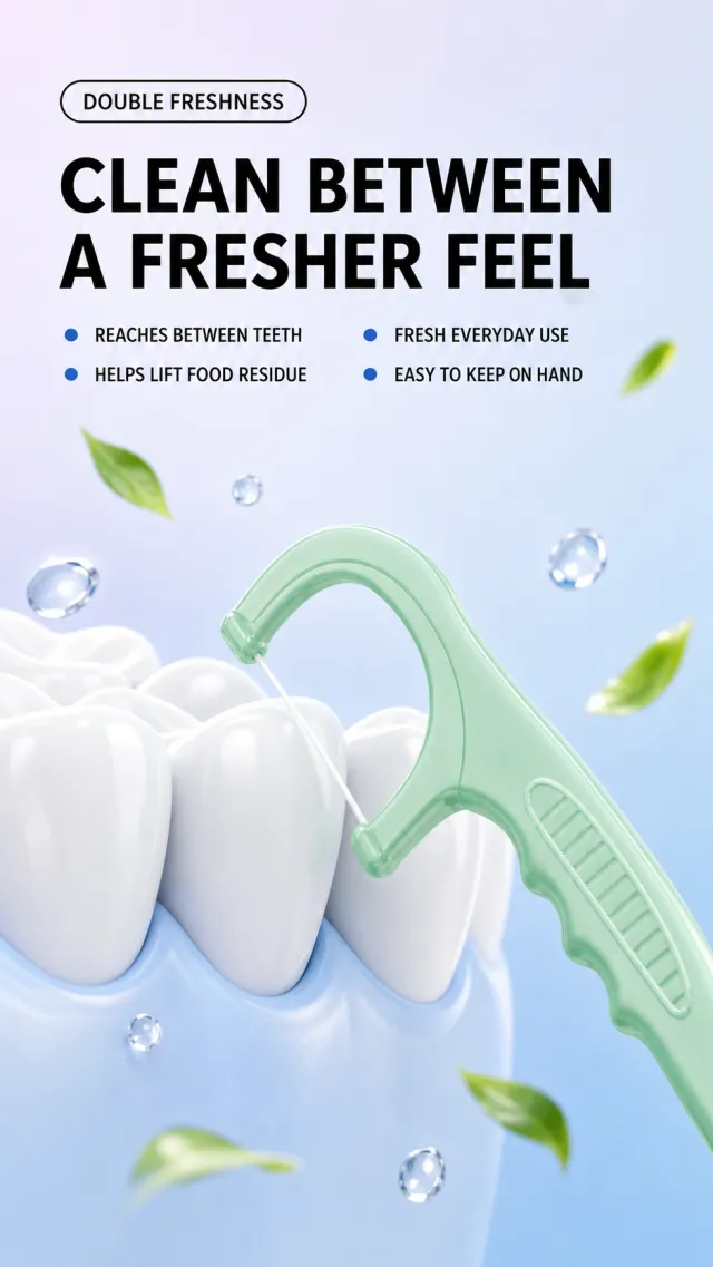
Based on the provided white-background product image, generate a dental floss pick detail page poster. The background features a soft gradient from light lavender white to light blue. On the top left, a fine black outlined rounded label labeled "Double Fresh" is placed first, followed by two lines of thick black sans-serif titled "Fresh and Clean / Lighter Breath." Below the title, there are two rows of small selling points: the left blue dot "Deep into tooth gaps / removes food residue," and the right blue dot "Fresh Experience / Everyday Use."
A set of rounded white teeth is placed slightly lower in the middle, with a mint-green floss pick inserted diagonally between the two teeth, making the transparent floss clearly visible; A small amount of transparent water droplets and abstract green leaf fragments float around the area, creating a fresh feel. Retains the curved floss rack, semi-transparent green handle, and grip texture, allowing adjustment of tooth angle to the product. No brand information, no new brand or slogan. Clear and light text, products not obscured by titles; Avoid original images with snowflake elements, claims of specific antibacterial properties, small footnotes, watermarks, and screenshot borders.
Asset type: Amazon secondary product benefit image, 1:1 aspect ratio.
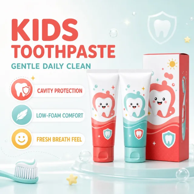
Create a polished benefit infographic for the supplied children’s toothpaste set. Use `1128_product.png` as the product reference; preserve the coral-red tube, mint-blue tube, matching carton, flip-top caps and friendly tooth illustrations. Keep the set on the right, carton behind and tubes in front.
Use a warm-white-to-mint gradient with restrained tooth-shield, bubble and star motifs. Retain a refined, playful children’s oral-care design language with flexible editorial typography—not rigid cards.
Information-volume cap: render exactly one title, one core benefit and three feature components. Do not add any other generated copy, slogan, badge, price or promotion.
Text (verbatim):
```
KIDS TOOTHPASTE
GENTLE DAILY CLEAN
CAVITY PROTECTION
LOW-FOAM COMFORT
FRESH BREATH FEEL
```
Avoid: extra products, altered packaging, watermarks, typoed or overlapping text, clipped copy, price or promotional information.
## Use case
Advertising and marketing.
## Asset type
Amazon secondary product benefit image, 1:1 aspect ratio.
## Input image
Use `692_product.png` as the sole product-appearance reference and `692_amazon.jpg` as the approved visual reference.
## Product fidelity
Preserve exactly the input product's colors, materials, construction, patterns, quantity, accessories, and package relationships; do not invent or remove components.
## Primary request
Reproduce the approved premium Amazon benefit image for SKU 692, retaining its product-specific visual identity.
## Source design to preserve
Preserve the approved image's palette, background atmosphere, graphic motifs, composition, information modules, and visual rhythm; do not replace it with a generic template.
## Subject and composition
Keep the complete product dominant and unobstructed, with at least 6% safe margin; preserve the approved model-worn composition when the product is apparel.
## Scene and graphics
Retain the category-appropriate gradients, lines, icons, textures, ingredient or material details, and accents visible in the approved design.
## Typography system
Use a category-appropriate display face for the title and a highly legible complementary face for body copy; maintain clear differences in size, weight, alignment, and color.
## Adaptive layout
Measure the available space first, wrap by meaning, and adapt title scale, line count, icon/text grid, spacing, and module size to the actual English copy while preserving the approved visual rhythm.
## Exact visible text (Text (verbatim))
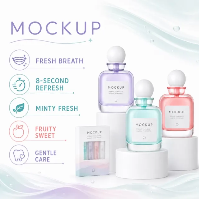
- `MOCKUP`
- `Source Fresh Breath`
- `8s Refreshing Good State`
- `Buy 3 Get 1 Free Portable Strip`
- `Minty Fresh`
- `Fruity Sweet`
- `Gentle and Non-Irritating`
## Offer filtering
Omit prices, currencies, discounts, price comparisons, coupons, gifts, limited-time wording, savings claims, purchase calls to action, and all other promotional messaging. Do not replace them with generic offers.
## Recommended information hierarchy
Lead with the title and core benefit, followed by three concise feature groups and, only when relevant, one objective specification or set quantity. Flexible grouping is allowed without changing meaning.
## Constraints
English is the only visible language. Keep the product faithful, complete, sharp, mobile-readable, and free of watermarks and invented brands. Preserve the exact visible text listed above.
## Avoid
Garbled or misspelled text, missing core copy, translated visible copy, text overlap, rigid generic typography, distorted products, wrong accessory counts, invented claims, unrelated props, low-resolution icons, clutter, and promotional language.
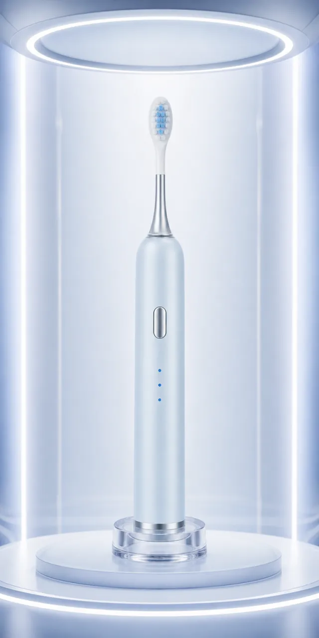
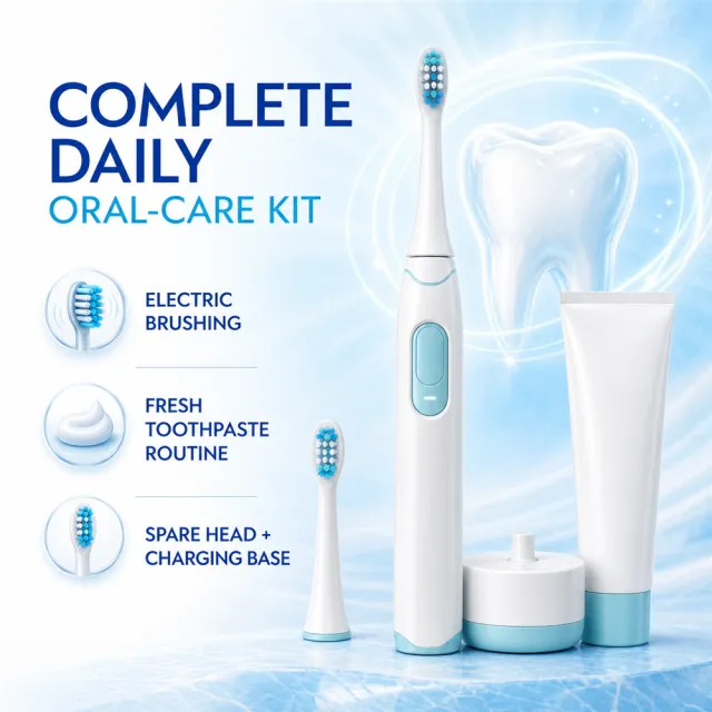
Use the attached white‑background product image as the sole reference; the product’s appearance must be strictly identical. Generate a high‑end personal‑care appliance commercial photography scene: showcase this ice‑blue and white sonic electric toothbrush, from the brush head to the base of the handle, fully and clearly upright within an ice‑blue vertical light chamber, set off by a transparent charging base, a redesigned silver‑white column, and softly glowing edge accents.
The product’s slender, light‑ice‑blue matte handle, rounded shoulders and base, silver metal ring at the bottom, long oval silver buttons on the front, three vertically arranged blue indicator lights, a flared silver neck extending upward, a slender white shaft, a white oval brush head, and the white–light‑blue segmented bristles—along with all structural proportions—must match the reference image exactly; no redesigns, additions, deletions, or simplifications are permitted. The main subject should be positioned centrally and fully visible, with natural, believable contour lighting, metallic reflections, and contact shadows.
No brand logos, text, slogans, watermarks, human figures, hands, toothpaste, packaging, other products, or duplicate items may appear in the image.
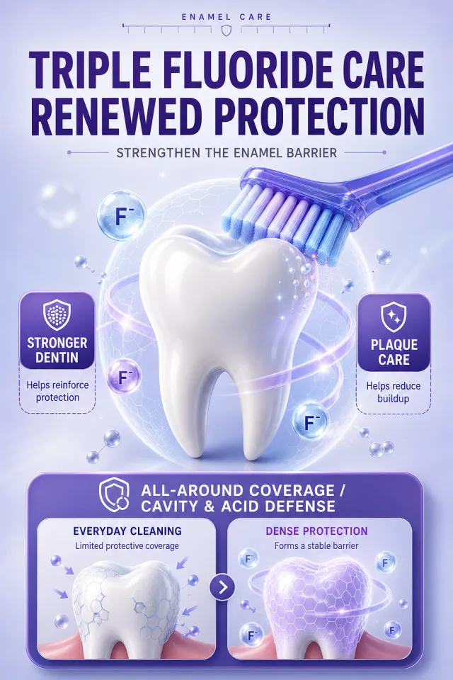
Based on scenario descriptions, generate a poster for an e-commerce detail page.
Product Performance:
- Do not display toothpaste packaging or brand information; It features a clean, three-dimensional tooth and a purple-blue toothbrush as the main features.
- Tooth protection mechanisms are represented using translucent mesh, mineral ion spheres, wrapping ribbons, and soft light, without using real brands, drug labels, minimal experimental parameters, or watermarks.
Layout Replica:
- Vertical light lavender blue background, topped with a narrow English auxiliary text and minimalist scale decoration, with two main headings and one subheading in the middle.
- The 3D teeth are placed in the center of the screen, with a toothbrush entering diagonally from the upper right; On each side, there is a rounded purple selling point label and a small instruction box.
- The bottom features a large purple rounded corner information area, with two horizontal comparison cards inside, highlighting the difference between standard protection and enhanced protection.
Fonts and typography:
- Font Style: Bold black modern sans serif-line title, smooth sans-serif label font, English is concise narrow sans-serific.
- The main title occupies about 84% of the screen width, with two centered lines and very heavy font; The subtitle should be centered, with font size about 42% of the main title.
- Purple labels use white text, instructions in the box use dark gray main text, and the text does not cover teeth or toothbrushes.
Copywriting Usage:
- English auxiliary word: ENAMEL CARE
- Main Title: Fluorine Renewal 3 Layers of Stable Protection
- Subtitle: Strengthening the Enamel Barrier
- Left label: Strong dentin
- Left side instructions: helps consolidate protection
- Right label: Clean dental plaque
- Right side instructions: Reduces adhesion for greater peace of mind
- Bottom Title: All-Round Wrapping Mothproof, Anti-Moth, and Acid-Resistant
- Left card: limited daily cleaning / protective coverage
- Right Card: Dense protection / forms a solid barrier
Graphic elements:
- Use transparent ion spheres, simple shield icons, fine dashed instruction boxes, and rounded corner cards; All edges are smooth and free of serrations.
Avoid: Tooth horror, medical promises, garbled text, low-definition icons, duplicated text, real brands, screenshot edges, and tiny footnotes.
【Output Rules | Do Not Display】
Generate only one 1000×1000, 1:1 Amazon Listing secondary image. Collages, six-grid layouts, multi-card grids, or multiple images are prohibited.
【Sharing Rules】
Use the provided product reference image as the sole product basis. Product: English white-and-aqua electric oral-care kit. Copywriting must preserve the source image's main language; brand placeholders should use MOCKUP only. Visuals should feature ice blue and white tones. The product’s appearance, structure, colors, quantity, accessories, and relative proportions must match the reference image exactly. Products, figures, icons, and props must maintain natural proportions. All essential information must remain within the safe zone, with the background extending fully to all four edges. External white borders, vertical borders on left and right, transparent edge fillers, watermarks, contact details, social media accounts, platform information, original branding, gibberish, irrelevant content, or unverified claims regarding efficacy or specifications are strictly prohibited. Headlines must not be displayed.
【Image Composition】
Create an Amazon secondary listing image at 1000 × 1000 using the redesigned product master as the definitive product reference. Employ a single integrated square composition featuring a dominant product hero, balanced copy hierarchy, generous safe margins, and no collage grid. Use a polished ice blue and white commercial style with crisp, legible typography and accurate product proportions. Rewrite copy only: COMPLETE DAILY ORAL-CARE KIT; ELECTRIC BRUSHING; FRESH TOOTHPASTE ROUTINE; SPARE HEAD + CHARGING BASE. Preserve the source's main language and avoid copying source sentences verbatim.
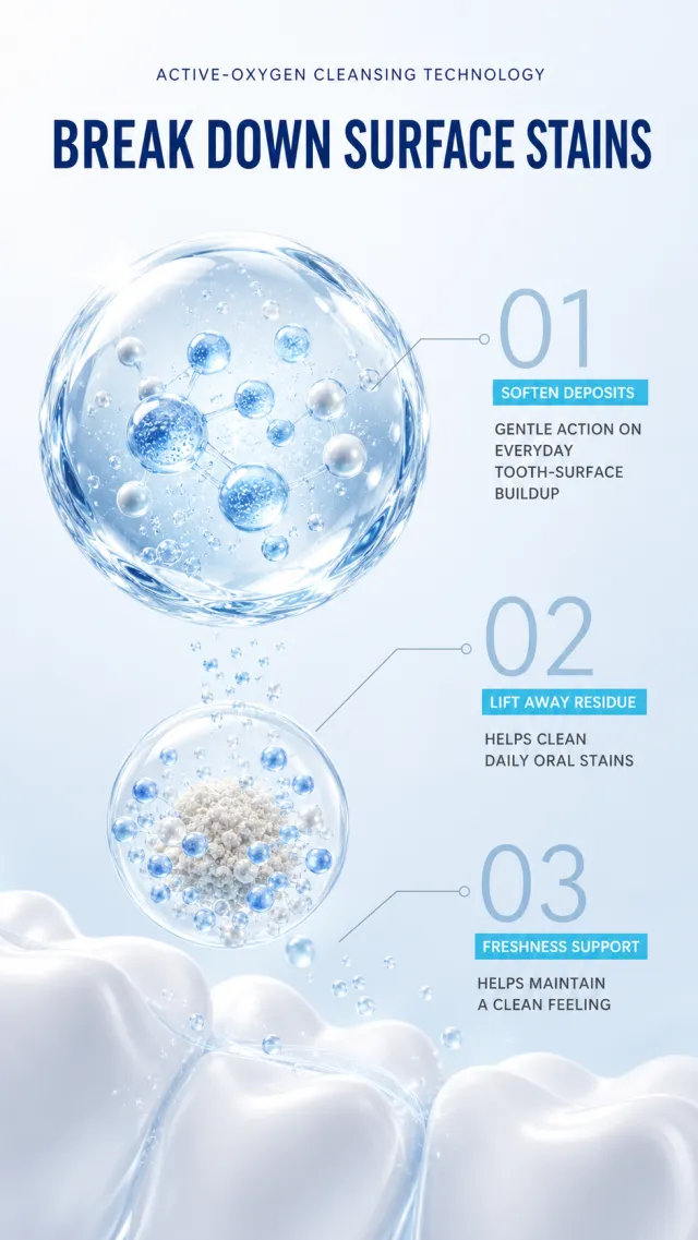
Generate an oral cleaning technology poster that does not require the product itself. The background features a soft space from light ice blue to white, with abstract white tooth curves at the bottom. Centered at the top are the subheading "Oxygen Clean Technology" and the main title "Dismantling Toothstains." The title uses a fresh modern sans-serif line, with the main title dark blue and slightly bold. In the center of the image, an enlarged transparent hydrogel bubble serves as the visual focal point, with blue-and-white active microbeads and delicate water glow inside the bubble; A smaller bubble is placed underneath, showing that the particles gradually disperse around the sediment.
On the right side, from top to bottom, three pieces of information are connected by fine gray-blue threads: 01 "Deeply softens / Gently acts on tooth surface attachments," 02 "Removes residue / Cleans everyday oral stains," 03 "Freshness protection / helps maintain a clean feeling." The serial number is large and light, the label uses a slender cyan blue block, and the main text is dark gray. Overall, it is lightweight, clean, and highly scientific; Avoid dental diseases, medical treatment commitments, original brands, parameter footnotes, watermarks, and screenshot margins.
## Use case
Advertising and marketing.
## Asset type
Amazon secondary product benefit image, 1:1 aspect ratio.
## Input image
Use `702_product.png` as the sole product-appearance reference and `702_amazon.jpg` as the approved visual reference.
## Product fidelity
Preserve exactly the input product's colors, materials, construction, patterns, quantity, accessories, and package relationships; do not invent or remove components.
## Primary request
Reproduce the approved premium Amazon benefit image for SKU 702, retaining its product-specific visual identity.
## Source design to preserve
Preserve the approved image's palette, background atmosphere, graphic motifs, composition, information modules, and visual rhythm; do not replace it with a generic template.
## Subject and composition
Keep the complete product dominant and unobstructed, with at least 6% safe margin; preserve the approved model-worn composition when the product is apparel.
## Scene and graphics
Retain the category-appropriate gradients, lines, icons, textures, ingredient or material details, and accents visible in the approved design.
## Typography system
Use a category-appropriate display face for the title and a highly legible complementary face for body copy; maintain clear differences in size, weight, alignment, and color.
## Adaptive layout
Measure the available space first, wrap by meaning, and adapt title scale, line count, icon/text grid, spacing, and module size to the actual English copy while preserving the approved visual rhythm.
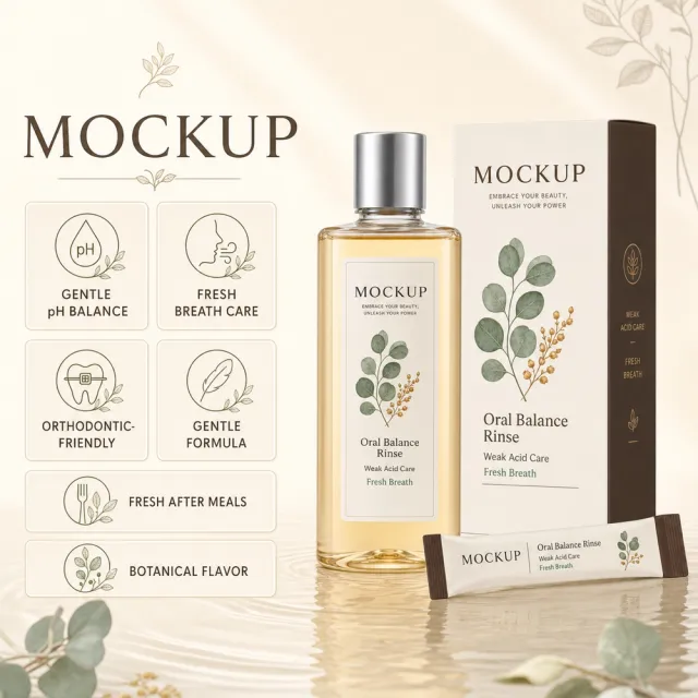
## Exact visible text (Text (verbatim))
- `MOCKUP`
- `弱酸平衡`
- `清新口气护理`
- `正畸可用`
- `温和不刺激`
- `饭后随时清爽`
- `植萃口感`
## Offer filtering
Omit prices, currencies, discounts, price comparisons, coupons, gifts, limited-time wording, savings claims, purchase calls to action, and all other promotional messaging. Do not replace them with generic offers.
## Recommended information hierarchy
Lead with the title and core benefit, followed by three concise feature groups and, only when relevant, one objective specification or set quantity. Flexible grouping is allowed without changing meaning.
## Constraints
English is the only visible language. Keep the product faithful, complete, sharp, mobile-readable, and free of watermarks and invented brands. Preserve the exact visible text listed above.
## Avoid
Garbled or misspelled text, missing core copy, translated visible copy, text overlap, rigid generic typography, distorted products, wrong accessory counts, invented claims, unrelated props, low-resolution icons, clutter, and promotional language.
【Output Rules | Do Not Display】
Generate only one 1000×1000, 1:1 Amazon Listing secondary image. Collage images, six-grid layouts, multi-card grids, or multiple scenes are prohibited.
【Sharing Rules】
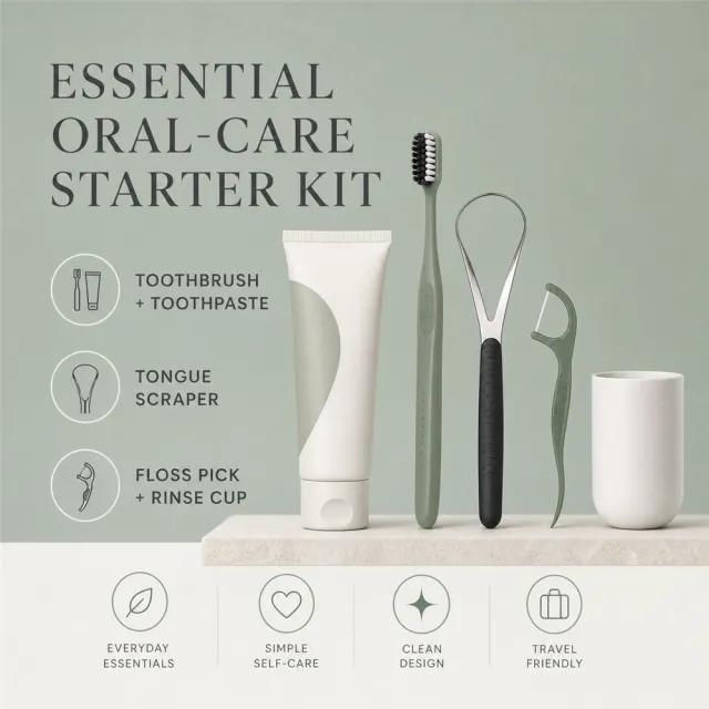
Use the provided product reference image as the sole product basis. Product: English sage oral-care starter kit. Copywriting must preserve the source image's main language; brand placeholders should use MOCKUP only. Visuals should incorporate sage, cream, and charcoal tones. The product’s appearance, structure, colors, quantity, accessories, and relative proportions must match the reference image exactly. Maintain natural proportions for products, figures, icons, and props. Ensure all essential information remains within the safe zone, with the background extending fully to all four edges. Prohibit white borders around the image, vertical borders on left and right sides, transparent edge fills, watermarks, contact details, social media accounts, platform information, original branding, gibberish, irrelevant content, or unverified claims regarding efficacy or specifications. Titles must not be displayed.
【Image Composition】
Create an Amazon secondary listing image at 1000 × 1000, using the redesigned product master as the definitive product reference. Employ a single, integrated square composition featuring a dominant product hero, balanced copy hierarchy, generous safe margins, and no collage grid. Utilize a polished commercial style in sage, cream, and charcoal, with crisp, legible typography and accurate product proportions. Rewrite copy only: ESSENTIAL ORAL-CARE STARTER KIT; TOOTHBRUSH + TOOTHPASTE; TONGUE SCRAPER; FLOSS PICK + RINSE CUP. Preserve the source's main language and avoid verbatim copying of source sentences.
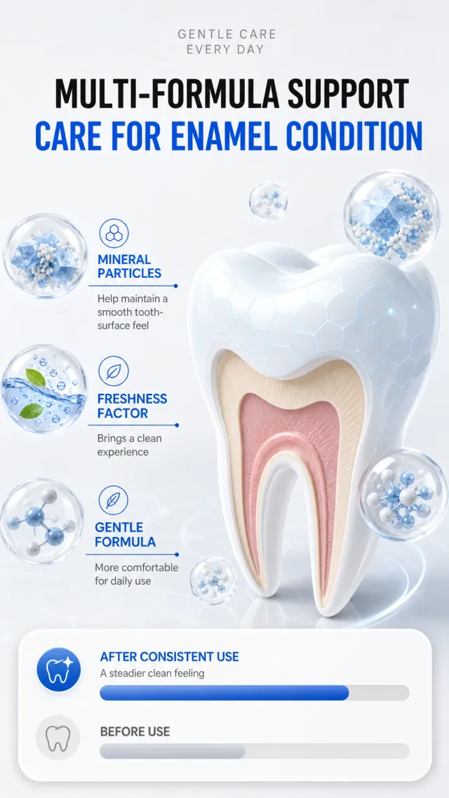
Generate a poster of the toothpaste repair formula principle, without the need for the entire product body. The background is a refreshing light gray-white, with the top labeled "Gentle Repair / Daily Care" in light gray lettering, and the lower part titled "Multiple Formulas Synergistic / Protecting Enamel Status" in black and bright blue bold sans-serific. On the right side of the middle is an enlarged vertical 3D diagram of a tooth: the outer layer of white enamel with a pale blue hexagonal light pattern, while the inner layer is a gentle layer of beige and light powder structure; Transparent small bubbles float around it, containing blue-white abstract mineral particles.
On the left, the three vertical ingredient directions are: "Mineral particles / helps maintain tooth smoothness," "Freshening factor / provides a clean experience," and "Gentle formula / more comfortable for daily use." At the bottom, there's a white rounded contrast area, with two progressive bars—one blue and one light gray—representing "after a period of use / more stable cleanliness" and "before use." The overall sense of technology is restrained, with no percentage references, medical treatments, caries prevention guarantees, original ingredient names, footnotes, or watermarks.
## Use case
Advertising and marketing.
## Asset type
Amazon secondary product benefit image, 1:1 aspect ratio.
## Input image
Use `705_product.png` as the sole product-appearance reference and `705_amazon.jpg` as the approved visual reference.
## Product fidelity
Preserve exactly the input product's colors, materials, construction, patterns, quantity, accessories, and package relationships; do not invent or remove components.
## Primary request
Reproduce the approved premium Amazon benefit image for SKU 705, retaining its product-specific visual identity.
## Source design to preserve
Preserve the approved image's palette, background atmosphere, graphic motifs, composition, information modules, and visual rhythm; do not replace it with a generic template.
## Subject and composition
Keep the complete product dominant and unobstructed, with at least 6% safe margin; preserve the approved model-worn composition when the product is apparel.
## Scene and graphics
Retain the category-appropriate gradients, lines, icons, textures, ingredient or material details, and accents visible in the approved design.
## Typography system
Use a category-appropriate display face for the title and a highly legible complementary face for body copy; maintain clear differences in size, weight, alignment, and color.
## Adaptive layout
Measure the available space first, wrap by meaning, and adapt title scale, line count, icon/text grid, spacing, and module size to the actual English copy while preserving the approved visual rhythm.
## Exact visible text (Text (verbatim))
- `MOCKUP`
- `Live Exclusive`
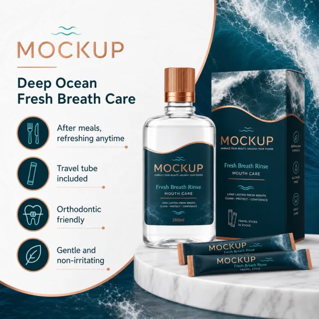
- `Deep Ocean Fresh Breath Care`
- `After meals, refreshing anytime`
- `Travel tube included`
- `Orthodontic friendly`
- `Gentle and non-irritating`
## Offer filtering
Omit prices, currencies, discounts, price comparisons, coupons, gifts, limited-time wording, savings claims, purchase calls to action, and all other promotional messaging. Do not replace them with generic offers.
## Recommended information hierarchy
Lead with the title and core benefit, followed by three concise feature groups and, only when relevant, one objective specification or set quantity. Flexible grouping is allowed without changing meaning.
## Constraints
English is the only visible language. Keep the product faithful, complete, sharp, mobile-readable, and free of watermarks and invented brands. Preserve the exact visible text listed above.
## Avoid
Garbled or misspelled text, missing core copy, translated visible copy, text overlap, rigid generic typography, distorted products, wrong accessory counts, invented claims, unrelated props, low-resolution icons, clutter, and promotional language.
## Use case
Advertising and marketing.
## Asset type
Amazon secondary product benefit image, 1:1 aspect ratio.
## Input image
Use `1112_product.png` as the sole product-appearance reference and `1112_amazon.jpg` as the approved visual reference.
## Product fidelity
Preserve exactly the input product's colors, materials, construction, patterns, quantity, accessories, and package relationships; do not invent or remove components.
## Primary request
Reproduce the approved premium Amazon benefit image for SKU 1112, retaining its product-specific visual identity.
## Source design to preserve
Preserve the approved image's palette, background atmosphere, graphic motifs, composition, information modules, and visual rhythm; do not replace it with a generic template.
## Subject and composition
Keep the complete product dominant and unobstructed, with at least 6% safe margin; preserve the approved model-worn composition when the product is apparel.
## Scene and graphics
Retain the category-appropriate gradients, lines, icons, textures, ingredient or material details, and accents visible in the approved design.
## Typography system
Use a category-appropriate display face for the title and a highly legible complementary face for body copy; maintain clear differences in size, weight, alignment, and color.
## Adaptive layout
Measure the available space first, wrap by meaning, and adapt title scale, line count, icon/text grid, spacing, and module size to the actual English copy while preserving the approved visual rhythm.
## Exact visible text (Text (verbatim))
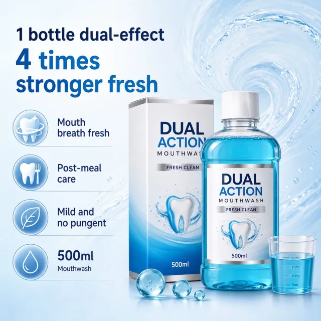
- `1 BOTTLE DUAL-EFFECT`
- `4 TIMES STRONGER FRESH`
- `MOUTH BREATH FRESH`
- `POST-MEAL CARE`
- `MILD AND NO PUNGENT`
- `500ML`
## Offer filtering
Omit prices, currencies, discounts, price comparisons, coupons, gifts, limited-time wording, savings claims, purchase calls to action, and all other promotional messaging. Do not replace them with generic offers.
## Recommended information hierarchy
Lead with the title and core benefit, followed by three concise feature groups and, only when relevant, one objective specification or set quantity. Flexible grouping is allowed without changing meaning.
## Constraints
English is the only visible language. Keep the product faithful, complete, sharp, mobile-readable, and free of watermarks and invented brands. Preserve the exact visible text listed above.
## Avoid
Garbled or misspelled text, missing core copy, translated visible copy, text overlap, rigid generic typography, distorted products, wrong accessory counts, invented claims, unrelated props, low-resolution icons, clutter, and promotional language.
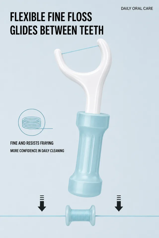
Based on the provided white-background product image, generate a floss pick material explanation poster. The background is a calm light ice gray-blue, with the top left side using a thick black sans-serif line titled "Flexible Fine Line / Easily Passing Through Gaps," and the upper right side balanced the image with small print "DAILY ORAL CARE." Enlarge a white dental floss pick in the middle, keeping the thread end light blue; Below, for a simple demonstration, the floss is tightened and wrapped around a small light blue reel. The wire is straight and fine, with two downward black arrows indicating stable tension.
On the left side, there's a minimalist coil icon and two lines of text: "Fine and tough, not easily loosened / More reliable for daily cleaning," without specifying kilograms or verifiable extreme tensile force data. Maintain the white U-frame and light cyan handle to adjust head curvature, handle texture, and reel shape. No brand information, no new brand or slogan. Layout with ample blank space to avoid original image values, parameter footnotes, watermarks, and obvious shadows.
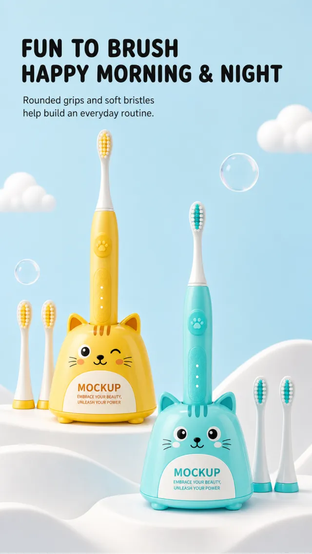
Based on the provided white background product image, generate a detailed poster for the children's electric toothbrush set. The background is a bright light sky blue, with a soft white corrugated countertop at the bottom. On the top left, a thick, black, rounded sans-serif line reads "Cute Brushing / Happy Morning and Night," with a line below that reads: "Smooth grip and soft bristles help children build daily habits." The middle and lower sections display two sets of yellow and teal animal-shaped electric toothbrushes suspended in staggered arrangements: each with a cute charging base, a vertical toothbrush handle, and several replacement brush heads. The product size is layered but not crowded.
Maintain a rounded, cat-like base, slender brush handle, and two-tone bristles to modify facial details, base contour, buttons, and placement angles. The product originally contained brand information, with only "MOCKUP" and "EMBRACE YOUR BEAUTY, UNLEASH YOUR POWER" clearly and naturally positioned on the surface. The font should be childlike and easy to read; the title should not overshadow the product, and avoid the original brand, social media watermarks, complex parameters, small footnotes, and obvious shadows.
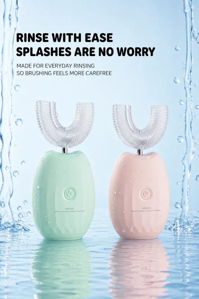
Generate a detailed poster for the children's U-shaped electric toothbrush based on the provided white-background product image. The background is a clear light blue, with vertical water flows and droplets on both sides. On the water surface at the lower center, two identical U-shaped toothbrushes are placed—one mint green and one cream pink. The transparent U-shaped brush head is clearly visible, and the body has fine water droplets.
Layout and copy: The top left aligns with two black lines of title: "Worry-free cleaning / No worries about splashes," and two gray-black lines below: "Easily handle daily rinsing, make brushing more comfortable." Leave a safe text area above the product, with natural reflections on the water surface.
The product features an oval, rounded body, transparent soft brush heads, and single round buttons for adjustable color and bristle details. The product originally included brand information, so the device only displayed "MOCKUP" and "EMBRACE YOUR BEAUTY, UNLEASH YOUR POWER," with no other logos. The font should be smooth and sans-serif lined, with headings in heavy black and regular descriptions; Smooth edges of water droplets to avoid true waterproof ratings, test parameters, medical commitments, prices, watermarks, or small print.
## Use case
Advertising and marketing.
## Asset type
Amazon secondary product benefit image, 1:1 aspect ratio.
## Input image
Use `803_product.png` as the sole product-appearance reference and `803_amazon.jpg` as the approved visual reference.
## Product fidelity
Preserve exactly the input product's colors, materials, construction, patterns, quantity, accessories, and package relationships; do not invent or remove components.
## Primary request
Reproduce the approved premium Amazon benefit image for SKU 803, retaining its product-specific visual identity.
## Source design to preserve
Preserve the approved image's palette, background atmosphere, graphic motifs, composition, information modules, and visual rhythm; do not replace it with a generic template.
## Subject and composition
Keep the complete product dominant and unobstructed, with at least 6% safe margin; preserve the approved model-worn composition when the product is apparel.
## Scene and graphics
Retain the category-appropriate gradients, lines, icons, textures, ingredient or material details, and accents visible in the approved design.
## Typography system
Use a category-appropriate display face for the title and a highly legible complementary face for body copy; maintain clear differences in size, weight, alignment, and color.
## Adaptive layout
Measure the available space first, wrap by meaning, and adapt title scale, line count, icon/text grid, spacing, and module size to the actual English copy while preserving the approved visual rhythm.
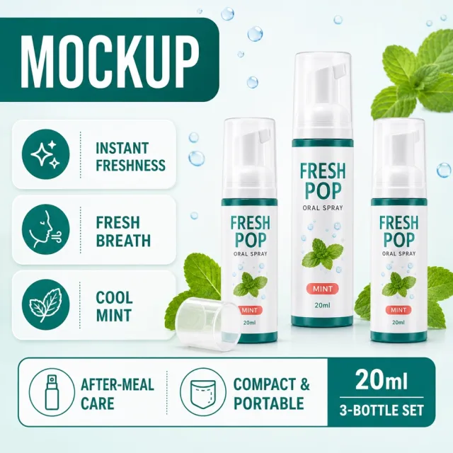
## Exact visible text (Text (verbatim))
- `MOCKUP`
- `Fresh Breath`
- `Three bottles`
- `20ml`
- `Fresh and clean`
## Offer filtering
Omit prices, currencies, discounts, price comparisons, coupons, gifts, limited-time wording, savings claims, purchase calls to action, and all other promotional messaging. Do not replace them with generic offers.
## Recommended information hierarchy
Lead with the title and core benefit, followed by three concise feature groups and, only when relevant, one objective specification or set quantity. Flexible grouping is allowed without changing meaning.
## Constraints
English is the only visible language. Keep the product faithful, complete, sharp, mobile-readable, and free of watermarks and invented brands. Preserve the exact visible text listed above.
## Avoid
Garbled or misspelled text, missing core copy, translated visible copy, text overlap, rigid generic typography, distorted products, wrong accessory counts, invented claims, unrelated props, low-resolution icons, clutter, and promotional language.
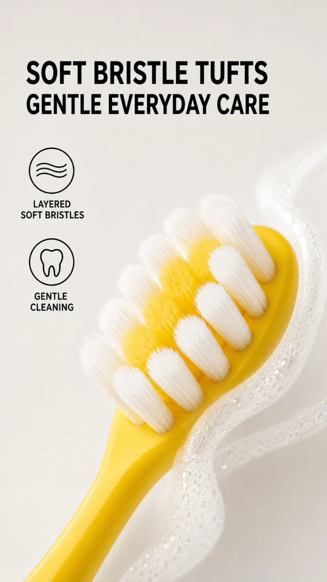
Based on the provided white background product image, generate a detail page poster for the dual soft-bristle toothbrush. The background is light gray and off-white, with two thick black sans serific lines in the upper left titled "Soft Brush Bundle / Gentle Care." Below the title, on the left side are two vertical minimalist icons: the streamlined icon corresponds to "Layered Soft Hair," and the tooth icon corresponds to "Gentle Clean." Close-up of the yellow toothbrush head in the lower right: white and light yellow dual-layer bristles are fluffy and dense, with the brush head extending along the right side into the frame; A semi-transparent white foam curve winds around the bristles from the right, giving a fresh texture.
Retains the core features of bright yellow handles, rounded brush heads, and two-tone soft bristles, allowing adjustment of bristle curvature, brush head angle, and foam movement. The product body originally had no brand information, and no new brand, slogan, logo, or product text were added. Font size should be balanced with blank space; avoid original image, year, brand, medicalized gum description, footnotes, or watermarks.
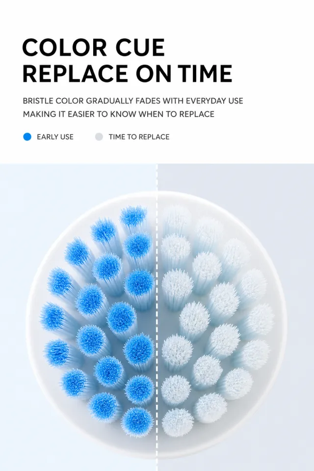
Generate a poster explaining the usage cycle of replacing the brush head of an electric toothbrush, without the need for the complete product body. The upper half of the image has a blank white background, with a black modern sans-serif title in the upper left labeled "Color Reminder / Timely Replacement." The two lines of dark gray below indicate "The bristle color will gradually lighten with daily use, making it easier to judge when to replace." Below the title, there are two small dotted labels: the left side is bright blue for "Early Use," and the right side is light gray for "Recommended Replacement."
The lower half is a close-up of an enlarged round brush head, with the background divided by a vertical dashed line in the center: light blue-white on the left and light gray-blue on the right. The left bristle ends have a clear blue gradient, while the right bristles are pale white and blue; The bristles are fine, neatly arranged, and have a realistic texture. The layout is simple and gives plenty of breathing room, with titles aligned to the left and descriptions and a style close to rational sans-serif lines. Do not include original brands, original numerical scales, size parameters, footnotes, watermarks, or screenshot borders.
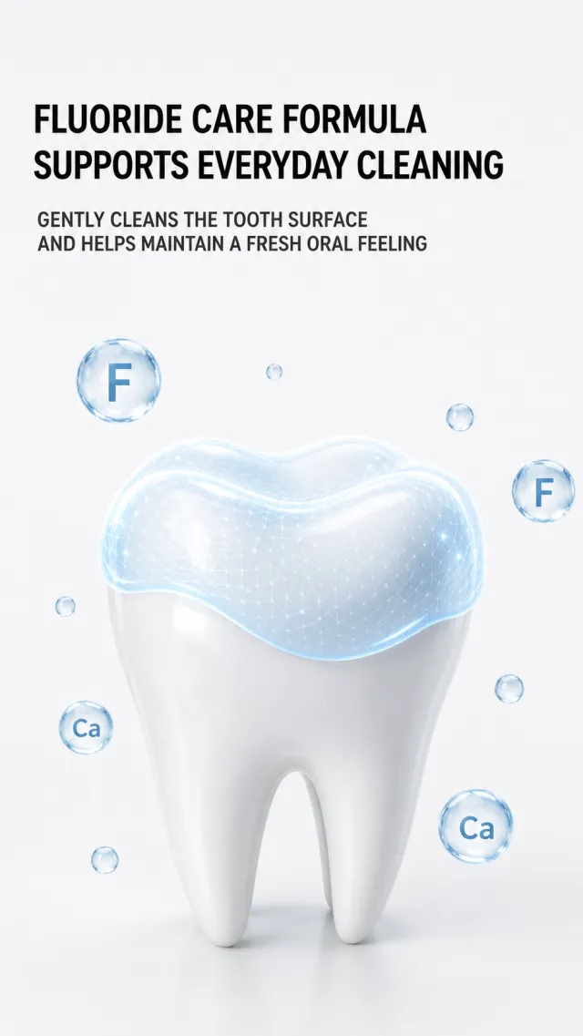
Generate a fluoride toothpaste formula principle poster without the product itself. The background is pure light gray-white, with two lines of coarse black modern sans-serif lined on the top left: "Fluoride Protection Formula / Protect Daily Cleanliness," and two gray-black lines below say "Gently cleanses the tooth surface, helps maintain oral freshness." In the lower half of the painting, an enlarged white tooth is placed, with the crown surface covered by a translucent light blue condensation protective layer, with the condensate edges smooth and natural; A small number of transparent blue circular particles float around it, with abstract letter symbols representing mineral elements.
The teeth use a soft, realistic 3D material, with a protective layer that has a fine mesh glossy texture but does not appear medical. The title occupies the upper half with blank space, the teeth are slightly larger in the center of the lower half, making the information concise and without stacked cards. Avoid diseases treatment, absolute moth-proofing, original image copy, specific ingredient dosages, small footnotes, watermarks, and screenshot borders.