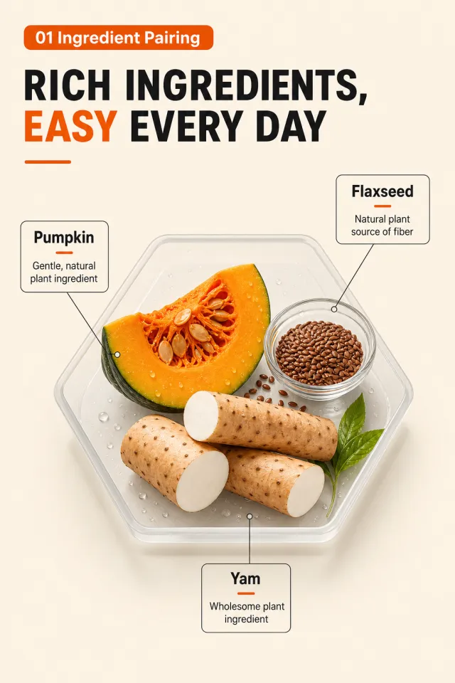
Generate a cat fresh fiber formula instruction page. The image features a warm off-white background, with a small orange rounded corner label on the top left reading "01 Ingredient Pairing," and the bottom text in bold, modern black text reads "Rich Ingredients, Easy Everyday Life," with "Easy" emphasized in vibrant orange. In the center, there is a translucent light gray hexagonal container, with fresh ingredients such as pumpkin, yam, flaxseed, and a small glass bowl with a small amount of natural water droplets; Three labels are connected with fine straight lines around the edges: "flaxseed," "pumpkin," and "yam," each with only one short, neutral description. The title occupies about 72% of the canvas width, the ingredient group occupies 48% of the central height, and orange is used only for key text and short horizontal lines. The fonts use a compact and powerful black font, with standard sans-serif fonts, and all lines and icons are smooth and clear. Do not include packaging, brand, health or bowel function promises, original image footnotes, screenshot white borders, watermarks, data labels, or fine text.
【Execution Route | Must Not Appear on Screen】
If the image-generation tool can be invoked multiple times: concatenate the sharing rules with A–F separately, and execute six times; each time, generate only one 1000×1000 square image.
If only one image can be generated at a time: first set the interface/API to a 2:3 portrait orientation and do not use Auto; then arrange images in a 2-column × 3-row grid labeled A/B, C/D, and E/F. All six cells must be equal in size, with a visual aspect ratio of 1:1. The outer canvas must not be 1:1.
【Sharing Rules】
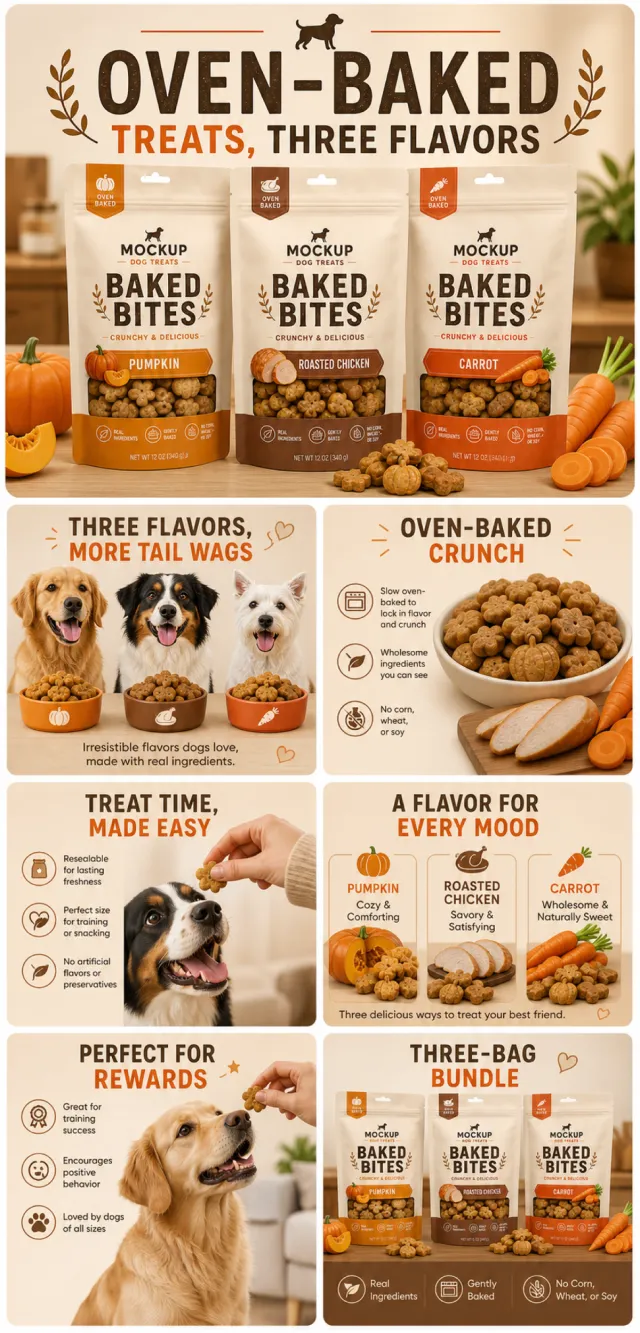
Use the provided product reference image as the sole basis for product appearance, structure, color, quantity, accessories, and relative proportions. The product is a three-bag beige, resealable dog baking snack set, featuring pumpkin orange, roasted chicken brown, and carrot orange flavor blocks, accompanied by a small number of flower-shaped and pumpkin-shaped treats. Visuals should convey a warm, baked-food aesthetic using beige, cocoa brown, and pumpkin orange tones, with friendly, bold English typography and natural ingredient photography. Maintain natural proportions for products, people, animals, text, icons, and props; stretching or independent scaling is prohibited. Ensure all essential information remains within the safe area, with the background extending fully across all four edges. Use MOCKUP exclusively for branding. Remove any peripheral white borders, vertical sidebars, numbered corner labels, watermarks, contact information, social media accounts, original brand logos, platform details, gibberish, distorted limbs, and irrelevant content. People and animals must be recreated from scratch. Copy should be concise, readable, and trustworthy; A–F are solely control markers and must not appear on screen.
【A | Core Selling Point】Title: “THREE FLAVORS, MORE TAIL WAGS.” Arrange three bags of product as heroes, introducing three different dog breeds eagerly anticipating their snacks.
【B | Baked Texture】Title: “OVEN-BAKED CRUNCH.” Close-up shots of snack textures and visual elements representing the three flavors, without making absolute health claims.
【C | Real Moment】Title: “TREAT TIME, MADE EASY.” A hand naturally offers a single treat while the dog maintains a relaxed sitting posture, with the packaging clearly visible.
【D | Flavor Combination】Title: “A FLAVOR FOR EVERY MOOD.” Each bag features visual cues—pumpkin, roasted chicken, and carrot—arranged in a clear layout.
【E | Usage Scenarios】Title: “PERFECT FOR REWARDS.” Four unnumbered scenarios: training, post-walk, daily interaction, and celebration.
【F | Package Contents】Title: “THREE-BAG BUNDLE.” Three bags and a small selection of treats laid out flat, with accurate quantities, colors, and relative sizes.
Views
2M
Sales
453
Revenue
$7K
Views
90K
Sales
127
Revenue
$3K
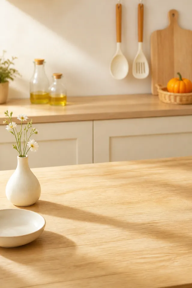
Use case: product-mockup. Reference image: warm sunlit kitchen tabletop composition only. Create a clean vertical 2:3 cozy cream kitchen background with a broad light-oak table filling the lower half, a small unmarked ivory vase with a few delicate white flowers at the front left, a shallow plain white bowl at the lower edge, a soft-focus pale kitchen counter behind with two clear unbranded oil bottles, hanging cream-and-wood utensils, a simple wood cutting board, and a small orange squash in a neutral basket at right. Leave the tabletop center clear. Warm morning sunlight, soft shadows, photorealistic editorial style. Remove the top-left AI label and all text. Change object placement, vase shape, flower stems, utensil forms, food arrangement, and wood grain so it is related but not identical. No text, numbers, Chinese characters, watermark, logo, tiny edge text, border, or white margin.
【Execution Route | Do Not Display】
If the image-generation tool can be invoked multiple times: concatenate the sharing rules with A–F separately, execute six times, generating only one 1000×1000 square image each time.
If only a single image can be generated at a time: first set the interface/API to a 2:3 portrait orientation (do not use Auto), then arrange A/B, C/D, and E/F into a 2-column × 3-row grid; ensure all six cells are equal in size and maintain a visual aspect ratio of 1:1. The outer canvas must not be 1:1.
【Sharing Rules】
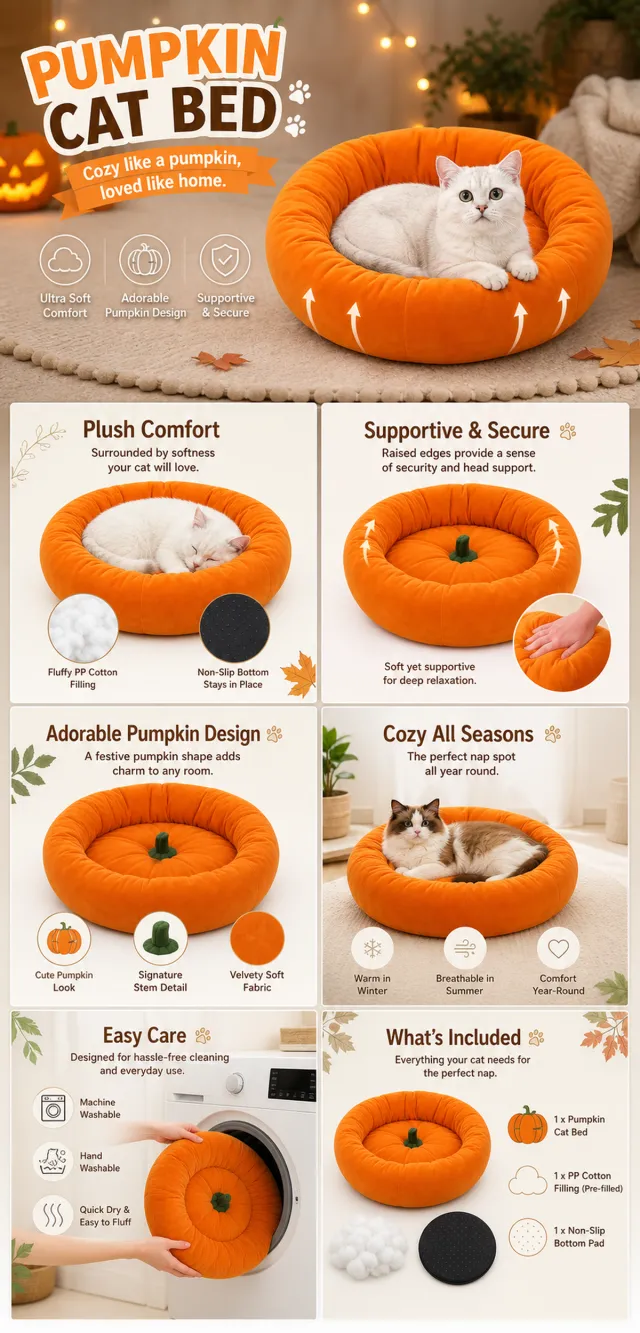
The provided product reference image serves as the sole basis for the product. The product is a pumpkin-shaped cat bed. Strictly adhere to the shape, structure, colors, quantities, accessories, textures, and relative proportions shown in the reference image; do not fabricate any unseen components, specifications, or functions. Use high-quality Amazon commercial photography and clear English infographics, with color schemes derived from the product, realistic lighting, and a clean layout. Maintain natural proportions for the product, figures, hands, icons, and props; stretching, flattening, or independently scaling is prohibited. Titles, products, and labels must remain fully within the safe area, while the background extends across the entire frame on all four sides. Only use MOCKUP for branding. No external white borders, vertical edges on either side, transparent fill-in borders, watermarks, contact information, social media accounts, original brand logos, platform identifiers, garbled text, distorted limbs, or unverified copywriting are allowed. A–F are solely control markers and must not be displayed.
【A | Product Overview】Title: “PRODUCT OVERVIEW.” The hero composition should fully showcase the product along with the accessories included in the reference image, accompanied by three brief English icon-based selling points that highlight only visible or verifiable information.
【B | Materials & Design】Title: “MATERIAL & DESIGN.” Present materials, structure, surface finishes, or styling through an overall view of the product combined with 2–3 close-up shots of specific areas; ensure clear annotations without inventing material names.
【C | Function in Focus】Title: “FUNCTION IN FOCUS.” Demonstrate key functions within reasonable usage scenarios; maintain natural proportions among figures, hands, and the product, with realistic actions and easily understandable information.
【D | Details Up Close】Title: “DETAILS UP CLOSE.” Highlight 2–4 critical structural or operational areas using magnified details and short labels; do not alter the product’s structure.
【E | Everyday Use】Title: “MADE FOR REAL LIFE.” Showcase scenes of actual use, carrying, storage, or maintenance that align with the product; retain only one clear theme and avoid duplication with C.
【F | Packaging Contents】Title: “WHAT’S INCLUDED.” Lay out or neatly arrange the actual products and accessories featured in the reference image, ensuring accurate quantities and relative sizes; if the list cannot be confirmed, instead display visible specifications, dimensional relationships, or usage steps without fabricating numbers.