Technical Diagram Creative Inspiration

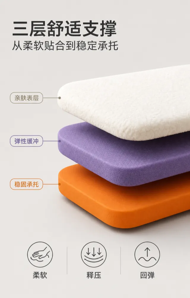
Generate a render of an e‑commerce product detail page featuring a comfortable seat cushion with layered support. Set against a warm gray background and lit with clean studio lighting, the design showcases three layers of suspended cushioning material: at the top, a soft, skin‑friendly layer in a fluffy, off‑white texture; in the middle, a thick, resilient, deep purple buffer layer; and at the bottom, a bright orange layer providing stable support. Each layer is shaped as a rounded‑corner rectangle, slightly staggered, with crisp edges and subtle shadows that suggest air between the layers. Center‑left align the bold, dark gray Chinese main title “Three‑Layer Comfortable Support,” while the subheading “From Soft, Close Fit to Stable Bearing” uses a smaller, medium‑weight gray typeface. On the left or right side of each of the three material layers, short leader lines paired with color‑coded labels indicate “Skin‑Friendly Surface,” “Elastic Buffer,” and “Stable Support.” The typography is modern and rational, with font sizes progressively decreasing from the headline to the labels, and spacing kept uniform. At the bottom, place three small, circular, linear icons alongside brief phrases—“Soft,” “Pressure Relief,” and “Rebound”—arranged horizontally. The layout remains uncluttered, avoiding any mention of brand names, model numbers, or complex specifications. Output dimensions: 750 x 1180 px. Avoid: real brand names, model numbers, footnotes, garbled text, watermarks, overlapping text, text overflow, low‑resolution icons, and excessive white space.

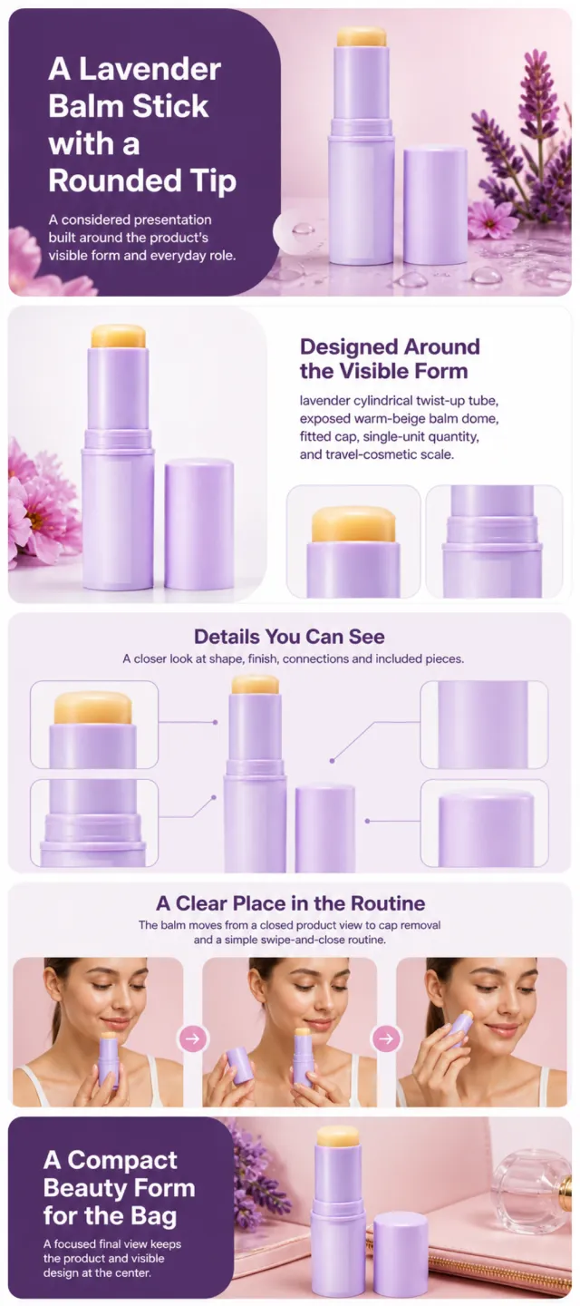
Using the supplied reference image as the sole product reference, create an Amazon A+ design preview for a solid cosmetic balm stick. Preserve exact geometry, proportions, colors, construction, quantity, accessories, and scale. Visible details: lavender cylindrical twist-up tube, exposed warm-beige balm dome, fitted cap, single-unit quantity, and travel-cosmetic scale. Do not invent hidden parts or claims. Visual system: orchid lavender, blush pink, warm beige, deep plum, and white. Composition motifs: bold rounded panels, botanical still lifes, water-drop macros, and bright beauty portraits. Alternate a wide banner, asymmetric overview, centered detail graphic, three-scene sequence, and wide closing scene. Use readable sans-serif type and mobile-safe margins. Build this official A+ module order. Keep every module independently complete; never split copy or product details. MODULE 1 — Image with text overlay — introduction Exact headline: “A Lavender Balm Stick with a Rounded Tip” Exact supporting copy: “A considered presentation built around the product’s visible form and everyday role.” Layout: wide image-led hero; dominant complete product and large safe headline area. MODULE 2 — Single image with side text — product overview Exact headline: “Designed Around the Visible Form” Exact supporting copy: “lavender cylindrical twist-up tube, exposed warm-beige balm dome, fitted cap, single-unit quantity, and travel-cosmetic scale.” Layout: large three-quarter product, side text field, and two detail crops. MODULE 3 — Four-image and text — visible evidence Exact headline: “Details You Can See” Exact supporting copy: “A closer look at shape, finish, connections and included pieces.” Layout: centered product with four rounded macro callouts; show only visible facts. MODULE 4 — Multiple image and text — routine or use setting Exact headline: “A Clear Place in the Routine” Exact supporting copy: “The balm moves from a closed product view to cap removal and a simple swipe-and-close routine.” Layout: three framed scenes with consistent product design and newly generated people or animals only when relevant. MODULE 5 — Full-width image with text overlay — closing Exact headline: “A Compact Beauty Form for the Bag” Exact supporting copy: “A focused final view keeps the product and visible design at the center.” Layout: wide editorial scene, strong silhouette, restrained props, safe text area. Create one vertical A+ preview at 1200px width with content-driven height, clear module boundaries, and varied compositions for independent export. Render only the exact copy above. Do not add logos, prices, promotions, QR codes, URLs, contacts, competitors, testimonials, ratings, guarantees, unverified claims, certifications, fake UI, watermarks, pseudo-text, or unrelated labels. Keep all elements natural and mobile-safe.

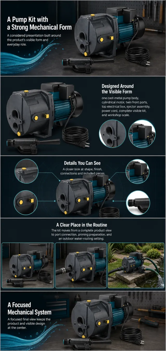
Using the supplied reference image as the sole product reference, create an Amazon A+ design preview for a convertible well-pump kit. Preserve exact geometry, proportions, colors, construction, quantity, accessories, and scale. Visible details: one cast-metal pump body, cylindrical motor, twin front ports, top electrical box, ejector assembly, power cord, complete visible kit, and workshop scale. Do not invent hidden parts or claims. Visual system: charcoal black, deep teal, bright cyan, and small yellow accents. Composition motifs: bold circular crops, dark technical diagrams, water-flow shapes, and outdoor irrigation scenes. Alternate a wide banner, asymmetric overview, centered detail graphic, three-scene sequence, and wide closing scene. Use readable sans-serif type and mobile-safe margins. Build this official A+ module order. Keep every module independently complete; never split copy or product details. MODULE 1 — Image with text overlay — introduction Exact headline: “A Pump Kit with a Strong Mechanical Form” Exact supporting copy: “A considered presentation built around the product’s visible form and everyday role.” Layout: wide image-led hero; dominant complete product and large safe headline area. MODULE 2 — Single image with side text — product overview Exact headline: “Designed Around the Visible Form” Exact supporting copy: “one cast-metal pump body, cylindrical motor, twin front ports, top electrical box, ejector assembly, power cord, complete visible kit, and workshop scale.” Layout: large three-quarter product, side text field, and two detail crops. MODULE 3 — Four-image and text — visible evidence Exact headline: “Details You Can See” Exact supporting copy: “A closer look at shape, finish, connections and included pieces.” Layout: centered product with four rounded macro callouts; show only visible facts. MODULE 4 — Multiple image and text — routine or use setting Exact headline: “A Clear Place in the Routine” Exact supporting copy: “The kit moves from a complete product view to port connection, priming preparation, and an outdoor water-routing setting.” Layout: three framed scenes with consistent product design and newly generated people or animals only when relevant. MODULE 5 — Full-width image with text overlay — closing Exact headline: “A Focused Mechanical System” Exact supporting copy: “A focused final view keeps the product and visible design at the center.” Layout: wide editorial scene, strong silhouette, restrained props, safe text area. Create one vertical A+ preview at 1200px width with content-driven height, clear module boundaries, and varied compositions for independent export. Render only the exact copy above. Do not add logos, prices, promotions, QR codes, URLs, contacts, competitors, testimonials, ratings, guarantees, unverified claims, certifications, fake UI, watermarks, pseudo-text, or unrelated labels. Keep all elements natural and mobile-safe.

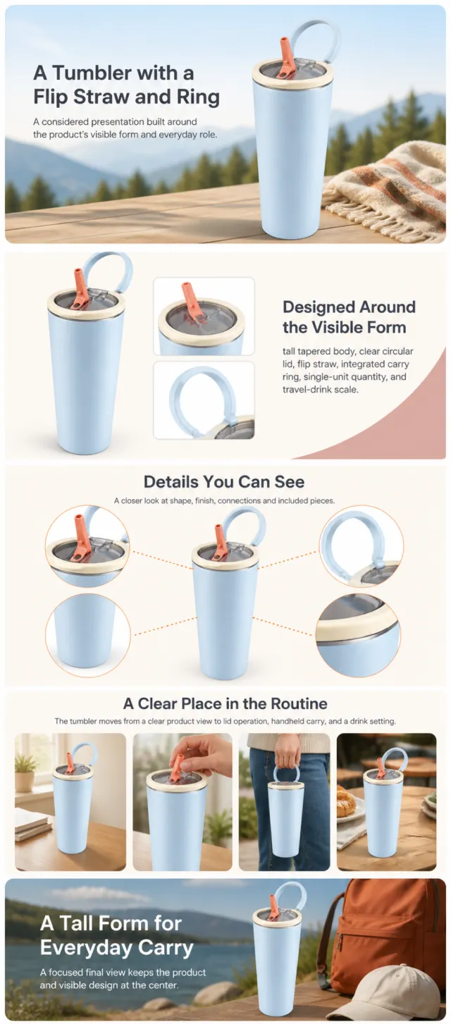
Using the supplied reference image as the sole product reference, create an Amazon A+ design preview for an insulated travel tumbler. Preserve exact geometry, proportions, colors, construction, quantity, accessories, and scale. Visible details: tall tapered body, clear circular lid, flip straw, integrated carry ring, single-unit quantity, and travel-drink scale. Do not invent hidden parts or claims. Visual system: warm ivory, pale blue, dusty rose, charcoal, and soft orange. Composition motifs: outdoor banners, cross-section graphics, rounded handling scenes, and circular lid close-ups. Alternate a wide banner, asymmetric overview, centered detail graphic, three-scene sequence, and wide closing scene. Use readable sans-serif type and mobile-safe margins. Build this official A+ module order. Keep every module independently complete; never split copy or product details. MODULE 1 — Image with text overlay — introduction Exact headline: “A Tumbler with a Flip Straw and Ring” Exact supporting copy: “A considered presentation built around the product’s visible form and everyday role.” Layout: wide image-led hero; dominant complete product and large safe headline area. MODULE 2 — Single image with side text — product overview Exact headline: “Designed Around the Visible Form” Exact supporting copy: “tall tapered body, clear circular lid, flip straw, integrated carry ring, single-unit quantity, and travel-drink scale.” Layout: large three-quarter product, side text field, and two detail crops. MODULE 3 — Four-image and text — visible evidence Exact headline: “Details You Can See” Exact supporting copy: “A closer look at shape, finish, connections and included pieces.” Layout: centered product with four rounded macro callouts; show only visible facts. MODULE 4 — Multiple image and text — routine or use setting Exact headline: “A Clear Place in the Routine” Exact supporting copy: “The tumbler moves from a clear product view to lid operation, handheld carry, and a drink setting.” Layout: three framed scenes with consistent product design and newly generated people or animals only when relevant. MODULE 5 — Full-width image with text overlay — closing Exact headline: “A Tall Form for Everyday Carry” Exact supporting copy: “A focused final view keeps the product and visible design at the center.” Layout: wide editorial scene, strong silhouette, restrained props, safe text area. Create one vertical A+ preview at 1200px width with content-driven height, clear module boundaries, and varied compositions for independent export. Render only the exact copy above. Do not add logos, prices, promotions, QR codes, URLs, contacts, competitors, testimonials, ratings, guarantees, unverified claims, certifications, fake UI, watermarks, pseudo-text, or unrelated labels. Keep all elements natural and mobile-safe.

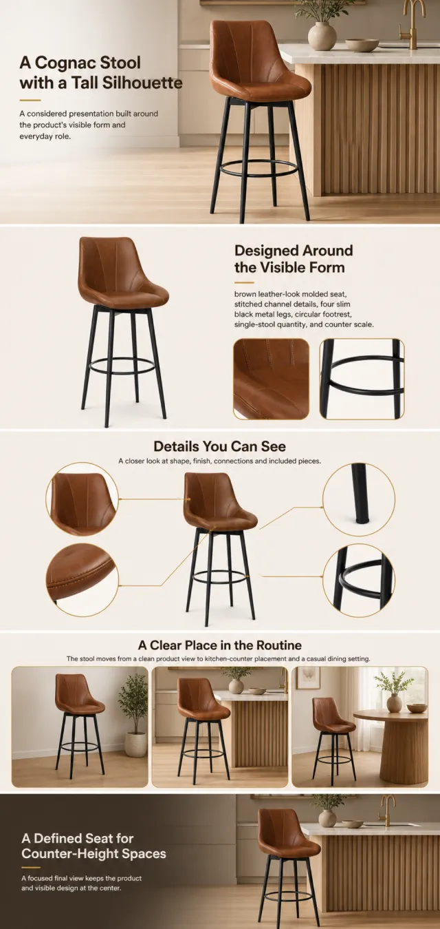
Using the supplied reference image as the sole product reference, create an Amazon A+ design preview for a tall upholstered bar stool. Preserve exact geometry, proportions, colors, construction, quantity, accessories, and scale. Visible details: brown leather-look molded seat, stitched channel details, four slim black metal legs, circular footrest, single-stool quantity, and counter scale. Do not invent hidden parts or claims. Visual system: cognac brown, black, warm beige, and restrained gold. Composition motifs: wide kitchen scenes, angled seam close-ups, circular base details, and assembly silhouettes. Alternate a wide banner, asymmetric overview, centered detail graphic, three-scene sequence, and wide closing scene. Use readable sans-serif type and mobile-safe margins. Build this official A+ module order. Keep every module independently complete; never split copy or product details. MODULE 1 — Image with text overlay — introduction Exact headline: “A Cognac Stool with a Tall Silhouette” Exact supporting copy: “A considered presentation built around the product’s visible form and everyday role.” Layout: wide image-led hero; dominant complete product and large safe headline area. MODULE 2 — Single image with side text — product overview Exact headline: “Designed Around the Visible Form” Exact supporting copy: “brown leather-look molded seat, stitched channel details, four slim black metal legs, circular footrest, single-stool quantity, and counter scale.” Layout: large three-quarter product, side text field, and two detail crops. MODULE 3 — Four-image and text — visible evidence Exact headline: “Details You Can See” Exact supporting copy: “A closer look at shape, finish, connections and included pieces.” Layout: centered product with four rounded macro callouts; show only visible facts. MODULE 4 — Multiple image and text — routine or use setting Exact headline: “A Clear Place in the Routine” Exact supporting copy: “The stool moves from a clean product view to kitchen-counter placement and a casual dining setting.” Layout: three framed scenes with consistent product design and newly generated people or animals only when relevant. MODULE 5 — Full-width image with text overlay — closing Exact headline: “A Defined Seat for Counter-Height Spaces” Exact supporting copy: “A focused final view keeps the product and visible design at the center.” Layout: wide editorial scene, strong silhouette, restrained props, safe text area. Create one vertical A+ preview at 1200px width with content-driven height, clear module boundaries, and varied compositions for independent export. Render only the exact copy above. Do not add logos, prices, promotions, QR codes, URLs, contacts, competitors, testimonials, ratings, guarantees, unverified claims, certifications, fake UI, watermarks, pseudo-text, or unrelated labels. Keep all elements natural and mobile-safe.

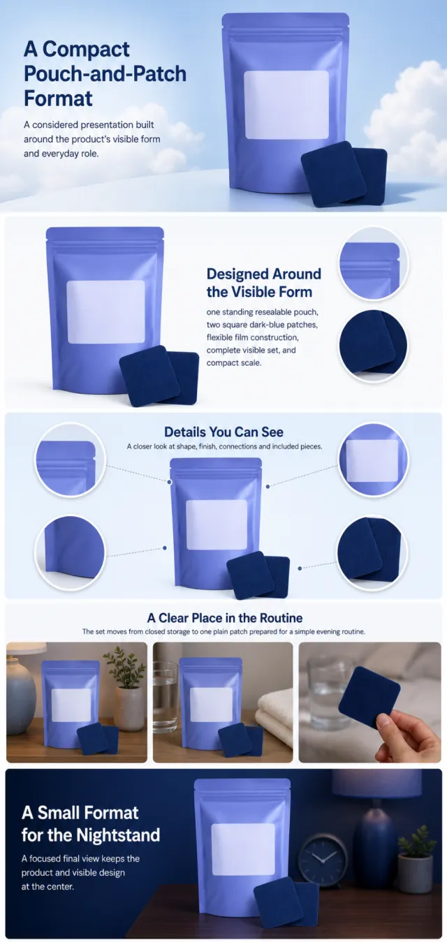
Using the supplied reference image as the sole product reference, create an Amazon A+ design preview for a pouch-and-patch personal-care set. Preserve exact geometry, proportions, colors, construction, quantity, accessories, and scale. Visible details: one standing resealable pouch, two square dark-blue patches, flexible film construction, complete visible set, and compact scale. Do not invent hidden parts or claims. Visual system: periwinkle blue, deep navy, white, and pale cloud blue. Composition motifs: soft cloud fields, rounded instruction panels, circular placement crops, and botanical still lifes. Alternate a wide banner, asymmetric overview, centered detail graphic, three-scene sequence, and wide closing scene. Use readable sans-serif type and mobile-safe margins. Build this official A+ module order. Keep every module independently complete; never split copy or product details. MODULE 1 — Image with text overlay — introduction Exact headline: “A Compact Pouch-and-Patch Format” Exact supporting copy: “A considered presentation built around the product’s visible form and everyday role.” Layout: wide image-led hero; dominant complete product and large safe headline area. MODULE 2 — Single image with side text — product overview Exact headline: “Designed Around the Visible Form” Exact supporting copy: “one standing resealable pouch, two square dark-blue patches, flexible film construction, complete visible set, and compact scale.” Layout: large three-quarter product, side text field, and two detail crops. MODULE 3 — Four-image and text — visible evidence Exact headline: “Details You Can See” Exact supporting copy: “A closer look at shape, finish, connections and included pieces.” Layout: centered product with four rounded macro callouts; show only visible facts. MODULE 4 — Multiple image and text — routine or use setting Exact headline: “A Clear Place in the Routine” Exact supporting copy: “The set moves from closed storage to one plain patch prepared for a simple evening routine.” Layout: three framed scenes with consistent product design and newly generated people or animals only when relevant. MODULE 5 — Full-width image with text overlay — closing Exact headline: “A Small Format for the Nightstand” Exact supporting copy: “A focused final view keeps the product and visible design at the center.” Layout: wide editorial scene, strong silhouette, restrained props, safe text area. Create one vertical A+ preview at 1200px width with content-driven height, clear module boundaries, and varied compositions for independent export. Render only the exact copy above. Do not add logos, prices, promotions, QR codes, URLs, contacts, competitors, testimonials, ratings, guarantees, unverified claims, certifications, fake UI, watermarks, pseudo-text, or unrelated labels. Keep all elements natural and mobile-safe.

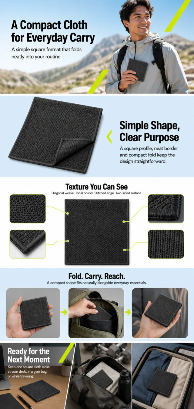
Using the supplied reference image as the sole product reference, create a complete Amazon A+ design preview. Preserve the exact square-cloth geometry, charcoal color, diagonal waffle weave, stitched edge, single-item quantity, and relative scale. Do not invent material composition or performance claims. Generate entirely new people where needed. Use pale ice blue, white, graphite, and sharp chartreuse accents with bold black sans-serif type, rounded image windows, diagonal motion arrows, macro weave crops, and compact information blocks. Alternate energetic wide banners, centered product evidence, a three-step carry sequence, and a clean everyday scene. Build this official A+ module order. Keep each module independently complete and mobile-safe; blue fields and chartreuse accents may repeat across boundaries. MODULE 1 — Image with text overlay — introduction Exact headline: “A Compact Cloth for Everyday Carry” Exact supporting copy: “A simple square format that folds neatly into your routine.” Layout: wide outdoor banner with a newly generated active adult holding the cloth; large safe headline and no brand marks. MODULE 2 — Single image with side text — form Exact headline: “Simple Shape, Clear Purpose” Exact supporting copy: “A square profile, neat border and compact fold keep the design straightforward.” Layout: large angled cloth on an ice-blue field with one folded corner and a side text panel. MODULE 3 — Four-image and text — visible details Exact headline: “Texture You Can See” Exact supporting copy: “Diagonal weave. Tonal border. Stitched edge. Two-sided surface.” Layout: centered product with four macro callouts and chartreuse connector lines. MODULE 4 — Multiple image and text — carry sequence Exact headline: “Fold. Carry. Reach.” Exact supporting copy: “A compact shape fits naturally alongside everyday essentials.” Layout: three framed scenes showing the same cloth folded, placed in a bag pocket, and held in one hand; no logos or readable device screens. MODULE 5 — Full-width image with text overlay — closing setting Exact headline: “Ready for the Next Moment” Exact supporting copy: “Keep one square cloth close at your desk, in a gym bag, or while traveling.” Layout: split wide editorial scene connecting desk, gym bag, and travel tray while keeping the cloth dominant. Create one continuous vertical A+ preview at 1200px width with content-driven height, clear module boundaries, and varied compositions for independent export. Render only the exact copy above. Do not add logos, prices, promotions, QR codes, URLs, contacts, comparisons, charity messages, material or drying claims, testimonials, guarantees, certifications, fake UI, watermarks, pseudo-text, or unrelated labels. Keep all elements natural and mobile-safe.

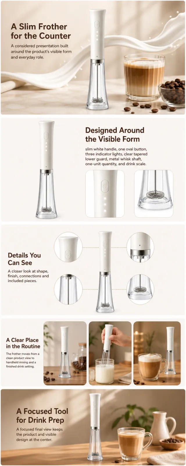
Using the supplied reference image as the sole product reference, create an Amazon A+ design preview for a handheld electric milk frother. Preserve exact geometry, proportions, colors, construction, quantity, accessories, and scale. Visible details: slim white handle, one oval button, three indicator lights, clear tapered lower guard, metal whisk shaft, one-unit quantity, and drink scale. Do not invent hidden parts or claims. Visual system: warm cream, coffee brown, white, red, and brushed metal. Composition motifs: flowing milk ribbons, coffee-bean still lifes, close-up mechanism crops, and warm café scenes. Alternate a wide banner, asymmetric overview, centered detail graphic, three-scene sequence, and wide closing scene. Use readable sans-serif type and mobile-safe margins. Build this official A+ module order. Keep every module independently complete; never split copy or product details. MODULE 1 — Image with text overlay — introduction Exact headline: “A Slim Frother for the Counter” Exact supporting copy: “A considered presentation built around the product’s visible form and everyday role.” Layout: wide image-led hero; dominant complete product and large safe headline area. MODULE 2 — Single image with side text — product overview Exact headline: “Designed Around the Visible Form” Exact supporting copy: “slim white handle, one oval button, three indicator lights, clear tapered lower guard, metal whisk shaft, one-unit quantity, and drink scale.” Layout: large three-quarter product, side text field, and two detail crops. MODULE 3 — Four-image and text — visible evidence Exact headline: “Details You Can See” Exact supporting copy: “A closer look at shape, finish, connections and included pieces.” Layout: centered product with four rounded macro callouts; show only visible facts. MODULE 4 — Multiple image and text — routine or use setting Exact headline: “A Clear Place in the Routine” Exact supporting copy: “The frother moves from a clean product view to handheld mixing and a finished drink setting.” Layout: three framed scenes with consistent product design and newly generated people or animals only when relevant. MODULE 5 — Full-width image with text overlay — closing Exact headline: “A Focused Tool for Drink Prep” Exact supporting copy: “A focused final view keeps the product and visible design at the center.” Layout: wide editorial scene, strong silhouette, restrained props, safe text area. Create one vertical A+ preview at 1200px width with content-driven height, clear module boundaries, and varied compositions for independent export. Render only the exact copy above. Do not add logos, prices, promotions, QR codes, URLs, contacts, competitors, testimonials, ratings, guarantees, unverified claims, certifications, fake UI, watermarks, pseudo-text, or unrelated labels. Keep all elements natural and mobile-safe.

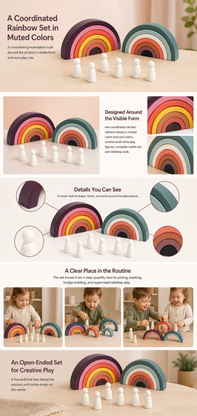
Using the supplied reference image as the sole product reference, create an Amazon A+ design preview for a wooden rainbow stacking toy set. Preserve exact geometry, proportions, colors, construction, quantity, accessories, and scale. Visible details: two coordinated arched rainbow stacks in muted warm and cool colors, several small white peg figures, complete visible set, and tabletop scale. Do not invent hidden parts or claims. Visual system: dusty coral, mustard, deep plum, sage green, pale aqua, and white. Composition motifs: arched frames, playful tabletop arrangements, close-up wood-grain crops, and family play scenes. Alternate a wide banner, asymmetric overview, centered detail graphic, three-scene sequence, and wide closing scene. Use readable sans-serif type and mobile-safe margins. Build this official A+ module order. Keep every module independently complete; never split copy or product details. MODULE 1 — Image with text overlay — introduction Exact headline: “A Coordinated Rainbow Set in Muted Colors” Exact supporting copy: “A considered presentation built around the product’s visible form and everyday role.” Layout: wide image-led hero; dominant complete product and large safe headline area. MODULE 2 — Single image with side text — product overview Exact headline: “Designed Around the Visible Form” Exact supporting copy: “two coordinated arched rainbow stacks in muted warm and cool colors, several small white peg figures, complete visible set, and tabletop scale.” Layout: large three-quarter product, side text field, and two detail crops. MODULE 3 — Four-image and text — visible evidence Exact headline: “Details You Can See” Exact supporting copy: “A closer look at shape, finish, connections and included pieces.” Layout: centered product with four rounded macro callouts; show only visible facts. MODULE 4 — Multiple image and text — routine or use setting Exact headline: “A Clear Place in the Routine” Exact supporting copy: “The set moves from a clear quantity view to sorting, stacking, bridge building, and supervised tabletop play.” Layout: three framed scenes with consistent product design and newly generated people or animals only when relevant. MODULE 5 — Full-width image with text overlay — closing Exact headline: “An Open-Ended Set for Creative Play” Exact supporting copy: “A focused final view keeps the product and visible design at the center.” Layout: wide editorial scene, strong silhouette, restrained props, safe text area. Create one vertical A+ preview at 1200px width with content-driven height, clear module boundaries, and varied compositions for independent export. Render only the exact copy above. Do not add logos, prices, promotions, QR codes, URLs, contacts, competitors, testimonials, ratings, guarantees, unverified claims, certifications, fake UI, watermarks, pseudo-text, or unrelated labels. Keep all elements natural and mobile-safe.

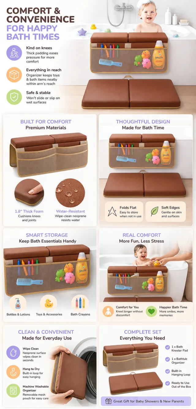
【Execution Route | Do Not Display】 If the image-generation tool can be invoked multiple times: concatenate the sharing rules with A–F separately, execute six times, generating only one 1000×1000 square image each time. If only a single image can be generated at a time: first set the interface/API to a 2:3 portrait orientation (do not use Auto), then arrange A/B, C/D, and E/F into a 2-column × 3-row grid; ensure all six cells are equal in size and maintain a visual aspect ratio of 1:1. The outer canvas must not be 1:1. 【Sharing Rules】 The provided product reference image serves as the sole basis for the product. The product is a baby bath kneeler and organizer set. Strictly adhere to the reference image’s shape, structure, color, quantity, accessories, texture, and relative proportions; do not fabricate any unseen components, specifications, or functions. Use high-quality Amazon commercial photography and clear English infographics, with colors derived from the product itself, realistic lighting, and a clean layout. Maintain natural proportions among the product, figures, hands, icons, and props; stretching, flattening, or independently scaling is prohibited. Titles, products, and labels must remain entirely within the safe zone, while the background extends fully across all four edges. Only use MOCKUP for branding. No white borders, vertical sidebars, transparent fill‑ins, watermarks, contact information, social media accounts, original brand logos, platform identifiers, garbled text, distorted limbs, or unverified copywriting are allowed. A–F are solely control markers and must not be displayed. 【A | Product Overview】Title: “PRODUCT OVERVIEW.” The hero composition should fully showcase the product along with the accessories depicted in the reference image, accompanied by three brief English icon‑based selling points that highlight only visible or verifiable information. 【B | Materials & Design】Title: “MATERIAL & DESIGN.” Present materials, structure, surface finishes, or styling through an overall view of the product combined with 2–3 close-up details; ensure clear labeling without inventing material names. 【C | Function in Focus】Title: “FUNCTION IN FOCUS.” Demonstrate key functions within realistic usage scenarios; maintain natural proportions among people, hands, and the product, with actions appearing genuine and information instantly understandable. 【D | Details Up Close】Title: “DETAILS UP CLOSE.” Highlight 2–4 critical structural or operational areas using magnified details and short captions; do not alter the product’s structure. 【E | Everyday Use】Title: “MADE FOR REAL LIFE.” Depict scenes of actual use, carrying, storage, or maintenance that align with the product; retain only one clear theme and avoid duplication with C. 【F | Packaging Contents】Title: “WHAT’S INCLUDED.” Lay out or neatly arrange the actual products and accessories shown in the reference image, ensuring accurate quantities and relative sizes; if the contents cannot be confirmed, instead display visible specifications, dimensional relationships, or usage steps without fabricating numbers.

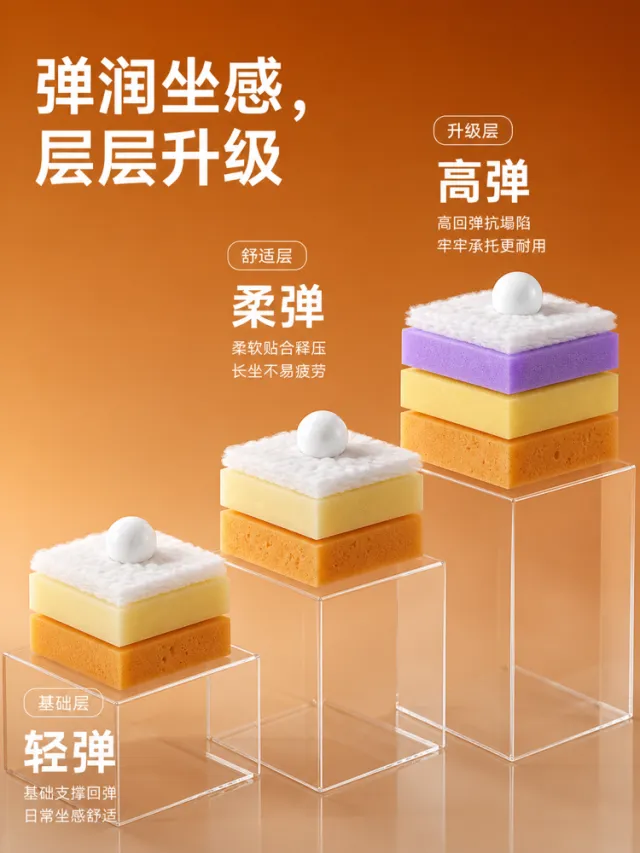
Generate a效果图 for the detailed product page of a sofa sponge cushion structure. The background features a warm caramel‑orange gradient. In the upper left corner, an oversized white modern black‑type headline reads: “Bouncy Comfort, Layered Upgrades.” In the center of the image, three sets of transparent acrylic pedestals at varying heights showcase the cushion’s material layers: the base layer, the comfort layer, and the premium upgrade layer. Each set comprises a bottom support foam, a middle resilient foam, and a top soft fiber layer; the upgrade layer further incorporates a purple elastic layer. A small white sphere rests atop each set, emphasizing bounce and a plush tactile experience. On the right side and in the lower left, large, hierarchical headings—“Light Bounce,” “Soft Bounce,” and “High Bounce”—are accompanied by one or two lines of explanatory text. The materials—micro‑perforated fabric, fibers, and transparent pedestals—are rendered with realistic, refined detail, lending the composition a youthful, vibrant feel reminiscent of a laboratory display. Output dimensions: 750 x 1000px. Avoid text misalignment, overlap, overflow, obvious shadows, jagged icons, irrelevant small text, and web‑page borders.

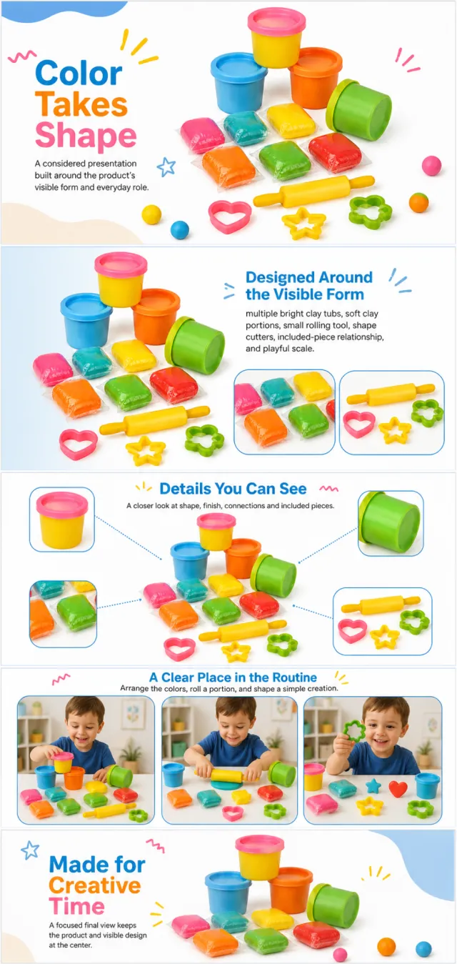
Using the supplied reference image as the sole product reference, create an Amazon A+ design preview for a colorful modeling-clay activity set. Preserve exact geometry, proportions, colors, construction, quantity, accessories, and scale. Visible details: multiple bright clay tubs, soft clay portions, small rolling tool, shape cutters, included-piece relationship, and playful scale. Do not invent hidden parts or claims. Visual system: warm white, sky blue, orange, yellow, green, pink, and red. Composition motifs: handwritten-style accent marks, rounded photo frames, colorful clay dots, and playful tool arrangements. Alternate a wide banner, asymmetric overview, centered detail graphic, three-scene sequence, and wide closing scene. Use readable sans-serif type and mobile-safe margins. Build this official A+ module order. Keep every module independently complete; never split copy or product details. MODULE 1 — Image with text overlay — introduction Exact headline: “Color Takes Shape” Exact supporting copy: “A considered presentation built around the product’s visible form and everyday role.” Layout: wide image-led hero; dominant complete product and large safe headline area. MODULE 2 — Single image with side text — product overview Exact headline: “Designed Around the Visible Form” Exact supporting copy: “multiple bright clay tubs, soft clay portions, small rolling tool, shape cutters, included-piece relationship, and playful scale.” Layout: large three-quarter product, side text field, and two detail crops. MODULE 3 — Four-image and text — visible evidence Exact headline: “Details You Can See” Exact supporting copy: “A closer look at shape, finish, connections and included pieces.” Layout: centered product with four rounded macro callouts; show only visible facts. MODULE 4 — Multiple image and text — routine or use setting Exact headline: “A Clear Place in the Routine” Exact supporting copy: “Arrange the colors, roll a portion, and shape a simple creation.” Layout: three framed scenes with consistent product design and newly generated people or animals only when relevant. MODULE 5 — Full-width image with text overlay — closing Exact headline: “Made for Creative Time” Exact supporting copy: “A focused final view keeps the product and visible design at the center.” Layout: wide editorial scene, strong silhouette, restrained props, safe text area. Create one vertical A+ preview at 1200px width with content-driven height, clear module boundaries, and varied compositions for independent export. Render only the exact copy above. Do not add logos, prices, promotions, QR codes, URLs, contacts, competitors, testimonials, ratings, guarantees, unverified claims, certifications, fake UI, watermarks, pseudo-text, or unrelated labels. Keep all elements natural and mobile-safe.

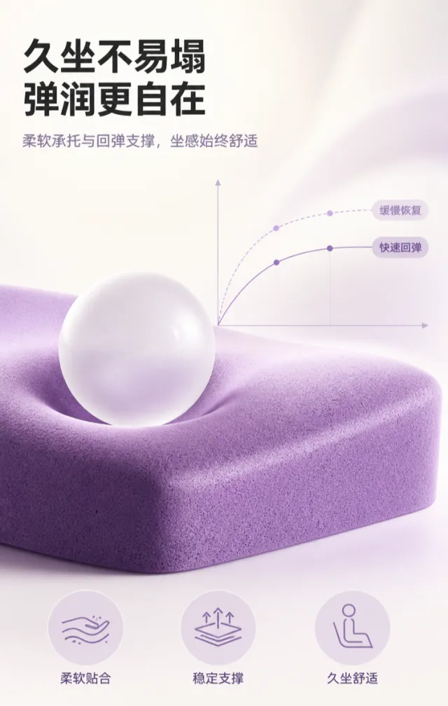
Generate a product detail page mockup showcasing the rebound performance of a seat cushion. The design features a clean, warm white background with soft lavender lighting. A thick, purple, elastic cushion material occupies the lower half of the composition; its surface bears a gently indented mark created by a translucent white sphere, which bounces back to reveal a smooth, plump recovery. The material appears finely textured with softly rounded edges, emphasizing the rebound process rather than the product itself. At the top, modern sans-serif Chinese typeface in bold is aligned left‑justified. The main headline spans two lines: “Resists sinking even after long sitting” and “Bouncy comfort for greater ease.” Below, medium‑weight gray‑purple body text reads: “Soft support and resilient rebound ensure consistently comfortable seating.” On the right side, a minimalist contrast curve—composed of thin lines, dots, and two short labels—illustrates “slow recovery” and “quick rebound,” avoiding complex numbers or footnotes. At the bottom, three pale purple circular icons are paired with brief captions: “Soft fit,” “Stable support,” and “Comfortable during prolonged sitting.” The typography is restrained, rounded, and generously spaced, while the icon edges remain crisp and smooth. All elements coalesce around the elastic material, creating a stable visual focal point. Output dimensions: 750 x 1180px. Avoid: real brand names, model numbers, footnotes, garbled characters, watermarks, overlapping text, text overflow, subject obstruction, low‑resolution icons, and unusual whitespace.

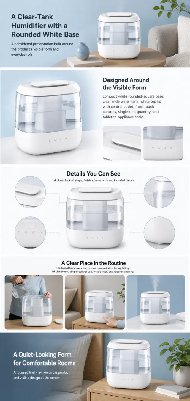
Using the supplied reference image as the sole product reference, create an Amazon A+ design preview for a top-fill room humidifier. Preserve exact geometry, proportions, colors, construction, quantity, accessories, and scale. Visible details: compact white rounded-square base, clear wide water tank, white top lid with central outlet, front touch controls, single-unit quantity, and tabletop-appliance scale. Do not invent hidden parts or claims. Visual system: clean white, clear aqua, soft blue, charcoal, and pale gray. Composition motifs: wide lifestyle banners, modular feature cards, water-and-mist close-ups, and calm room scenes. Alternate a wide banner, asymmetric overview, centered detail graphic, three-scene sequence, and wide closing scene. Use readable sans-serif type and mobile-safe margins. Use this five-module order. Keep each module complete. MODULE 1 — Image with text overlay — introduction Exact headline: “A Clear-Tank Humidifier with a Rounded White Base” Exact supporting copy: “A considered presentation built around the product’s visible form and everyday role.” Layout: wide image-led hero; dominant complete product and large safe headline area. MODULE 2 — Single image with side text — product overview Exact headline: “Designed Around the Visible Form” Exact supporting copy: “compact white rounded-square base, clear wide water tank, white top lid with central outlet, front touch controls, single-unit quantity, and tabletop-appliance scale.” Layout: large three-quarter product, side text field, and two detail crops. MODULE 3 — Four-image and text — visible evidence Exact headline: “Details You Can See” Exact supporting copy: “A closer look at shape, finish, connections and included pieces.” Layout: centered product with four rounded macro callouts; show only visible facts. MODULE 4 — Multiple image and text — routine or use setting Exact headline: “A Clear Place in the Routine” Exact supporting copy: “The humidifier moves from a clear product view to top filling, lid placement, simple control use, visible mist, and routine cleaning.” Layout: three framed scenes with consistent product design and newly generated people or animals only when relevant. MODULE 5 — Full-width image with text overlay — closing Exact headline: “A Quiet-Looking Form for Comfortable Rooms” Exact supporting copy: “A focused final view keeps the product and visible design at the center.” Layout: wide editorial scene, strong silhouette, restrained props, safe text area. Create one vertical A+ preview at 1200px width with content-driven height, clear module boundaries, and varied compositions for independent export. Render only the exact copy above. Do not add logos, prices, promotions, QR codes, URLs, contacts, competitors, testimonials, ratings, guarantees, unverified claims, certifications, fake UI, watermarks, pseudo-text, or unrelated labels. Keep all elements natural and mobile-safe.

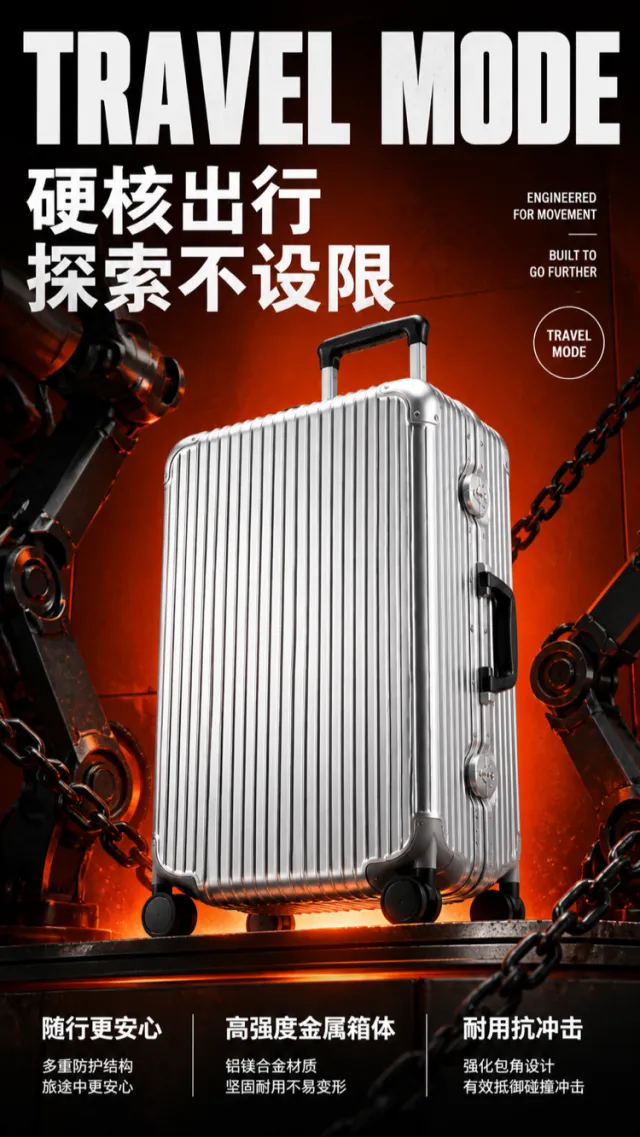
Based on the reference image, generate a high‑fidelity e‑commerce product detail page rendering showcasing the hard‑core texture of an aluminum‑magnesium travel suitcase. A bright silver, vertically striped suitcase is positioned at a three‑quarter upward angle in the center of an orange‑red industrial‑style background. The design retains the metal vertical‑grain body, pull handle, side carry handle, four wheels, and rigid corner protectors, while refining the wheel assembly, lock mechanism, and edge details. No brand names, logos, slogans, or decorative text appear on the product surface. On either side of the composition, black metallic robotic arms paired with thick chains create a sense of tension, while orange floor lighting illuminates the suitcase from below. At the top, an oversized, bold, experimental‑type white English headline reads “TRAVEL MODE.” In the middle, large white Chinese text declares “Hardcore Travel” and “Explore Without Limits.” At the bottom, three columns of white bullet points highlight key selling points: “More Peace of Mind on the Go,” “High‑Strength Metal Body,” and “Durable & Impact‑Resistant,” each accompanied by a brief explanatory line. On the right, a small set of offset English supporting text and white circular markers adds visual flair without introducing meaningless micro‑text. The overall composition evokes a trendy industrial‑style poster, with robust, dynamic typography that keeps information clear and unobscured by the suitcase, while faithfully rendering metallic details. Output dimensions: 750 x 1334px. Avoid: real brands, model numbers, footnotes, garbled characters, watermarks, overlapping text, text overflow, subject occlusion, abnormal subject proportions, duplicate products, low‑resolution icons, and excessive negative space.

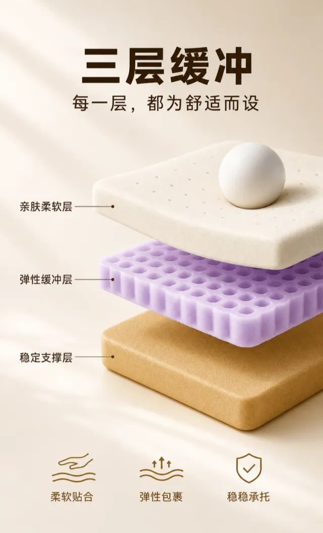
Generate a layered cushioning material e‑commerce product detail page mockup. Use a warm off‑white background with soft golden highlights. In the center of the composition, present three thick layers in a suspended cross‑section: the top layer is a delicate, milky‑white, breathable soft layer; the middle layer is an elastic, pale purple honeycomb cushioning layer; and the bottom layer is a stable, golden‑brown support layer. Maintain appropriate spacing between the layers, with smooth, well‑defined edges. A small sphere gently presses down on the top layer from above, emphasizing its soft, supportive quality. At the top, centered, place a bold, dark brown Chinese main title: “Three‑Layer Cushioning,” accompanied by the subtitle: “Every layer is designed for comfort.” The main title is solid and expansive, while the subtitle is lighter and more refined, with slightly wider letter spacing. To the left of the three layers, use thin leader lines to connect three sets of text labels: “Skin‑Friendly Soft Layer,” “Elastic Cushioning Layer,” and “Stable Support Layer.” These labels are medium‑weight and evenly spaced. At the bottom, include three small, golden‑brown linear icons paired with short phrases: “Soft and Snug,” “Elastic Wrap,” and “Stable Support.” The overall design resembles a high‑quality home‑textile product description page, with crisp, smooth edges on both the icons and the leader lines—no extraneous numbers or tiny text. Output dimensions: 750 x 1240px. Avoid: real brand names, model numbers, footnotes, garbled characters, watermarks, overlapping text, text overflow, low‑resolution icons, and unusual white space.

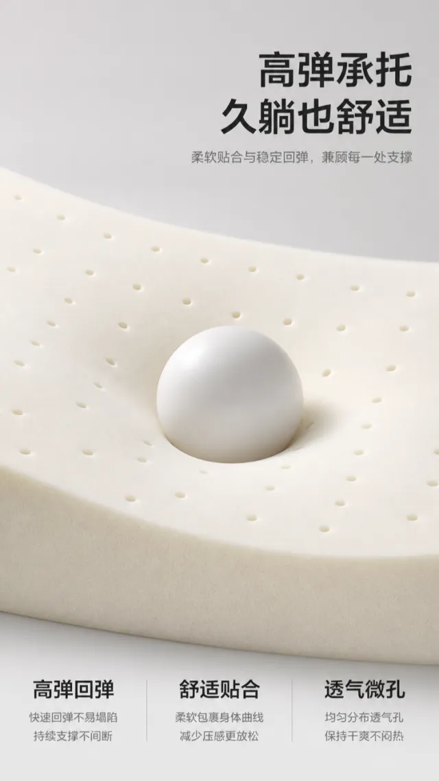
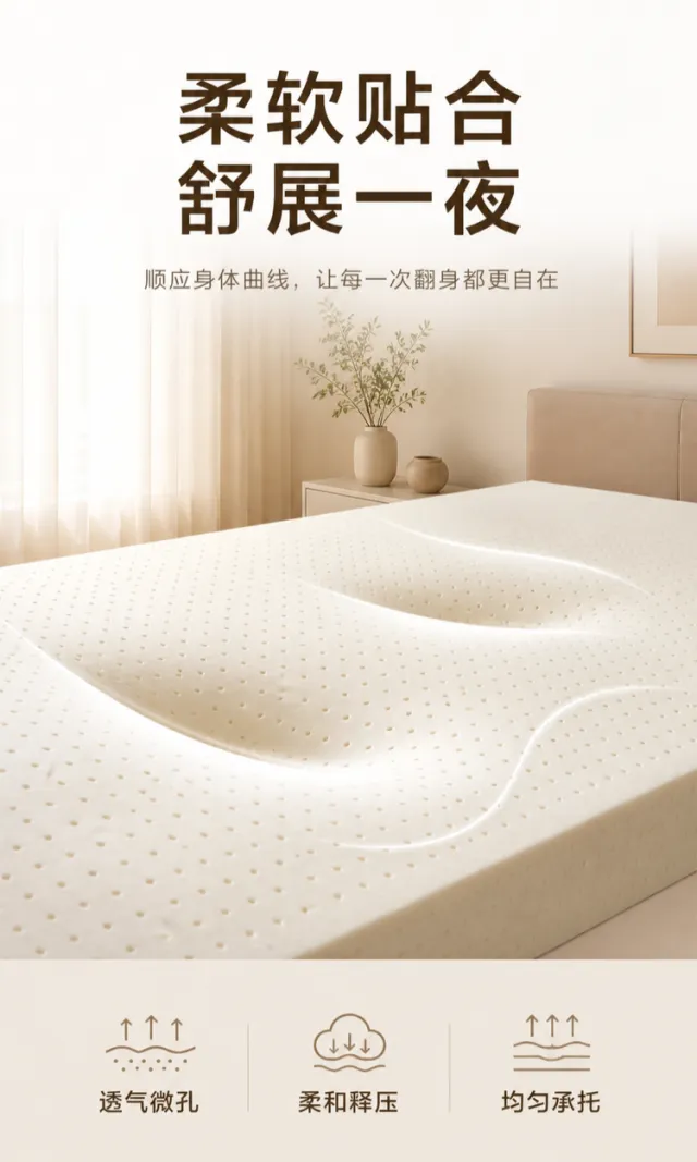
Generate a render for an e-commerce product detail page showcasing latex rebound support. Set against a light gray‑white background with soft, creamy lighting, the scene features a thick, off‑white latex material. Its surface is evenly perforated for breathability, while a white sphere pressed into the center creates a natural, deep indentation, forming gentle, resilient curves around it. The composition focuses solely on the material and its rebound properties, without depicting the finished product or any brand logos. In the upper right corner, two bold black Chinese lines read: “High Elastic Support” and “Comfortable Even After Long Lying.” Below these, in subtle gray type, is the tagline: “Soft conformity and stable rebound, supporting every contour.” At the bottom, three large, numerically styled information blocks are arranged horizontally: “High Elastic Rebound,” “Comfortable Conformity,” and “Breathable Micro‑Pores.” Each element is highlighted with a large white numeral or an abstract symbol, accompanied by a brief explanatory line—no exaggerated percentages or specific performance claims are used. The typography is clean and modern; ample white space separates the headings from the material block. All text is crisp and shadow‑free, lending the image a soft, premium aesthetic. Output dimensions: 750 x 1334px. Avoid: real brands, model numbers, footnotes, garbled characters, watermarks, overlapping text, text overflow, low‑resolution icons, or unusual whitespace.

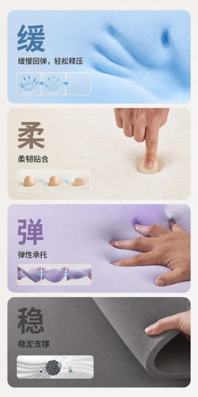
Generate a效果图 for a sofa upholstery material details page. The design features a warm white background with four large, rounded-corner material information cards arranged vertically. The first card showcases a close-up of light blue memory foam with indentation, titled “Slow Rebound, Effortless Pressure Relief.” The second displays a close-up of a creamy‑white latex surface under pressure, labeled “Flexible and Adaptable.” The third presents a pale purple high‑resilience sponge pressed into shape, captioned “Elastic Support.” The fourth highlights dark gray high‑density support foam, with the title “Stable Support.” Each card is structured hierarchically with a single large character and a concise line of description, complemented by subtle status indicators; no small, distracting annotations are used. The overall aesthetic is clean, rational, and true to the materials’ textures. Output dimensions: 750 x 1500px. Avoid text misalignment, overlapping, overflow, noticeable shadows, jagged icons, meaningless small text, or web‑page borders.

Generate a mockup for an e‑commerce product detail page showcasing the comfort and fit of a natural latex mattress. The scene features a gentle milky white and light apricot bedroom setting. A figure lies on their side atop a creamy‑white mattress with fine, breathable perforations; the surface naturally conforms to the contours of the shoulders, neck, waist, and legs. In the center of the image, a delicate, semi‑transparent arc outlines the support zone, emphasizing soft envelopment and even distribution of pressure. Bedding, walls, and window light remain softly understated, with no brand information visible. At the top, a large, minimalist title area uses elegant, subtly humanistic dark brown Chinese bold typeface. The main headline is split into two lines: “Soft & Close-Fitting” and “Unwind Through the Night.” Below, in lighter brown and smaller font, reads: “Adapts to your body’s curves, making every turn more comfortable.” Line spacing is generous, ensuring the headlines are prominent yet not overly dramatic, with no heavy shadows. Beneath, three sets of light, linear icons paired with short phrases convey “Breathable Micro‑Perforations,” “Gentle Pressure Relief,” and “Even Support.” Each card features minimal borders and ample negative space. The overall aesthetic exudes calm, clean, and cozy sleep quality. Output dimensions: 750 x 1250px. Avoid: real brand names or model numbers, footnotes, garbled text, watermarks, overlapping text, text overflow, figures or key elements obscured, low‑resolution icons, and unusual use of negative space.

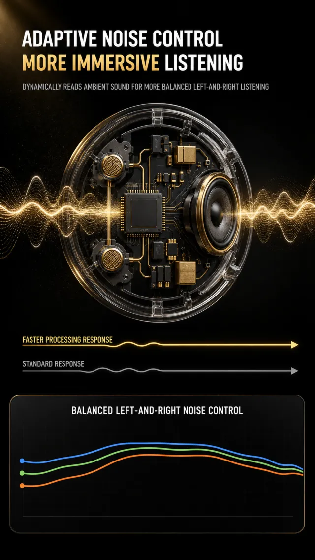
Generate a poster explaining the noise cancellation principle of true wireless earphones, without needing a full headphone product image. The background is deep black, with subtle black gold mist light in some areas. The top left-aligned is paired with two lines of thick white sans-serif lines: "Adaptive Noise Reduction / More Immersive Listening," emphasizing "More Immersive" in warm gold; The gray-white line below indicates "Dynamic recognition of ambient sounds, making the listening experience more balanced for both ears." In the center is a semi-transparent round headphone acoustic chamber cross-section, inside which you can see the dark gray main control chip, microphone, speakers, and golden signal components; A delicate golden sound wave passes through from both sides. Below the cross-section, a gold progress line and a gray progress line are used to compare "faster processing response" and "normal response," without specifying the multiplier or model. The bottom data panel is marked with black and gray rounded corners, titled "Balanced Noise Cancellation Performance for Left and Right Ears," showing stable trends with three smooth blue, green, and orange curves, without complex coordinate values. Clean fonts with a strong sense of technology; avoid original brand, model, absolute performance data, footnotes, watermarks, or screenshot borders.

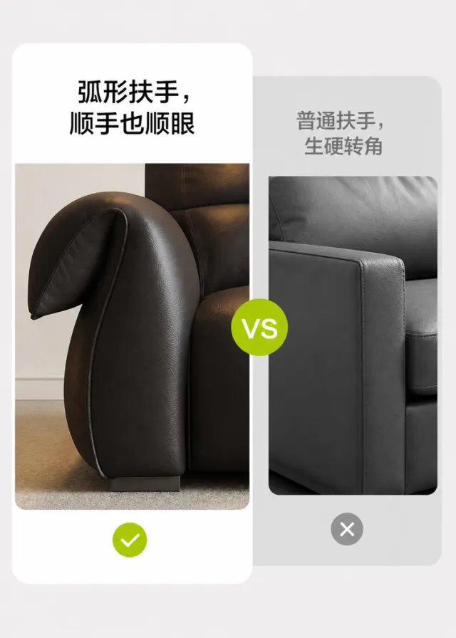
Generate a visual mockup for the craftsmanship details page of a leather sofa armrest. On a light gray background, employ a left–right contrast: on the left, a large rounded‑corner white card showcases a close‑up view of the deep brown leather sofa’s streamlined, curved armrest from the side, with the headline “Curved Armrest—Comfortable to the Touch and Pleasing to the Eye,” accompanied by a green checkmark below. On the right, a grayscale card highlights the rigid, angular design of a standard armrest, overlaid with a subtle gray cross. A circular “VS” logo separates the two visuals, rendered in modern black typeface with clean, well‑balanced white space and realistic leather texture. Do not include any text related to the original brand, logos, slogans, patents, or counterfeit claims. Output dimensions: 750 x 1050px. Avoid misaligned text, overlapping elements, text overflow, obvious shadows, jagged icons, irrelevant small print, or visible web page borders.

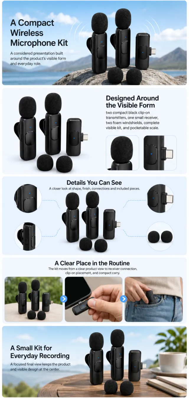
Using the supplied reference image as the sole product reference, create an Amazon A+ design preview for a wireless clip-on microphone kit. Preserve exact geometry, proportions, colors, construction, quantity, accessories, and scale. Visible details: two compact black clip-on transmitters, one small receiver, two foam windshields, complete visible kit, and pocketable scale. Do not invent hidden parts or claims. Visual system: sky blue, white, black, and soft gray. Composition motifs: wide outdoor banners, rounded carry windows, signal arcs, and clean device connection diagrams. Alternate a wide banner, asymmetric overview, centered detail graphic, three-scene sequence, and wide closing scene. Use readable sans-serif type and mobile-safe margins. Build this official A+ module order. Keep every module independently complete; never split copy or product details. MODULE 1 — Image with text overlay — introduction Exact headline: “A Compact Wireless Microphone Kit” Exact supporting copy: “A considered presentation built around the product’s visible form and everyday role.” Layout: wide image-led hero; dominant complete product and large safe headline area. MODULE 2 — Single image with side text — product overview Exact headline: “Designed Around the Visible Form” Exact supporting copy: “two compact black clip-on transmitters, one small receiver, two foam windshields, complete visible kit, and pocketable scale.” Layout: large three-quarter product, side text field, and two detail crops. MODULE 3 — Four-image and text — visible evidence Exact headline: “Details You Can See” Exact supporting copy: “A closer look at shape, finish, connections and included pieces.” Layout: centered product with four rounded macro callouts; show only visible facts. MODULE 4 — Multiple image and text — routine or use setting Exact headline: “A Clear Place in the Routine” Exact supporting copy: “The kit moves from a clear product view to receiver connection, clip-on placement, and compact carry.” Layout: three framed scenes with consistent product design and newly generated people or animals only when relevant. MODULE 5 — Full-width image with text overlay — closing Exact headline: “A Small Kit for Everyday Recording” Exact supporting copy: “A focused final view keeps the product and visible design at the center.” Layout: wide editorial scene, strong silhouette, restrained props, safe text area. Create one vertical A+ preview at 1200px width with content-driven height, clear module boundaries, and varied compositions for independent export. Render only the exact copy above. Do not add logos, prices, promotions, QR codes, URLs, contacts, competitors, testimonials, ratings, guarantees, unverified claims, certifications, fake UI, watermarks, pseudo-text, or unrelated labels. Keep all elements natural and mobile-safe.

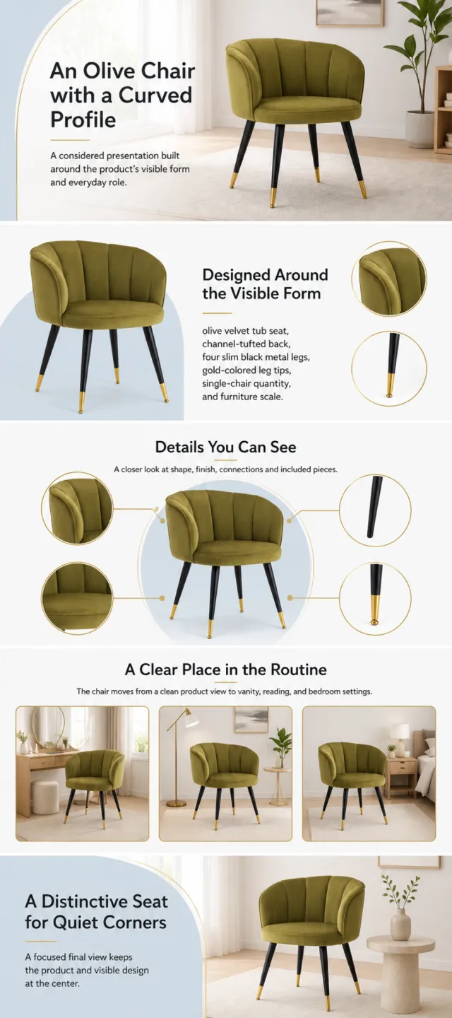
Using the supplied reference image as the sole product reference, create an Amazon A+ design preview for an upholstered accent chair. Preserve exact geometry, proportions, colors, construction, quantity, accessories, and scale. Visible details: olive velvet tub seat, channel-tufted back, four slim black metal legs, gold-colored leg tips, single-chair quantity, and furniture scale. Do not invent hidden parts or claims. Visual system: olive green, warm white, pale blue, black, and muted gold. Composition motifs: large airy interiors, circular detail crops, arched color panels, and restrained line accents. Alternate a wide banner, asymmetric overview, centered detail graphic, three-scene sequence, and wide closing scene. Use readable sans-serif type and mobile-safe margins. Build this official A+ module order. Keep every module independently complete; never split copy or product details. MODULE 1 — Image with text overlay — introduction Exact headline: “An Olive Chair with a Curved Profile” Exact supporting copy: “A considered presentation built around the product’s visible form and everyday role.” Layout: wide image-led hero; dominant complete product and large safe headline area. MODULE 2 — Single image with side text — product overview Exact headline: “Designed Around the Visible Form” Exact supporting copy: “olive velvet tub seat, channel-tufted back, four slim black metal legs, gold-colored leg tips, single-chair quantity, and furniture scale.” Layout: large three-quarter product, side text field, and two detail crops. MODULE 3 — Four-image and text — visible evidence Exact headline: “Details You Can See” Exact supporting copy: “A closer look at shape, finish, connections and included pieces.” Layout: centered product with four rounded macro callouts; show only visible facts. MODULE 4 — Multiple image and text — routine or use setting Exact headline: “A Clear Place in the Routine” Exact supporting copy: “The chair moves from a clean product view to vanity, reading, and bedroom settings.” Layout: three framed scenes with consistent product design and newly generated people or animals only when relevant. MODULE 5 — Full-width image with text overlay — closing Exact headline: “A Distinctive Seat for Quiet Corners” Exact supporting copy: “A focused final view keeps the product and visible design at the center.” Layout: wide editorial scene, strong silhouette, restrained props, safe text area. Create one vertical A+ preview at 1200px width with content-driven height, clear module boundaries, and varied compositions for independent export. Render only the exact copy above. Do not add logos, prices, promotions, QR codes, URLs, contacts, competitors, testimonials, ratings, guarantees, unverified claims, certifications, fake UI, watermarks, pseudo-text, or unrelated labels. Keep all elements natural and mobile-safe.

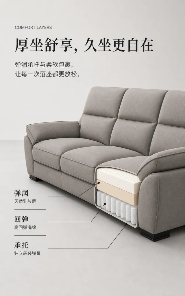
Based on the reference image, generate a render for a modern home sofa product detail page. Product Presentation: - Maintain the warm gray three‑seat fabric sofa’s high backrest, thick and plush seat cushions, upholstered armrests, low dark‑toned feet, and comfortable velvety fabric. - Position the sofa in the lower right corner of the frame, presented from a slight three‑quarter side view; show a clean horizontal cross‑section of the right seat cushion, revealing the white latex layer, light beige high‑resilience foam layer, and independent pocket spring structure. - Ensure no brand names, logos, slogans, or decorative text appear on the product surface. Visual Layout: - Vertical composition with a warm, light gray background. In the upper left, include English supporting text, a single‑line headline, and two lines of descriptive copy, leaving ample breathing room. - The lower half is dominated by the sofa, with three sets of structural labels arranged vertically on the left. Each label is precisely connected to its corresponding sectional material using thin black leader lines and small dots, without crossing the sofa’s outline. - Employ soft studio lighting and subtle gray floor reflections to achieve a clean, restrained aesthetic with the refined texture of a high‑end home‑furnishings catalog. Typography and Text Layout: - Use a light, modern sans‑serif typeface for the English supporting text; an elegant, high‑contrast Songti font for the Chinese headline; and a clear, standard sans‑serif for the body text. - Align the headline left‑justified, occupying approximately 72% of the width, as a single line of large type. Place the body text below the headline, at about 34% of the headline’s size, with generous line spacing. - Left‑align the three structural label groups, with larger primary terms and smaller material descriptions, separated by fine dividers, keeping all text within safe margins. Copywriting: - English Supporting Text: COMFORT LAYERS - Headline: Plush Seating, Comfort That Lasts - Body Text: Bouncy support and gentle envelopment make every sit feel more relaxing. - Label 1: Bouncy / Natural Latex Layer - Label 2: Resilient / High‑Resilience Foam - Label 3: Supportive / Independent Pocket Springs Graphic Elements: - Utilize thin black leader lines, circular markers, and three delicate horizontal dividers, with crisp, smooth edges. Output Size: 750 x 1200px. Avoidance Guidelines: - No real brands, model numbers, footnotes, garbled characters, watermarks, overlapping text, text overflow, subject obstruction, abnormal subject proportions, repeated sofas, low‑resolution leader lines, or unusual blank spaces.

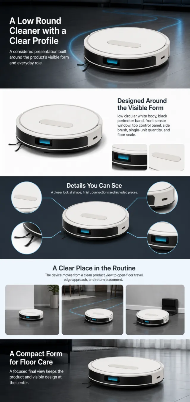
Using the supplied reference image as the sole product reference, create an Amazon A+ design preview for a round robot vacuum. Preserve exact geometry, proportions, colors, construction, quantity, accessories, and scale. Visible details: low circular white body, black perimeter band, front sensor window, top control panel, side brush, single-unit quantity, and floor scale. Do not invent hidden parts or claims. Visual system: charcoal, white, electric cyan, and pale blue. Composition motifs: dark room banners, glowing path lines, transparent mechanism views, and clean obstacle diagrams. Alternate a wide banner, asymmetric overview, centered detail graphic, three-scene sequence, and wide closing scene. Use readable sans-serif type and mobile-safe margins. Build this official A+ module order. Keep every module independently complete; never split copy or product details. MODULE 1 — Image with text overlay — introduction Exact headline: “A Low Round Cleaner with a Clear Profile” Exact supporting copy: “A considered presentation built around the product’s visible form and everyday role.” Layout: wide image-led hero; dominant complete product and large safe headline area. MODULE 2 — Single image with side text — product overview Exact headline: “Designed Around the Visible Form” Exact supporting copy: “low circular white body, black perimeter band, front sensor window, top control panel, side brush, single-unit quantity, and floor scale.” Layout: large three-quarter product, side text field, and two detail crops. MODULE 3 — Four-image and text — visible evidence Exact headline: “Details You Can See” Exact supporting copy: “A closer look at shape, finish, connections and included pieces.” Layout: centered product with four rounded macro callouts; show only visible facts. MODULE 4 — Multiple image and text — routine or use setting Exact headline: “A Clear Place in the Routine” Exact supporting copy: “The device moves from a clean product view to open-floor travel, edge approach, and return placement.” Layout: three framed scenes with consistent product design and newly generated people or animals only when relevant. MODULE 5 — Full-width image with text overlay — closing Exact headline: “A Compact Form for Floor Care” Exact supporting copy: “A focused final view keeps the product and visible design at the center.” Layout: wide editorial scene, strong silhouette, restrained props, safe text area. Create one vertical A+ preview at 1200px width with content-driven height, clear module boundaries, and varied compositions for independent export. Render only the exact copy above. Do not add logos, prices, promotions, QR codes, URLs, contacts, competitors, testimonials, ratings, guarantees, unverified claims, certifications, fake UI, watermarks, pseudo-text, or unrelated labels. Keep all elements natural and mobile-safe.

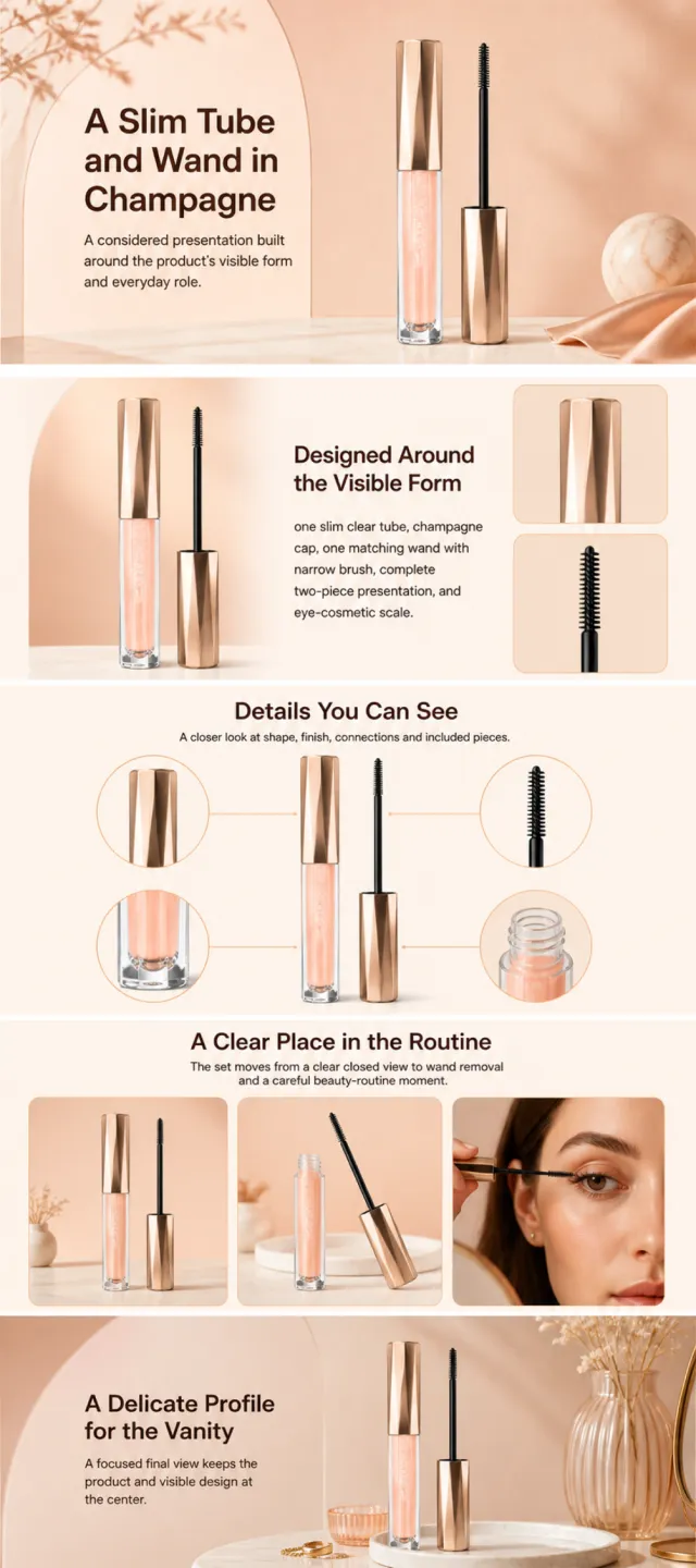
Using the supplied reference image as the sole product reference, create an Amazon A+ design preview for a lash-cosmetic tube and wand set. Preserve exact geometry, proportions, colors, construction, quantity, accessories, and scale. Visible details: one slim clear tube, champagne cap, one matching wand with narrow brush, complete two-piece presentation, and eye-cosmetic scale. Do not invent hidden parts or claims. Visual system: warm peach, champagne gold, cream, and cocoa brown. Composition motifs: soft beauty portraits, arched beige panels, circular brush details, and airy cosmetic still lifes. Alternate a wide banner, asymmetric overview, centered detail graphic, three-scene sequence, and wide closing scene. Use readable sans-serif type and mobile-safe margins. Build this official A+ module order. Keep every module independently complete; never split copy or product details. MODULE 1 — Image with text overlay — introduction Exact headline: “A Slim Tube and Wand in Champagne” Exact supporting copy: “A considered presentation built around the product’s visible form and everyday role.” Layout: wide image-led hero; dominant complete product and large safe headline area. MODULE 2 — Single image with side text — product overview Exact headline: “Designed Around the Visible Form” Exact supporting copy: “one slim clear tube, champagne cap, one matching wand with narrow brush, complete two-piece presentation, and eye-cosmetic scale.” Layout: large three-quarter product, side text field, and two detail crops. MODULE 3 — Four-image and text — visible evidence Exact headline: “Details You Can See” Exact supporting copy: “A closer look at shape, finish, connections and included pieces.” Layout: centered product with four rounded macro callouts; show only visible facts. MODULE 4 — Multiple image and text — routine or use setting Exact headline: “A Clear Place in the Routine” Exact supporting copy: “The set moves from a clear closed view to wand removal and a careful beauty-routine moment.” Layout: three framed scenes with consistent product design and newly generated people or animals only when relevant. MODULE 5 — Full-width image with text overlay — closing Exact headline: “A Delicate Profile for the Vanity” Exact supporting copy: “A focused final view keeps the product and visible design at the center.” Layout: wide editorial scene, strong silhouette, restrained props, safe text area. Create one vertical A+ preview at 1200px width with content-driven height, clear module boundaries, and varied compositions for independent export. Render only the exact copy above. Do not add logos, prices, promotions, QR codes, URLs, contacts, competitors, testimonials, ratings, guarantees, unverified claims, certifications, fake UI, watermarks, pseudo-text, or unrelated labels. Keep all elements natural and mobile-safe.

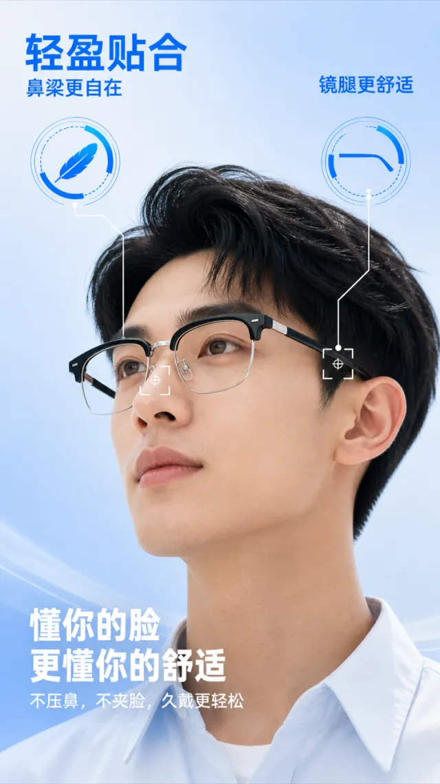
Based on the reference image, generate a render for an e‑commerce product detail page showcasing lightweight optical eyewear. On a light sky-blue gradient background, an adult model wears semi‑rimless black optical glasses from a side‑upward angle, emphasizing the nose pads, temples, hinges, and the close fit between the frame and the face. The glasses retain a semi‑rimless design with clear lenses, slender metal nose pads, and flexible temples; edge and hinge details have been subtly refined. The product surface bears no brand logos, slogans, or decorative text. The bridge of the nose and ear area are marked with ultra‑thin white positioning frames and crosshair lines indicating pressure‑bearing contact points. In the upper left corner, bold bright blue Chinese text reads “Lightweight & Close Fit,” with the smaller subtitle below: “More Comfort on the Bridge.” In the upper right, “More Comfortable Temples” is displayed, each accompanied by a large, blue, data‑inspired icon—without specific percentage values. At the bottom, aligned to the left in bold white Chinese, two lines read “Understands Your Face” and “Even More Comfort.” Below these, the body copy states: “No pressure on the nose, no pinching on the cheeks—longer wear feels easier.” The typography is modern and crisp, while the blue informational markers paired with the model’s portrait create a clean, tech‑savvy aesthetic. Text does not obscure the face or the glasses. Output dimensions: 750 x 1334px. Avoid: real brands, model numbers, footnotes, garbled characters, watermarks, overlapping text, text overflow, obstruction of people or main subjects, abnormal subject proportions, duplicate products, low‑resolution icons, and excessive negative space.

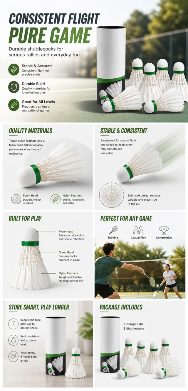
【Execution Route | Do Not Display】 If the image-generation tool can be invoked multiple times: concatenate the sharing rules with A–F separately, execute six times, generating only one 1000×1000 square image each time. If only a single image can be generated at a time: first set the interface/API to a 2:3 portrait orientation (do not use Auto), then arrange A/B, C/D, and E/F into a 2-column × 3-row grid; ensure all six cells are equal in size and maintain a visual aspect ratio of 1:1. The outer canvas must not be 1:1. 【Sharing Rules】 The provided product reference image serves as the sole basis for the product. The product is a badminton shuttlecock set. Strictly adhere to the reference image’s shape, structure, color, quantity, accessories, texture, and relative proportions; do not fabricate any unseen components, specifications, or functions. Use high-quality Amazon commercial photography and clear English infographics, with colors derived from the product, realistic lighting, and a clean layout. Maintain natural proportions for the product, figures, hands, icons, and props; stretching, flattening, or independently scaling is prohibited. Titles, products, and labels must remain fully within the safe zone, with the background extending evenly to all four edges. Only use MOCKUP for branding. Avoid peripheral white borders, vertical sidebars, transparent fill-in borders, watermarks, contact information, social media accounts, original brand logos, platform identifiers, garbled text, distorted body parts, or unverified copywriting. A–F are solely control markers and must not be displayed. 【A | Product Overview】Title: “PRODUCT OVERVIEW.” The hero composition should fully showcase the product along with the accessories included in the reference image, accompanied by three brief English icon-based selling points that highlight only visible or verifiable information. 【B | Materials & Design】Title: “MATERIAL & DESIGN.” Present materials, structure, surface finishes, or styling through an overall view of the product combined with 2–3 close-up details; ensure clear labeling without inventing material names. 【C | Function in Focus】Title: “FUNCTION IN FOCUS.” Demonstrate key functions within realistic usage scenarios; maintain natural proportions among figures, hands, and the product, with authentic actions and easily understandable information. 【D | Details Up Close】Title: “DETAILS UP CLOSE.” Highlight 2–4 critical structural or operational areas using magnified details and short captions; do not alter the product’s structure. 【E | Everyday Use】Title: “MADE FOR REAL LIFE.” Showcase usage, carrying, storage, or maintenance scenarios consistent with the product; focus on a single clear theme and avoid redundancy with C. 【F | Packaging Contents】Title: “WHAT’S INCLUDED.” Lay out or neatly display the actual products and accessories shown in the reference image, ensuring accurate quantities and relative sizes; if the contents cannot be confirmed, instead present visible specifications, dimensional relationships, or usage steps without fabricating numbers.
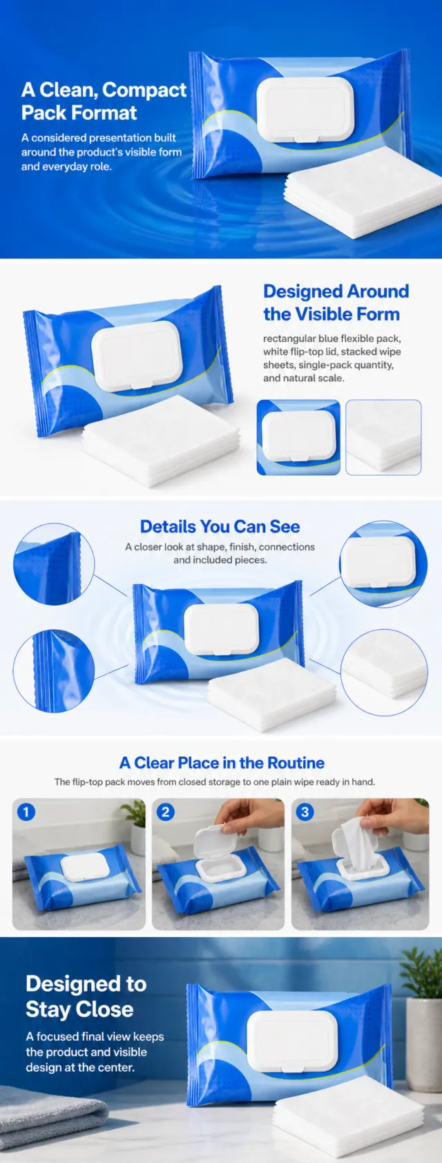
Using the supplied reference image as the sole product reference, create an Amazon A+ design preview for a soft-pack wet-wipe product. Preserve exact geometry, proportions, colors, construction, quantity, accessories, and scale. Visible details: rectangular blue flexible pack, white flip-top lid, stacked wipe sheets, single-pack quantity, and natural scale. Do not invent hidden parts or claims. Visual system: vivid royal blue, pale sky blue, white, and lime accents. Composition motifs: water-ripple circles, layered wipe sheets, rounded blue panels, and compact lifestyle frames. Alternate a wide banner, asymmetric overview, centered detail graphic, three-scene sequence, and wide closing scene. Use readable sans-serif type and mobile-safe margins. Build this official A+ module order. Keep every module independently complete; never split copy or product details. MODULE 1 — Image with text overlay — introduction Exact headline: “A Clean, Compact Pack Format” Exact supporting copy: “A considered presentation built around the product’s visible form and everyday role.” Layout: wide image-led hero; dominant complete product and large safe headline area. MODULE 2 — Single image with side text — product overview Exact headline: “Designed Around the Visible Form” Exact supporting copy: “rectangular blue flexible pack, white flip-top lid, stacked wipe sheets, single-pack quantity, and natural scale.” Layout: large three-quarter product, side text field, and two detail crops. MODULE 3 — Four-image and text — visible evidence Exact headline: “Details You Can See” Exact supporting copy: “A closer look at shape, finish, connections and included pieces.” Layout: centered product with four rounded macro callouts; show only visible facts. MODULE 4 — Multiple image and text — routine or use setting Exact headline: “A Clear Place in the Routine” Exact supporting copy: “The flip-top pack moves from closed storage to one plain wipe ready in hand.” Layout: three framed scenes with consistent product design and newly generated people or animals only when relevant. MODULE 5 — Full-width image with text overlay — closing Exact headline: “Designed to Stay Close” Exact supporting copy: “A focused final view keeps the product and visible design at the center.” Layout: wide editorial scene, strong silhouette, restrained props, safe text area. Create one vertical A+ preview at 1200px width with content-driven height, clear module boundaries, and varied compositions for independent export. Render only the exact copy above. Do not add logos, prices, promotions, QR codes, URLs, contacts, competitors, testimonials, ratings, guarantees, unverified claims, certifications, fake UI, watermarks, pseudo-text, or unrelated labels. Keep all elements natural and mobile-safe.
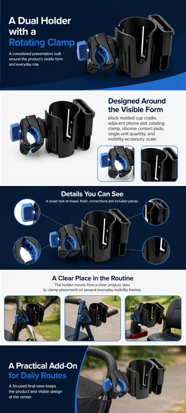
Using the supplied reference image as the sole product reference, create an Amazon A+ design preview for a clamp-on cup-and-phone holder. Preserve exact geometry, proportions, colors, construction, quantity, accessories, and scale. Visible details: black molded cup cradle, adjacent phone slot, rotating clamp, silicone contact pads, single-unit quantity, and mobility-accessory scale. Do not invent hidden parts or claims. Visual system: deep navy, bright blue, white, and matte black. Composition motifs: rounded compatibility tiles, circular clamp details, wide installation scenes, and clean dimensional silhouettes. Alternate a wide banner, asymmetric overview, centered detail graphic, three-scene sequence, and wide closing scene. Use readable sans-serif type and mobile-safe margins. Build this official A+ module order. Keep every module independently complete; never split copy or product details. MODULE 1 — Image with text overlay — introduction Exact headline: “A Dual Holder with a Rotating Clamp” Exact supporting copy: “A considered presentation built around the product’s visible form and everyday role.” Layout: wide image-led hero; dominant complete product and large safe headline area. MODULE 2 — Single image with side text — product overview Exact headline: “Designed Around the Visible Form” Exact supporting copy: “black molded cup cradle, adjacent phone slot, rotating clamp, silicone contact pads, single-unit quantity, and mobility-accessory scale.” Layout: large three-quarter product, side text field, and two detail crops. MODULE 3 — Four-image and text — visible evidence Exact headline: “Details You Can See” Exact supporting copy: “A closer look at shape, finish, connections and included pieces.” Layout: centered product with four rounded macro callouts; show only visible facts. MODULE 4 — Multiple image and text — routine or use setting Exact headline: “A Clear Place in the Routine” Exact supporting copy: “The holder moves from a clear product view to clamp placement on several everyday mobility frames.” Layout: three framed scenes with consistent product design and newly generated people or animals only when relevant. MODULE 5 — Full-width image with text overlay — closing Exact headline: “A Practical Add-On for Daily Routes” Exact supporting copy: “A focused final view keeps the product and visible design at the center.” Layout: wide editorial scene, strong silhouette, restrained props, safe text area. Create one vertical A+ preview at 1200px width with content-driven height, clear module boundaries, and varied compositions for independent export. Render only the exact copy above. Do not add logos, prices, promotions, QR codes, URLs, contacts, competitors, testimonials, ratings, guarantees, unverified claims, certifications, fake UI, watermarks, pseudo-text, or unrelated labels. Keep all elements natural and mobile-safe.