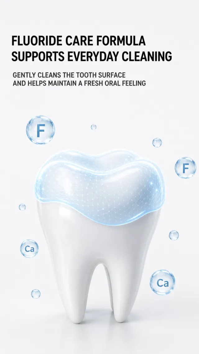
Generate a fluoride toothpaste formula principle poster without the product itself. The background is pure light gray-white, with two lines of coarse black modern sans-serif lined on the top left: "Fluoride Protection Formula / Protect Daily Cleanliness," and two gray-black lines below say "Gently cleanses the tooth surface, helps maintain oral freshness." In the lower half of the painting, an enlarged white tooth is placed, with the crown surface covered by a translucent light blue condensation protective layer, with the condensate edges smooth and natural; A small number of transparent blue circular particles float around it, with abstract letter symbols representing mineral elements.
The teeth use a soft, realistic 3D material, with a protective layer that has a fine mesh glossy texture but does not appear medical. The title occupies the upper half with blank space, the teeth are slightly larger in the center of the lower half, making the information concise and without stacked cards. Avoid diseases treatment, absolute moth-proofing, original image copy, specific ingredient dosages, small footnotes, watermarks, and screenshot borders.
【Execution Route | Do Not Display】
If the image-generation tool can be invoked multiple times: concatenate the sharing rules with A–F separately, execute six times, generating only one 1000×1000 square image each time.
If only a single image can be generated at a time: first set the interface/API to a 2:3 portrait orientation (do not use Auto), then arrange A/B, C/D, and E/F into a 2-column × 3-row grid; ensure all six cells are equal in size and maintain a visual aspect ratio of 1:1. The outer canvas must not be 1:1.
【Sharing Rules】
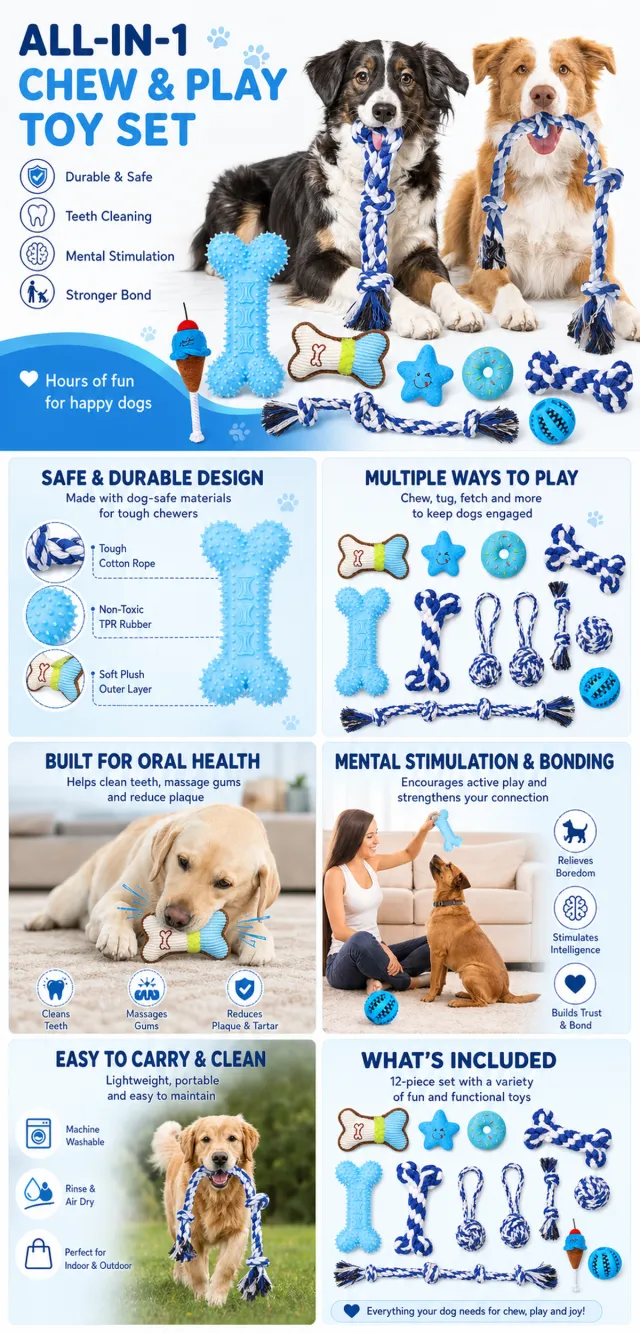
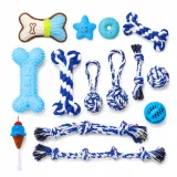
The provided product reference image serves as the sole basis for the product. The product is a dog chew toy set. Strictly adhere to the shape, structure, color, quantity, accessories, texture, and relative proportions shown in the reference image; do not fabricate any components, specifications, or functions that are not depicted. Use high-quality Amazon commercial photography and clear English infographics; color schemes should match the product, lighting must be realistic, and layout kept simple. Maintain natural proportions among the product, figures, hands, icons, and props—no stretching, flattening, or independent scaling is allowed. Titles, products, and labels must remain fully within the safe zone, with the background extending seamlessly to all four edges. Only use MOCKUP for branding. No white borders, vertical sidebars, transparent fill‑ins, watermarks, contact information, social media accounts, original brand logos, platform identifiers, garbled text, distorted body parts, or unverified copywriting are permitted. A–F are solely control markers and must not be displayed.
【A | Product Overview】Title: “PRODUCT OVERVIEW.” The hero composition should fully showcase the product along with the accessories included in the reference image; accompany it with three brief English icon‑based selling points, stating only information that is visible or verifiable.
【B | Materials & Design】Title: “MATERIAL & DESIGN.” Present materials, structure, surface finishes, or styling through an overall view of the product combined with 2–3 close-up shots of specific areas; ensure clear labeling without inventing material names.
【C | Function in Focus】Title: “FUNCTION IN FOCUS.” Demonstrate key functions within realistic usage scenarios; maintain natural proportions among characters, hands, and the product, with actions appearing genuine and information easily understandable at a glance.
【D | Details Up Close】Title: “DETAILS UP CLOSE.” Highlight 2–4 critical structural or operational areas using magnified details and short captions; do not alter the product’s structure.
【E | Everyday Use】Title: “MADE FOR REAL LIFE.” Showcase scenes of actual use, carrying, storage, or maintenance that align with the product; keep the focus on a single clear theme and avoid duplication with C.
【F | Packaging Contents】Title: “WHAT’S INCLUDED.” Lay out or neatly arrange the actual products and accessories featured in the reference image, ensuring accurate quantities and relative sizes; if the contents cannot be confirmed, instead display visible specifications, dimensional relationships, or usage steps, without fabricating numbers.
【Execution Route | Must Not Appear on Screen】
If the image-generation tool can be invoked multiple times: concatenate the sharing rules with A–F separately and execute six times; each time, generate only one independent 1000×1000 square image, resulting in six sub-images.
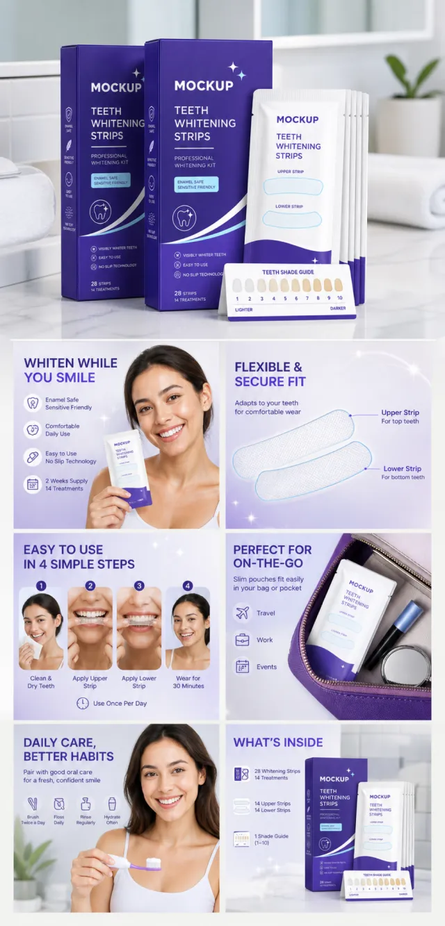
If only single‑shot generation is allowed: use a 2:3 vertical canvas measuring 1200×2500, with approximately 30% at the top reserved for the product’s main visual integrated into the background, and arrange the remaining area into a 2‑column × 3‑row grid labeled A/B, C/D, and E/F. All six cards should be equal in size, with an aspect ratio close to 1:1. Do not use a 1:1 outer canvas, nor full‑width cards, cross‑column cards, merged cards, borders, frames, or white margins.
【Sharing Rules】
The provided product reference image serves as the sole basis for the product’s appearance, structure, color, quantity, accessories, and relative proportions. Product orientation: tooth‑whitening strip packaging paired with individual strips; emphasize fit, application steps, oral care, and portability, while avoiding absolute whitening claims. Maintain natural proportions for the product itself as well as any newly generated characters, animals, props, or text—no stretching, flattening, or non‑uniform scaling is permitted; ensure the background extends fully across all four edges. Use MOCKUP consistently for branding; remove original brand elements, logos, watermarks, contact information, social media handles, platform details, gibberish, and irrelevant content. Copywriting should be concise, clear, and credible, retaining the language of the reference image and refraining from adding unsupported absolute or medical claims. A–F are merely control markers and must not appear on screen.
【A | Core Selling Point】
Highlight the product’s most important value proposition and its complete main subject; keep the headline short and straightforward.
【B | Structure & Materials】
Showcase key structural features, materials, or components using close-up shots or simple annotations, adhering to the product’s intended direction.
【C | Real‑World Usage】
Generate natural human/animal figures or everyday scenes to demonstrate realistic usage, ensuring believable proportions and actions.
【D | Details & Steps】
Use close‑up views, step‑by‑step instructions, or flowcharts to explain operations, textures, interfaces, storage solutions, or maintenance details.
【E | Lifestyle Integration】
Illustrate how the product seamlessly fits into daily life scenarios such as home, commuting, outdoor activities, travel, or work.
【F | Sets & Portability】
Accurately depict the product, its accessories, quantities, and storage relationships; do not add any components absent from the reference image.
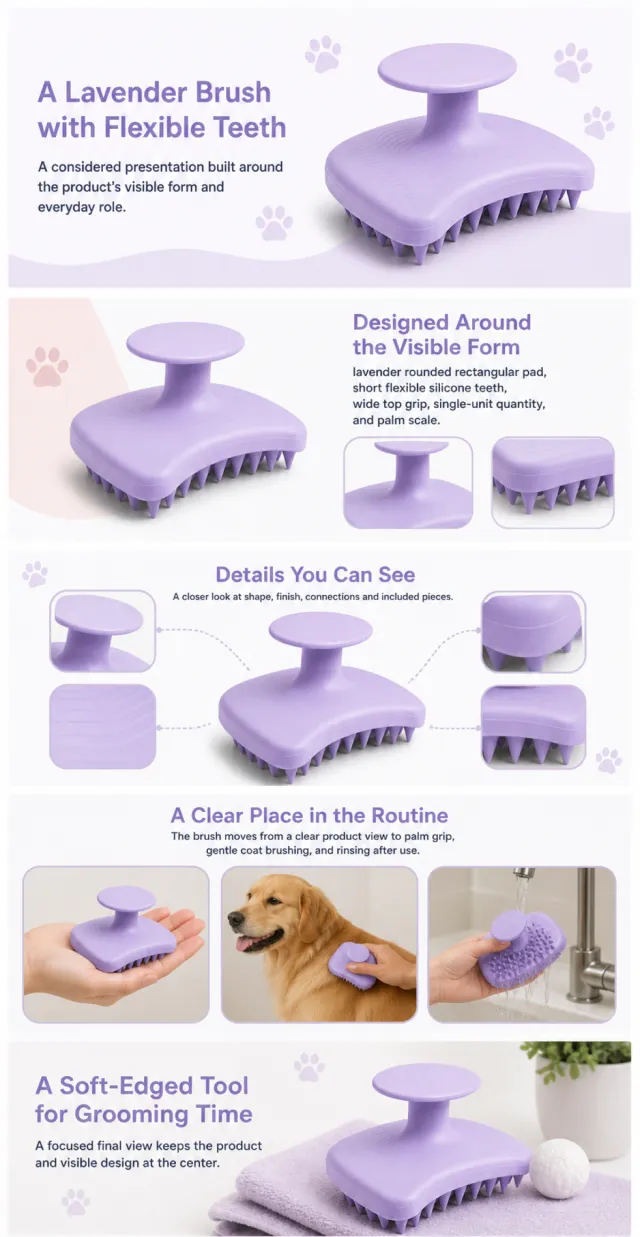
Using the supplied reference image as the sole product reference, create an Amazon A+ design preview for a silicone pet grooming brush. Preserve exact geometry, proportions, colors, construction, quantity, accessories, and scale. Visible details: lavender rounded rectangular pad, short flexible silicone teeth, wide top grip, single-unit quantity, and palm scale. Do not invent hidden parts or claims.
Visual system: lavender, white, soft gray, pale blush, and charcoal. Composition motifs: paw-print accents, rounded pet portraits, three-step handling tiles, and close-up tooth patterns. Alternate a wide banner, asymmetric overview, centered detail graphic, three-scene sequence, and wide closing scene. Use readable sans-serif type and mobile-safe margins.
Build this official A+ module order. Keep every module independently complete; never split copy or product details.
MODULE 1 — Image with text overlay — introduction
Exact headline: “A Lavender Brush with Flexible Teeth”
Exact supporting copy: “A considered presentation built around the product’s visible form and everyday role.”
Layout: wide image-led hero; dominant complete product and large safe headline area.
MODULE 2 — Single image with side text — product overview
Exact headline: “Designed Around the Visible Form”
Exact supporting copy: “lavender rounded rectangular pad, short flexible silicone teeth, wide top grip, single-unit quantity, and palm scale.”
Layout: large three-quarter product, side text field, and two detail crops.
MODULE 3 — Four-image and text — visible evidence
Exact headline: “Details You Can See”
Exact supporting copy: “A closer look at shape, finish, connections and included pieces.”
Layout: centered product with four rounded macro callouts; show only visible facts.
MODULE 4 — Multiple image and text — routine or use setting
Exact headline: “A Clear Place in the Routine”
Exact supporting copy: “The brush moves from a clear product view to palm grip, gentle coat brushing, and rinsing after use.”
Layout: three framed scenes with consistent product design and newly generated people or animals only when relevant.
MODULE 5 — Full-width image with text overlay — closing
Exact headline: “A Soft-Edged Tool for Grooming Time”
Exact supporting copy: “A focused final view keeps the product and visible design at the center.”
Layout: wide editorial scene, strong silhouette, restrained props, safe text area.
Create one vertical A+ preview at 1200px width with content-driven height, clear module boundaries, and varied compositions for independent export. Render only the exact copy above. Do not add logos, prices, promotions, QR codes, URLs, contacts, competitors, testimonials, ratings, guarantees, unverified claims, certifications, fake UI, watermarks, pseudo-text, or unrelated labels. Keep all elements natural and mobile-safe.