Discover inspiration

【Execution Route | Must Not Appear on Screen】 If the image-generation tool can be invoked multiple times: concatenate the sharing rules with A–F separately, and execute six times; each time, generate only one 1000×1000 square image. If only a single image can be generated at a time: first set the interface/API to a 2:3 portrait orientation and do not use Auto; then generate a 2-column × 3-row grid labeled A/B, C/D, and E/F. All six cells must be equal in size, with a visual ratio of 1:1. The outer canvas must not be 1:1. 【Sharing Rules】 The provided product reference image serves as the sole basis for the product’s appearance, structure, color, quantity, accessories, and relative proportions. The product is a dark olive-green daily soft-chew nutritional jar for dogs, featuring a beige screw cap and label, with the front showcasing a bowl of brown, square-shaped soft chews. The visual style employs natural outdoor pet nutrition tones—deep green, cream, and warm brown—with friendly English typography and realistic golden daylight. Products, people, animals, text, icons, and props must maintain their natural proportions; stretching or independent scaling is prohibited. All essential information must remain within the safe zone, while the background extends fully across all four edges. Only MOCKUP may be used for branding. Remove any surrounding white borders, vertical sidebars, numbered corner marks, watermarks, contact details, social media accounts, original brand logos, platform information, gibberish, distorted limbs, and irrelevant content. People and animals must be recreated from scratch. Copy should be concise, readable, and trustworthy; A–F are purely control markers and must not appear on screen. 【A | Core Selling Point】Title: “ONE CHEW, SIMPLE ROUTINE.” Show the nutritional jar alongside a newly created happy adult dog, emphasizing simple everyday support without making therapeutic claims. 【B | Everyday Support】Title: “DAILY SUPPORT MADE EASY.” Use four clean icons to represent coat health, vitality, activity, and digestion, with restrained yet credible copy. 【C | Soft Chew Format】Title: “SOFT CHEW FORMAT.” Close-up shots of the soft chews and small bowl highlight the square texture and easy-to-use format. 【D | Real-Life Scene】Title: “MADE FOR REAL LIFE.” After an outdoor walk, the owner naturally hands over a chew, with the full jar prominently displayed in the foreground. 【E | Usage Instructions】Title: “SERVE WITH MEALTIME.” No three-part numerical sequence—open, take out, serve alongside the regular meal. 【F | Product Overview】Title: “JAR CONTENTS.” Neatly arrange the nutritional jar, its open lid, and the soft chews, without exaggerating the quantity.

【Execution Route | Must Not Appear on Screen】 If the image-generation tool can be invoked multiple times: concatenate the sharing rules with A–F separately, and execute six times; each time generating only one 1000×1000 square image. If only a single image can be generated at a time: first set the interface/API to a 2:3 portrait orientation and disable Auto; then generate a 2-column × 3-row grid labeled A/B, C/D, and E/F. All six cells must be equal in size, with a visual ratio of 1:1. Do not use an outer canvas with a 1:1 aspect ratio. 【Sharing Rules】 The provided product reference image serves as the sole basis for the product’s appearance, structure, color, quantity, accessories, and relative proportions. The product is a resealable cat food bag in sage green and charcoal gray, featuring a cream-colored label, botanical line art, and round kibble windows, accompanied by a mint-green measuring spoon and a bowl of dry food. The visual style employs natural, premium pet-food aesthetics in sage green, cream white, and charcoal gray, with clear English typography, soft daylight, and plant-inspired elements. Products, people, animals, text, icons, and props must maintain their natural proportions; stretching or independent scaling is prohibited. All essential information must remain within the safe zone, while the background extends fully across all four edges. Only MOCKUP should be used for branding. Remove any surrounding white borders, vertical sidebars, numbered corner marks, watermarks, contact information, social media accounts, original brand logos, platform details, gibberish, distorted limbs, and unrelated content. People and animals must be recreated from scratch. Copywriting should be concise, readable, and trustworthy; A–F are solely control markers and must not appear on screen. 【A | Core Selling Point】Title: “EVERYDAY NUTRITION FOR CATS.” The hero composition features a cat food bag alongside a newly rendered adult cat, creating an overall natural, high-end aesthetic—without mentioning medical claims or absolute efficacy. 【B | Kibble Display】Title: “CRUNCHY KIBBLE, EASY TO SERVE.” Close-up shots of the bowl, measuring spoon, and kibbles showcase authentic texture and appropriate portion sizes. 【C | Dining Scene】Title: “MEALTIME MADE SIMPLE.” An adult cat enjoys its meal in a bright, homey setting, with packaging and the measuring spoon clearly visible. 【D | Packaging Details】Title: “PACKAGE DETAILS.” Four close-up shots highlight the sealed top, stable bag bottom, kibble window, and botanical line art. 【E | Usage Instructions】Title: “SCOOP, SERVE, ENJOY.” Three simple actions without numbers: open the package, measure out the food, and pour it into the bowl. 【F | Set Contents】Title: “BAG + SCOOP + BOWL.” A complete product set featuring the bag, a mint-green measuring spoon, and a bowl neatly arranged.

【Output Guidelines | Must Not Appear on Screen】 Generate only one 1000×1000, 1:1 Amazon Listing secondary image. Do not use collage images, six‑panel grids, storyboard layouts, multi‑card grids, or multiple frames. 【Sharing Guidelines】 Use the provided product reference image as the sole basis for product appearance, structure, color, quantity, accessories, and relative proportions. The product is a coral‑red interactive cat toy, comprising a textured soft ball, a transparent connecting ring, a braided long rope, a soft ring‑shaped handle, and fabric tassels at the ball’s end. The visual style employs bright, natural photography set in a modern living room, accented with coral red, navy blue, and soft green hues, with clear English typography. Maintain natural proportions for products, people, animals, text, icons, and props; do not stretch or scale elements independently. Ensure all essential information remains within the safe area, and extend the background to fully cover all four edges. Use only the MOCKUP brand name. Remove any surrounding white borders, vertical sidebars, watermarks, contact information, social media handles, original brand logos, platform details, gibberish, distorted body parts, or irrelevant content. People and animals must be recreated from scratch. 【Image Composition】 Title: “PLAY THAT MOVES WITH THEM.” A newly generated adult cat chases a coral‑red rope ball across a light‑colored rug, while the owner’s hand—naturally holding the ring‑shaped handle—is shown in full view. The toy, from the handle to the ball, is fully visible and maintains its natural length. On the right side, three colorful rounded‑corner labels accompanied by icons display: “FLEXIBLE BRAIDED CORD,” “EASY LOOP HANDLE,” and “TEXTURED PLAY BALL.” The background fills the entire frame, with no card‑style collages.

【Execution Route | Must Not Appear on Screen】 If the image-generation tool can be invoked multiple times: concatenate the sharing rules with A–F separately, and execute six times; each time, generate only one 1000×1000 square image. If only a single image can be generated at a time: first set the interface/API to a 2:3 portrait orientation and disable Auto; then arrange images in a 2-column × 3-row grid labeled A/B, C/D, and E/F. Ensure all six cells are equal in size and maintain a visual aspect ratio of 1:1. Do not use an outer canvas with a 1:1 ratio. 【Sharing Rules】 Use the provided product reference image as the sole basis for the product’s appearance, structure, color, quantity, accessories, and relative proportions. The product is a black, dual-bowl smart pet feeder featuring a cylindrical grain storage compartment, vertically grooved surfaces, a round top cover, two stainless steel bowls, and a mobile app control interface. Visuals should employ warm white home‑style photography, with black products and orange highlight information; use bold English text and a clean, minimalist UI. Maintain natural proportions for products, people, animals, text, icons, and props—no stretching or independent scaling allowed. Keep all essential information within the safe zone, and extend the background across the entire frame to all four edges. Use only the MOCKUP brand name. Remove any surrounding white borders, vertical sidebars, numbered corner marks, watermarks, contact details, social media accounts, original brand logos, platform information, gibberish, distorted body parts, and irrelevant content. People and animals must be newly rendered. Copy should be concise, readable, and trustworthy; A–F are purely control markers and must not appear on screen. 【A | Core Selling Point】Title: “MEALS ON YOUR SCHEDULE.” Feature a hero shot of the product with both bowls filled with appropriate portions of food, accompanied by a simple mobile‑app display showing the feeding schedule. 【B | Dual-Pet Use】Title: “TWO BOWLS, ONE FEEDER.” Two newly created pets are shown eating from the dual bowls, preventing competition while maintaining accurate product proportions. 【C | Remote Control】Title: “CONTROL FROM YOUR PHONE.” Depicts a newly created adult holding a smartphone, setting feeding times and portion sizes via a clean, non‑branded interface. 【D | Grain Storage Structure】Title: “DESIGNED TO KEEP FOOD READY.” Illustrates key structural elements—top cover, grain storage compartment, feed outlet, and dual bowls—without fabricating capacity figures. 【E | Outing Scenario】Title: “FEED EVEN WHEN YOU’RE AWAY.” Shows a split-screen narrative of the owner away from home versus the device dispensing food on schedule, ensuring complete information without cropping. 【F | Cleaning & Maintenance】Title: “EASY TO REFILL & CLEAN.” Demonstrates a no‑numbers workflow: open the top cover, replenish food, remove the bowls for cleaning.

【Execution Route | Must Not Appear on Screen】 If the image-generation tool can be invoked multiple times: concatenate the sharing rules with A–F separately, and execute six times; each time, generate only one 1000×1000 square image. If only a single image can be generated at a time: first set the interface/API to a 2:3 portrait orientation and do not use Auto; then arrange images in a 2-column × 3-row grid labeled A/B, C/D, and E/F. All six cells must be equal in size, with a visual aspect ratio of 1:1. The outer canvas must not be 1:1. 【Sharing Rules】 Use the provided product reference image as the sole basis for product appearance, structure, color, quantity, accessories, and relative proportions. The product is a white, wide-mouthed probiotic powder canister for dogs, featuring a dark teal striped lid, cream-and-teal green labels, and a transparent measuring spoon containing light-colored powder. The visual style employs clean pet nutrition graphics in white, dark teal, and soft beige, combined with modern English typography and bright lifestyle photography. Maintain natural proportions for products, people, animals, text, icons, and props—no stretching or independent scaling allowed. Ensure all essential information remains within the safe zone, with the background extending fully across all four edges. Use MOCKUP exclusively for branding. Remove any peripheral white borders, vertical sidebars, numbered corner marks, watermarks, contact details, social media accounts, original brand logos, platform information, gibberish, distorted body parts, and irrelevant content. People and animals must be recreated from scratch. Copy should be concise, readable, and trustworthy; A–F are solely control markers and must not appear on screen. 【A | Core Selling Point】Title: “A SIMPLE DAILY DIGESTIVE ROUTINE.” Feature a hero shot of the canister and measuring spoon, accompanied by credible language emphasizing everyday digestive support—without making therapeutic claims. 【B | Usage Instructions】Title: “MEASURE. MIX. SERVE.” Present three non-numeric scenes: measure the powder, mix it into food, and serve it to your dog. 【C | Powder Form】Title: “EASY-TO-MIX POWDER.” Close-up shots of the powder and measuring spoon highlight its fine texture and easy mixing. 【D | Everyday Scene】Title: “MADE FOR EVERYDAY MEALS.” Newly created imagery shows a dog owner adding the powder to their pet’s bowl in a bright kitchen. 【E | Packaging Details】Title: “DESIGNED FOR FRESHNESS.” Close-ups of the wide-mouth canister, striped screw-on lid, sealing edge, and label, focusing only on visible structural elements. 【F | Package Contents】Title: “JAR + MEASURING SCOOP.” Neatly arranged canister, measuring spoon, and a small amount of powder, with accurate quantities displayed.

【Execution Route | Must Not Appear on Screen】 If the image-generation tool can be invoked multiple times: concatenate the sharing rules with A–F separately, and execute six times; each time, generate only one 1000×1000 square image. If only one image can be generated at a time: first set the interface/API to a 2:3 portrait orientation and do not use Auto; then arrange images in a 2-column × 3-row grid labeled A/B, C/D, and E/F. All six cells must be equal in size, with a visual aspect ratio of 1:1. The outer canvas must not be 1:1. 【Sharing Rules】 Use the provided product reference image as the sole basis for product appearance, structure, color, quantity, accessories, and relative proportions. The product is a three-bag beige, resealable dog baking snack set, featuring pumpkin orange, roasted chicken brown, and carrot orange flavor blocks, accompanied by a small number of flower-shaped and pumpkin-shaped treats. Visuals should convey a warm, baked-food aesthetic using beige, cocoa brown, and pumpkin orange tones, with friendly, bold English typography and natural ingredient photography. Maintain natural proportions for products, people, animals, text, icons, and props; stretching or independent scaling is prohibited. Ensure all essential information remains within the safe area, with the background extending fully across all four edges. Use MOCKUP exclusively for branding. Remove any peripheral white borders, vertical sidebars, numbered corner labels, watermarks, contact information, social media accounts, original brand logos, platform details, gibberish, distorted limbs, and irrelevant content. People and animals must be recreated from scratch. Copy should be concise, readable, and trustworthy; A–F are solely control markers and must not appear on screen. 【A | Core Selling Point】Title: “THREE FLAVORS, MORE TAIL WAGS.” Arrange three bags of product as heroes, introducing three different dog breeds eagerly anticipating their snacks. 【B | Baked Texture】Title: “OVEN-BAKED CRUNCH.” Close-up shots of snack textures and visual elements representing the three flavors, without making absolute health claims. 【C | Real Moment】Title: “TREAT TIME, MADE EASY.” A hand naturally offers a single treat while the dog maintains a relaxed sitting posture, with the packaging clearly visible. 【D | Flavor Combination】Title: “A FLAVOR FOR EVERY MOOD.” Each bag features visual cues—pumpkin, roasted chicken, and carrot—arranged in a clear layout. 【E | Usage Scenarios】Title: “PERFECT FOR REWARDS.” Four unnumbered scenarios: training, post-walk, daily interaction, and celebration. 【F | Package Contents】Title: “THREE-BAG BUNDLE.” Three bags and a small selection of treats laid out flat, with accurate quantities, colors, and relative sizes.

【Execution Route | Must Not Appear on Screen】 If the image-generation tool can be invoked multiple times: concatenate the sharing rules with A–F separately, and execute six times; each time, generate only one 1000×1000 square image. If only a single image can be generated at a time: first set the interface/API to a 2:3 portrait orientation and disable Auto; then arrange images in a 2-column × 3-row grid labeled A/B, C/D, and E/F. All six cells must be equal in size, with a visual aspect ratio of 1:1. The outer canvas must not be 1:1. 【Sharing Rules】 Use the provided product reference image as the sole basis for the product’s appearance, structure, color, quantity, accessories, and relative proportions. The product is a reusable pet hair removal roller in mint green, apricot orange, and off-white, featuring a long handle and an openable hair collection chamber, showcasing both closed and open states. The visual style employs fresh, home‑inspired pet‑related infographics in mint green and apricot orange, with bold English text and bright, realistic indoor photography. Maintain natural proportions for products, people, animals, text, icons, and props; stretching or independent scaling is prohibited. Ensure all essential information remains within the safe zone, with the background extending fully across all four edges. Use “MOCKUP” exclusively for branding. Remove any peripheral white borders, vertical sidebars, numbered corner labels, watermarks, contact information, social media accounts, original brand logos, platform details, gibberish, distorted limbs, and irrelevant content. People and animals must be recreated from scratch. Copy should be concise, readable, and credible; A–F are solely control markers and must not appear on screen. 【A | Core Cleaning】Title: “PET HAIR, LIFTED FAST.” Feature a hero shot of the product rolling across a fabric sofa surface, clearly showing the areas before and after cleaning. 【B | Operation Process】Title: “ROLL. PRESS. EMPTY.” Depict three simple actions without numerical breakdown: roll back and forth, press to open the chamber, and empty out the collected hair. 【C | Reusability】Title: “REUSABLE BY DESIGN.” Show the product in both closed and open states within the same frame, emphasizing the hair-collection chamber design while avoiding comparisons involving consumables. 【D | Applicable Surfaces】Title: “WORKS ACROSS HOME FABRICS.” Illustrate five real-life scenarios: sofas, blankets, clothing, pet beds, and car seats. 【E | Structural Details】Title: “CLEANUP MADE SIMPLE.” Provide close-up shots of the roller’s surface, the opening button, the hair-collection chamber, and the handle. 【F | Pet‑Friendly Home】Title: “READY FOR PET-FILLED HOMES.” Introduce newly rendered scenes of cats and dogs alongside a tidy living room, with the product prominently placed in the foreground.

【Execution Route | Must Not Appear on Screen】 If the image-generation tool can be invoked multiple times: concatenate the sharing rules with A–F separately and execute six times, generating only one 1000×1000 square image each time. If only a single image can be generated at a time: first set the interface/API to a 2:3 vertical format and disable Auto; then generate a 2-column × 3-row grid labeled A/B, C/D, and E/F. All six cells must be equal in size, with a visual aspect ratio of 1:1. Do not use an outer canvas with a 1:1 ratio. 【Sharing Rules】 The provided product reference image serves as the sole basis for the product’s appearance, structure, color, quantity, accessories, and relative proportions. The product is a white, bone-shaped, rechargeable interactive dog toy featuring a dark gray control bar in the center, two cyan-blue indicator lights, and a white USB‑C cable. The visual style employs bright cyan-blue, white, and light gray to create a minimalist smart-pet aesthetic, accompanied by a large, sans-serif English title. Products, people, animals, text, icons, and props must maintain their natural proportions; stretching or independent scaling is prohibited. All essential information must remain within the safe area, with the background extending fully across all four edges. Only the MOCKUP logo may be used for branding. Remove any peripheral white borders, vertical sidebars, numbered corner marks, watermarks, contact information, social media accounts, original brand logos, platform details, gibberish, distorted body parts, and irrelevant content. People and animals must be recreated from scratch. Copywriting should be concise, readable, and trustworthy; A–F are solely control markers and must not appear on screen. 【A | Core Selling Point】Title: “SMART PLAY STARTS HERE.” The composition features a heroic toy character alongside a newly generated small dog, with the product’s light bar illuminated, leaving ample space for the title. 【B | Interactive Scene】Title: “KEEPS DOGS MOVING.” Realistic footage shows a dog chasing and gently biting the toy, while maintaining consistent toy dimensions throughout. 【C | Response Mechanism】Title: “REACTS TO PLAY.” Explains the interaction concept using simple motion trails and touch icons, without fabricating additional modes or numbers. 【D | Structural Details】Title: “TEXTURED FOR EASY GRIP.” Close-up shots highlight the textured ends, central control bar, and indicator lights. 【E | Usage Instructions】Title: “CHARGE, CONNECT, PLAY.” Three distinct scenes without numerical labels: charging via USB‑C, powering on, and interacting on the floor. 【F | Package Contents】Title: “TOY + CHARGING CABLE.” A flat lay of the toy and USB‑C cable against a white background, with accurate quantities displayed.

【Execution Route | Must Not Appear on Screen】 If the image-generation tool can be invoked multiple times: concatenate the sharing rules with A–F separately, and execute six times; each time, generate only one 1000×1000 square image. If only a single image can be generated at a time: first set the interface/API to a 2:3 portrait orientation and do not use Auto; then arrange images in a 2-column × 3-row grid labeled A/B, C/D, and E/F. All six cells must be equal in size, with a visual aspect ratio of 1:1. Do not use an outer canvas with a 1:1 ratio. 【Sharing Rules】 The provided product reference image serves as the sole basis for the product’s appearance, structure, color, quantity, accessories, and relative proportions. The product is a resealable adult dog food bag in coral orange and dark green, featuring a heart-shaped dog illustration on the front and a transparent heart-shaped granule window, accompanied by a bowl of heart-shaped kibble. The visual style employs warm pet-food infographics in coral pink, dark green, and cream tones, paired with rounded, bold English typography and soft lifestyle photography. Products, people, animals, text, icons, and props must maintain their natural proportions; stretching or independent scaling is prohibited. All essential information must remain within the safe zone, while the background extends fully across all four edges. Only MOCKUP may be used for branding. Remove any peripheral white borders, vertical sidebars, numbered corner labels, watermarks, contact information, social media accounts, original brand logos, platform details, gibberish, distorted body parts, and unrelated elements. People and animals must be newly rendered. Copy should be concise, readable, and trustworthy; A–F are solely control markers and must not appear on screen. 【A | Core Benefit】Title: “NUTRITION FOR EVERYDAY ADVENTURES.” Depict the dog food bag alongside a newly rendered happy adult dog, emphasizing complete daily meals without mentioning medical benefits. 【B | Kibble Display】Title: “BITE-SIZE KIBBLE.” Show close-up views of heart-shaped kibble and a bowl, preserving realistic textures and natural sizes. 【C | Dining Scene】Title: “MADE FOR MEALTIME.” Render a newly created dog quietly eating in a bright kitchen, with the packaging positioned safely within the designated area. 【D | Packaging Design】Title: “FRESHNESS IN EVERY BAG.” Provide three close-up shots focusing on the sealing strip, stable bag bottom, and transparent granule window, describing only visible structural elements. 【E | Feeding Method】Title: “SCOOP, SERVE, ENJOY.” Present a straightforward three-step process—open, measure, pour into the bowl—with actions naturally aligned to the packaging’s proportions. 【F | Product Overview】Title: “WHAT’S IN THE BAG.” Fully display the packaged product, bowl, and kibble neatly arranged, accompanied by brief, credible labeling.

【Execution Route | Must Not Appear on Screen】 If the image-generation tool can be invoked multiple times: concatenate the sharing rules with A–F separately, and execute six times; each time, generate only one 1000×1000 square image. If only a single image can be generated at a time: first set the interface/API to a 2:3 portrait orientation and do not use Auto; then arrange images in a 2-column × 3-row grid labeled A/B, C/D, and E/F. All six cells must be equal in size, with a visual aspect ratio of 1:1. Do not use an outer canvas with a 1:1 ratio. 【Sharing Rules】 The provided product reference image serves as the sole basis for the product’s appearance, structure, color, quantity, accessories, and relative proportions. The product is a coral-red, hollow spherical dog sniffing toy, adorned with blue, yellow, purple, and light-green rolled fabric strips, and displaying a small number of snack pellets. The visual style employs a friendly pet‑brand palette of cream white, light green, and coral red, paired with rounded English typography and authentic home‑style photography. Product, people, animals, text, icons, and props must maintain natural proportions; stretching or independent scaling is prohibited. All essential information must remain within the safe zone, with the background extending fully across all four edges. Only MOCKUP may be used for branding. Remove any peripheral white borders, vertical sidebars, numbered corner marks, watermarks, contact information, social media handles, original brand logos, platform details, gibberish, distorted limbs, and unrelated elements. People and animals must be newly rendered. Copy should be concise, readable, and trustworthy; A–F are solely control markers and must not appear on screen. 【A | Core Gameplay】Title: “TURN TREATS INTO PLAY.” Featuring a heroic composition of the toy, with a newly generated medium-sized dog sniffing exposed fabric strips—vibrant yet keeping the product clearly visible. 【B | Sniffing Mechanism】Title: “ROLL, SNIFF, DISCOVER.” A sectional illustration shows snacks hidden inside the rolled fabric and the sphere, using simple arrows without numbered steps. 【C | Difficulty Adjustment】Title: “CHALLENGE MADE ADJUSTABLE.” Demonstrates both tightly rolled and loosely coiled fabric states, explaining that rolling technique can alter the difficulty of finding treats. 【D | Material Details】Title: “SOFT FABRIC, BUSY NOSE.” Close-up shots highlight the sphere’s perforations, fabric textures, and snack pellets, with colors and geometry consistent throughout. 【E | Loading Method】Title: “HOW TO LOAD & PLAY.” Four action steps without numbers: place treats, roll the fabric strip, insert it into the designated opening, and let the dog sniff. 【F | Applicable Scenarios】Title: “PLAYTIME FOR CURIOUS DOGS.” Three newly generated small to medium-sized dogs of different coat colors interact individually, with the product maintaining uniform size.

【Execution Route | Must Not Appear on Screen】 If the image-generation tool can be invoked multiple times: concatenate the sharing rules with A–F separately, and execute six times; each time, generate only one 1000×1000 square image. If only a single image can be generated at a time: first set the interface/API to a 2:3 portrait orientation and do not use Auto; then arrange images in two columns by three rows, forming a six‑grid layout labeled A/B, C/D, and E/F. All six grids must be equal in size, with a visual aspect ratio of 1:1. The outer canvas must not be 1:1. 【Sharing Rules】 The provided product reference image serves as the sole basis for the product’s appearance, structure, color, quantity, accessories, and relative proportions. The product is a dark blue USB‑charged pet nail grinder, featuring a transparent protective cover, a front‑mounted LED, and a mint‑green non‑slip button area, accompanied by three grinding heads and a charging cable. The visual design employs a clean pet‑care infographic in light ice blue and deep blue, accented sparingly with fluorescent green and rendered in sans‑serif English typography. Products, people, animals, text, icons, and props must maintain their natural proportions; stretching or independent scaling is prohibited. All essential information must remain within the safe zone, while the background extends fully across all four edges. Only MOCKUP may be used for branding. Remove any peripheral white borders, vertical sidebars, numbered corner marks, watermarks, contact information, social media accounts, original brand logos, platform details, gibberish, distorted body parts, and unrelated content. People and animals must be newly generated. Copy should be concise, readable, and trustworthy; A–F are solely control markers and must not appear on screen. 【A | Core Care】Title: “GENTLE NAIL CARE AT HOME.” The hero composition features the product alongside a newly generated dog paw, demonstrating the nail grinder approaching the nail without causing harm. 【B | Lighting Details】Title: “LIGHT WHERE YOU NEED IT.” Close‑up shots highlight the front‑mounted LED and the transparent protective cover, with accompanying annotations indicating the visible operating area. 【C | Grinding Head Combination】Title: “SWAP THE GRINDING HEAD.” Three grinding heads are neatly arranged, each showcasing its shape and applicable size, without fabricating rotational speeds. 【D | Low‑Disturbance Scene】Title: “QUIET, CONTROLLED GROOMING.” In a quiet home setting, a newly generated pet appears relaxed and receptive to care, with the product depicted at true-to-life proportions. 【E | Usage Workflow】Title: “A SIMPLE GROOMING ROUTINE.” Four step‑by‑step visuals without numbers: attach the grinding head, power on, gently touch to grind, and clean up and store. 【F | Kit Contents】Title: “EVERYTHING IN THE KIT.” The nail grinder, three grinding heads, and a USB‑C cable are laid out flat, with accurate quantities and relative proportions.

【Execution Route | Must Not Appear on Screen】 If the image-generation tool can be invoked multiple times: concatenate the sharing rules with A–F separately and execute six times, generating only one 1000×1000 square image each time. If only a single image can be generated at a time: first set the interface/API to a 2:3 portrait orientation and disable Auto; then generate a 2-column × 3-row grid labeled A/B, C/D, and E/F. All six cells must be equal in size, with a visual aspect ratio of 1:1. The outer canvas must not be set to 1:1. 【Sharing Rules】 The provided product reference image serves as the sole basis for the product’s appearance, structure, color, quantity, accessories, and relative proportions. The product is a light gray‑white foldable aerial photography drone kit, featuring black arms and propellers, a gimbal camera, a remote controller, and spare batteries. The visual style employs high‑end outdoor‑tech aesthetics in dark gray, ice blue, and black, with bold English typography and authentic sky and landscape photography. Products, people, animals, text, icons, and props must maintain their natural proportions; stretching or independent scaling is prohibited. All essential information must remain within the safe zone, while the background extends fully across all four edges. Only the MOCKUP logo may be used. Remove any peripheral white borders, vertical sidebars, numbering labels, watermarks, contact information, social media accounts, original brand logos, platform details, gibberish, distorted body parts, and irrelevant content. People and animals must be recreated from scratch. Copy should be concise, readable, and credible; A–F are solely control markers and must not appear on screen. 【A | Core Aerial Photography】Title: “CAPTURE MORE FROM ABOVE.” The drone flies over a valley, with the full fuselage and gimbal camera visible in the foreground, accompanied by the title and three brief functional icons. 【B | Imaging Capability】Title: “SMOOTH AERIAL IMAGING.” The gimbal camera and expansive scenery are framed together, visually demonstrating stable aerial shooting without specifying unverified resolution figures. 【C | Control Experience】Title: “CONTROL WITH CONFIDENCE.” A newly rendered adult user naturally holds the remote controller, with a clean aerial view displayed on the screen—no brand‑specific app interfaces appear. 【D | Return-to-Home Scenario】Title: “SMART RETURN SUPPORT.” A simple route map illustrates the concept of returning to the takeoff point when battery is low or communication is lost, without fabricating distance data. 【E | Environmental Adaptability】Title: “READY FOR NEW TERRAIN.” Four small scenes—grassland, rocky terrain, coastline, and snowy landscape—are depicted using the same drone at its natural scale. 【F | Kit Contents】Title: “FLY KIT INCLUDED.” The drone, remote controller, and spare batteries are laid out flat, with accessory quantities strictly adhering to the reference image.

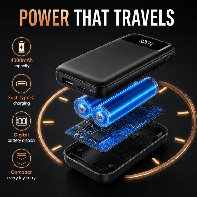
【Execution Route | Must Not Appear on Screen】 If the image-generation tool can be invoked multiple times: concatenate the sharing rules with A–F separately and execute six times, generating only one 1000×1000 square image per run. If only a single image can be generated at a time: first set the interface/API to a 2:3 vertical format and disable Auto; then generate a 2-column × 3-row grid labeled A/B, C/D, and E/F, ensuring all six cells are equal in size and maintain a 1:1 visual ratio. The outer canvas must not be 1:1. 【Sharing Rules】 Use the provided product reference image as the sole basis for the product’s appearance, structure, color, quantity, accessories, and relative proportions. The product is a black portable power bank featuring four built-in short cables, a side-mounted USB port, a circular battery‑level display, a fluorescent‑green wrist strap, and includes a charging cable and a storage pouch. The visual style employs a modern digital‑information aesthetic with a black‑gray background accented by fluorescent green and white, bold Russian typography, and sharp lighting. Products, people, animals, text, icons, and props must retain their natural proportions; stretching or independent scaling is prohibited. All essential information must remain within the safe zone, while the background extends fully across all four edges. Only the brand name “MOCKUP” should be used. Remove any peripheral white borders, vertical side bars, numbered corner marks, watermarks, contact details, social media handles, original branding, platform information, gibberish, distorted body parts, and irrelevant content. People and animals must be recreated from scratch. Copywriting should be concise, readable, and credible; A–F are purely control markers and must not appear on screen. 【A | Core Selling Point】Title: “ENERGY ALWAYS AT HAND.” Feature a hero‑style composition of the product, with the four built-in cables extended and the screen illuminated, accompanied by a brief tagline highlighting its portability. 【B | Multiple Interfaces】Title: “4 BUILT-IN CABLES.” Present a top-down view showcasing the four connectors alongside the top storage compartment, clearly labeling but avoiding fabricated compatibility claims. 【C | Simultaneous Charging】Title: “CHARGE MULTIPLE DEVICES.” Depict a realistic desktop scene connecting various mobile devices, with cable lengths and product proportions accurately rendered. 【D | Battery Level Display】Title: “BATTERY LEVEL VISIBLE AT A GLANCE.” Offer a close-up of the circular percentage display and the side-mounted USB port, paired with simple wiring. 【E | Portable Scenarios】Title: “COMPACT FOR TRAVEL.” Show handheld and bag‑carried scenarios, emphasizing the fluorescent‑green wrist strap, with the product presented intact and without distortion. 【F | Package Contents】Title: “PACKAGE CONTENTS.” Lay out the power bank, built-in cables, external charging cable, wrist strap, and storage pouch, ensuring accurate quantities.
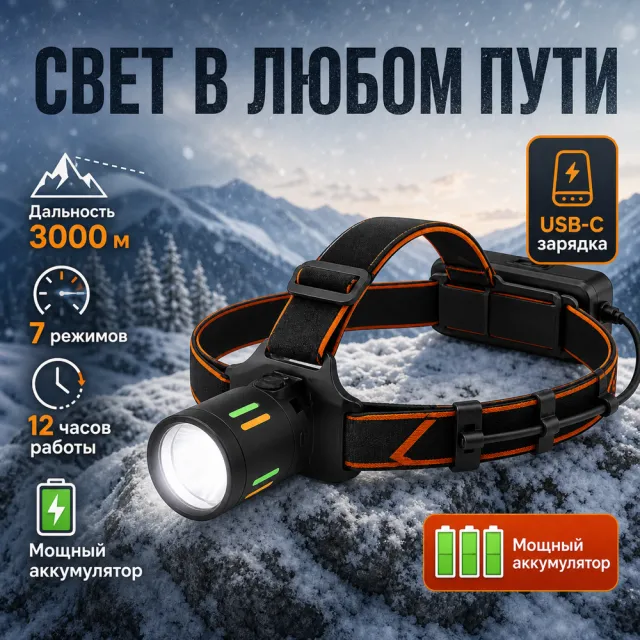
【Execution Route | Must Not Appear on Screen】 If the image-generation tool can be invoked multiple times: concatenate the sharing rules with A–F separately, and execute six times; each time, generate only one 1000×1000 square image. If only a single image can be generated at a time: first set the interface/API to a 2:3 portrait orientation and disable Auto mode, then arrange images in a 2-column × 3-row grid labeled A/B, C/D, and E/F; ensure all six cells are equal in size and maintain a visual aspect ratio of 1:1. Do not use an outer canvas with a 1:1 ratio. 【Sharing Rules】 The provided product reference image serves as the sole basis for the product’s appearance, structure, color, quantity, accessories, and relative proportions. The product is a black dual‑light USB‑C charging headlamp set, including a dark blue/black elastic headband, a charging cable, and a hard-shell storage case. The visual style employs high‑contrast blue-and-white tech‑infographics, featuring a dark blue gradient, white cards, and clear bold Russian typography. Products, people, animals, text, icons, and props must retain their natural proportions; stretching or independent scaling is prohibited. All essential information must remain within the safe zone, with the background extending fully across all four edges. Only the brand name “MOCKUP” may be used. Remove any peripheral white borders, vertical sidebars, numbered corner marks, watermarks, contact details, social media accounts, original branding, platform information, gibberish, distorted body parts, and irrelevant content. People and animals must be recreated from scratch. Copy should be concise, readable, and credible; A–F are purely control markers and must not appear on screen. 【A | Core Illumination】Title: “BRIGHT LIGHT WITH NO UNNECESSARY MOVEMENT.” Feature the headlamp hero in composition, with both lights simultaneously illuminated, accompanied by three simple icons explaining the main light, auxiliary light, and button controls. 【B | All‑Weather Use】Title: “READY FOR ANY WEATHER.” Show a raindrop scene alongside close‑ups of the splash‑proof structure, maintaining the product’s full, natural proportions without listing unverified rating numbers. 【C | Charging Method】Title: “CHARGING WITHOUT BATTERIES.” Display a USB‑C cable connected to the headlamp, with an adjacent battery‑level indicator light, paired with short labels reading “USB‑C” and “BUILT‑IN ACCUMULATOR.” 【D | Control Details】Title: “TWO MODES OF OPERATION.” Provide close‑up shots of the dual top buttons and touch‑sensitive controls, using explanatory lines to clarify conventional button operation versus hands‑free activation. 【E | Wearing Experience】Title: “LIGHTWEIGHT AND COMFORTABLE.” Depict an outdoor user wearing the headlamp, showcasing the adjustable headband and secure fit, with natural, fluid movements. 【F | Package Contents】Title: “EVERYTHING INCLUDED.” Neatly arrange the headlamp, elastic headband, USB‑C cable, and hard-shell case, ensuring quantities match those shown in the product reference image.
【Execution Route | Must Not Appear on Screen】 If the image-generation tool can be invoked multiple times: concatenate the sharing rules with A–F separately, and execute six times; each time generating only one independent 1000×1000 square image, resulting in six sub‑images. If only single‑shot generation is allowed: use a 2:3 vertical canvas of 1200×2500 pixels, with approximately 30% at the top reserved for the product’s main visual integrated into the background, and arrange the remaining area into a 2‑column × 3‑row grid labeled A/B, C/D, and E/F. All six cards should be equal in size, with an aspect ratio close to 1:1. Do not use a 1:1 outer frame, nor full‑width cards, cross‑column cards, merged cards, borders, frames, or white margins. 【Sharing Rules】 The provided product reference image serves as the sole basis for the product’s appearance, structure, color, quantity, accessories, and relative proportions. Product orientation: dark green herbal facial essence dropper bottle, white cap, sage‑colored label, and individual dropper; plant‑based skincare, drop‑application, morning‑and‑evening care, and portability. The product itself, along with any newly generated characters, animals, props, or text, must maintain natural proportions—stretching, flattening, or non‑proportional scaling is prohibited—and the background must extend fully across all four edges. Branding must uniformly follow the MOCKUP style; remove original branding, logos, watermarks, contact information, social media accounts, platform details, gibberish, and irrelevant content. Copywriting should be concise, clear, and credible, retaining the language of the reference image, without adding unsubstantiated absolute claims or medical promises. A–F are merely control markers and must not appear on screen. 【A | Core Selling Point】 Highlight the product’s most important value and its complete main subject; keep the headline short and clear. 【B | Structure & Material】 Showcase key structural elements, materials, or components using close‑up shots or simple annotations, adhering to the product’s intended orientation. 【C | Real‑World Use】 Generate natural human/animal figures or everyday scenes to demonstrate realistic usage, ensuring proportions and actions appear believable. 【D | Details & Steps】 Use close‑ups, step‑by‑step instructions, or flowcharts to explain operations, textures, interfaces, storage solutions, or care‑related details. 【E | Lifestyle】 Illustrate how the product seamlessly integrates into daily life scenarios such as home, commuting, outdoor activities, travel, or work. 【F | Sets & Portability】 Accurately depict the product, its accessories, quantities, and storage relationships; do not add any components absent from the reference image.
【Execution Route | Must Not Appear on Screen】 If the image-generation tool can be invoked multiple times: concatenate the sharing rules with A–F separately, and execute six times; each time, generate only one independent 1000×1000 square image, resulting in six sub‑images. If single‑shot generation is permitted: use a 2:3 vertical canvas measuring 1200×2500, with the top approximately 30% reserved for the product’s main visual integrated into the background, and arrange A/B, C/D, and E/F in a 2‑column × 3‑row grid below. All six cards should be equal in size, with visual proportions close to 1:1. Do not use an outer 1:1 canvas, nor full‑width cards, cross‑column cards, merged cards, borders, frames, or white margins. 【Sharing Rules】 The provided product reference image serves as the sole basis for the product’s appearance, structure, color, quantity, accessories, and relative proportions. Product orientation: blue hydrating facial mask/cream jar, white cap, and refreshing label; moisturizing texture, application method, bathroom setting, and portability. The product itself, along with any newly generated characters, animals, props, or text, must maintain natural proportions—stretching, flattening, or non‑uniform scaling is prohibited—and the background must extend fully across all four edges. Branding must uniformly follow MOCKUP standards; remove original branding, logos, watermarks, contact information, social media accounts, platform details, gibberish, and irrelevant content. Copywriting should be concise, clear, and credible, retaining the language of the reference image, without adding unsubstantiated absolute claims or medical promises. A–F are merely control markers and must not appear on screen. 【A | Core Selling Point】 Highlight the product’s most important value and its complete main subject; keep the headline short and clear. 【B | Structure and Materials】 Showcase key structural elements, materials, or components using close‑up shots or simple annotations, adhering to the product’s intended direction. 【C | Real‑World Use】 Generate natural human/animal figures or everyday scenes to demonstrate realistic usage, ensuring proportions and actions appear believable. 【D | Details and Steps】 Use close‑ups, step‑by‑step instructions, or flowcharts to explain operations, textures, interfaces, storage solutions, or care details. 【E | Lifestyle】 Illustrate how the product naturally integrates into family life, commuting, outdoor activities, travel, or work settings. 【F | Sets and Portability】 Accurately depict the product, its accessories, quantities, and storage relationships; do not add any components absent from the reference image.
【Output Guidelines | Must Not Appear in the Image】 Generate only one final 1000×1000, 1:1 Amazon Listing secondary image. Do not use collage, six‑panel grids, storyboards, multi‑card grids, split‑screen layouts, or second images. 【Sharing Guidelines】 Use the provided product reference image as the sole basis for depicting the product’s appearance, structure, color, quantity, accessories, and relative proportions. Product orientation: white air fryer with digital display and preset menus; kitchen setting, digital controls, cooking functionality, and easy cleaning. Ensure the product is fully presented, with all subjects, props, and text maintaining natural proportions—no stretching, flattening, cropping, or independent non‑proportional scaling. Extend the background to fill the entire frame on all four sides. Use MOCKUP consistently across all branding; remove original brand elements, logos, watermarks, contact information, social media accounts, platform details, gibberish, and any irrelevant content. Keep copy concise, clear, and credible, adhering to the language of the reference image, and refrain from adding unsubstantiated absolute claims or medical promises. Create new, natural human or animal figures—do not replicate characters from the original image. 【Image Composition】 Produce a single, complete, single‑scene product secondary image: place the product at the visual center, integrate it with a natural lifestyle scene that aligns with the product’s intended use, preserve all product information and maintain safe margins, ensure harmonious blending between background and subject, and avoid white borders, vertical edges on either side, outer frames, or visible collage boundaries.

【Execution Route | Must Not Appear on Screen】 If the image-generation tool can be invoked multiple times: concatenate the sharing rules with A–F separately and execute six times; each time, generate only one independent 1000×1000 square image, resulting in six sub-images. If the tool can only generate once: use a 2:3 vertical canvas measuring 1200×2500, with approximately 30% at the top reserved for the product’s main visual integrated into the background, and arrange the remaining area into a 2-column × 3-row grid labeled A/B, C/D, and E/F. All six cards should be of equal size, with an aspect ratio close to 1:1. Do not use a 1:1 outer canvas, nor full-width cards, cross-column cards, merged cards, borders, frames, or white margins. 【Sharing Rules】 The provided product reference image serves as the sole basis for the product’s appearance, structure, color, quantity, accessories, and relative proportions. Product orientation: pink U-shaped travel neck pillow, black interior, and storage pouch; supportive, soft, foldable, airport‑friendly, and portable. The product itself, along with any newly generated characters, animals, props, or text, must maintain natural proportions—stretching, flattening, or non‑uniform scaling is prohibited—and the background must extend fully across all four edges. Branding must uniformly follow the MOCKUP style; remove original branding, logos, watermarks, contact information, social media handles, platform details, gibberish, and irrelevant content. Copywriting should be concise, clear, and credible, retaining the language of the reference image without adding unsubstantiated absolute claims or medical promises. A–F are merely control markers and must not appear on screen. 【A | Core Selling Point】 Highlight the product’s most important value and its complete main subject; keep the headline short and clear. 【B | Structure & Materials】 Showcase key structural elements, materials, or components using close-up shots or simple annotations, adhering to the product’s intended orientation. 【C | Real‑World Use】 Generate natural scenes featuring people, animals, or everyday settings to demonstrate realistic usage, ensuring proportions and actions appear believable. 【D | Details & Steps】 Use close-ups, step-by-step instructions, or flowcharts to explain operations, textures, interfaces, storage solutions, or care details. 【E | Lifestyle】 Illustrate how the product seamlessly integrates into daily life scenarios such as home, commuting, outdoor activities, travel, or work. 【F | Sets & Carrying】 Accurately depict the product, its accessories, quantities, and storage relationships; do not add any components absent from the reference image.
【Execution Route | Must Not Appear on Screen】 If the image-generation tool can be invoked multiple times: concatenate the sharing rules with A–F separately, and execute six times; each time, generate only one independent 1000×1000 square image, resulting in six sub-images. If single‑shot generation is permitted: use a 2:3 vertical canvas measuring 1200×2500, with approximately 30% at the top reserved for the product’s main visual integrated into the background, and arrange the remaining area into a 2‑column × 3‑row grid labeled A/B, C/D, and E/F. All six cards should be equal in size, with an aspect ratio close to 1:1. Do not use a 1:1 outer canvas, nor full‑width cards, cross‑column cards, merged cards, borders, frames, or white margins. 【Sharing Rules】 The provided product reference image serves as the sole basis for the product’s appearance, structure, color, quantity, accessories, and relative proportions. Product orientation: deep blue enameled cast iron pot, lid, and handle; uniform cooking, stewing, lid usage, cleaning, and kitchen applications. The product itself, along with any newly generated characters, animals, props, or text, must maintain natural proportions—stretching, flattening, or non‑uniform scaling is prohibited—and the background must extend fully across all four edges. Branding must uniformly follow the MOCKUP style; remove original branding, logos, watermarks, contact information, social media accounts, platform details, gibberish, and irrelevant content. Copywriting should be concise, clear, and credible, maintaining the language of the reference image, without adding unsubstantiated absolute claims or medical promises. A–F are merely control markers and must not appear on screen. 【A | Core Selling Point】 Highlight the product’s most important value and its complete main subject; keep the title short and clear. 【B | Structure and Material】 Showcase key structural elements, materials, or components through close-up shots or simple annotations, adhering to the product’s intended orientation. 【C | Real‑World Use】 Generate natural human/animal figures or everyday scenes to demonstrate realistic usage, ensuring proportions and actions appear believable. 【D | Details and Steps】 Use close-ups, step-by-step illustrations, or flowcharts to explain operations, textures, interfaces, storage solutions, or maintenance details. 【E | Lifestyle】 Depict how the product seamlessly integrates into daily life scenarios such as home, commuting, outdoor activities, travel, or work. 【F | Sets and Portability】 Accurately present the product, its accessories, quantities, and storage relationships; do not add any components absent from the reference image.

【Execution Route | Must Not Appear on Screen】 If the image-generation tool can be invoked multiple times: concatenate the sharing rules with A–F separately and execute six times; each time, generate only one independent 1000×1000 square image, resulting in six sub-images. If single‑shot generation is permitted: use a 2:3 vertical canvas measuring 1200×2500, with the top approximately 30% reserved for the product’s main visual integrated into the background, and arrange A/B, C/D, and E/F in two columns by three rows to form a six‑grid layout. All six cards should be equal in size, with visual proportions close to 1:1. Do not use an outer 1:1 canvas, nor full‑width cards, cross‑column cards, merged cards, borders, frames, or white margins. 【Sharing Rules】 The provided product reference image serves as the sole basis for the product’s appearance, structure, color, quantity, accessories, and relative proportions. Product orientation: white powdered milk/milk maker, transparent water tank, control panel, and liquid outlet; kitchen setting, buttons, water tank, and cleaning. The product itself, along with any newly generated characters, animals, props, or text, must maintain natural proportions—stretching, flattening, or non‑uniform scaling is prohibited—and the background must extend fully across all four edges. Branding must uniformly follow the MOCKUP style; remove original branding, logos, watermarks, contact information, social media accounts, platform details, gibberish, and irrelevant content. Copywriting should be concise, clear, and credible, retaining the language of the reference image, without adding unverified absolute claims or medical promises. A–F are merely control markers and must not appear on screen. 【A | Core Selling Point】 Highlight the product’s most important value and its complete main subject; keep the title short and clear. 【B | Structure and Materials】 Showcase the product’s key structures, materials, or components using close-up shots or simple annotations, adhering to the product’s orientation. 【C | Real‑World Use】 Generate natural human/animal figures or everyday scenes to demonstrate realistic usage, ensuring proportions and actions are believable. 【D | Details and Steps】 Use close-ups, step-by-step illustrations, or flowcharts to explain operations, textures, interfaces, storage, or care instructions. 【E | Lifestyle】 Depict how the product naturally integrates into family life, commuting, outdoor activities, travel, or work settings. 【F | Sets and Portability】 Accurately present the product, its accessories, quantities, and storage relationships; do not add any elements absent from the reference image.

【Execution Route | Must Not Appear on Screen】 If the image-generation tool can be invoked multiple times: concatenate the sharing rules with A–F separately and execute six times; each time, generate only one independent 1000×1000 square image, resulting in six sub-images. If only single‑shot generation is allowed: use a 2:3 vertical canvas measuring 1200×2500, with the top approximately 30% reserved for the product’s main visual integrated into the background, and arrange the remaining area into a 2‑column × 3‑row grid labeled A/B, C/D, and E/F. All six cards should be equal in size, with an aspect ratio close to 1:1. Do not use a 1:1 outer canvas, nor full‑width cards, cross‑column cards, merged cards, borders, frames, or white margins. 【Sharing Rules】 The provided product reference image serves as the sole basis for the product’s appearance, structure, color, quantity, accessories, and relative proportions. Product orientation: sunscreen lotion tube; themes include sunny beaches, application, even coverage, and portability—avoid making absolute sun-protection claims. The product itself, along with any newly generated characters, animals, props, or text, must maintain natural proportions; stretching, flattening, or non‑uniform scaling is prohibited. The background should extend fully across all four edges. Branding must uniformly use MOCKUP; remove original branding, logos, watermarks, contact information, social media accounts, platform details, gibberish, and irrelevant content. Copywriting should be concise, clear, and credible, maintaining the language of the reference image, and refraining from adding unsupported absolute or medical claims. A–F are merely control markers and must not appear on screen. 【A | Core Selling Point】 Highlight the product’s most important value and its complete subject matter; keep the headline short and clear. 【B | Structure and Materials】 Showcase the product’s key structural elements, materials, or components using close-up shots or simple annotations, adhering to the product’s intended orientation. 【C | Real‑World Use】 Generate natural scenes featuring people, animals, or everyday life to demonstrate realistic usage, ensuring proportions and actions appear believable. 【D | Details and Steps】 Use close-ups, step-by-step illustrations, or flowcharts to explain operations, textures, interfaces, storage solutions, or care instructions. 【E | Lifestyle】 Depict how the product naturally integrates into family life, commuting, outdoor activities, travel, or work settings. 【F | Sets and Portability】 Accurately present the product, its accessories, quantities, and storage relationships; do not add any components absent from the reference image.

【Execution Route | Must Not Appear on Screen】 If the image-generation tool can be invoked multiple times: concatenate the sharing rules with A–F separately, and execute six times; each time, generate only one independent 1000×1000 square image, resulting in six sub-images. If only single‑shot generation is allowed: use a 2:3 vertical canvas measuring 1200×2500, with the top approximately 30% reserved for the product’s main visual integrated into the background, and arrange the lower portion into a 2‑column × 3‑row grid labeled A/B, C/D, and E/F; all six cards should be equal in size and maintain an aspect ratio close to 1:1. Do not use a 1:1 outer canvas, nor full‑width cards, cross‑column cards, merged cards, borders, frames, or white margins. 【Sharing Rules】 The provided product reference image serves as the sole basis for the product’s appearance, structure, color, quantity, accessories, and relative proportions. Product orientation: baby monitor host, screen, and accessories; clear display, nighttime viewing, communication, placement, and home use. The product itself, along with any newly generated characters, animals, props, or text, must maintain natural proportions—stretching, flattening, or non‑uniform scaling is prohibited—and the background must extend fully across all four edges. Branding must uniformly follow the MOCKUP style; remove original branding, logos, watermarks, contact information, social media accounts, platform details, gibberish, and irrelevant content. Copywriting should be concise, clear, and credible, retaining the language of the reference image, without adding unsubstantiated absolute claims or medical promises. A–F are merely control markers and must not appear on the final output. 【A | Core Selling Point】 Highlight the product’s most important value and its complete main subject; keep the headline short and clear. 【B | Structure and Materials】 Showcase key structural elements, materials, or accessories through close-up shots or simple annotations, adhering to the product’s intended purpose. 【C | Real‑World Use】 Generate natural human/animal figures or everyday scenes to demonstrate realistic usage, ensuring proportions and actions appear believable. 【D | Details and Steps】 Use close-ups, step-by-step instructions, or flowcharts to explain operations, textures, interfaces, storage solutions, or care‑related details. 【E | Lifestyle】 Illustrate how the product seamlessly integrates into daily life scenarios such as home, commuting, outdoor activities, travel, or work. 【F | Packaging and Portability】 Accurately depict the product, its accessories, quantities, and storage relationships; do not add components absent from the reference image.

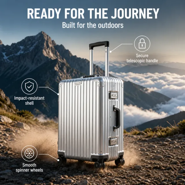
【Execution Route | Must Not Appear on Screen】 If the image-generation tool can be invoked multiple times: concatenate the sharing rules with A–F separately and execute six times; each time, generate only one independent 1000×1000 square image, resulting in six sub-images. If single‑shot generation is permitted: use a 2:3 vertical canvas measuring 1200×2500, with the top approximately 30% reserved for the product’s main visual integrated into the background, and arrange the remaining area into a 2‑column × 3‑row grid labeled A/B, C/D, and E/F. All six cards should be equal in size, with visual proportions close to 1:1. Do not use an outer 1:1 canvas, nor full‑width cards, cross‑column cards, merged cards, borders, frames, or white margins. 【Sharing Rules】 The provided product reference image serves as the sole basis for product appearance, structure, color, quantity, accessories, and relative proportions. Product orientation: suitcases with pull‑handles and wheels; surface textures, airport settings, internal organization, wheels, and safety details. Products, along with newly generated characters, animals, props, and text, must maintain natural proportions—stretching, flattening, or non‑uniform scaling is prohibited—and the background must extend fully across all four edges. The brand name must uniformly appear as “MOCKUP”; remove any original branding, logos, watermarks, contact information, social media handles, platform details, gibberish, or irrelevant content. Copywriting should be concise, clear, and credible, retaining the language of the reference image, without adding unsubstantiated absolute claims or medical promises. A–F are merely control markers and must not be displayed. 【A | Core Selling Point】 Highlight the product’s most important value and its complete main subject; keep the title short and clear. 【B | Structure & Materials】 Showcase key structural elements, materials, or components using close‑up shots or simple annotations, adhering to the product’s intended orientation. 【C | Real‑World Use】 Generate natural human/animal figures or everyday scenes to demonstrate realistic usage, ensuring proportions and actions are believable. 【D | Details & Steps】 Use close‑ups, step‑by‑step instructions, or flowcharts to explain operations, textures, interfaces, storage solutions, or maintenance details. 【E | Lifestyle】 Illustrate how the product naturally integrates into family life, commuting, outdoor activities, travel, or work scenarios. 【F | Sets & Carrying】 Accurately depict the product, its accessories, quantities, and storage relationships; do not add any components absent from the reference image.

【Execution Route | Must Not Appear on Screen】 If the image-generation tool can be invoked multiple times: concatenate the sharing rules with A–F separately and execute six times; each time, generate only one independent 1000×1000 square image, resulting in six sub-images. If single‑shot generation is permitted: use a 2:3 vertical canvas measuring 1200×2500, with approximately 30% at the top reserved for the product’s main visual integrated into the background, and arrange the remaining area into a 2‑column × 3‑row grid labeled A/B, C/D, and E/F. All six cards should be equal in size, with an aspect ratio close to 1:1. Do not use a 1:1 outer canvas, nor full‑width cards, cross‑column cards, merged cards, borders, frames, or white margins. 【Sharing Rules】 The provided product reference image serves as the sole basis for the product’s appearance, structure, color, quantity, accessories, and relative proportions. Product orientation: white and purple inositol supplement bottle, purple cap, coral‑purple label, and white capsules; designed for everyday use and portability, avoiding any medical claims. The product itself, along with newly generated characters, animals, props, and text, must maintain natural proportions—stretching, flattening, or non‑uniform scaling is prohibited—and the background must extend fully across all four edges. Branding must uniformly follow the MOCKUP style; remove original branding, logos, watermarks, contact information, social media accounts, platform details, gibberish, and irrelevant content. Copywriting should be concise, clear, and credible, maintaining the language of the reference image without adding unsupported absolute or medical claims. A–F are merely control markers and must not appear on screen. 【A | Core Selling Point】 Highlight the product’s most important value and its complete main subject; keep the title short and clear. 【B | Structure and Materials】 Showcase key structural elements, materials, or components using close-up shots or simple annotations, adhering to the product’s intended direction. 【C | Real‑World Use】 Generate natural human/animal figures or real-life scenes to demonstrate authentic usage, ensuring proportions and actions appear believable. 【D | Details and Steps】 Use close-ups, step-by-step illustrations, or flowcharts to explain operations, textures, interfaces, storage solutions, or care instructions. 【E | Lifestyle】 Depict how the product naturally integrates into family life, commuting, outdoor activities, travel, or work settings. 【F | Sets and Portability】 Accurately present the product, its accessories, quantities, and storage relationships; do not add any components absent from the reference image.

【Execution Route | Must Not Appear on Screen】 If the image-generation tool can be invoked multiple times: concatenate the sharing rules with A–F separately and execute six times; each time, generate only one independent 1000×1000 square image, resulting in six sub‑images. If single‑shot generation is permitted: use a 2:3 vertical canvas measuring 1200×2500, with the top approximately 30% reserved for the product’s main visual integrated into the background, and arrange the remaining area into a 2‑column × 3‑row grid labeled A/B, C/D, and E/F. All six cards should be of equal size, with an aspect ratio close to 1:1. Do not use a 1:1 outer frame, nor full‑width cards, cross‑column cards, merged cards, borders, frames, or white margins. 【Sharing Rules】 The provided product reference image serves as the sole basis for the product’s appearance, structure, color, quantity, accessories, and relative proportions. Product orientation: pink tranexamic acid skincare serum bottle, white cap, and label; texture, application, daily care, and portability—avoid making absolute whitening claims. The product itself, along with any newly generated characters, animals, props, or text, must maintain natural proportions; stretching, flattening, or non‑uniform scaling is prohibited. The background should extend fully across all four edges. Branding must uniformly follow MOCKUP; remove original branding, logos, watermarks, contact information, social media accounts, platform details, gibberish, and irrelevant content. Copywriting should be concise, clear, and credible, maintaining the language of the reference image, without adding unsupported absolute or medical claims. A–F are merely control markers and must not appear on screen. 【A | Core Selling Point】 Highlight the product’s most important value and its complete main subject; keep the headline short and clear. 【B | Structure and Materials】 Showcase the product’s key structure, materials, or components using close-up shots or simple annotations, adhering to the product’s intended orientation. 【C | Real‑World Use】 Generate natural human/animal figures or everyday scenes to demonstrate realistic usage, ensuring proportions and actions appear believable. 【D | Details and Steps】 Use close‑ups, step‑by‑step instructions, or flowcharts to explain operations, textures, interfaces, storage solutions, or care details. 【E | Lifestyle】 Depict how the product naturally integrates into family life, commuting, outdoor activities, travel, or work settings. 【F | Sets and Portability】 Accurately present the product, its accessories, quantities, and storage relationships; do not add any elements absent from the reference image.

【Execution Route | Must Not Appear on Screen】 If the image-generation tool can be invoked multiple times: concatenate the sharing rules with A–F separately and execute six times; each time, generate only one independent 1000×1000 square image, resulting in six sub‑images. If only single‑shot generation is allowed: use a 2:3 vertical canvas measuring 1200×2500, with the top approximately 30% reserved for the product’s main visual integrated into the background, and arrange A/B, C/D, and E/F in two columns by three rows to form a six‑grid layout. All six cards should be equal in size, with visual proportions close to 1:1. Do not use a 1:1 outer canvas, nor full‑width cards, cross‑column cards, merged cards, borders, frames, or white margins. 【Sharing Rules】 The provided product reference image serves as the sole basis for product appearance, structure, color, quantity, accessories, and relative proportions. Product orientation: a set of three makeup items; color textures, application steps, details, everyday looks, and portable storage. Products, as well as newly generated characters, animals, props, and text, must maintain natural proportions—stretching, flattening, or non‑uniform scaling is prohibited—and the background must extend fully across all four edges. The brand must uniformly use MOCKUP; remove original branding, logos, watermarks, contact information, social media accounts, platform details, gibberish, and any irrelevant content. Copywriting should be concise, clear, and credible, maintaining the language of the reference image, without adding unsubstantiated absolute claims or medical promises. A–F are merely control markers and must not appear on screen. 【A | Core Selling Point】 Highlight the product’s most important value and its complete main subject; keep the title short and clear. 【B | Structure & Materials】 Showcase key structural elements, materials, or accessories through close-up shots or simple annotations, adhering to the product’s intended direction. 【C | Real‑World Use】 Generate natural human/animal figures or real-life scenes to demonstrate authentic usage, ensuring realistic proportions and believable actions. 【D | Details & Steps】 Use close‑ups, step‑by‑step instructions, or flowcharts to explain operations, textures, interfaces, storage solutions, or care details. 【E | Lifestyle】 Illustrate how the product naturally integrates into home, commuting, outdoor, travel, or work settings. 【F | Set Composition & Portability】 Accurately depict the product, accessories, quantities, and their relationships within the storage setup; do not add components absent from the reference image.

【Execution Route | Must Not Appear on Screen】 If the image-generation tool can be invoked multiple times: concatenate the sharing rules with A–F separately, and execute six times; each time generating only one independent 1000×1000 square image, resulting in six sub-images. If single‑shot generation is permitted: use a 2:3 vertical canvas measuring 1200×2500, with the top approximately 30% reserved for the product’s main visual integrated into the background, and arrange A/B, C/D, and E/F in two columns by three rows to form a six‑grid layout; all six cards should be equal in size and maintain an aspect ratio close to 1:1. Do not use a 1:1 outer canvas, nor full‑width cards, cross‑column cards, merged cards, borders, frames, or white margins. 【Sharing Rules】 The provided product reference image serves as the sole basis for the product’s appearance, structure, color, quantity, accessories, and relative proportions. Product direction: green facial cleansing products with a refreshing label; gentle cleansing, foaming action, usage steps, plant‑inspired design, and morning/evening care. Products, as well as newly generated characters, animals, props, and text, must retain natural proportions—stretching, flattening, or non‑uniform scaling is prohibited—and the background must extend fully across all four edges. The brand must uniformly use MOCKUP; remove any original branding, logos, watermarks, contact information, social media accounts, platform details, gibberish, or irrelevant content. Copywriting should be concise, clear, and credible, maintaining the language of the reference image, without adding unsubstantiated absolute claims or medical promises. A–F are merely control markers and must not appear on screen. 【A | Core Selling Point】 Highlight the product’s most important value and its complete main subject; keep the title short and clear. 【B | Structure & Materials】 Showcase the product’s key structure, materials, or components using close-up shots or simple annotations, adhering to the product’s designated direction. 【C | Real‑World Use】 Generate natural human/animal figures or everyday scenes to demonstrate authentic usage, ensuring proportions and actions are believable. 【D | Details & Steps】 Use close-ups, step-by-step illustrations, or flowcharts to explain operations, textures, interfaces, storage solutions, or care instructions. 【E | Lifestyle】 Depict how the product naturally integrates into family life, commuting, outdoor activities, travel, or work settings. 【F | Sets & Portability】 Accurately present the product, its accessories, quantities, and storage relationships; do not add any elements absent from the reference image.

【Execution Route | Must Not Appear on Screen】 If the image-generation tool can be invoked multiple times: concatenate the sharing rules with A–F separately, and execute six times; each time, generate only one independent 1000×1000 square image, resulting in six sub-images. If single‑shot generation is permitted: use a 2:3 vertical canvas measuring 1200×2500, with the top approximately 30% reserved for the product’s main visual integrated into the background, and arrange A/B, C/D, and E/F in two columns by three rows to form a six‑grid layout. All six cards should be equal in size, with visual proportions close to 1:1. Do not use a 1:1 outer canvas, nor full‑width cards, cross‑column cards, merged cards, borders, frames, or white margins. 【Sharing Rules】 The provided product reference image serves as the sole basis for the product’s appearance, structure, color, quantity, accessories, and relative proportions. Product orientation: Vitamin C facial serum bottle; orange‑colored skincare, essence‑textured, dropper‑dispensed, applied via smearing, intended for daily care and portability. The product itself, along with any newly generated characters, animals, props, or text, must maintain natural proportions—stretching, flattening, or non‑uniform scaling is prohibited—and the background must extend fully across all four edges. Branding must uniformly follow the MOCKUP style; remove original branding, logos, watermarks, contact information, social media accounts, platform details, gibberish, and irrelevant content. Copywriting should be concise, clear, and credible, retaining the language of the reference image, without adding unverified absolute claims or medical promises. A–F are merely control markers and must not appear on screen. 【A | Core Selling Point】 Highlight the product’s most important value and its complete subject matter, with a short, clear title. 【B | Structure & Materials】 Showcase the product’s key structural elements, materials, or components using close‑up shots or simple annotations, adhering to the product’s designated orientation. 【C | Real‑World Use】 Generate natural human/animal figures or everyday scenes to demonstrate realistic usage, ensuring proportions and actions are believable. 【D | Details & Steps】 Use close‑ups, step‑by‑step instructions, or flowcharts to explain operations, textures, interfaces, storage solutions, or care‑related details. 【E | Lifestyle】 Depict how the product naturally integrates into family life, commuting, outdoor activities, travel, or work settings. 【F | Sets & Carrying】 Accurately present the product, its accessories, quantities, and storage relationships; do not add any components absent from the reference image.

【Execution Route | Must Not Appear on Screen】 If the image-generation tool can be invoked multiple times: concatenate the sharing rules with A–F separately and execute six times; each time, generate only one independent 1000×1000 square image, resulting in six sub-images. If single‑shot generation is permitted: use a 2:3 vertical canvas measuring 1200×2500, with approximately 30% at the top reserved for the product’s main visual integrated into the background, and arrange the remaining area into a 2‑column × 3‑row grid labeled A/B, C/D, and E/F. All six cards should be equal in size, with an aspect ratio close to 1:1. Do not use a 1:1 outer canvas, nor full‑width cards, cross‑column cards, merged cards, borders, frames, or white margins. 【Sharing Rules】 The provided product reference image serves as the sole basis for the product’s appearance, structure, color, quantity, accessories, and relative proportions. Product orientation: pink vibration training board, black foot pads, and control panel; designed for stable standing, control, home workouts, and storage. The product itself, along with any newly generated characters, animals, props, or text, must maintain natural proportions—stretching, flattening, or non‑uniform scaling is prohibited—and the background must extend fully across all four edges. Branding must uniformly follow MOCKUP standards; remove original branding, logos, watermarks, contact information, social media accounts, platform details, gibberish, and irrelevant content. Copywriting should be concise, clear, and credible, retaining the language of the reference image without adding unsubstantiated absolute claims or medical promises. Labels A–F are purely for control purposes and must not appear on screen. 【A | Core Selling Point】 Highlight the product’s most important value and its primary subject; keep the headline short and straightforward. 【B | Structure and Materials】 Showcase key structural elements, materials, or components using close-up shots or simple annotations, adhering to the product’s intended orientation. 【C | Real‑World Use】 Generate natural scenes featuring people, animals, or everyday settings to demonstrate realistic usage, ensuring proportions and actions appear believable. 【D | Details and Steps】 Use close-ups, step-by-step instructions, or flowcharts to explain operations, textures, interfaces, storage solutions, or maintenance details. 【E | Lifestyle Integration】 Illustrate how the product seamlessly fits into daily life scenarios such as home, commuting, outdoor activities, travel, or work. 【F | Sets and Portability】 Accurately depict the product, its accessories, quantities, and storage relationships; do not add any components absent from the reference image.

【Execution Route | Must Not Appear on Screen】 If the image-generation tool can be invoked multiple times: concatenate the sharing rules with A–F separately and execute six times; each time, generate only one independent 1000×1000 square image, resulting in six secondary images. If single‑shot generation is permitted: use a 2:3 vertical canvas measuring 1200×2500, with the top approximately 30% reserved for the product’s main visual integrated into the background, and arrange the remaining area into a 2‑column × 3‑row grid labeled A/B, C/D, and E/F. All six cards should be equal in size, with visual proportions close to 1:1. Do not use an outer 1:1 canvas, nor full‑width cards, cross‑column cards, merged cards, borders, frames, or white margins. 【Sharing Rules】 The provided product reference image serves as the sole basis for product appearance, structure, color, quantity, accessories, and relative proportions. Product orientation: coconut water packaging and coconut elements; refreshing consumption, sports hydration, cold beverages, easy opening, and portability—avoiding absolute health claims. Products, as well as newly generated characters, animals, props, and text, must maintain natural proportions; stretching, flattening, or non‑uniform scaling is prohibited. The background should extend fully across all four edges. Use MOCKUP consistently for branding; remove original brand elements, logos, watermarks, contact information, social media accounts, platform details, gibberish, and irrelevant content. Copywriting should be concise, clear, and credible, maintaining the language of the reference image, without adding unsupported absolute or medical claims. A–F are merely control markers and must not appear on screen. 【A | Core Selling Point】 Highlight the product’s most important value and its complete main subject; keep the headline short and clear. 【B | Structure & Materials】 Showcase key structural features, materials, or components using close-up shots or simple annotations, adhering to the product’s thematic direction. 【C | Real‑World Usage】 Generate natural scenes featuring people, animals, or everyday life to demonstrate realistic usage, ensuring believable proportions and actions. 【D | Details & Steps】 Use close-ups, step-by-step illustrations, or flowcharts to explain operations, textures, interfaces, storage, or maintenance details. 【E | Lifestyle】 Depict how the product naturally integrates into family life, commuting, outdoor activities, travel, or work settings. 【F | Sets & Carrying】 Accurately present the product, its accessories, quantities, and storage relationships; do not add any components absent from the reference image.

【Output Guidelines | Must Not Appear on Screen】 Generate only one final 1000×1000, 1:1 Amazon Listing secondary image. Do not use collage, six‑panel grids, storyboards, multi‑card grids, split‑screen layouts, or a second image. 【Sharing Guidelines】 Use the provided product reference image as the sole basis for product appearance, structure, color, quantity, accessories, and relative proportions. Product orientation: yellow‑green children’s sports water bottle; designed for outdoor use, easy to grip, portable, and suitable for everyday drinking. The product must be fully presented, with all subjects, props, and text maintaining natural proportions—no stretching, flattening, cropping, or independent non‑proportional scaling is allowed. The background should extend across the entire frame to all four edges. Use “MOCKUP” consistently for branding; remove any original brand elements, logos, watermarks, contact information, social media accounts, platform details, gibberish, or irrelevant content. Copywriting should be concise, clear, and credible, retaining the language of the reference image and refraining from adding unverified absolute claims or medical promises. Create new, natural‑looking characters or animals—do not replicate figures from the original image. 【Image Composition】 Produce a single, complete, single‑scene product secondary image: place the product at the visual center, integrate it with a natural lifestyle scene that aligns with the product’s intended use, preserve all product information and maintain safe margins, ensure harmonious blending between background and subject, and avoid white borders, vertical side bars, outer frames, or collage boundaries.

【Execution Route | Must Not Appear on Screen】 If the image-generation tool can be invoked multiple times: concatenate the sharing rules with A–F separately and execute six times; each time, generate only one independent 1000×1000 square image, resulting in six sub-images. If only a single generation is allowed: use a 2:3 vertical canvas measuring 1200×2500, with approximately 30% at the top reserved for the product’s main visual integrated into the background, and arrange the remaining area into a 2-column × 3-row grid labeled A/B, C/D, and E/F. All six cards should be equal in size, with an aspect ratio close to 1:1. Do not use a 1:1 outer canvas, nor full-width cards, cross-column cards, merged cards, borders, frames, or white margins. 【Sharing Rules】 The provided product reference image serves as the sole basis for the product’s appearance, structure, color, quantity, accessories, and relative proportions. Product orientation: a yellow-green watering can; grip, fine nozzle, indoor plants, watering steps, and portability. The product itself, along with any newly generated characters, animals, props, and text, must maintain natural proportions—stretching, flattening, or non-uniform scaling is prohibited—and the background must extend fully across all four edges. Branding must uniformly follow the MOCKUP style; remove original branding, logos, watermarks, contact information, social media accounts, platform details, gibberish, and irrelevant content. Copywriting should be concise, clear, and credible, retaining the language of the reference image without adding unsubstantiated absolute claims or medical promises. A–F are merely control markers and must not appear on screen. 【A | Core Selling Point】 Highlight the product’s most important value and its complete main subject; keep the headline short and clear. 【B | Structure and Materials】 Showcase key structural elements, materials, or accessories through close-up shots or simple annotations, adhering to the product’s intended direction. 【C | Real-World Use】 Generate natural scenes featuring people, animals, or everyday life to demonstrate realistic usage, ensuring proportions and actions appear believable. 【D | Details and Steps】 Use close-ups, step-by-step illustrations, or flowcharts to explain operations, textures, interfaces, storage solutions, or care instructions. 【E | Lifestyle】 Depict how the product naturally integrates into home, commuting, outdoor, travel, or work settings. 【F | Sets and Portability】 Accurately present the product, its accessories, quantities, and storage relationships; do not add components absent from the reference image.

【Execution Route | Must Not Appear on Screen】 If the image-generation tool can be invoked multiple times: concatenate the sharing rules with A–F separately, and execute six times; each time generating only one independent 1000×1000 square image, resulting in six sub-images. If single‑shot generation is permitted: use a 2:3 vertical canvas measuring 1200×2500, with the top approximately 30% reserved for the product’s main visual integrated into the background, and arrange A/B, C/D, and E/F in two columns by three rows to form a six‑grid layout; all six cards should be of equal size and maintain an aspect ratio close to 1:1. Do not use a 1:1 outer canvas, nor full‑width cards, cross‑column cards, merged cards, borders, frames, or white margins. 【Sharing Rules】 The provided product reference image serves as the sole basis for the product’s appearance, structure, color, quantity, accessories, and relative proportions. Product orientation: brown skincare beauty device, charging cable, and accessories; focus on grip, massage steps, charging, care, and portability, while avoiding any medical claims. The product itself, along with newly generated characters, animals, props, and text, must maintain natural proportions—stretching, flattening, or non‑uniform scaling is prohibited—and the background must extend fully across all four edges. Branding must uniformly follow the MOCKUP style; remove original branding, logos, watermarks, contact information, social media accounts, platform details, gibberish, and irrelevant content. Copywriting should be concise, clear, and credible, retaining the language of the reference image, without adding unverified absolute or medical claims. A–F are merely control markers and must not appear on screen. 【A | Core Selling Point】 Highlight the product’s most important value and its complete main subject; keep the title short and clear. 【B | Structure and Materials】 Showcase the product’s key structural elements, materials, or accessories using close-up shots or simple annotations, adhering to the product’s intended direction. 【C | Real‑World Use】 Generate natural human/animal figures or everyday scenes to demonstrate realistic usage, ensuring proportions and actions appear believable. 【D | Details and Steps】 Use close‑ups, step‑by‑step illustrations, or flowcharts to explain operations, textures, interfaces, storage, or care‑related details. 【E | Lifestyle】 Depict how the product naturally integrates into home, commuting, outdoor, travel, or work settings. 【F | Packaging and Portability】 Accurately present the product, its accessories, quantities, and storage relationships; do not add components absent from the reference image.

【Execution Route | Must Not Appear on Screen】 If the image-generation tool can be invoked multiple times: concatenate the sharing rules with A–F separately, and execute six times; each time generating only one independent 1000×1000 square image, resulting in six sub-images. If only single‑shot generation is allowed: use a 2:3 vertical canvas of 1200×2500 pixels, with approximately 30% at the top reserved for the product’s main visual integrated into the background, and arrange the remaining area into a 2‑column × 3‑row grid labeled A/B, C/D, and E/F. All six cards should be equal in size, with an aspect ratio close to 1:1. Do not use a 1:1 outer frame, nor full‑width cards, cross‑column cards, merged cards, borders, frames, or white margins. 【Sharing Rules】 The provided product reference image serves as the sole basis for the product’s appearance, structure, color, quantity, accessories, and relative proportions. Product orientation: green hydrating spray bottle with light green labels; fine mist, hydration, portable, pre‑makeup application, and outdoor use. The product itself, along with any newly generated characters, animals, props, or text, must maintain natural proportions—stretching, flattening, or non‑uniform scaling is prohibited—and the background must extend fully across all four edges. Branding must uniformly follow the MOCKUP style; remove original branding, logos, watermarks, contact information, social media handles, platform details, gibberish, and irrelevant content. Copywriting should be concise, clear, and credible, retaining the language of the reference image, without adding unsubstantiated absolute claims or medical promises. A–F are merely control markers and must not appear on screen. 【A | Core Selling Point】 Highlight the product’s most important value and its complete main subject; keep the headline short and clear. 【B | Structure & Materials】 Showcase key structural elements, materials, or components using close-up shots or simple annotations, adhering to the product’s intended direction. 【C | Real‑World Use】 Generate natural human/animal figures or everyday scenes to demonstrate realistic usage, ensuring proportions and actions are believable. 【D | Details & Steps】 Use close-ups, step-by-step instructions, or flowcharts to explain operations, textures, interfaces, storage solutions, or care details. 【E | Lifestyle】 Illustrate how the product seamlessly integrates into daily life scenarios such as home, commuting, outdoors, travel, or work. 【F | Sets & Portability】 Accurately depict the product, its accessories, quantities, and storage relationships; do not add any components absent from the reference image.

【Execution Route | Must Not Appear on Screen】 If the image-generation tool can be invoked multiple times: concatenate the sharing rules with A–F separately and execute six times; each time, generate only one independent 1000×1000 square image, resulting in six sub-images. If only single‑shot generation is allowed: use a 2:3 vertical canvas measuring 1200×2500, with the top approximately 30% reserved for the product’s main visual integrated into the background, and arrange the remaining area into a 2‑column × 3‑row grid labeled A/B, C/D, and E/F. All six cards should be equal in size, with an aspect ratio close to 1:1. Do not use a 1:1 outer canvas, nor full‑width cards, cross‑column cards, merged cards, borders, frames, or white margins. 【Sharing Rules】 The provided product reference image serves as the sole basis for the product’s appearance, structure, color, quantity, accessories, and relative proportions. Product orientation: purple beauty gummy bottles paired with gummies of the same color; dressing table, taste, everyday use, ingredients, and portability—avoid medical claims. The product itself, along with any newly generated characters, animals, props, or text, must maintain natural proportions; stretching, flattening, or non‑uniform scaling is prohibited. The background should extend fully across all four edges. Branding must uniformly follow MOCKUP; remove original branding, logos, watermarks, contact information, social media accounts, platform details, gibberish, and irrelevant content. Copywriting should be concise, clear, and credible, maintaining the language of the reference image, without adding unverified absolute statements or medical claims. A–F are merely control markers and must not appear on screen. 【A | Core Selling Point】 Highlight the product’s most important value and its complete subject matter; keep the title short and clear. 【B | Structure and Materials】 Showcase the product’s key structure, materials, or components using close-up shots or simple annotations, adhering to the product’s intended direction. 【C | Real‑World Use】 Generate natural human/animal figures or real-life scenes to demonstrate authentic usage, ensuring proportions and actions are believable. 【D | Details and Steps】 Use close-ups, step-by-step illustrations, or flowcharts to explain operations, textures, interfaces, storage, or care details. 【E | Lifestyle】 Depict how the product naturally integrates into family life, commuting, outdoor activities, travel, or work settings. 【F | Sets and Portability】 Accurately present the product, its accessories, quantities, and storage relationships; do not add any elements absent from the reference image.

【Execution Route | Must Not Appear on Screen】 If the image-generation tool can be invoked multiple times: concatenate the sharing rules with A–F separately, and execute six times; each time, generate only one independent 1000×1000 square image, resulting in six sub-images. If single‑shot generation is permitted: use a 2:3 vertical canvas measuring 1200×2500, with approximately 30% at the top reserved for the product’s main visual integrated into the background, and arrange the remaining area into a 2‑column × 3‑row grid labeled A/B, C/D, and E/F. All six cards should be equal in size, with an aspect ratio close to 1:1. Do not use a 1:1 outer canvas, nor full‑width cards, cross‑column cards, merged cards, borders, frames, or white margins. 【Sharing Rules】 The provided product reference image serves as the sole basis for the product’s appearance, structure, color, quantity, accessories, and relative proportions. Product orientation: a creamy‑colored jar with a golden lid, containing a beef tallow‑infused moisturizing cream; rich texture, easy application, suitable for daily hydration and portable use. The product itself, along with any newly generated characters, animals, props, or text, must maintain natural proportions—stretching, flattening, or non‑uniform scaling is prohibited—and the background must extend fully across all four edges. Branding must uniformly follow the MOCKUP style; remove original branding, logos, watermarks, contact information, social media handles, platform details, gibberish, and irrelevant content. Copywriting should be concise, clear, and credible, retaining the language of the reference image, without adding unverified absolute claims or medical promises. A–F are merely control markers and must not appear on screen. 【A | Core Selling Point】 Highlight the product’s most important value and its complete main subject; keep the title short and clear. 【B | Structure and Materials】 Showcase the product’s key structural elements, materials, or accessories through close‑up shots or simple annotations, adhering to the product’s intended direction. 【C | Real‑World Use】 Generate natural scenes featuring people, animals, or everyday settings to demonstrate authentic usage, ensuring realistic proportions and believable actions. 【D | Details and Steps】 Use close‑ups, step‑by‑step instructions, or flowcharts to explain operations, textures, interfaces, storage solutions, or care details. 【E | Lifestyle】 Illustrate how the product seamlessly integrates into family life, commuting, outdoor activities, travel, or work scenarios. 【F | Sets and Portability】 Accurately depict the product, its accessories, quantities, and storage relationships; do not add components absent from the reference image.

【Execution Route | Must Not Appear on Screen】 If the image-generation tool can be invoked multiple times: concatenate the sharing rules with A–F separately and execute six times; each time, generate only one independent 1000×1000 square image, resulting in six sub‑images. If single‑shot generation is permitted: use a 2:3 vertical canvas measuring 1200×2500, with approximately 30% at the top reserved for the product’s main visual integrated into the background, and arrange the remaining area into a 2‑column × 3‑row grid labeled A/B, C/D, and E/F. All six cards should be equal in size, with an aspect ratio close to 1:1. Do not use a 1:1 outer canvas, nor full‑width cards, cross‑column cards, merged cards, borders, frames, or white margins. 【Sharing Rules】 The provided product reference image serves as the sole basis for the product’s appearance, structure, color, quantity, accessories, and relative proportions. Product orientation: children’s U‑shaped electric toothbrush, featuring a light‑colored U‑shaped brush head and handle; designed for parent‑child bathroom use, gentle brushing, and easy operation and cleaning. The product itself, along with any newly generated characters, animals, props, or text, must maintain natural proportions—stretching, flattening, or non‑uniform scaling is prohibited—and the background must extend fully across all four edges. Branding must uniformly follow the MOCKUP style; remove original branding, logos, watermarks, contact information, social media accounts, platform details, gibberish, and irrelevant content. Copywriting should be concise, clear, and credible, maintaining the language of the reference image and refraining from adding unsubstantiated absolute claims or medical promises. A–F are merely control markers and must not appear on screen. 【A | Core Selling Point】 Highlight the product’s most important value and its primary subject; keep the headline short and clear. 【B | Structure and Materials】 Showcase key structural elements, materials, or components using close‑up shots or simple annotations, adhering to the product’s intended direction. 【C | Real‑World Use】 Generate natural human/animal figures or everyday scenes to demonstrate realistic usage, ensuring proportions and actions appear believable. 【D | Details and Steps】 Use close‑ups, step‑by‑step instructions, or flowcharts to explain operations, textures, interfaces, storage solutions, or care details. 【E | Lifestyle Integration】 Illustrate how the product naturally fits into family life, commuting, outdoor activities, travel, or work settings. 【F | Sets and Portability】 Accurately depict the product, its accessories, quantities, and storage relationships; do not add any components absent from the reference image.

【Execution Route | Must Not Appear on Screen】 If the image-generation tool can be invoked multiple times: concatenate the sharing rules with A–F separately and execute six times; each time, generate only one independent 1000×1000 square image, resulting in six sub‑images. If single‑shot generation is permitted: use a 2:3 vertical canvas measuring 1200×2500, with the top approximately 30% reserved for the product’s main visual integrated into the background, and arrange the remaining area into a 2‑column × 3‑row grid labeled A/B, C/D, and E/F. All six cards should be equal in size, with visual proportions close to 1:1. Do not use an outer 1:1 canvas, nor full‑width cards, cross‑column cards, merged cards, borders, frames, or white margins. 【Sharing Rules】 The provided product reference image serves as the sole basis for the product’s appearance, structure, color, quantity, accessories, and relative proportions. Product orientation: light blue household vacuum cleaner—main unit, nozzle, hose, and accessories; multi‑surface cleaning, dustbin, filtration, and storage. The product itself, along with any newly generated characters, animals, props, or text, must maintain natural proportions; stretching, flattening, or non‑uniform scaling is prohibited. The background should extend fully across all four edges. Branding must uniformly follow the MOCKUP style; remove original branding, logos, watermarks, contact information, social media accounts, platform details, gibberish, and irrelevant content. Copywriting should be concise, clear, and credible, maintaining the language of the reference image, without adding unsubstantiated absolute claims or medical promises. A–F are merely control markers and must not appear on screen. 【A | Core Selling Point】 Highlight the product’s most important value and its complete main body; keep the headline short and clear. 【B | Structure and Materials】 Showcase key structural elements, materials, or components through close-up shots or simple annotations, adhering to the product’s intended direction. 【C | Real‑World Use】 Generate natural human/animal figures or everyday scenes to demonstrate realistic usage, ensuring proportions and actions appear believable. 【D | Details and Steps】 Use close‑ups, step‑by‑step instructions, or flowcharts to explain operations, textures, interfaces, storage solutions, or maintenance details. 【E | Lifestyle】 Illustrate how the product seamlessly integrates into daily life scenarios such as home, commuting, outdoor activities, travel, or work. 【F | Sets and Portability】 Accurately depict the product, its accessories, quantities, and storage relationships; do not add any components absent from the reference image.

【Execution Route | Must Not Appear on Screen】 If the image-generation tool can be invoked multiple times: concatenate the sharing rules with A–F separately and execute six times; each time, generate only one independent 1000×1000 square image, resulting in six sub-images. If single‑shot generation is permitted: use a 2:3 vertical canvas measuring 1200×2500, with the top approximately 30% reserved for the product’s main visual integrated into the background, and arrange the remaining area into a 2‑column × 3‑row grid labeled A/B, C/D, and E/F. All six cards should be equal in size, with an aspect ratio close to 1:1. Do not use a 1:1 outer canvas, nor full‑width cards, cross‑column cards, merged cards, borders, frames, or white margins. 【Sharing Rules】 The provided product reference image serves as the sole basis for the product’s appearance, structure, color, quantity, accessories, and relative proportions. Product orientation: Omega‑3 bottles paired with golden soft capsules; oceanic inspiration, capsule details, daily use, and portability—avoiding any medical claims. The product itself, along with newly generated characters, animals, props, and text, must maintain natural proportions; stretching, flattening, or non‑uniform scaling is prohibited. The background should extend fully across all four edges. Branding must uniformly follow MOCKUP; remove original branding, logos, watermarks, contact information, social media accounts, platform details, gibberish, and irrelevant content. Copywriting should be concise, clear, and credible, retaining the language of the reference image, without adding unverified absolute statements or medical claims. A–F are merely control markers and must not appear on screen. 【A | Core Selling Point】 Highlight the product’s most important value and its complete main subject; keep the headline short and clear. 【B | Structure & Materials】 Showcase key structural elements, materials, or components using close-up shots or simple annotations, adhering to the product’s intended direction. 【C | Real‑World Use】 Generate natural human/animal figures or everyday scenes to demonstrate realistic usage, ensuring proportions and actions are believable. 【D | Details & Steps】 Use close‑ups, step‑by‑step instructions, or flowcharts to explain operations, textures, interfaces, storage solutions, or care details. 【E | Lifestyle】 Illustrate how the product seamlessly integrates into family life, commuting, outdoor activities, travel, or work settings. 【F | Sets & Portability】 Accurately depict the product, its accessories, quantities, and storage relationships; do not add any components absent from the reference image.

【Execution Route | Must Not Appear on Screen】 If the image-generation tool can be invoked multiple times: concatenate the sharing rules with A–F separately and execute six times; each time, generate only one independent 1000×1000 square image, resulting in six sub-images. If single‑shot generation is permitted: use a 2:3 vertical canvas measuring 1200×2500, with the top approximately 30% reserved for the product’s main visual integrated into the background, and arrange A/B, C/D, and E/F in two columns by three rows to form a six‑grid layout. All six cards should be equal in size, with visual proportions close to 1:1. Do not use an outer 1:1 canvas, nor full‑width cards, cross‑column cards, merged cards, borders, frames, or white margins. 【Sharing Rules】 The provided product reference image serves as the sole basis for the product’s appearance, structure, color, quantity, accessories, and relative proportions. Product orientation: orange sunscreen tube with a white cap; designed for seaside skincare, featuring a lightweight texture, even application, and portability, while avoiding absolute sun-protection claims. The product itself, along with any newly generated characters, animals, props, or text, must maintain natural proportions—stretching, flattening, or non‑uniform scaling is prohibited—and the background must extend fully across all four edges. Branding must uniformly follow the MOCKUP style; remove original branding, logos, watermarks, contact information, social media accounts, platform details, gibberish, and irrelevant content. Copywriting should be concise, clear, and credible, retaining the language of the reference image, without adding unsupported absolute or medical claims. A–F are merely control markers and must not appear on screen. 【A | Core Selling Point】 Highlight the product’s most important value and its complete subject matter, with a short, clear headline. 【B | Structure and Materials】 Showcase the product’s key structural elements, materials, or accessories through close-up shots or simple annotations, adhering to the product’s designated orientation. 【C | Real‑World Use】 Generate natural human/animal figures or everyday scenes to demonstrate realistic usage, ensuring proportions and actions are believable. 【D | Details and Steps】 Use close-ups, step-by-step instructions, or flowcharts to explain operations, textures, interfaces, storage, or care-related details. 【E | Lifestyle】 Illustrate how the product seamlessly integrates into daily life scenarios such as home, commuting, outdoor activities, travel, or work. 【F | Sets and Portability】 Accurately depict the product, its accessories, quantities, and storage relationships, without introducing components absent from the reference image.