Original portrait Korean weekend sale poster in pink, black, and cream. Text: “주말 특가”, “WEEKEND SALE”, “7% 쿠폰”, “지금 쇼핑”. Two small gift accents only. No brand, watermark, QR code, website, Chinese text, or random tiny text.
Original portrait Korean weekend sale poster in pink, black, and cream. Text: “주말 특가”, “WEEKEND SALE”, “7% 쿠폰”, “지금 쇼핑”. Two small gift accents only. No brand, watermark, QR code, website, Chinese text, or random tiny text.

Create an original square English coupon-gift visual in lavender, yellow, and pink, with an open 3D box, two floating coupon cards, and two tiny stars. Text: “SPECIAL COUPON”, “GIFT INSIDE”. Keep the background clean. No brand, watermark, QR code, website, non-English text, or random tiny text.
Create an original near-square Korean shopping sale poster in bright blue, pink, and white, with gift boxes, a shopping bag, and one large discount panel. Text: “상반기 최대 세일”, “신선한 혜택”, “BIG SALE”. Keep only two small sparkle accents. No brand, watermark, QR code, website, Chinese text, or random tiny text.

Create an original square English spring awards poster in pink, lilac, and white, with a 3D trophy, soft flowers, and bold stacked headline. Text: “SPRING AWARDS”, “SPECIAL SALE”. Use two small sparkles only. No brand, watermark, QR code, website, non-English text, or random tiny text.
Create an original near-square Korean gift promotion poster in pink, lavender, and cream, with a glossy 3D present, a small heart accent, and a clean dark text band. Text: “스페셜 선물”, “오늘의 혜택”, “지금 확인”. Use only two tiny flower accents. No brand, watermark, QR code, website, Chinese text, English text, or random tiny text.
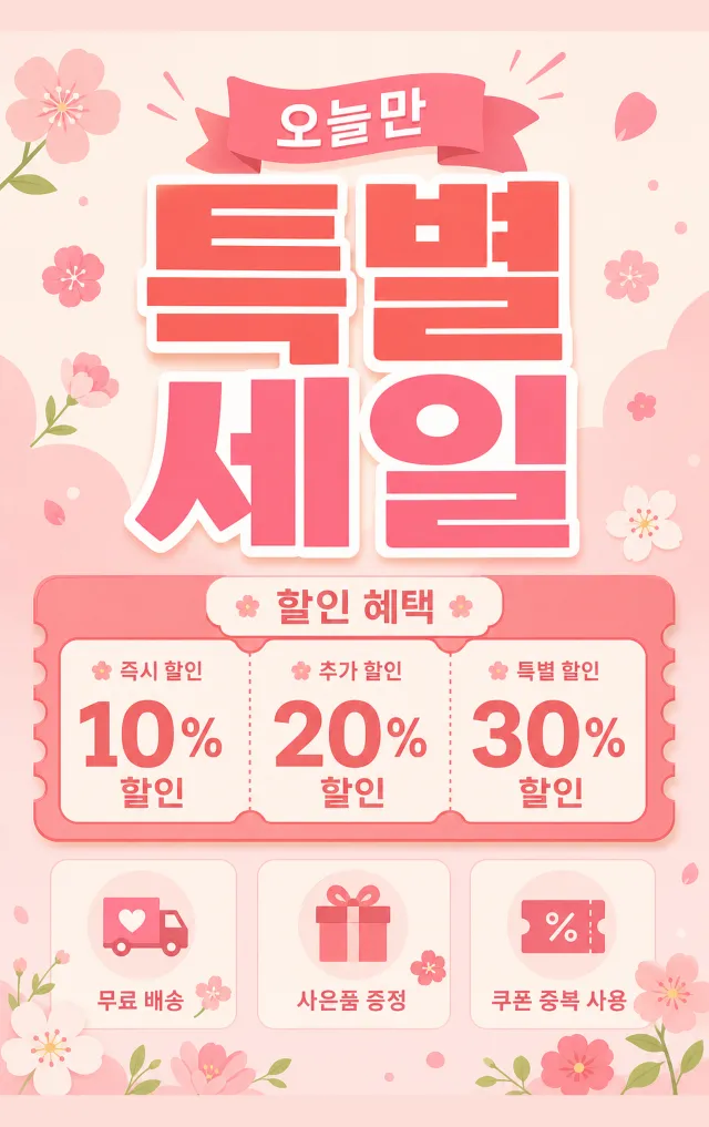
Create an original portrait 2:3 Korean special-sale poster in pale pink, coral, and cream, with a playful coupon board, compact benefit boxes, and small flower accents. Text: “특별 세일”, “할인 혜택”, “오늘만”. No brand, watermark, QR code, website, Chinese text, English text, or random tiny text.
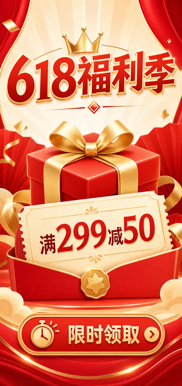
Create an original tall Chinese 618 gift promotion poster in bright red, gold, and cream, with a large centered gift box, a coupon card, and one compact action strip. Text: “618福利季”, “满299减50”, “限时领取”. Use restrained gold highlights only. No brand, watermark, QR code, website, English text, Korean text, or random tiny text.

Create an original square English welcome-gift banner in periwinkle, lavender, and pink, with a present, a small calendar card, and a clean centered headline. Text: “WELCOME GIFT”, “NEW MEMBER BONUS”. Use only two small stars. No brand, watermark, QR code, website, non-English text, or random tiny text.

Create an original tall Korean autumn shopping coupon poster in bright red, orange, and cream, with a large white coupon ticket and a compact discount strip. Text: “가을 쇼핑대축제”, “전 품목 7-10% 할인”, “기간 한정”. Keep festive details restrained. No brand, watermark, QR code, website, Chinese text, English text, or random tiny text.
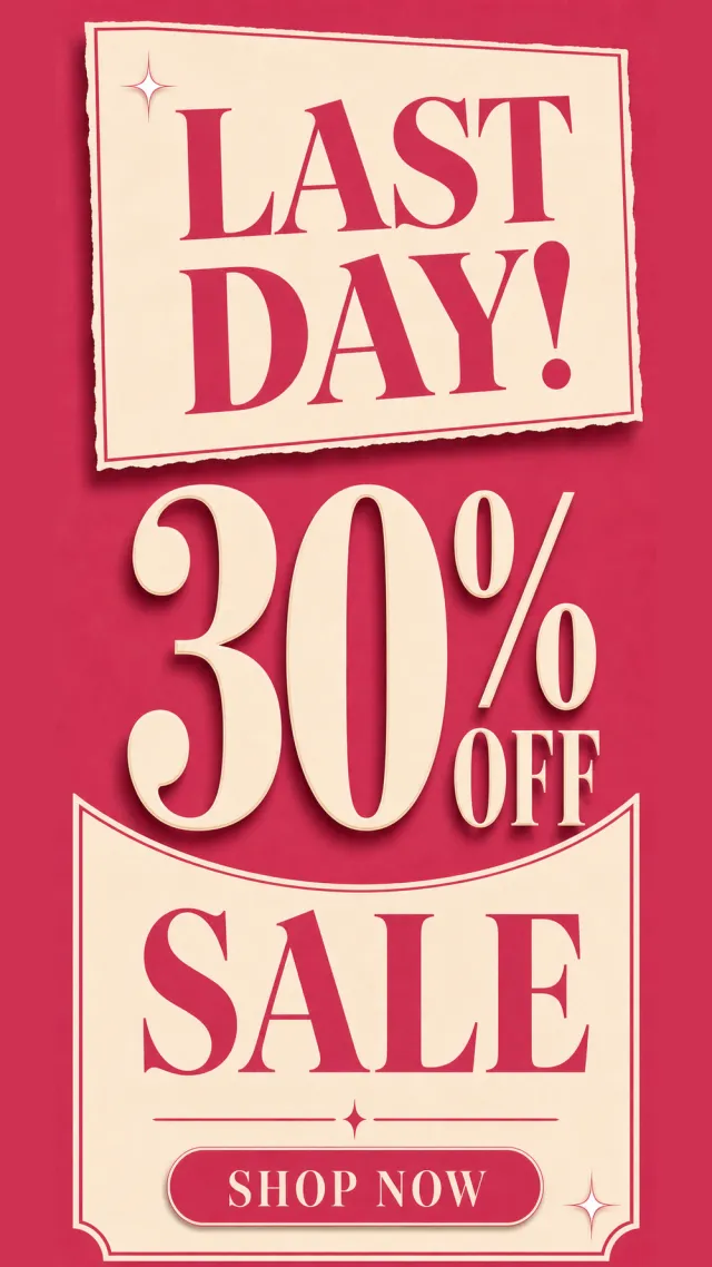
Create an original tall English last-day sale poster in deep rose pink and cream, with large stacked percentage typography, a slim date bar, and one simple shop button. Text: “LAST DAY!”, “30% OFF”, “SALE”, “SHOP NOW”. Use only two small shine accents. No brand, watermark, QR code, website, non-English text, or random tiny text.
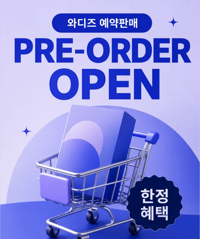
Create an original portrait 5:6 Korean pre-order poster in cobalt blue and lavender, with a 3D shopping cart, one product box, and a dark call-to-action badge. Text: “와디즈 예약판매”, “PRE-ORDER OPEN”, “한정 혜택”. Keep the composition clean with two tiny stars only. No brand, watermark, QR code, website, Chinese text, or random tiny text.
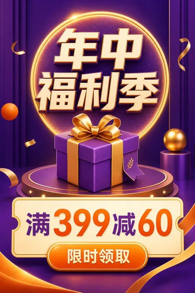
Create an original portrait 2:3 Chinese mid-year shopping festival poster in purple, gold, and orange, with a 3D gift box, a circular spotlight, and a bold coupon panel. Text: “年中福利季”, “满399减60”, “限时领取”. Keep decorations sparse and balanced. No brand, watermark, QR code, website, English text, Korean text, or random tiny text.

Create an original square 3D gift-box promotion visual on a clean white background, with a translucent lavender and blue present, a satin bow, and one small coupon tag. Text: “GIFT BONUS”. Keep the design minimal with no confetti. No brand, watermark, QR code, website, non-English text, or random tiny text.
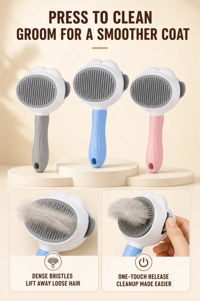
Based on the provided white-background product image, generate a detailed e-commerce page poster. Product Performance: - Maintain the cloud-shaped white comb, dense metal needles, gray one-touch hair removal button, and light blue handle. - In the center, three identical pet needle combs are displayed: gray, light blue, and cherry blossom pink handles. The products have no brand, logo, slogan, or model. - The two rounded corner function cards below show close-ups of combing needles cleaning loose hair and finger presses of the hair removal button. Layout Replica: - Warm cream beige background, with two rows of dark brown large titles centered at the top, and a short beige brown horizontal decoration below the title. - Place three needle combs in different colors on steps or curved platforms in the center, casting soft shadows. - The lower half contains two horizontal stroked rounded function cards. The top of the card is a close-up image of real photos, and the bottom has a small circular icon and a line of dark brown instructions. Fonts and typography: - Font Style: Bold black with a warm sans-serif tone, indicating clear to medium weight sans-serif lines. - The main title is centered and two lines, occupying about 78% of the screen width; Card instructions should be centered and no more than two lines. Copywriting Usage: - Main Title: One-Press Cleaning / Effortlessly Brush Out Smooth Hair - Left clip: dense combing / easily removes loose hair - Right card: One-touch hair removal / easier cleaning Graphic elements: - Two finely outlined rounded corner cards, a small comb icon, a power button icon, and a soft platform projection; All icons have smooth edges. Avoid: excessive messy pet fur, authentic branding, text pressing down on comb needles, incorrect product quantity, low-definition icons, obvious shadowed text, watermarks, and screenshot edges.
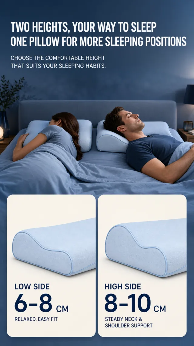
Based on the provided white-background product image, generate a detailed e-commerce page poster. Product Performance: - Maintain the powder blue double-height curved pillow, soft edging, and the core contours of low and high pillow edges. - In the center, two adults are placed sleeping on their side/back, each using the same pillow at different heights; The two large rounded corner cards below show partial views of the pillow on the low and high edges. - The original product has no brand information and does not add new brand, slogan, logo, or small print parameters. Layout Replica: - Deep misty blue gradient bedroom background, aligned at the top with two lines of large white titles and two lines of secondary descriptions. - The middle section is a transverse bed surface, with two adults lying back to back on the blue bedding, with the pillow's curve clearly visible. - The lower half displays two off-white large rounded corner cards side by side. The left card shows the lower pillow edge, the right card shows the higher pillow edge. The card contains the height range for the large size and instructions for the small size fit. Fonts and typography: - Font style: Bold white sans serific title, with bold dark blue title and standard blue-gray explanatory text inside the card. - The main title occupies about 82% of the screen width, with two rows aligned to the left; The card has the highest height number, placed at the lower left. Copywriting Usage: - Main Title: Double Height Sleep Freely / One Pillow Adapts to More Sleeping Positions - Main text: You can flexibly choose a comfortable height based on your sleep habits. - Left clip: low pillow edge / 6-8cm / easy fit and relax - Right card: high pillow / 8-10cm / provides stable support for neck and shoulders Graphic elements: - Two cream-colored rounded corner pillow cards with a clean deep blue background gradient; Do not include real scale data, brands, or footnotes. Avoid: unnatural sleeping postures, incorrect pillow contours, medical promises, text obscuring characters, obvious text shadows, low-definition cards, watermarks, and blurred edges in screenshots.
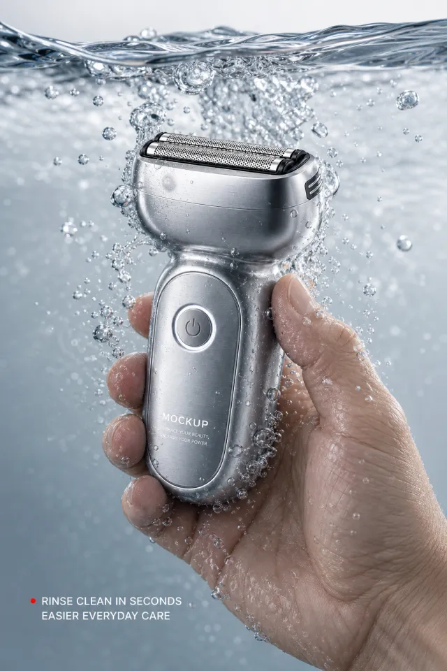
Based on the provided white-background product image, generate a detailed e-commerce page poster. Product Performance: - Keeps the silver-gray metal shaver, wide reciprocating blade mesh, round power button, and rounded handle. - An adult hand holding a razor in clear water, with the water surface running across the upper part of the frame, surrounded by clear blisters; The body text only retains MOCKUP and EMBRACE YOUR BEAUTY, UNLEASH YOUR POWER. Layout Replica: - Cool gray-white underwater photography background, with the water surface about one-fifth above, hands and razors positioned slightly to the right of center in the water. - Starting with a small red dot in the lower left, two lines of white short sentences form a contrast with the underwater product; No outlines, cards, or large titles are added. - Highlights the cleanliness and mesh-like details of the metal body wrapped in water flow. Fonts and typography: - Character Style: White with medium weight sans-serifs, short sentences aligned to the left, and natural spacing. - The copy should be placed in the lower left safe area; do not press on your hands, products, or blisters. Copywriting Usage: - Synopsis: Instant rinse / Daily cleaning is more worry-free Graphic elements: - Use only a small red dot as a guide, allowing the blisters to scatter naturally; No icons, dividers, or footnotes. Avoid: abnormal fingers, water surface mold piercing, exaggerated sterilization claims, real branding, duplicated text, low-resolution water blisters, product deformation, watermarks, and screenshot edges.
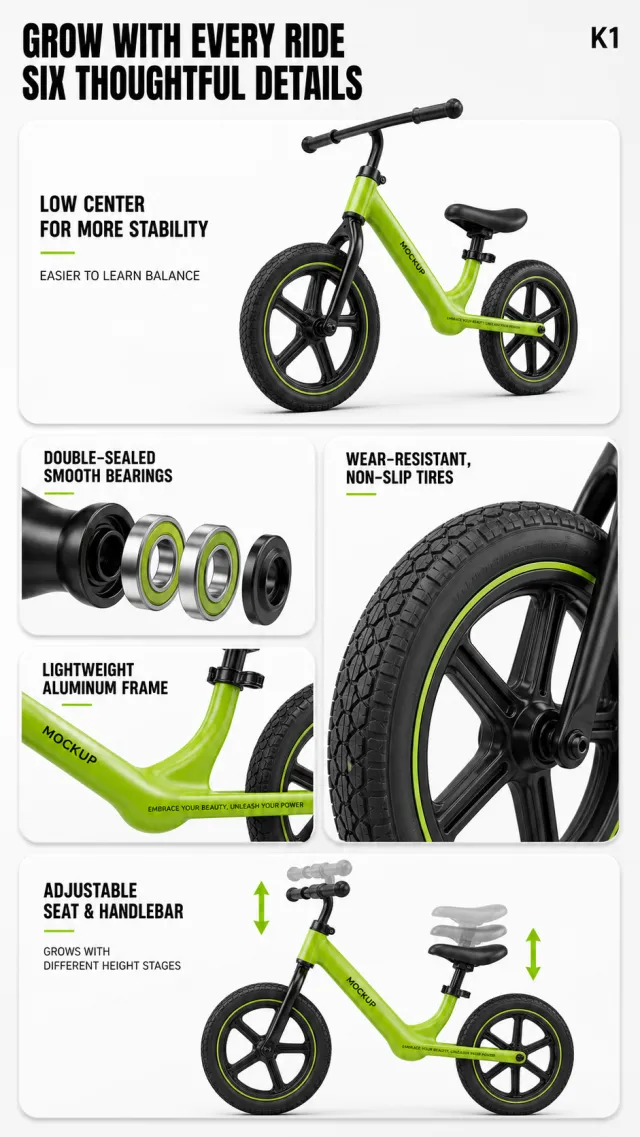
Based on the provided white-background product image, generate a detailed e-commerce page poster. Product Performance: - Maintain bright green children's balance bike, low center of gravity aluminum frame, black handlebars and seat, and large anti-slip tires. - The main product is housed in a large rounded top module, with tires, bearings, frame, and adjustment handles displayed as partial modules; Frame text only retains MOCKUP and EMBRACE YOUR BEAUTY, UNLEASH YOUR POWER. Layout Replica: - Light gray-white background, with two bold black lines of title on the top left and a small product series code in the upper right. - The top is a horizontal white rounded main product card, with the balance scooter placed diagonally, and a short title and a line of description on the left side; In the center are two rounded detail cards on the left and right: the left side has a bearing explosion structure, and the right side is a close-up of the tire. - On the lower left side, a frame card is placed, with a large rounded horizontal corner card at the bottom showing that the handlebars and seat are adjustable vertically, indicated by a bright green arrow. Fonts and typography: - Font Style: Bold black sans-serif main title, module title in dark gray medium weight, with a small amount of bright green accent text. - Main title aligned to the left, two lines; The text on each card should remain at the upper left or lower left of the card and do not cover any parts of the product. Copywriting Usage: - Main Title: Growth Along / Six Details for Greater Peace of Mind - Series codename: K1 - Main card: Low center of gravity for greater stability / Easy balance control - Bearing clip: double-sealed smooth bearing - Tire clips: wear-resistant and slip-resistant tires - Frame card: lightweight aluminum alloy frame - Bottom clip: Adjustable seat and handlebars to accompany different height levels Graphic elements: - White rounded corner information card, bright green arrows, a small amount of soft projection; The card edges are smooth and clear. Avoid: Real brands, children's figures, missing wheels, abnormal product proportions within modules, text covering tires, low-resolution bearings, watermarks, and residual edges in screenshots.
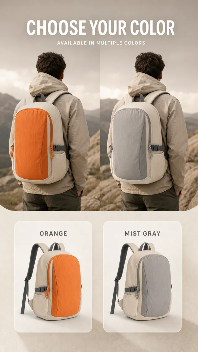
Based on the provided white-background product image, generate a detailed e-commerce page poster. Product Performance: - Lightweight backpack with off-white and orange color-block, large front pocket, compression buckle, and gray shoulder strap structure. - The upper half shows both orange and gray backpacks from the back view of an adult male, while the lower half uses white rounded corner cards to show the colors of each item; Products do not have brand, logo, slogan, or model number. Layout Replica: - Warm gray with an off-white background, centered above with a white Chinese title and white English subtitle, and below the title is a large portrait of the person's back. - Each character carries a different colored bag of the same style, with two semi-transparent white large rounded color cards stacked downward in the center of the image. - On each color spad, on the left side is a large Chinese color name and a small English label on the color block, while on the right side is a complete small image of the backpack for the corresponding color. Fonts and typography: - Font Style: Bold white sans-serif title, light dark gray sans within the card, English small labels placed within circular character blocks. - Centered top title, large single-line Chinese text, single-line small English font; Color scan text aligns left, small product images align right. Copywriting Usage: - Main Title: Multiple Colors to Choose Freely - English: AVAILABLE IN MULTIPLE COLORS - Color Card 1: Orange / ORANGE - Color Card 2: GRAY Graphic elements: - Two white semi-transparent rounded corner color cards and two English color codes with matching rounded corners; No extra icons or parameters are added. Avoid: facial features, backpack duplication, brand wording, text overflow, inconsistent colors, low-definition small product images, watermarks, and screenshot edges.
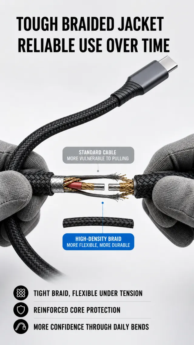
Based on the provided white-background product image, generate a detailed e-commerce page poster. Product Performance: - Maintain the black nylon braided cable and the dark gray metal connector; the image only shows the enlarged cable arc and partial connection at one end. - In the middle, a pair of gray gloves are used to open a section of the braided wire core in an explosive cross-section, revealing multiple strands of red, gold, and copper wire; The original product has no brand information and does not add new brands, slogans, or logos. Layout Replica: - Light gray-white tech background, with two oversized black titles aligned at the top left. - The black braided data cable is wound into a large curved line from the lower left to the upper right interface, with the core cross-section pulled open in the middle; Use gray and bright blue rounded corner labels to describe ordinary and woven wires respectively. - On the bottom left side, use three lines of black dotted short sentences summarizing durability features, leaving clean blank space. Fonts and typography: - Font Style: Bold black modern sans serific large heading, labels in white medium sans serific, main text in black regular font. - Main title aligned to the left, two lines, occupying about 83% of the image width; The label cannot press against the core structure. Copywriting Usage: - Main Title: Durable Woven Outer Cover / Peace of Mind Even After Long-Term Use - Gray label: Ordinary wire / easily damaged by pulling - Blue label: High-density weave / more flexible and durable - Bottom: Tightly woven for flexible and tensile resistance / reinforced yarn core protection / easier to bend in daily life Graphic elements: - Gray and bright blue rounded labels, fine reference lines, black dotted short sentences; The cross-section leads are clear but do not show the brand. Avoid: Exaggerated frequency promises, genuine brands, broken cables with bloody appearances, text obscuring cross-sections, incorrect port shapes, garbled text, watermarks, and screenshots of edges.
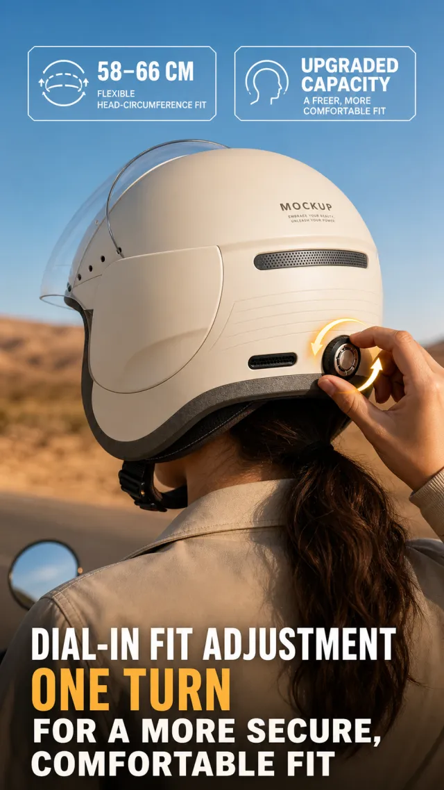
Based on the provided white-background product image, generate a detailed e-commerce page poster. Product Performance: - Retains the ivory white half-helmet, transparent flip-out mask, dark gray lining, and rear side knob adjustment structure. - An adult rider wears a helmet on the rear side of their head, with their right hand turning the rear side adjustment knob; The visible text on the helmet body is only MOCKUP and EMBRACE YOUR BEAUTY, UNLEASH YOUR POWER. Layout Replica: - The outdoor background transitions from blue sky to warm brown ground, with two sets of large white numbers and notes arranged horizontally on the top left. - The center is a close-up of the back of the helmet, with the adjustment knob operated by fingers, surrounded by two warm yellow-orange semi-transparent curved arrows emphasizing the rotation direction. - The bottom is aligned to the left with two large lines of large white main headings, with English keywords highlighted in warm yellow. Fonts and typography: - Font Style: Heavy white sans-serif numbers and titles, with English keywords in bright warm yellow wide-font. - The top group of numbers occupies half the side, the main heading occupies about 85% of the width at the bottom, with two rows arranged compactly. Copywriting Usage: - Top: 58-66 cm / flexibly fits head circumference - Top: Upgraded capacity / more comfortable to wear - Main Title: Knob-Type Fit Adjustment / Stable and Comfortable with One Turn Graphic elements: - Two warm yellow-orange directional arrows and a clean digital information block at the top; No certification stamps, models, or footnotes are added. Avoid: abnormal finger movements, distorted helmet proportions, mask piercing, real branding, exaggerated safety promises, text masking knobs, low-resolution arrows, watermarks, and screenshot edges.
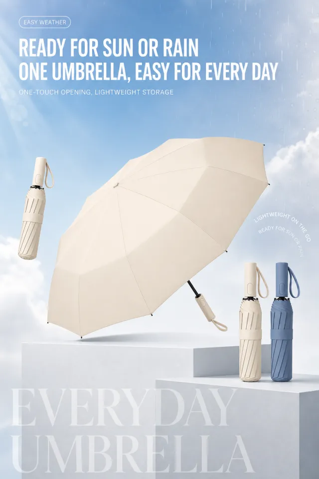
Based on the provided white-background product image, generate a detailed e-commerce page poster. Product Performance: - Maintain a combination of off-white large umbrella, off-white folding umbrella, and misty blue folding umbrella; the umbrella surface opens naturally and the folding umbrella stands on the steps. - The original product has no brand information and does not add new brands, slogans, logos, or packaging text. Layout Replica: - Clear sky blue to cloud-white gradient background, with a white wireframe capsule short word aligned at the top left, and a large white English and Chinese title line below. - In the upper right, three lines of vertical short sentences are outlined with fine white arcs. In the middle is an open off-white umbrella, with a folding umbrella floating on the left and two on the right placed on a light gray geometric step. - The bottom features oversized plain English text as the background decoration, which must not affect product reading. Fonts and typography: - Font Style: Bold, white, modern sans serif, main title, English auxiliary text is wide-font sans-serific. - Main title aligned to the left, two lines, occupying about 78% of the image width; The subtitle is 'medium white' placed below the title. Copywriting Usage: - Capsule shortword: EASY WEATHER - Main Title: Weather and Rain / A Calm Face with an Umbrella - Subtitle: One-touch opening and closing, lightweight storage - Short sentence on the right: Easily accompanying / suitable for rain or shine - Bottom English: EVERYDAY UMBRELLA Graphic elements: - White thin line capsule, curved text frame, geometric steps, and very soft English background text; Smooth edges without serrations. Avoid: Rib errors, mold holes on the umbrella surface, genuine brand, text obscuring the umbrella surface, strong mirror glare, garbled text, watermarks, and screenshot edges.
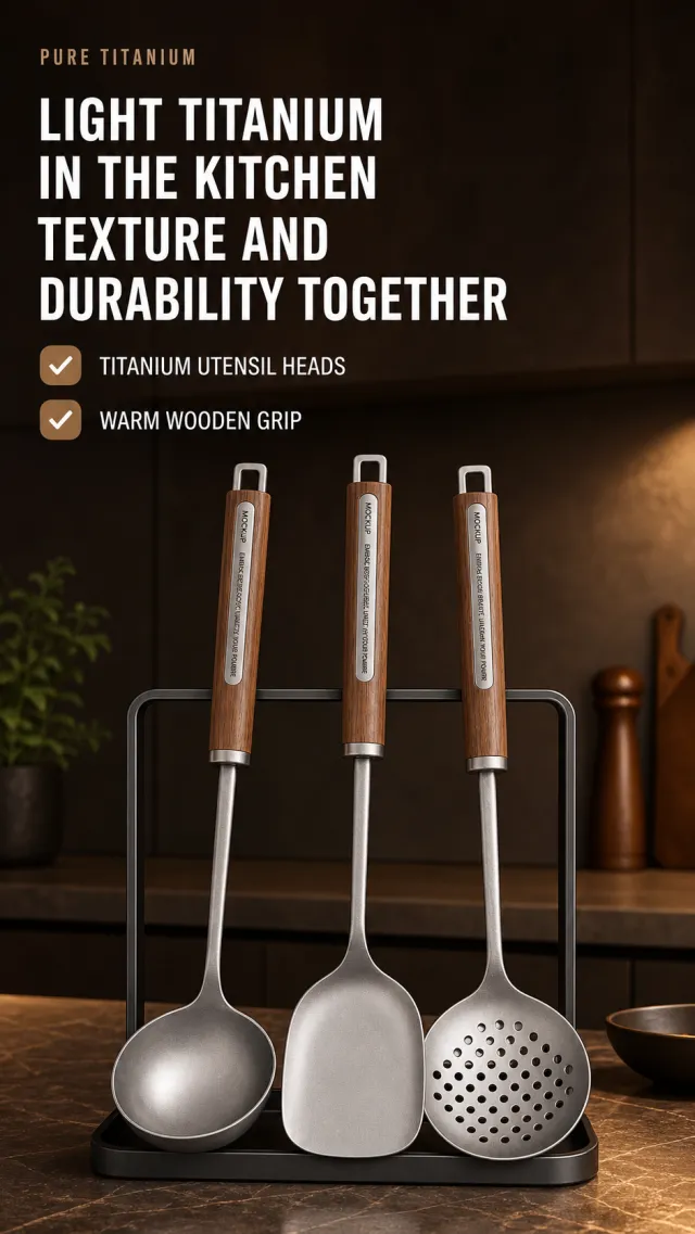
Based on the provided white-background product image, generate a detailed e-commerce page poster. Product Performance: - Keeps three pieces of titanium kitchenware, walnut handles, and dark metal storage racks; Spoons, spatulas, and strainers stand on the kitchen countertop. - Only MOCKUP and EMBRACE YOUR BEAUTY, UNLEASH YOUR POWER are displayed on the controller and product, with no other brands, models, or small engravings. Layout Replica: - Dark brown modern kitchen background: on the top left side are small English auxiliary text and two lines of large white titles, with two horizontal warm brown tick icons and short selling points arranged horizontally below the title. - Three pieces of kitchenware stand on black shelves in the lower middle, with a slight warm side shine; Place a few blurry kitchen still lifes as backgrounds around the area, without overshadowing the main subject. - The overall image features a low-light atmosphere typical of high-end material advertisements. Fonts and typography: - Font Style: Bold white sans-serif title, English is small narrow full-caps, selling point is white medium sans-serif lines. - Title aligned to the left, occupying about 72% of the image width, two lines; Check the selling points to arrange vertically and leave a breathable feel at the top of the product. Copywriting Usage: - English auxiliary word: PURE TITANIUM - Main Title: Light Titanium for the Kitchen / Combining Quality and Durability - Selling Point: Titanium spoon head / Smooth wooden grip Graphic elements: - Two warm brown rounded checkboxes icon; Do not use brand logos, certification labels, specification sheets, or footnotes. Avoid: Real brands, kitchen clutter covering kitchenware, low-resolution metal materials, product deformation, text shadows, garbled text, watermarks, and screenshot edges.
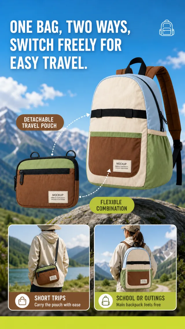
Based on the provided white-background product image, generate a detailed e-commerce page poster. Product Performance: - Maintains the combination structure of the main backpack in light blue, cream white, and moss green with a brown detachable small bag, reflecting a fitted detachable relationship. - The main backpack is center-right, with the individual small bag placed at the lower left; The visible text on the product is only MOCKUP and EMBRACE YOUR BEAUTY, UNLEASH YOUR POWER. Layout Replica: - Blue sky and distant mountains background, with two lines of large white titles at the top, and a simple linear backpack icon in the upper right corner. - The center is a floating combination of the main backpack and the detachable small bag, connected by two white dot-shaped arc lines connecting different positions of the small and main bags, each with rounded text labels. - The lower half features two rounded outdoor character scenes arranged horizontally, showing the small bag worn crossbody and the main bag on both shoulders, with a bright yellow-green label strip at the bottom. Fonts and typography: - Font Style: Bold white modern sans-serif title, rounded white text label, scene card label in bold white text. - Main title aligned to the left, two lines, occupying about 80% of the screen width; The middle label uses brown and yellow-green capsules, with text centered. Copywriting Usage: - Main Title: One Pack for Dual Use and Splitting, / Switch Freely for Easy Travel. - Tags: Detachable travel small bag / Flexible combinations to customize as you wish - Left scene: Short trips / Small bags can be easily carried crossbody - Right scenario: School trips / Main bag for extra comfort on both shoulders Graphic elements: - White dotted cable, two rounded capsule labels, two bottom rounded scene cards, and a minimalist backpack icon. Avoid: real brands, close-ups of facial portraits, text obscuring products, duplicate packaging, low-definition scene cards, strongly shadowed text, watermarks, and screenshot borders.
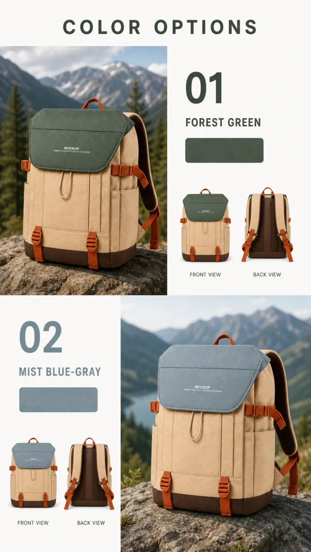
E-commerce product poster design: COLOR OPTIONS title, left-right column composition: the left side places the product in an outdoor natural scene, the backpack rests on rough rocks, the background features blurred mountains and coniferous forest, natural daylight lighting, the right side features a white information layout area including number 01, color name Forest Green, color blocks, and small front and back view images of the product, plus Chinese labels. The overall style is modern and minimalist, high definition, realistic rendering texture, beige bag body paired with forest green flap covers, Below is an extended display of the 02 Mist Blue-Gray color options, corresponding scenarios, and layouts.
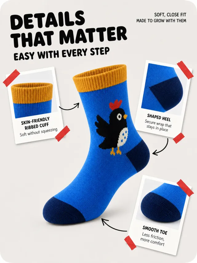
Based on the provided white-background product image, generate a detailed e-commerce page poster. Product Performance: - Maintain bright blue mid-calf socks, ginger ribbed cuffs, deep blue reinforced toe and heel, and simple black bird knit patterns. - The socks stand diagonally in the center, with three white Polaroid-style detail images placed around them, showing the cuff, heel, and toe; No branding, logos, slogans, or readable decorative words are added. Layout Replica: - Light warm gray with large rounded corners, two bold black headlines in the upper left, and two short black short lines in small sizes at the top right. - The middle sock is the largest body, with three white tilted photo paper cards placed at the top left, upper right, and lower right respectively; Each card is taped with red tape at the corner. - Three black hand-drawn curved arrows point between the sock and detail card, giving a relaxed, playful journal feel. Fonts and typography: - Font Style: Bold black and rounded, sans-serif title; card description should be small with clear sans-serif lines. - Main title aligned to the left, two lines; The short sentence in the upper right should be aligned to the right, and the font size should be about 30% of the main title. - Card labels have two rows each, centered or left-aligned, but do not press the main image. Copywriting Usage: - Main Title: Details in Place / Every Step Feels Natural - Top right: Soft fit / Accompanying growth - Card 1: Skin-friendly ribbed sock cuff / Soft and non-cramping - Card 2: 3D heel / Stable wrapping and non-slip - Card 3: Flat toe / Less friction for more comfort Graphic elements: - Three white Polaroid cards, red tape, and black hand-drawn arrows; The edges are clear and serrate-free. Avoid: children's branding, duplicate photo card content, arrows crossing the sock body, low-definition knit textures, overlapping text, strong shadows, watermarks, and screenshot edges.
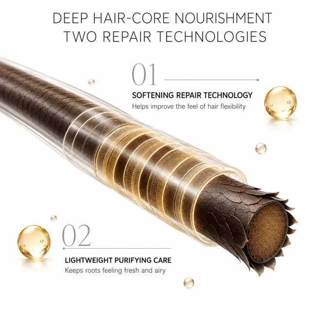
Based on scenario descriptions, generate a poster for an e-commerce detail page. Product Performance: - Do not display the toiletry packaging or brand; It features a cross-section of a dark brown strand of hair, extending from the upper left to the lower right. - The outer side of the hair shaft has a transparent protective tube and a multi-layer golden-brown repair ring, with damaged cuticles partially opening outward on the lower right; A small amount of transparent golden nourishing droplets dotted the edges. Layout Replica: - Pure white warm background, with two black titles centered at the top, spaced out widely. - The main visual hairpiece runs diagonally from the upper left to the lower right, with the first set of technical titles and a fine gray horizontal line placed slightly above the center, and the upper right side is marked with a large light gray size numbered 01. - The second set of technical titles and descriptions is placed at the bottom left, with a light gray large number 02 next to it; two golden droplets are placed near the two sets of text. - Large blank space, restrained and refined in tech. Fonts and typography: - Font Style: Slender modern sans Sans-serif main title, bold black sans technical title, main text clear and regular sans-serific. - The main title is centered, occupying about 62% of the width, two lines; Technical title: Right alignment or left alignment is close to both ends of the hair core to maintain balance. Copywriting Usage: - Main Title: Deep Nourishment for the Core / Two Major Repair Technologies - 01: Gentle Repair Technology / Helps enhance hair elasticity - 02: Lightweight Cleansing Technology / Keeps hair roots fresh and voluminous Graphic elements: - Use transparent tubes, golden nutrient droplets, light gray numbering, and fine horizontal lines; All materials are clear and delicate. Avoid: genuine product packaging, medical efficacy promises, excessive damage to cuticles, text covering the hair core, low-definition droplets, branding, watermarks, and screenshot edges.
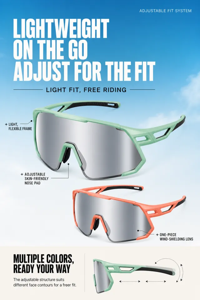
Based on the provided white-background product image, generate a detailed e-commerce page poster. Product Performance: - Maintains the core structure of a light mint green frame, silver-gray integrated lenses, adjustable nose pads, and lightweight frames; The main product is suspended in the middle with a large four-thirds front. - Below is a coral orange version with the same structure; Neither side product has a brand, logo, slogan, model, or minor parameters. Layout Replica: - Background transitioning from sky blue to cloud-white, with a small small fine white auxiliary text on the top right and an oversized white title on the left; Place a thin black horizontal line and a centered black short sentence below the title. - The main view in the center uses a mint green main wind-facing lens, which covers about 88% of the image width, with short black wires marking the frame, nose pad, and other structures. - The lower half uses the coral orange version for the front layer, with a black short lead line marking the lens in the lower right; At the bottom is the warm white instruction area and a simplified side view schematic. Fonts and typography: - Font Style: Extremely bold and wide typeface with sans-serif white titles, explanations are simple black sans-serifs. - Main headings aligned to the left, two lines, about 90% of the width; Lead text is small black text, and the first character uses a plus sign. - The bottom notes are standard gray-black font, with extended character spacing. Copywriting Usage: - Auxiliary word: ADJUSTABLE FIT SYSTEM - Main Title: Lightweight and Portable / Instant Fit - Subtitle: Lightweight and Fitting, Comfortable Ride - Notes: + Lightweight flexible frames / + Adjustable skin-friendly nose pads / + Integrated windproof lenses - Bottom Title: Multiple color options, go wherever you want - Bottom Description: Adjustable structure to accommodate different facial contours, making it more comfortable to wear. Graphic elements: - Use fine black leads, plus prefixes, a small cloud background, and simplified side view structure illustrations; Does not include year, patent, brand, or watermark. Avoid: Inconsistent structure between two pairs of glasses, missing temples, lens reflections, garbled text, text coverage products, low-definition lines, genuine branding, white margins in screenshots, and tiny footnotes.
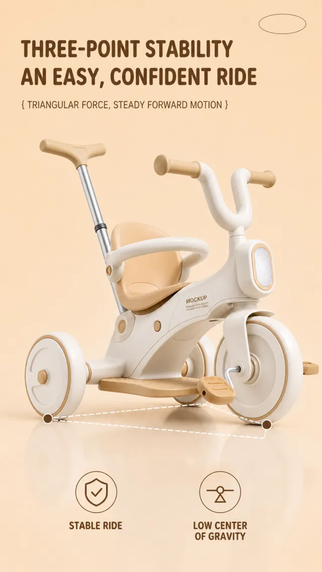
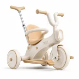
Based on the provided white-background product image, generate a detailed e-commerce page poster. Product Performance: - Maintain warm ivory white and apricot toddler tricycles, three-wheel structures, push bars, U-shaped handlebars, seat cushions, footpegs, and front guardrails. - The car body is positioned slightly to the right of center at the bottom of the frame, fully presented from a slightly frontal angle; Frame text uses only MOCKUP and EMBRACE YOUR BEAUTY, UNLEASH YOUR POWER. Layout Replica: - Warm beige apricot solid background, with two rows of brown large titles aligned at the top left, and a line of bracket-style subtitles below; The upper right corner only retains the minimalist oval decoration and cannot contain brand text. - Use three brown dots and a white dashed line to connect the front end, seat area, front wheels, and rear wheels to form a stable triangle schematic. - The bottom features two linear circular icons and two rows of Chinese and English labels arranged horizontally, with a very light reflection on the white background. Fonts and typography: - Font Style: Rounded, thick black sans-serif title, main text in dark brown medium weight sans-serif, English text in compact uppercase. - Main title aligned to the left, two lines, occupying about 56% of the image width; The subtitle is a notch smaller and placed below the title. - The bottom label has an icon on the left and a copy on the right, with two symmetrical groups on the left and right. Copywriting Usage: - Main Title: Three Points of Stability / Easy and Safe Riding - Subtitle: { Triangular Forces, Steady Progress } - Tag 1: Steady Ride / STEADY RIDE - Tag 2: Low Center of Gravity Design / LOW CENTER Graphic elements: - White dashed triangle, brown dots, two fine-lined circular icons, and understated oval corner markings; Clear lines without jagged edges. Avoid: child figures, real brands, exaggerated safety certifications, missing wheelsets, text pressing down on the body, low-definition icons, watermarks, screenshot margins, and tiny footnotes.
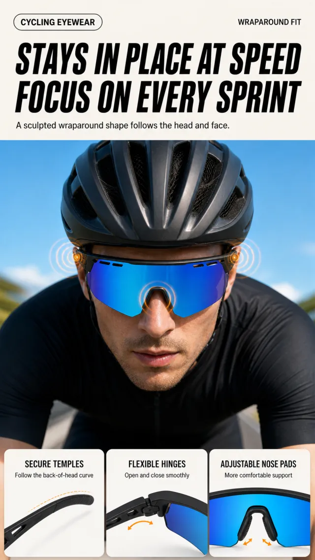
Based on the provided white-background product image, generate a detailed e-commerce page poster. Product Performance: - Maintains a black frame, blue integrated lenses, adjustable nose pads, and wrap-around temples. - The upper half has an adult cyclist wearing goggles and a black helmet, with the front close-up protruding visor fitting fit; The lower half contains three horizontal structural small cards, with no brand, logo, or slogan. Layout Replica: - The top features a warm white background, with the English category text for small capsules in the upper left and the small English auxiliary text in the upper right. In the middle, there are two bold black lines of large titles and one line of description. - Large sky blue background in the center, with the cyclist half-centered; Use very light orange concentric circles to mark the fit points on the sides of the ears and the bridge of the nose. - Three white rounded partial display cards are arranged horizontally at the bottom, with small spacing along the outer edges, corresponding to temple arms, hinges, and nose pads that can be adjusted. Fonts and typography: - Font Style: Bold black modern sans serif title, concise narrow English auxiliary text, and clear and easy-to-read small text inside the card. - Main title aligned to the left, occupying about 82% of the screen width, with two lines in a compact space; The explanatory text should be placed below the title, staying within one line. Copywriting Usage: - Category: CYCLING EYEWEAR - Main Title: Avoid Misalignment on High-Speed Riding / Focus on Every Sprint - Description: Three-dimensional wrapping design fits the curve of the head and face. - Card 1: Temple Stabilization / Fitting the curve of the back of the head - Card 2: Flexible hinge / smoother opening and closing - Card 3: Adjustable nose pad / more comfortable support Graphic elements: - Use small capsule labels, light orange adhesive rings, and 3 white rounded cards; No real brand or spec footnotes are added. Avoid: distorted facial features, helmet molding, duplicate windshields, text obscuring glasses, low-definition partial card cards, branding, watermarks, and screenshot edges.
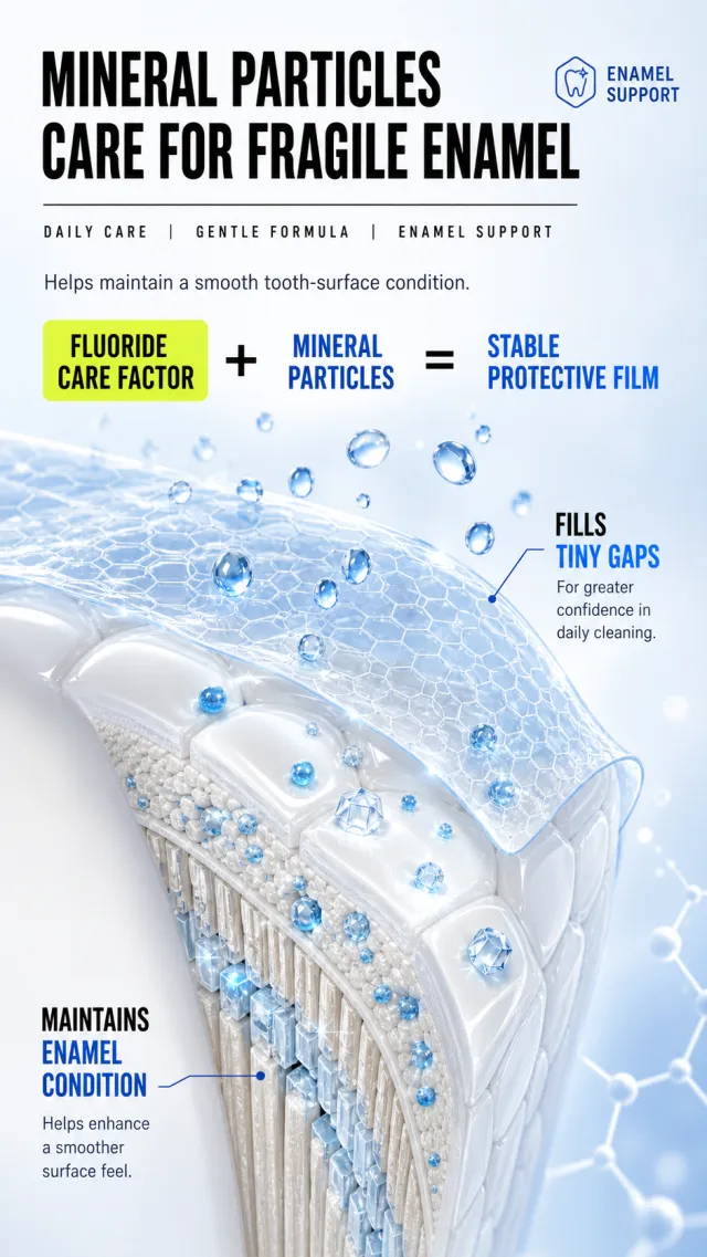
Based on scenario descriptions, generate a poster for an e-commerce detail page. Product Performance: - Do not display toothpaste packaging or brand; A gentle repair concept is presented through enlarged tooth enamel cross-sections, transparent hydrogel films, blue mineral particles, and translucent crystal structures. - Prohibit the appearance of drug packaging, genuine brands, medical certification, specific high multipliers, and extremely small footnotes. Layout Replica: - Light blue-white gradient background, with two large black titles on the top left and minimalist dark blue auxiliary text labels at the top right. - Below the title, a thin black horizontal line is used to separate them, with three English keywords placed horizontally; Next is a line of medium-sized gray-black instructions. - The middle part is a large component equation, with the first keyword highlighted by a yellow-green fluorescent background; Cover the tooth area with blue droplets and a transparent protective film underneath. - Each of the lower right and lower left has a set of English subheadings, blue Chinese selling points, and two lines of black-and-gray descriptions, forming a vertical echo. Fonts and typography: - Character Style: High-Font Weight Modern sans serif titles, English keywords use sans-serif lines with extended spacing. - Main headings occupy about 82% of the width, with two lines aligned to the left; The blue selling point is bold black text with bright blue accent text, clearly hierarchical. Copywriting Usage: - Main Title: Mineral Particles / Caring for Fragile Enamel - English keyword: DAILY CARE | GENTLE FORMULA | ENAMEL SUPPORT - Description: Helps maintain the delicate surface of teeth - Ingredient claims: Fluorine protection factor + mineral particles = strong protective film - Bottom right: fills in tiny gaps / makes daily cleaning more worry-free - Bottom left: Maintains enamel condition / helps improve surface smoothness Graphic elements: - Use transparent gel balls, blue mineral particles, honeycomb texture protective film, and fine black dividing lines; The graphic edges are smooth and free of jagged edges. Avoid: medical promises, authentic brands, exaggerated numbers, images of dental lesions, garbled text, overlapping text, low-definition 3D, watermarks, and screenshot edges.
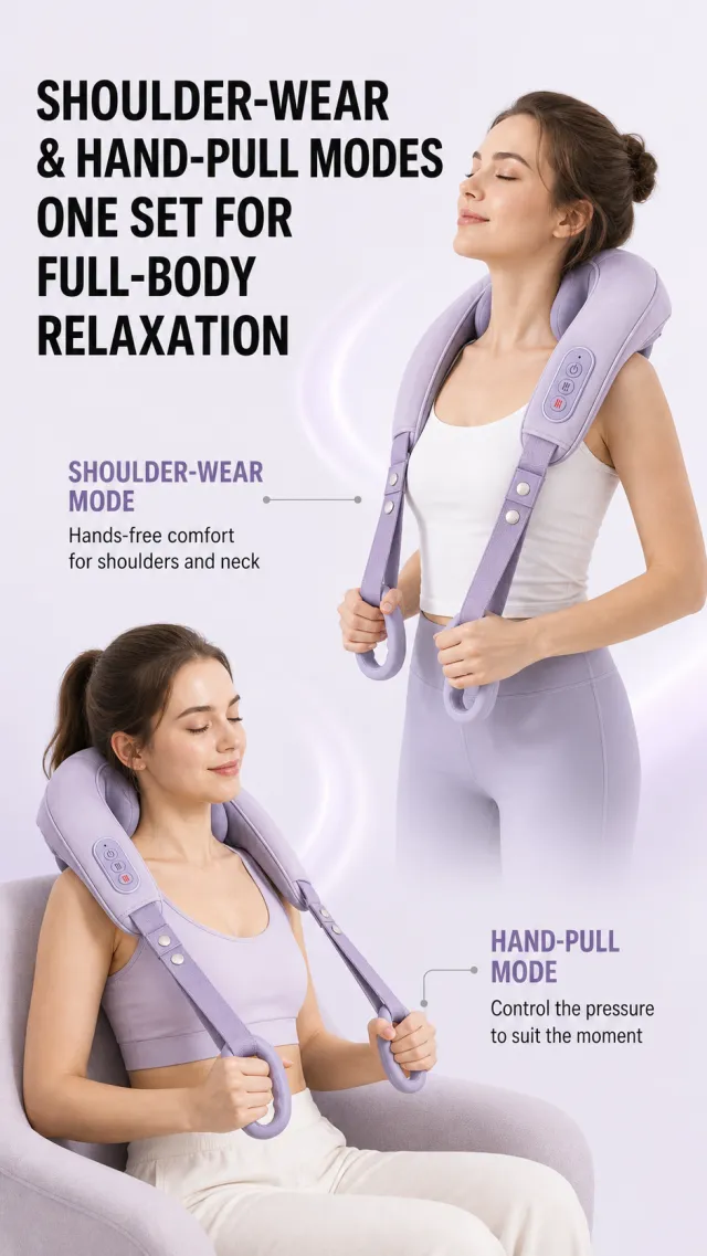
Based on the provided white-background product image, generate a detailed e-commerce page poster. Product Performance: - Maintain the core structure of the pale purple U-shaped shoulder and neck massager, soft cushions, double pull straps, control panel, and handle. - Demonstration by two adult women: upper right is shoulder-back wearable, lower left is seated hand-pulled style; Product proportions are natural, original products have no brand information, and no new brands, slogans, or logos are added. Layout Replica: - An extremely light lavender gray background, with two lines of bold black titles aligned on the top left. - The upper right of the screen shows a half-body scene of a standing woman wearing a massager; on the left side are purple mode titles, fine gray leads, and short descriptions; The lower half shows a close-up of a seated woman holding a massager, with the lower right corresponding to the second set of mode titles and descriptions. - Two usage scenarios are naturally layered, with clean blank spaces, and some areas are connected by soft purple light, without using border cards. Fonts and typography: - Font Style: Bold black sans-serif main title, medium purple text heavy mode title, black regular main text. - The main title occupies about 74% of the screen width, with two rows aligned to the left; Each set of modes is named close to the character's scene, with fine lines not passing through the character. Copywriting Usage: - Main Title: Dual Modes with Shoulder and Back, Hand, and Pull / One Set to Soothe the Whole Body and Mind - Pattern 1: Shoulder-Back Pose / Free Your Hands to Relax Shoulders and Neck - Mode 2: Manual pull / self-controlled, pressurized on demand Graphic elements: - Use fine gray horizontal lines, circular locator points, and light purple mode titles; No medical icons, grade parameters, or micro-annotations are used. Avoid: abnormal fingers, product mold piercing, medical diagnosis statements, text obscuring faces, obvious shadowed text, low-definition lines, brand information, watermarks, and screenshot edges.
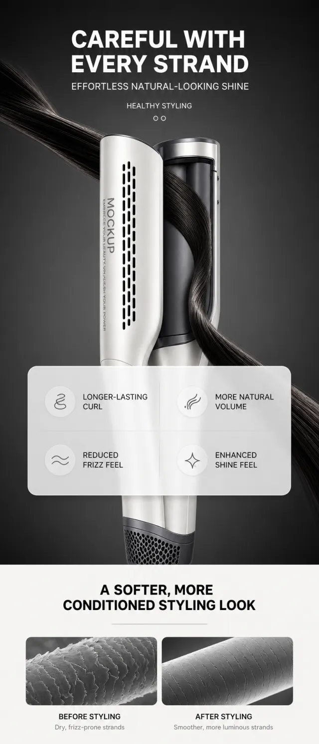
Based on the provided white-background product image, generate a detailed e-commerce page poster. Product Performance: - Maintains the dual-column structure, air outlet, and curling chamber of the Pearl White and Graphite Gray automatic curling machines, with the product extending vertically from the center. - Use a smooth strand of black hair to sweep diagonally from the upper left to the lower right, passing through the product; The product surface only retains MOCKUP and EMBRACE YOUR BEAUTY, UNLEASH YOUR POWER. Layout Replica: - The upper half of the poster features a dark gray studio background, with the title, short sentences, double circled symbols, and English auxiliary text centered at the top; The middle section features highlights of curlers and black hair as the main visual effects. - A semi-transparent white large rounded corner data card floats in front of the product, with four effect data items arranged in two columns on the left and right, without using real detection sources or exaggerated percentages. - The lower half switches to a warm white background, centering a bold black title and a fine gray divider; Then, side by side with two grayscale microscopic hair image images, mark before and after use. Fonts and typography: - Character Style: The upper part is a bold sans serif title, and in English, it is narrow sans serif; The lower half is a steady black sans-serif line. - The top title is centered, occupying about 64% of the width; Data cards have large numbers and small labels, aligning left and right neatly. - Use medium grayscale for the bottom card description to avoid tiny footnotes. Copywriting Usage: - Main Title: Carefully Grinding Every Strand of Hair - Subtitle: Effortlessly Achieve a Natural Shine - English Auxiliary Word: HEALTHY STYLING - Data Card: longer-lasting curls / more natural voluminity / reduced frizz / enhanced shine - Title of the second section: Make your look look softer and more textured - Left image: Before styling / Dry hair and prone to frizz - Right image: After styling / hair becomes smoother and shinier Graphic elements: - Use a semi-transparent white rounded corner data card, fine ash divider, and two parallel microscopic texture maps; No real test reports, percentages, or footnotes are retained. Avoid: exaggerated scientific promises, real brands, repetitive hair textures, text overflow, card obscuration of products, low-definition micro images, watermarks, and screenshot borders.
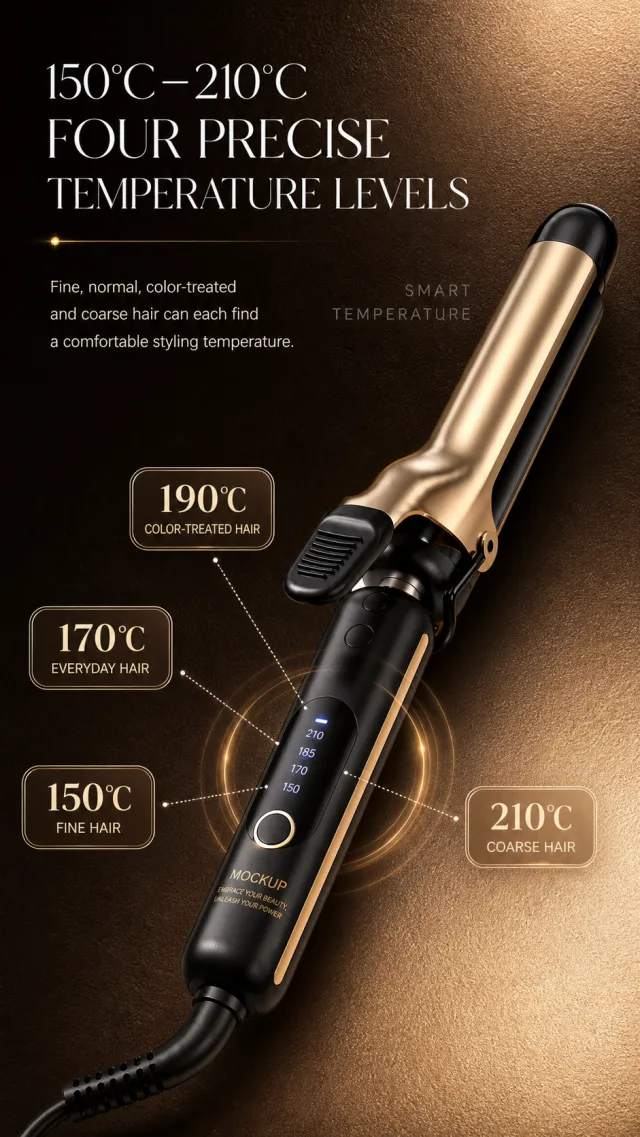
Based on the provided white-background product image, generate a detailed e-commerce page poster. Product Performance: - Maintain the complete structure of the black and gold curler, digital control panel, round dial, splint, and comb clip, extending diagonally from the lower right to the middle. - Only MOCKUP and EMBRACE YOUR BEAUTY, UNLEASH YOUR POWER are retained on the product; The digital temperature display is a functional interface that can retain a small number of clear temperature numbers. Layout Replica: - A leather background ranging from dark chocolate brown to warm sand gold, with two lines of fine white titles aligned at the top left, two lines of white notes on the left in the center, and faint dark gray English auxiliary text on the right. - The curler inserts the screen diagonally from the lower right, occupying the main area of the lower half; A golden semi-transparent halo is drawn around the outer ring of the digital display area. - Four cream-gold brushed rounded labels are distributed around the product, connected by fine white dashed lines to the center of the panel, forming a radial structure with four temperature settings. Fonts and typography: - Font Style: Slender and elegant sans serific large heading, with soft, medium-weight sans-serif text. - Main title aligned to the left, two lines, occupying approximately 66% of the image width; Temperature labels use high-contrast serif numbers and small sans serifs. - Do not add obvious text shadows; keep sufficient distance between text and the product. Copywriting Usage: - Main Title: 150°C-210°C / Four Levels of Precise Temperature Control - Main Text: Fine and soft, normal, coarse and coarse hair types can all find comfortable styling temperatures. - Tags: 150°C Fine & Soft / 170°C Daily / 190°C Dyed & Permed / 210°C Coarse & Hard Hair - English auxiliary word: SMART TEMPERATURE Graphic elements: - Creamy gold rounded temperature label, white dotted leads, golden halo, and very faint English auxiliary text with clear and smooth edges. Avoid: temperature labels obscure products, excessive lighting, genuine brands, garbled text, duplicate splints, product deformation, watermarks, screenshot white borders, and meaningless small text.
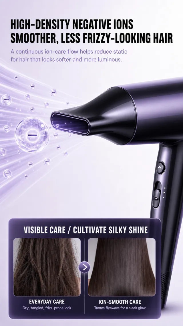
Based on the provided white-background product image, generate a detailed e-commerce page poster. Product Performance: - Maintains deep purple-black high-speed hair dryer, flat air collection nozzle, streamlined body, and minimalist control buttons. - Only the enlarged side view from the hair dryer head to part of the body is visible, diagonally from the lower right toward the center; Transparent purple airflow and sparkling negative ion microbubbles surround the air vent, without adding brand, logo, slogan, parameters, or model. Layout Replica: - Light purple-white soft light background, aligned at the top left, place two rows of large black titles and two lines of light purple-gray description. - The center features an enlarged purple-black hair dryer and transparent airflow effects, with a semi-transparent ionized circular structure at the center of the airflow surrounded by a few small bubbles. - Below is a deep purple, semi-transparent large rounded corner information card, with two vertical hair comparison images placed side by side on the left and right, using a white title and a small account to distinguish between regular care and ionic smoothing. Fonts and typography: - Font Style: Bold black modern sans serif title, light purple-gray fine text body, and smooth and clear white sans-serif text inside the card. - Main title aligned to the left, occupying about 82% of the screen width, two lines, numbers slightly larger; Wide line spacing in the main text. - The bottom card title is centered, with two contrast labels placed below the corresponding image, so as not to cover the hair texture. Copywriting Usage: - Main Title: High-density negative ions / Smooth hair strands without frizz - Main Text: Continuously releases ions to help reduce static electricity, making hair softer and shinier. - Card Title: Visible Results Achieve a Silky Shine - Left image: General care / dryness and tangling tend to cause frizz - Right image: Ion Smooth Protection / Smooths Lifts Smooth and Radiant Graphic elements: - Use transparent purple airflow, rounded ionic microbubbles, and a deep purple semi-transparent rounded corner contrast card; All edges are smooth and free of serrations. Avoid: false extreme values, medical aesthetics, low bubble clarity, text covering the air vent, repeated hair textures, product deformation, watermarks, branding, and screenshot edges.
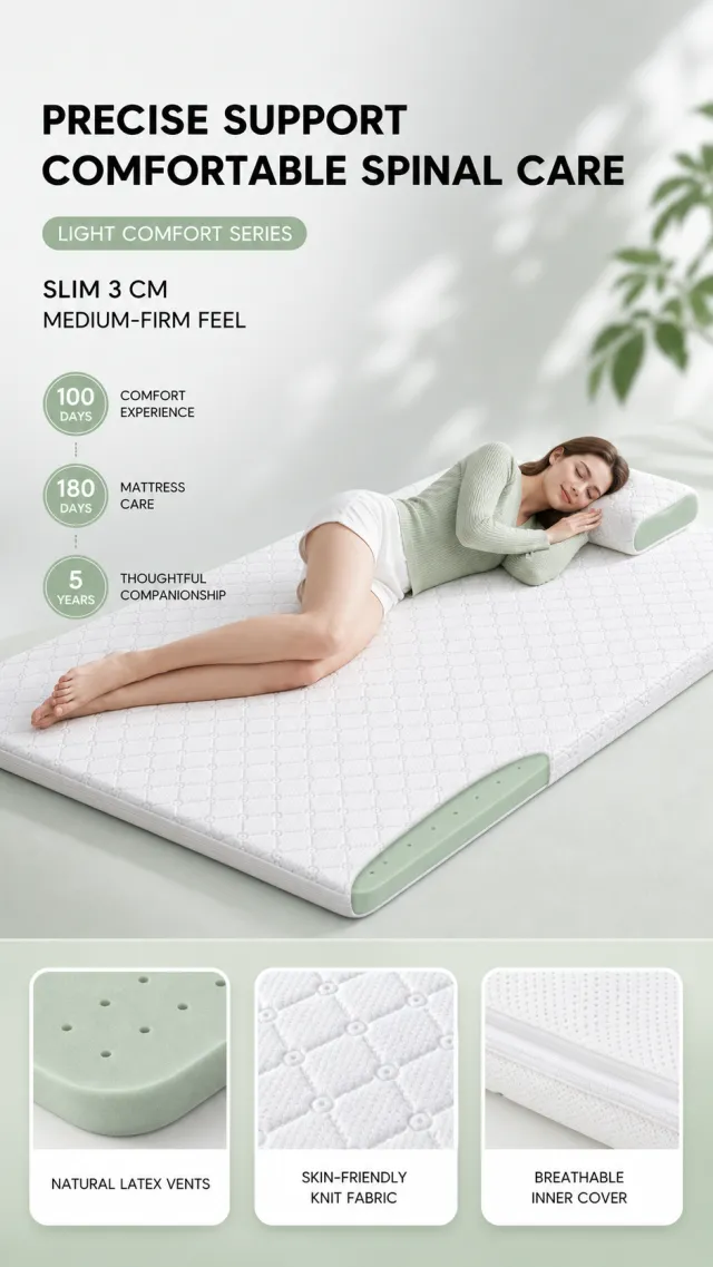
Based on the provided white-background product image, generate a detailed e-commerce page poster. Product Performance: - Retains the core features of the white diamond knit thin mattress, light sage green latex core, and small pillows made from the same material. - The upper half lets an adult woman wear a light green knit top and white shorts, easily lying on her side on the mattress; The product is fully exposed at a horizontal angle, with the pillow placed at the upper right corner. - The original product has no brand information and does not add new brands, slogans, logos, or product labels. Layout Replica: - Vertical light gray to light green soft background, with two lines of bold black titles aligned at the top left, and a light green rounded corner series label and two lines of specification notes below. - The central section features a person lying and a horizontal mattress forming the main visual effect, while three pale green circular digital information points are arranged vertically on the left. - The bottom features a light green gradient information band, with three horizontal white rounded photo cards displayed respectively showing latex holes, skin-friendly fabric, and breathable inner sleeves. Fonts and typography: - Character Style: Bold black modern sans-serif title, rounded and clear sans-serif numbers and explanatory text. - The main title should occupy about 60% of the screen width, with two rows aligned to the left; The numbers in circular digital information points are larger, indicating smaller descriptions. - The bottom card label should be medium white text, neatly centered. Copywriting Usage: - Main Title: Precise Support / Comfortable Spine Protection - Tag: Light Enjoyment Series - Description: Thin 3CM / moderate firmness - Circular information: 100 days / comfortable experience; 180 days / mattress maintenance; 5 years / Accompanying wholeheartedly - Card labels: Natural latex holes / Skin-friendly knit fabric / Breathable inner sleeve Graphic elements: - Use three pale green circular data points and three white rounded base material cards; No exaggerated certification stamps or footnotes are added. Avoid: distorted body parts, incorrect mattress thickness, excessive medical claims, text shadows, text overshadowing people, low-definition material images, brand text, watermarks, and screenshot edges.
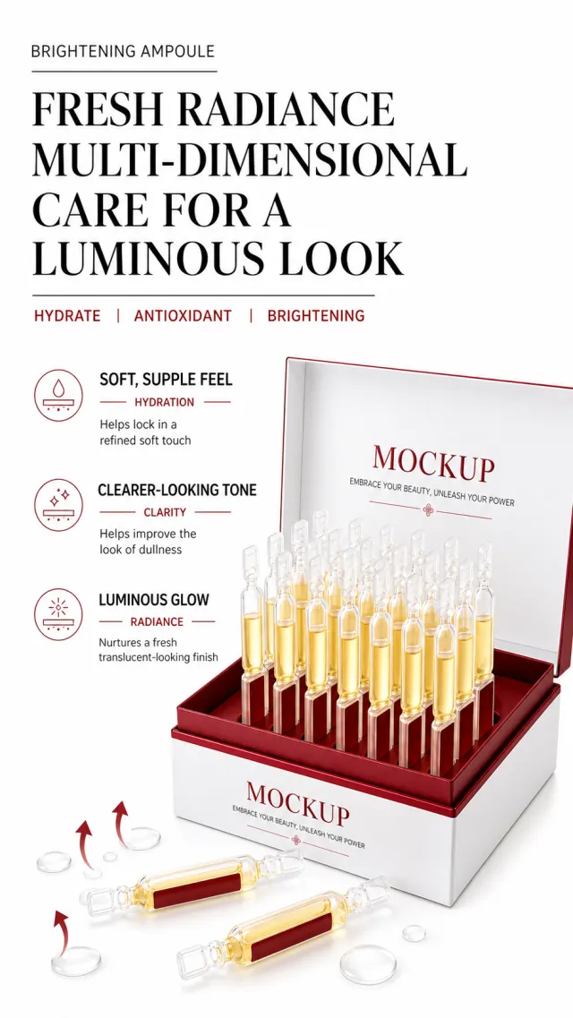
Based on the provided white-background product image, generate a detailed e-commerce page poster. Product Performance: - Keep the white and burgundy ampoule gift box, row of transparent gold essence ampoules, and two separate front ampoules. - Place the gift box in the middle and lower part of the image, with ampoules neatly standing upright, surrounded by a small amount of clear essence droplets; The packaging only retains MOCKUP and EMBRACE YOUR BEAUTY, UNLEASH YOUR POWER. Layout Replica: - Pure white background, with a row of small English auxiliary text and two large black titles aligned at the top, separated by a thin black horizontal line below, arranged horizontally with three red English keywords. - Center-left, arranged from top to bottom in three sets of efficacy descriptions, each consisting of a bold black subheading, a red short horizontal with English words, and two lines of main text; On the right is the ampoule gift box with the lid open. - Finish below with a foreground independent ampoule and transparent droplet, using a small number of red rising arrows to emphasize layering. Fonts and typography: - Font Style: Strong contrast black sans-serif title, slender sans-serif English auxiliary text, red as the only accent color. - Main title aligned to the left, occupying about 82% of the image width, two large lines, the first line relatively compact; English keywords are in all caps in the smallest size. - The efficacy text is arranged vertically and evenly on the left side, so it cannot cover the ampoule. Copywriting Usage: - English auxiliary word: BRIGHTENING AMPOULE - Main Title: Vibrant and Radiant / Frequent Maintenance for a Radiant Look - English keyword: HYDRATE | ANTIOXIDANT | BRIGHTENING - Selling Point 1: Soft and moisturizing to lock in delicate touch - Selling Point 2: Clear and Clear / Helps improve a dull appearance - Selling Point 3: Glow / Creates a translucent, radiant state Graphic elements: - Use thin red horizontal lines, small red arrows, fine black separators, and transparent droplets; Clear lines and edges without jagged edges. Avoid: absolute efficacy, authentic brands, garbled packaging, excessive text, low-definition droplets, overlapping text, duplicate ampoules, watermarks, and white border screenshots.
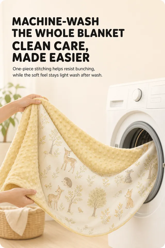
Based on the provided white-background product image, generate a detailed e-commerce page poster. Product Performance: - Retains the material features of a double-sided baby blanket: light creamy yellow raised suede and ivory white small animal print cotton surface. - In the image, two adult hands gently unfold the blanket, forming a natural arc; The right side reveals a simple white detail of the washing machine, with the blanket not cut. - The original product has no brand information and does not add new brand, slogan, logo, or tag text. Layout Replica: - Warm off-white background, soft large rounded corners at the four corners, two lines of large black text on the top left side, and two lines of black notes below. - The center to bottom is a large fabric usage scenario, with the blanket stretching from the left side to the washing machine opening on the right, highlighting soft drapes and double-sided textures. - Ample blank space in the frame, giving a gentle and clean sense of life. Fonts and typography: - Font Style: Rounded, bold, black sans serifics, with a concise sans-serif line for the main text of medium weight. - Main title aligned to the left, occupying about 55% of the image width, two lines of large text; The main text is placed below, with font size about 32% of the main title. - No bottom footnotes, icons, or extra tags added. Copywriting Usage: - Main Title: The whole blanket is machine washable / Cleaner and more worry-free - Main text: The integrated stitching prevents clumping, and the soft texture keeps it light and light even after long washing. Graphic elements: - No need for extra icons; The image is composed solely of soft natural light, fabric folds, and the round door of the washing machine. Avoid: children's faces, dirty effects, hard product edges, brand tags, text shadows, text overflow, watermarks, screenshot edges, and fine notes.
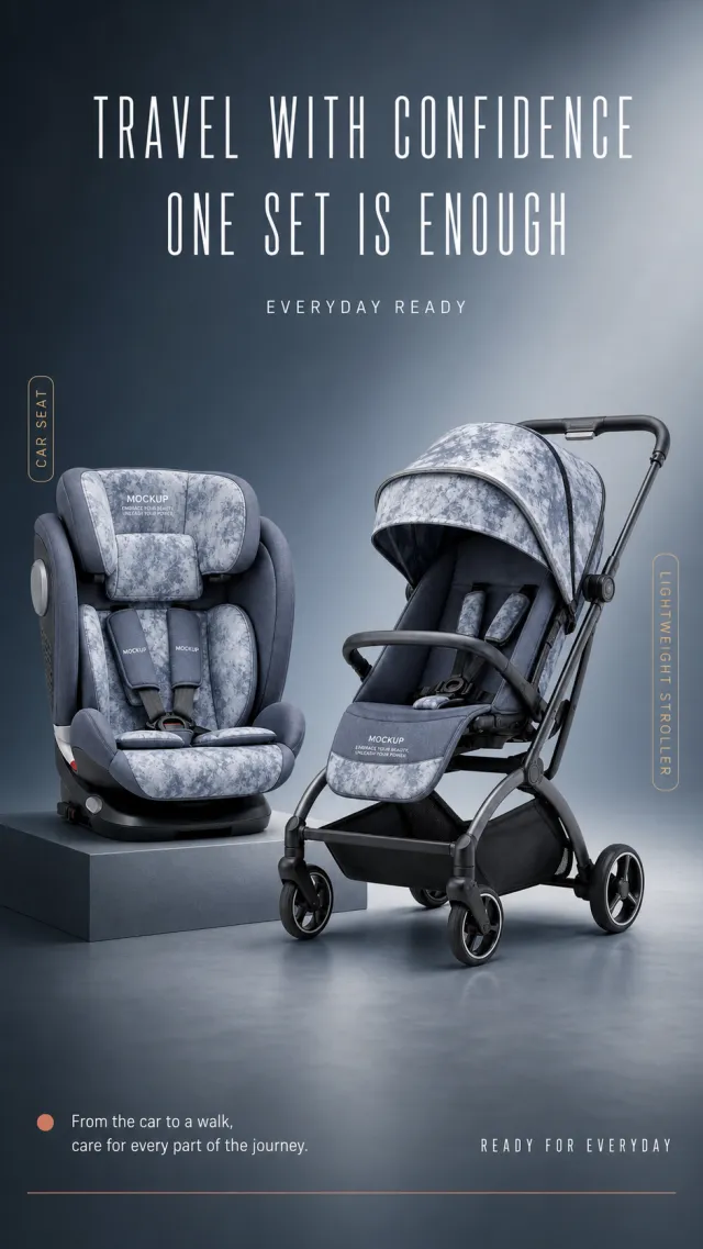
Based on the provided white-background product image, generate a detailed e-commerce page poster. Product Performance: - Maintains the core structure of the smoky blue-gray soft-wrapped child safety seat, lightweight stroller, sunshade, seat belt, and dark gray metal frame. - The safety seat rests on a slightly elevated square base on the left side, while the stroller rests on the right floor, creating a balanced dual-product composition; Product text only retains MOCKUP and EMBRACE YOUR BEAUTY, UNLEASH YOUR POWER. Layout Replica: - Studio background with a gradient from dark blue gray to misty gray, with two lines of narrow white title text centered at the top and a row of small English auxiliary text below. - The left child seat and the right stroller form a front and rear combination, each with a narrow gold vertical label beside them. - On the bottom left, there is a short horizontal dot with two lines of white safety instructions; in the lower right corner, there is a minimalist English short sentence; At the bottom, a thin warm red horizontal line concludes the scene. Fonts and typography: - Font Style: Slim, narrow modern sans-serif titles, with clear, medium-weight sans-serif in the main text. - The main title should be centered in two lines, occupying about 62% of the screen width, with light font weight but large font size; Safety instructions should be aligned to the left, with font size one level smaller. - Gold vertical labels with dark small text, positioned close to the outside of the corresponding product. Copywriting Usage: - Main Title: Leave-With Peace of Mind / One Package Is Enough - English auxiliary word: EVERYDAY READY - Left label: Child seat - Right tag: Light cart - Bottom note: From getting in the car to walking, take care of every step more thoroughly. - English short phrase: READY FOR EVERYDAY Graphic elements: - Use simple gold vertical stripe labels, warm red thin lines at the bottom, and small dots; No certification stamps, models, or footnotes are added. Avoid: children's figures, real brands, exaggerated safety certifications, incorrect proportions, missing wheels, text obscuring products, low-definition labels, watermarks, and screenshot edges.
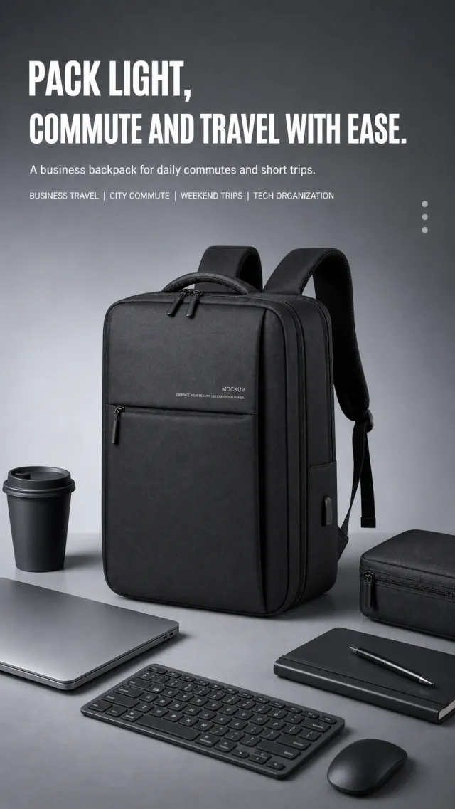
Based on the provided white-background product image, generate a detailed e-commerce page poster. Product Performance: - Maintains the black square business backpack, layered zipper, front storage pocket, and thick shoulder strap structure. - The product stands upright in the center of the desktop, surrounded by commuting items such as laptops, keyboards, mice, water bottles, and storage bags; The text on the packaging body may only include MOCKUP and EMBRACE YOUR BEAUTY, UNLEASH YOUR POWER. Layout Replica: - Cool gray studio background, with two lines of large white text and two lines of small text aligned at the top left, with a complete backpack as the main visual in the center. - Flat digital commuting items are placed at the bottom and sides of the image, forming a workbench composition around the product; The object does not obstruct the package body. - Overall quiet, neat, and with a commercial advertising texture, using soft studio shadows. Fonts and typography: - Character Style: Bold and heavy modern sans-serif titles, light text with heavy sans-serif lines, and a small amount of small dot decoration. - Main title aligned to the left, occupying about 58% of the image width, arranged in two rows; Explanatory text is aligned to the left at the bottom, with wide line spacing. - Place the copy in the safe area above, keeping the product clear and white. Copywriting Usage: - Main Title: Travel Light, / Commuting Effortlessly. - Main Text: A business backpack that balances daily commuting and short trips. - Scene tags: Business Travel | Urban commuting | Weekend getaways | Digital storage Graphic elements: - Use only three light gray vertical dots as small decorations, without adding borders, cards, or extra icons. Avoid real brands, other English labels, overly complex props, text shadows, overlapping text, product deformation, watermarks, screenshot white borders, and minor parameters.
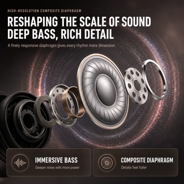
Based on scenario descriptions, generate a poster for an e-commerce detail page. Product Performance: - Do not display the complete earphones or branded packaging; An abstract explosive structure consists of a set of silver-gray high-resolution speaker diaphragms, metal acoustic rings, and localized black headphone housings. - The structure extends from the lower left to the center, with the central diaphragm being the largest and clearest; Do not include brand, model, certification mark, test data, or small footnotes. Layout Replica: - Soft-focus background from dark coffee gray to smoky gray, with a small auxiliary title and two lines of large white text on the top left; In the center is a circular acoustic wave halo with fine iridescent particles, surrounding the suspended diaphragm assembly. - Below, two horizontal dark brown semi-transparent rounded information cards are placed side by side: the left side contains two large lines of selling points, and the right side contains a brief description. - The visual focus is on the texture of the central metal diaphragm and the surround sound wave trajectory, maintaining a premium acoustic atmosphere. Fonts and typography: - Character Style: High font weight, modern sans serif, white title text; main text medium weight sans-serif; The auxiliary title is small and restrained. - Main title aligned to the left, occupying about 80% of the screen width, two large lines, tight spacing but not crowded. - Inside the card, the left is larger and the right is smaller, with clear hierarchy between white text and light warm gray explanatory text. Copywriting Usage: - Secondary title: High-resolution composite diaphragm - Main Title: Reshaping the Scale of Sound / Deep Low Frequencies, Rich Details - Description: Fine diaphragm response adds layers to every rhythm. - Card 1: Immersive bass / More power when diving down - Card 2: Composite diaphragm / richer details Graphic elements: - Uses fine particles, soft circular sound waves, and two semi-transparent rounded corner cards; No brand badges or authentic certification patterns are used. Avoid: Earphone structural distortion, glaring neon, garbled text, overly small footnotes, text overflow, low-definition particles, watermarks, and screenshot margins.